Agile Startup Policies Landing Page Template
The Mandate Startup Velocity Policy Management landing page template is a split-screen, single-page layout built for compliance-focused B2B teams. It uses a Charcoal and Amber color system, a scroll-driven Comparison Journey structure, and a freemium trial conversion model to turn policy chaos into a clear, organized product story that moves potential customers toward signing up.
by Rocket studio
Quick summary
Mandate is a professionally designed, single-page landing page template built for policy management platforms targeting compliance officers, human resources directors, and operations managers. It uses a 50/50 split-screen layout, a scroll-linked Comparison Journey, and a sticky freemium call to action to communicate a clear value proposition and drive sign-ups without friction.
Who this template is for
This template is built for founders, product teams, and marketers launching a B2B SaaS policy management product or service. It is especially effective when your target audience includes people who feel the daily pain of unorganized compliance processes. If your start up operates in RegTech, compliance technology, or any field where policy enforcement matters, this layout speaks directly to your buyers.
- Compliance officers preparing for audits who need a landing page that mirrors their urgency and need for order
- Human resources directors fielding repeated policy questions who want a product story built around self-service clarity
- Operations managers at scaling start ups who need to show potential customers and investors that their product solves a real, costly problem
What problem this template solves
Policy sprawl is a genuine business crisis for scaling organizations. Policies scattered across shared drives, buried in email threads, and versioned into confusion create daily annoyances that escalate into audit failures and regulatory exposure. A landing page that fails to surface these pain points loses visitor's attention before the first scroll. This template is built to make the cost of inaction feel real and immediate.
- It replaces a generic, feature-first landing page with a scroll story that escalates from daily annoyance to audit panic, making the value proposition impossible to ignore
- It gives each target audience segment a visual mirror of their exact pain points, so the desired action feels obvious and inevitable
- It removes the false sense of safety that comes from a polished but unconvincing page by grounding every section in recognizable, real-world compliance scenarios
What you get with this template
This template delivers a complete, structured landing page ready for customization. Every section is purposefully ordered to guide potential customers from awareness to sign-up in a single scroll. The layout is fully customizable to fit your brand, copy, and business model without starting from scratch.
- A 50/50 split-screen hero section with a parallaxing Stacked Type Tower and an amber tagline, followed by three scroll-linked Comparison Journey sections that escalate stakes from daily friction to audit failure
- A sticky freemium call to action pinned to the right pane, a two-field signup modal with no credit card required, and secondary sandbox calls to action beneath each comparison section
- A social proof metrics bar, a testimonial card, and a linear single-row footer with social media links included in the layout
Feature list
This landing page template ships with a focused set of built-in sections and interaction patterns. Each feature below is grounded directly in the template brief.
Stacked Type Tower Hero Section
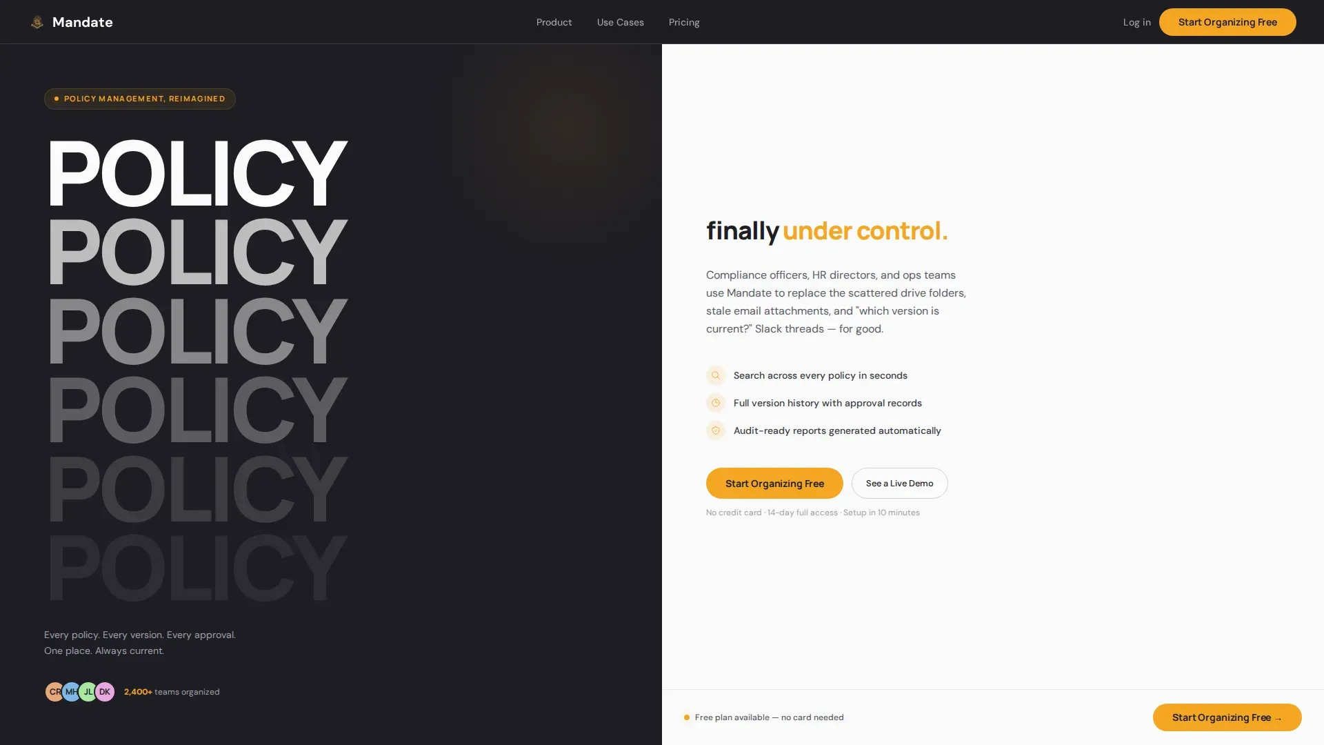
The hero section fills the left pane with the word "POLICY" repeated vertically in massive, tightly kerned type. Each repetition fades in opacity from solid charcoal to near-invisible, creating a typographic tower that recedes like documents being filed. The right pane answers with a single amber line: "finally under control." The tower parallaxes on scroll, giving the landing page an immediate sense of motion and authority without relying on imagery or dashboard screenshots.
Scroll-Linked Comparison Journey
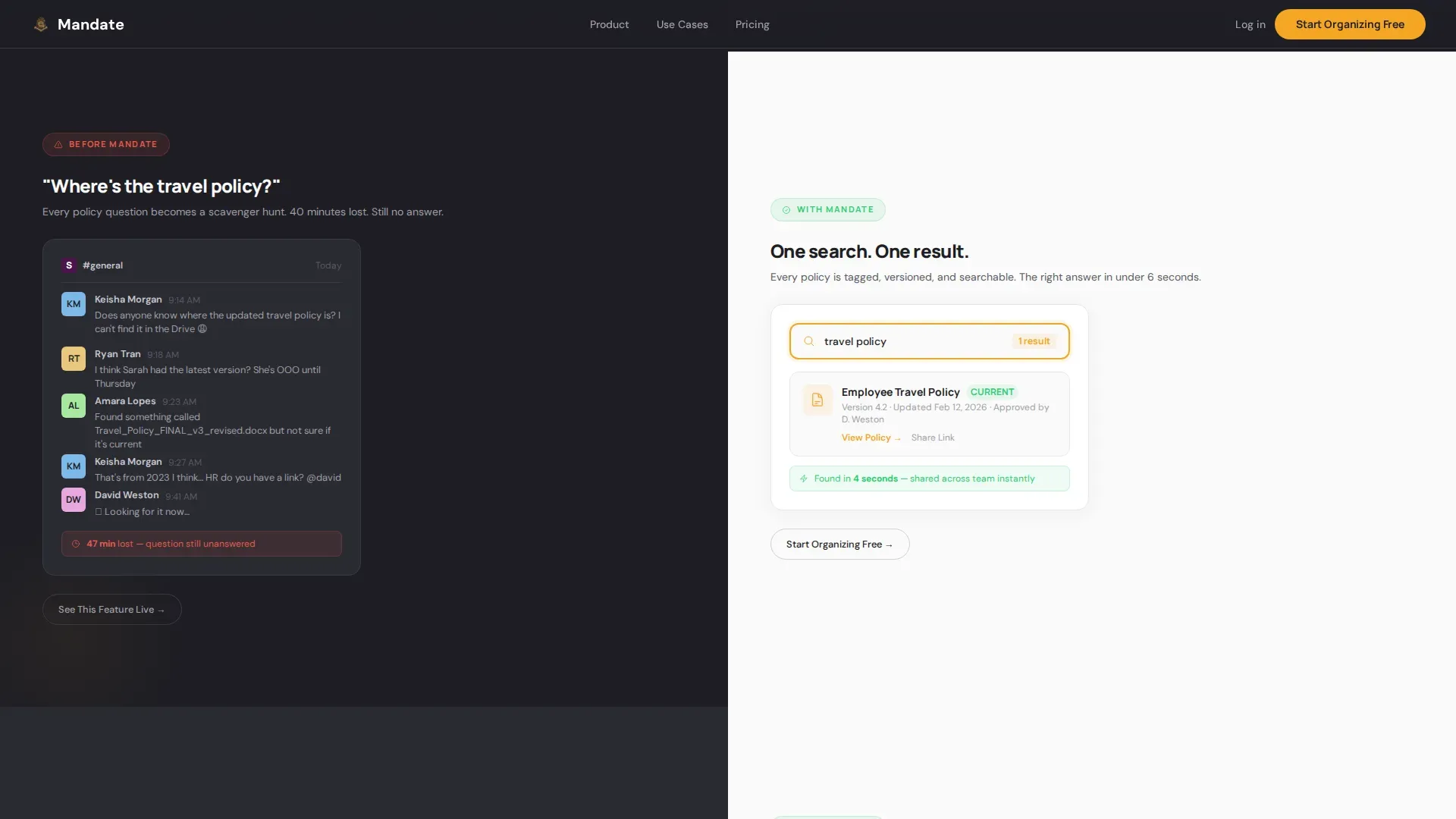
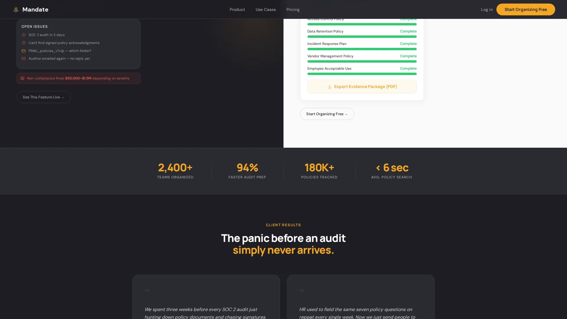
Three full-width comparison sections drive the entire scroll narrative. The left pane always shows the "before" state: a chaotic message thread asking where the travel policy is, seventeen versions of a Word document, a calendar alert counting down to a SOC 2 audit. The right pane resolves each scenario with the corresponding product feature: instant search results, a version timeline with tracked approvals, a compliance dashboard glowing green. Each section escalates the stakes, making the desired action feel more urgent with every scroll. This structure is one of the best examples of scroll storytelling applied to a SaaS landing page.
Sticky Freemium Call to Action
A primary call to action reading "Start Organizing Free" stays pinned to the bottom of the right pane throughout the entire page. This ensures the call to action travels with the visitor through every comparison without interrupting the narrative. Clicking opens a lightweight two-field signup modal: work email and a company size dropdown covering 1 to 50, 51 to 200, and 200 or more employees. No credit card is required, reducing friction and increasing conversion rates for freemium and trial-based business models.
Secondary Sandbox Calls to Action
Beneath each comparison section, a secondary call to action reads "See This Feature Live" and drops the visitor into an interactive sandbox for that specific workflow. This pattern lets potential customers experience the product or service before committing, which is especially powerful for early stage startups that need to build trust quickly. These secondary touchpoints create multiple conversion opportunities across the page without crowding the primary call to action.
Social Proof Metrics Bar and Testimonial Card
A dedicated social proof section presents trust-building metrics: policies organized, audit preparation time saved, and total companies using the platform. A single testimonial card sits alongside the metrics bar, giving real customers a voice on the page. Using social proof elements such as testimonials can significantly increase conversion rates on a landing page by communicating validated learning from real-world use.
Scroll-Triggered Animation System
The template includes a high-interactivity animation layer built on scroll-linked before-and-after reveals and stagger animations. The parallax tower, the progressive comparison reveals, and the sticky call to action all use GPU-accelerated transforms and CSS custom properties. This creates a landing page design that feels fast, intentional, and premium without requiring heavy development effort to deploy.
Page sections overview
| Section | Purpose |
|---|---|
| Hero: Type Tower | Establish product authority with a typographic split-screen and amber tagline |
| Comparison One: Daily Annoyance | Show Slack chaos before versus instant policy search after |
| Comparison Two: Version Hell | Contrast seventeen document versions before with an approval timeline after |
| Comparison Three: Audit Panic | Show a SOC 2 countdown before versus a green compliance dashboard after |
| Social Proof + Metrics | Build trust with a metrics bar and a single testimonial card |
| Linear Footer | Close the page with a single-row footer including social media links |
Design & branding system
The visual identity is built around a Charcoal and Amber palette that communicates authority and speed simultaneously. The design language feels like a matte-black notebook with a single amber ribbon bookmark: serious, organized, and never corporate-stuffy. Careful use of white space keeps the layout breathable and scannable, directing the eye through each comparison without clutter.
- Charcoal (#1E1E24) dominates the left pane and primary background; white (#FAFAFA) dominates the right pane and content cards; warm amber (#F5A623) appears only on buttons, toggle states, progress indicators, and notification badges, so every amber element signals action
- Soft ash (#A0A0A8) is used for secondary text and dividers, maintaining visual hierarchy without adding noise; Manrope is used for all headings and display type; DM Sans handles body copy for a premium, readable feel
Mobile & speed optimization
The template is built desktop-first, which aligns with the primary target audience of compliance officers and human resources professionals who work at desks. However, the layout is built to remain usable and readable on smaller screens, ensuring the landing page does not lose potential customers who review it on a mobile device. Allowing teams to review, share, and act on the page from any device supports broader reach during a product launch or trial campaign.
- The split-screen layout adapts gracefully for mobile, stacking the left and right panes vertically so the Comparison Journey reads cleanly in a single-column flow on smaller viewports
- GPU-accelerated transforms and CSS custom properties power the animation layer, keeping the page responsive and smooth without sacrificing the high-interactivity experience that makes the scroll narrative effective
How this template helps you convert
A landing page is most effective when every element works toward a single primary goal: turning a visitor into a lead. This template is engineered around that principle. The Comparison Journey makes the cost of inaction feel concrete. The sticky call to action ensures the conversion moment is always one click away. The social proof section gives undecided visitors the external validation they need to move forward.
- The scroll narrative escalates from minor pain points to major audit risk, so by the time a visitor reaches the bottom of the page, the freemium call to action feels like relief rather than a sales pitch, producing higher conversion rates than a static feature list ever could
- The secondary sandbox calls to action create additional lead generation touchpoints tied to specific features, allowing teams to capture interest from visitors who are not yet ready to sign up but want to explore the product or service further before taking the final step
Other information about this template
This template was designed with the principles of startup velocity in mind. A startup velocity policy is a strategic framework focused on maximizing the rate at which a start up achieves key milestones such as product development, customer acquisition, and revenue generation. High-performing companies can make critical decisions up to 9.3 times faster than bureaucratic counterparts, and this landing page is built to match that pace. The competitive advantage in modern business is increasingly determined by the rate at which an organization can learn and adapt, and this template supports that through validated learning built into the freemium conversion model.
The template is also well-suited for teams using a minimum viable product approach to test ideas before full software development investment. A minimum viable product is the simplest version of a product that allows teams to validate ideas and gather feedback with minimal effort. By launching this landing page before the full product is complete, teams can collect information on genuine demand, measure user behavior through sign-up patterns, and make data driven decisions about which new features to prioritize. This is consistent with the Lean Startup Build-Measure-Learn feedback loop, which emphasizes validated learning and minimal effort at each iteration stage.
For teams conducting market research, the two-field signup modal collects vital information: work email and company size. The data gathered from these fields gives your sales team and product team a clear picture of who your potential users are and what segment they fall into. This supports customer feedback loops and informs future market research priorities without adding friction to the sign-up experience. Customer interviews and positive feedback from early adopters can then be used to fine tune the landing page copy over time, improving conversion rates and perceived value across each iteration.
The Mandate Startup Velocity Policy Management landing page template is one of the best examples of how landing page design can serve a compliance-focused B2B product while maintaining the speed and energy of a start up. Teams building a new venture in the RegTech or compliance space will find this layout acts as a game changer for early traction. The landing page design draws on various strategies used by silicon valley-style start ups to create a product launch moment that feels inevitable rather than promotional.
This template is fully customizable, allowing teams to swap colors, update copy, and fine tune visual elements to match their brand in a few minutes. You can add visual elements such as compliance badge graphics or "how-it-works" diagrams to sections where you need to convey the policy lifecycle more concretely. Professional design and a clear professional credibility signal are baked into the layout, so even early stage startups present with the authority of an established product. Small businesses in regulated industries will find the freemium model and simple landing structure particularly effective for lead generation without a large sales team or marketing budget.
This template supports the full range of startup landing pages needs: from validating a minimum viable product before building, to launching a full product or service with a polished saas landing page that converts on the first visit. The layout aligns with best practices for a saas landing page, including a clear engaging headline, a focused value proposition, strong social proof, and a frictionless call to action. It is designed to create informed decisions from visitor's attention captured in the hero section and sustained through every comparison scroll.
- The template supports startup success by making the landing page conversion-ready from day one, without requiring a development team to build from scratch
- It is built to help potential customers understand the product or service clearly, take the desired action quickly, and return for the next stage of their trial experience with confidence
- Brand-level details, including use of customer experience design principles drawn from best examples in the RegTech and compliance space, are embedded in the layout so you create a credible first impression in the long run

Theme
Startup Velocity
Creative direction
Comparison Journey
Color system
Charcoal & Amber
Style
Split Screen (50/50)
Direction
Freemium/Trial
Page Sections
Stacked Type Tower Hero Section
Scroll-linked Comparison Journey
Sticky Freemium Call to Action
Secondary Sandbox Calls to Action
Social Proof Metrics Bar and Testimonial
High-interactivity Animation Layer
Related questions
Who is this landing page template designed for?
Can I customize the colors and copy in this template?
Does this template support a freemium or trial sign-up flow?
How does the Comparison Journey structure work?
Is this template suitable for validating a minimum viable product?


