Bootcamp Creative Training | Free Website Template | Rocket
The Upskill Intensive Bootcamp Creative Training Comparison Landing Page Template is built for creative and media training providers. It guides visitors through a Hero's Journey narrative, from the creative stuck in a freelance loop to broadcast-ready professional. A three-column comparison table, scrolling logo bar, alumni stories, and a frictionless free-module signup form do the heavy lifting.
by Rocket studio
Quick summary
This landing page template is purpose-built for creative bootcamp providers. It uses a dark post-production aesthetic, a three-tier comparison table, and a freemium conversion flow to move potential students from first scroll to free module signup. Every section raises the stakes, and every design choice reflects the quality of the training it promotes.
Who this template is for
This template speaks directly to training providers who work with working creatives. The page is structured to serve a specific target audience across three distinct groups, and the course landing page layout reflects that focus clearly.
- Mid-career video editors who want to break into directing or level up their skills
- Junior designers and production company founders onboarding new hires to broadcast standard
- Creative training businesses that need a high-quality course landing page to generate leads and enrol students
What problem this template solves
Most course landing page designs fail creatives because they feel corporate, generic, or built for business software rather than post-production talent. Visitors with dwindling attention spans leave before reaching the comparison table. This template solves that by leading with atmosphere, then delivering hard information fast.
- No clear course outline means potential students cannot evaluate which tier fits their career stage
- Generic landing page design fails to build trust with a creative-industry audience
- Scattered calls to action reduce the average conversion rate and push qualified leads away
What you get with this template
You get a complete, single-page course landing page built around a Hero's Journey narrative arc. Each section earns the next scroll. The page is structured to display social proof early, surface the course structure clearly, and deliver a frictionless signup form that converts visitors into enrolled students.
- A scrolling broadcaster logo bar, three-column comparison table, alumni narrative cards, and a minimal free-module signup form
- Deep navy, slate, and signal-green visual identity styled as a post-production suite at 2 a.m.
- Fraunces display serif headlines paired with DM Sans body copy for quality typographic contrast
Feature list
This template includes a focused set of features, each one grounded in what the source brief calls for. The goal is to create a course landing page that does its job without distraction.
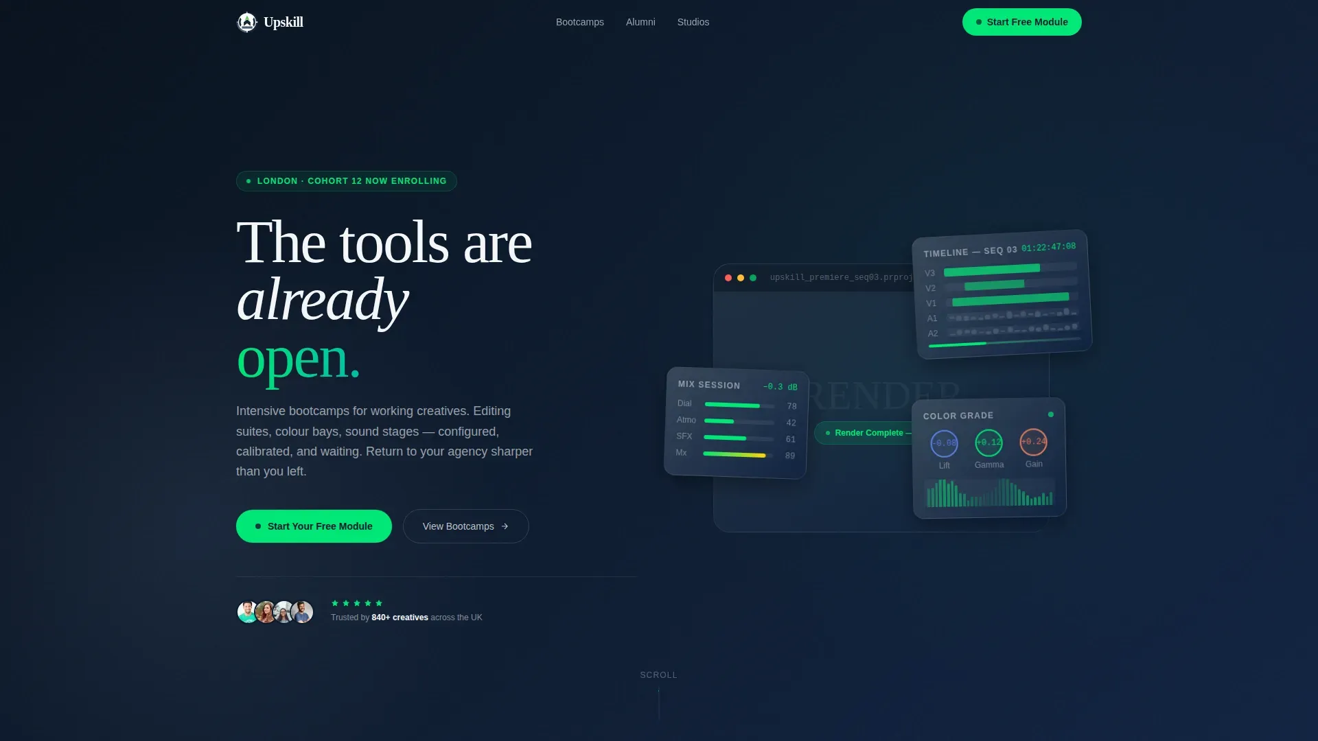
Hero Section with Floating Workstation Cards
The hero section opens on deep navy with floating workstation cards that carry the headline "The tools are already waiting." This outcome-led opening sets the tone before visitors read a single feature. The hero section focuses on transformation, not curriculum, which is proven to improve first impressions on a course landing page.
Scrolling Broadcaster Logo Bar
A horizontal ribbon of broadcaster and studio logos scrolls beneath the hero at a deliberate pace. The logos function as silent social proof. Visitors notice the credibility signal immediately, and it requires no marketing copy to explain. This feature does the heavy lifting that long testimonial blocks often fail to do.
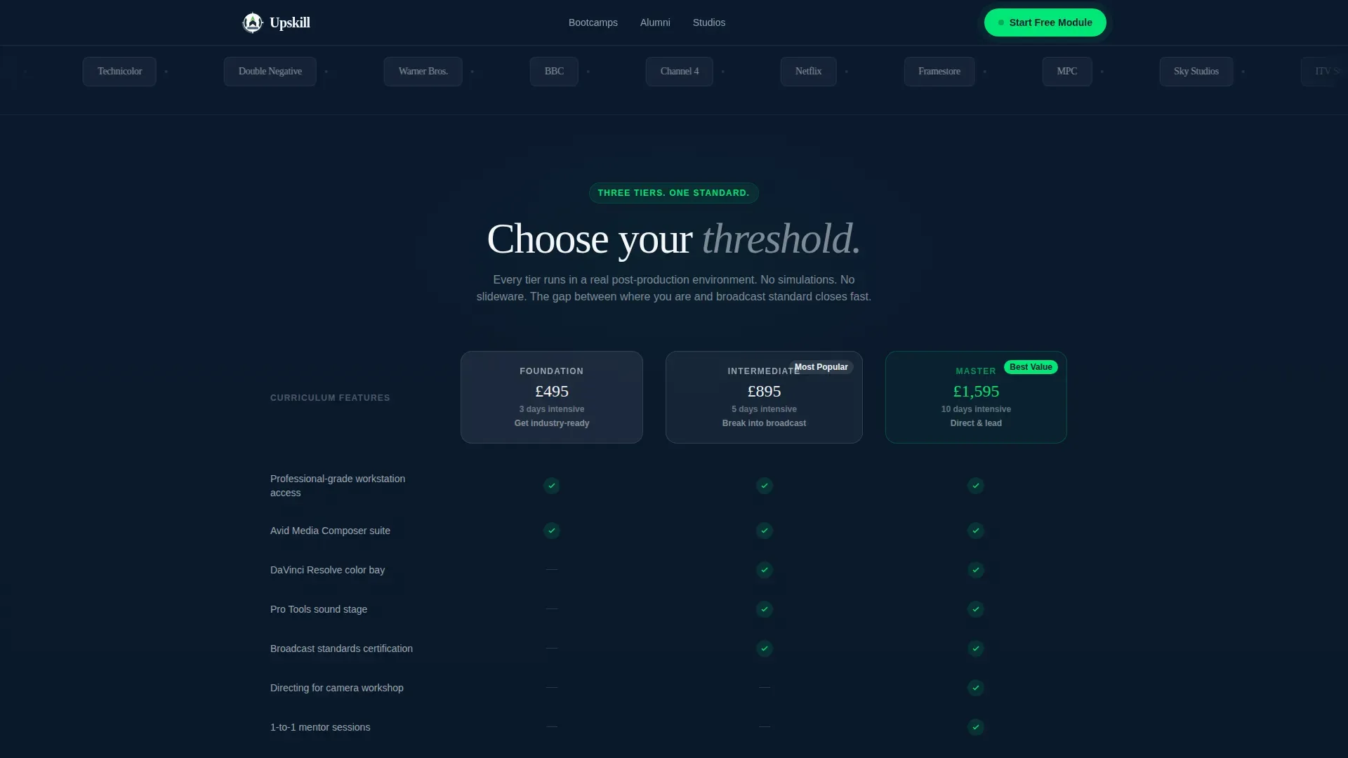
Three-Column Course Comparison Table
The comparison table is the centrepiece of this landing page design. It lays out Foundation, Intermediate, and Master tiers side by side, with signal-green checkmarks marking included features. A side-by-side comparison table like this helps users evaluate course duration, intensity, primary tools, and skill level at a glance. The primary call to action is pinned directly beneath it.
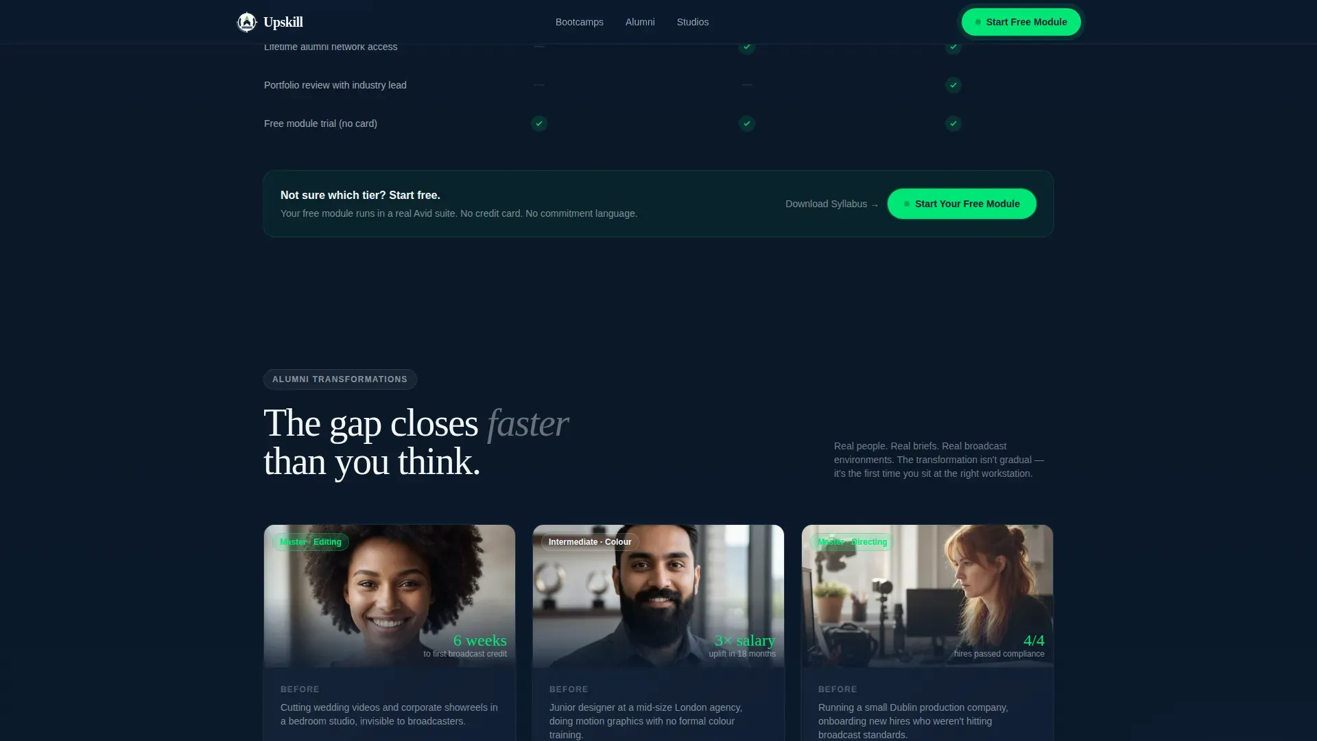
Alumni Transformation Narrative Cards
Asymmetric narrative cards display real-before-and-after stories from past students. These cards act as social proof and inspiration at the same point in the scroll where visitors most need reassurance. Each card follows the transformation format: where the person was, what course they took, where they landed in their career.
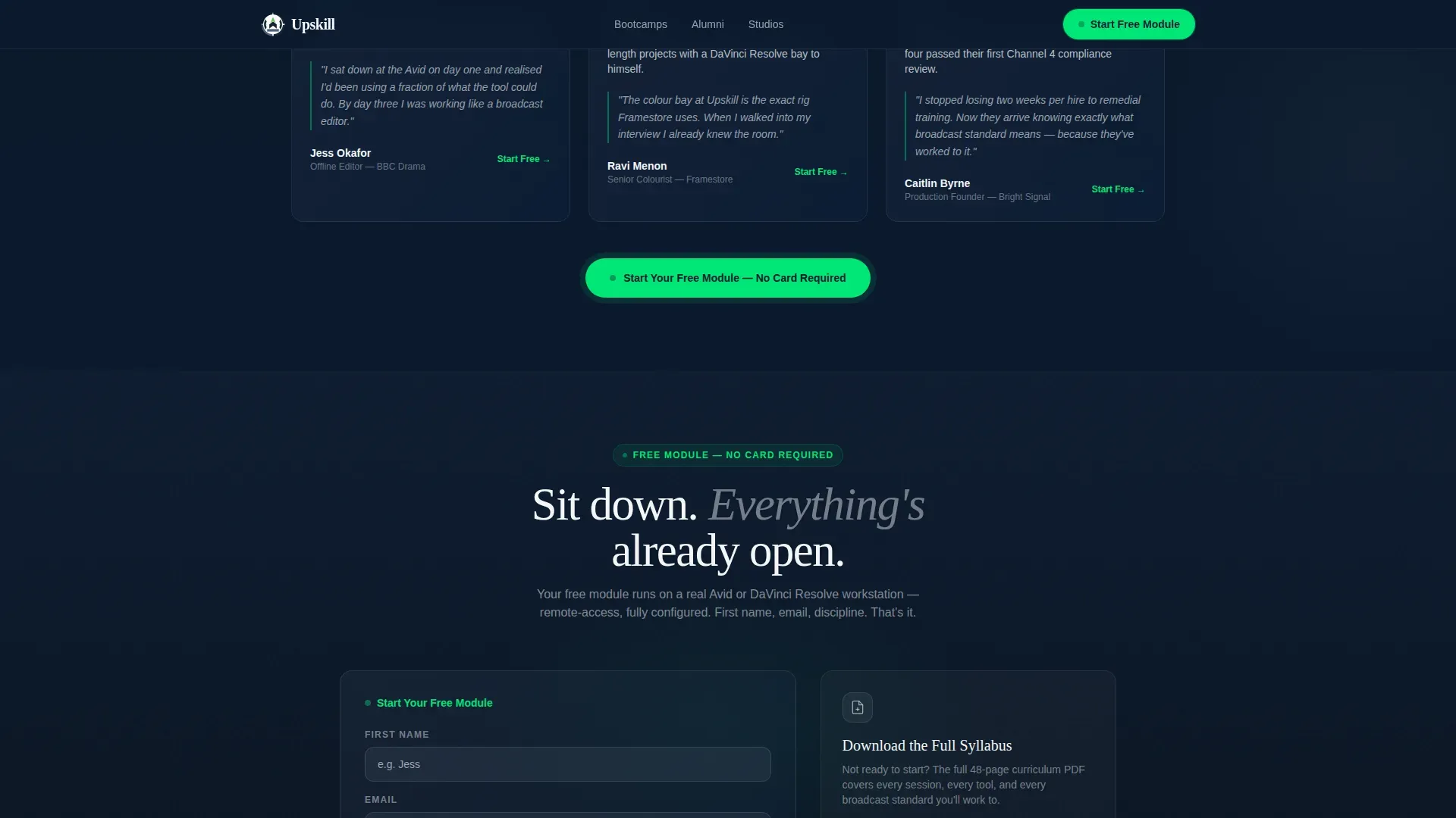
Minimal Free Module Signup Form
The signup form asks only for a first name, email address, and creative discipline via dropdown. No credit card. No commitment language. On-demand access to a free module removes the most common objection at the finish line. The form is the conversion engine; once learners sit in that virtual workstation, friction disappears.
Secondary PDF Syllabus Gate
A secondary call to action offers visitors the option to download a full course outline as a PDF in exchange for their email. This captures leads from potential customers who are not ready to start but are willing to share contact details. It is an effective content marketing tool that widens the top of the sales funnel.
Page sections overview
| Section | Purpose |
|---|---|
| Hero with Cards | Opens with outcome-led headline and floating workstation cards |
| Logo Bar | Scrolling broadcaster logos serve as silent social proof |
| Comparison Table | Three-tier course breakdown with signal-green checkmarks |
| Alumni Story Cards | Transformation narratives build trust and inspiration |
| Free Module Form | Minimal signup captures name, email, and discipline |
| Footer | Single-row linear footer with clean navigation links |
Design & branding system
The visual identity follows the Startup Velocity theme using a Navy Authority colour palette. The brand feel is a post-production suite at 2 a.m.: dark walls absorbing distraction, glowing screens full of purpose, one green light confirming the render is live. This quality of visual atmosphere is rare in course landing page design and is central to the template's effectiveness.
- Colours: deep command-room navy (#0B1A2E), slate-panel grey (#3A4A5C), crisp monitor white (#F4F6F8), and electric signal green (#00E676) reserved for calls to action, progress indicators, and active states
- Typography: Fraunces display serif for headlines and DM Sans for body and user interface copy
- Animation: scroll-linked reveals, staggered table rows, logo marquee, floating card animations, and a green pulse on the call to action button
Mobile & speed optimization
The template is desktop-first by design, matching the post-production suite aesthetic its target audience expects. Full mobile responsiveness is built in so the page performs across all devices without sacrificing the dark, immersive quality of the layout. Fast load times are critical for any course landing page; high bounce rates cost leads.
- Server Components handle static content for speed; Client Components handle scroll-linked animations and interactive states
- The comparison table, form, and logo marquee all reflow cleanly for smaller screen sizes
- Minimalist navigation keeps users focused on the course and the call to action across every device
How this template helps you convert
This template is designed as a conversion-focused course landing page with a single purpose: to get users to start the free module or exchange their email for the full syllabus. Every section is structured to increase conversions by removing friction and building trust progressively.
- The logo bar and alumni cards provide layered social proof early, so visitors trust the course before they reach the comparison table. Including testimonials and credible brand signals on a landing page is proven to build confidence with potential students.
- The comparison table gives visitors the course outline, course duration, and tier detail they need to determine which programme fits their career stage. A clear course outline helps potential students understand what they will learn and what to expect. The pinned call to action then converts that clarity directly into a signup.
- The minimal form and secondary PDF gate capture leads at two different points in the decision journey, serving both visitors who are ready to start and those who need a sneak peek at the full syllabus before committing.
Other information about this template
This template is part of a broader set of landing page examples built for creative and media training providers. It takes a similar approach to high-performing course landing page designs in the bootcamp and professional development space, balancing high-quality visuals with concrete, career-focused data.
- Training formats supported by this page include in person studio sessions, live online classes, and on-demand modules that learners can complete at their own pace
- The page structure maps each course tier to specific job roles, helping visitors determine which programme matches their current skills and career ambitions
- Paid course pricing can be displayed transparently within the comparison table, and a paid search or social media marketing campaign can drive traffic directly to this page as a standalone conversion asset
- Content marketing, search engine optimization, and paid search teams can all use this page as a landing destination to drive traffic and capture leads
- The page supports user engagement through high interactivity: hover states on the table, a magnetic call to action button, and a discipline dropdown in the form
- Tools such as Google Analytics can be connected to track visitor behaviour, form submissions, and overall page performance once the template is live on your site
- The average conversion rate for a course landing page is 13%, above the 11% average across all landing page types, making a focused, well-designed course landing page a strong business investment
- Positive reviews and alumni feedback can be rotated into the narrative card section to keep social proof current and relevant
- The template provides security in brand consistency: every colour, font, and interaction follows the Navy Authority system without deviation
- This template is one of many landing page examples available on the platform and is designed to stand out in the creative and media training niche
Theme
Startup Velocity
Creative direction
Hero's Journey
Color system
Navy Authority
Style
Comparison Table
Direction
Freemium/Trial
Page Sections
Three-tier Course Comparison Table
Scrolling Broadcaster Logo Bar
Alumni Transformation Narrative Cards
Hero Section with Floating Cards
Minimal Free Module Signup Form
Secondary Syllabus PDF Gate
Related questions
Does this template include a free module or course content?
Can I add or remove tiers from the comparison table?
Is this landing page suitable for both individual creatives and business clients?
How does the secondary PDF syllabus gate work?
What makes this different from a generic course landing page template?


