Specialist Low Income Finance Cost Estimator Website Template
Qualify is a Dashboard Pro landing page built for low-income personal loan services. It opens with trust-shield badges and a live loan calculator showing real monthly payment figures in gold before a visitor touches anything. The page guides borrowers through soft qualification via a comparison data grid, an eligibility checklist, and a progressive multi-step form, all without a hard credit pull.
by Rocket studio
Quick summary
Qualify is a single-page, calculator-first loan landing page template built for the low-income personal loan segment. It shows borrowers a real monthly payment number the moment the page loads, then guides them through rate comparison, soft-qualification questions, and a progressive form, earning trust before asking for commitment. No hard credit pull. No judgment. Just clean finance tools and clear numbers.
Who this template is for
This landing page is designed for finance businesses and agencies that serve borrowers often turned away elsewhere. The layout is honest, dignified, and built to generate leads from people who are searching for answers at midnight on a phone with a cracked screen.
- Personal loan services and direct lenders targeting sub-620 credit borrowers
- Finance agencies managing lead generation campaigns for low-income loan products
- Financial counselors and social workers who share vetted loan resources with clients
What problem this template solves
Most loan landing pages are built for prime borrowers. They lead with dense forms, hidden fees, and fine print. That layout creates anxiety for users already stretched thin. This template removes those distractions and replaces them with transparent tools and clear payments, so visitors feel informed rather than interrogated.
- Borrowers abandon loan pages when the form appears before the math does
- Low-income users need to see that the page is safe and free of predatory practices before they sign anything
- A cluttered or cold page kills conversion rates for finance offers in this segment
What you get with this template
This template delivers a complete, structured loan landing page with every section a finance business needs to capture leads and build borrower trust. The page earns each scroll by deepening the tool experience rather than rushing users toward a form.
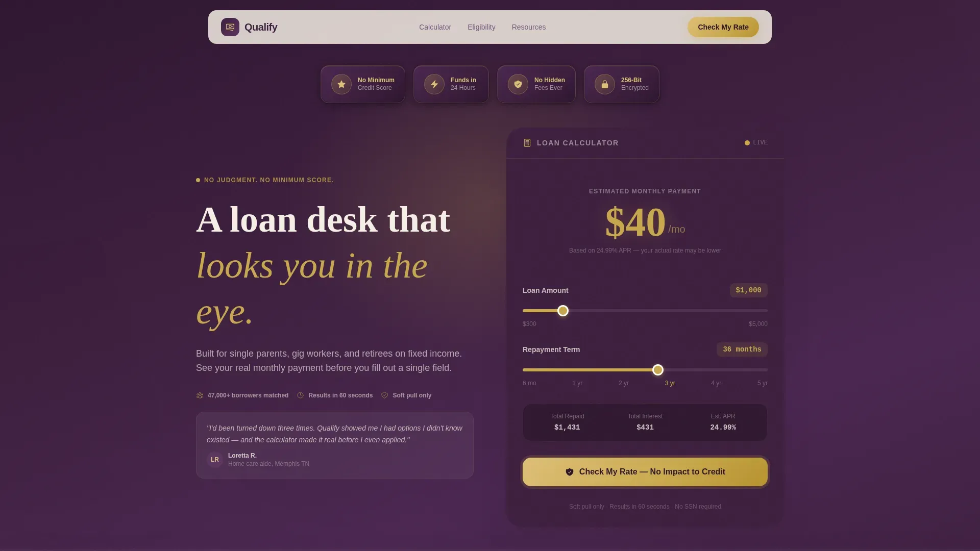
- A live loan calculator pre-set to $1,000 and 36 months, with a gold payment display showing $38/month as the default
- A rate comparison data grid, an eligibility checklist, contextual resource cards, and a progressive multi-step disclosure form
- A secondary lead path offering a downloadable Low-Income Borrower's Guide, plus a sticky footer call to action bar
Feature list
This landing page template includes a focused set of features designed to improve conversions, build borrower confidence, and help your team capture leads responsibly.
Live Loan Calculator with Gold Payment Display
The calculator loads pre-populated with a $1,000 loan amount and a 36-month loan duration. The monthly payment figure appears immediately in large gold numerals. Visitors see a real number before they interact with a single slider, which reduces anxiety and increases the duration of time they spend on the page.
Award Badge Trust Row
Four embossed trust-shield icons sit at the top of the page: "No Minimum Credit Score," "Funds in 24 Hours," "No Hidden Fees," and "256-Bit Encrypted." These badges answer the three fears borrowers carry, will I qualify, how fast, and what's the catch, within the first two seconds of landing.
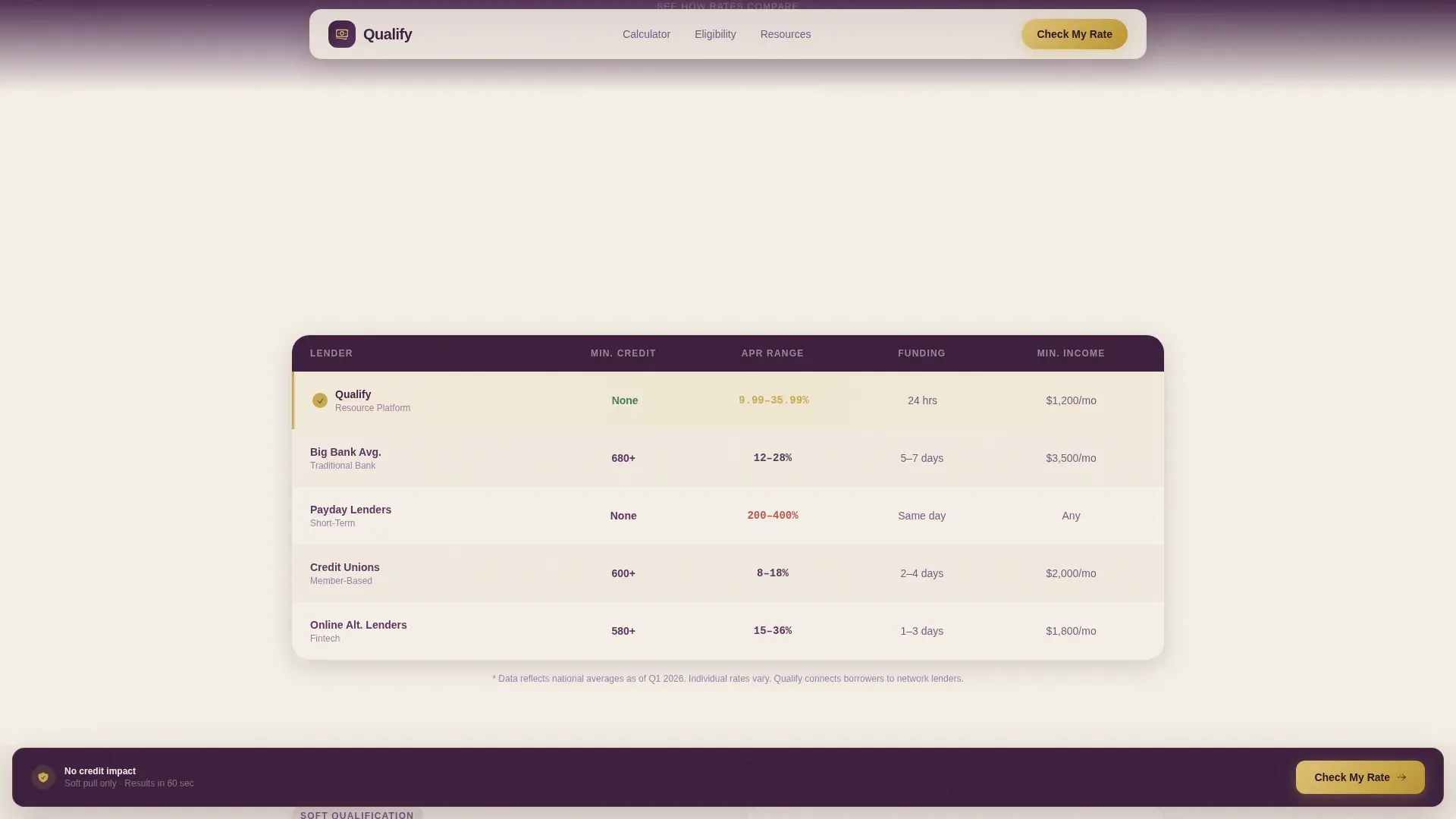
Rate Comparison Data Grid
As visitors scroll, a comparison data grid surfaces their estimated loan rate against national averages. This section helps users compare options clearly and signals that the lending page has nothing to hide. Transparent data builds the credibility that low-income borrowers need before they apply.
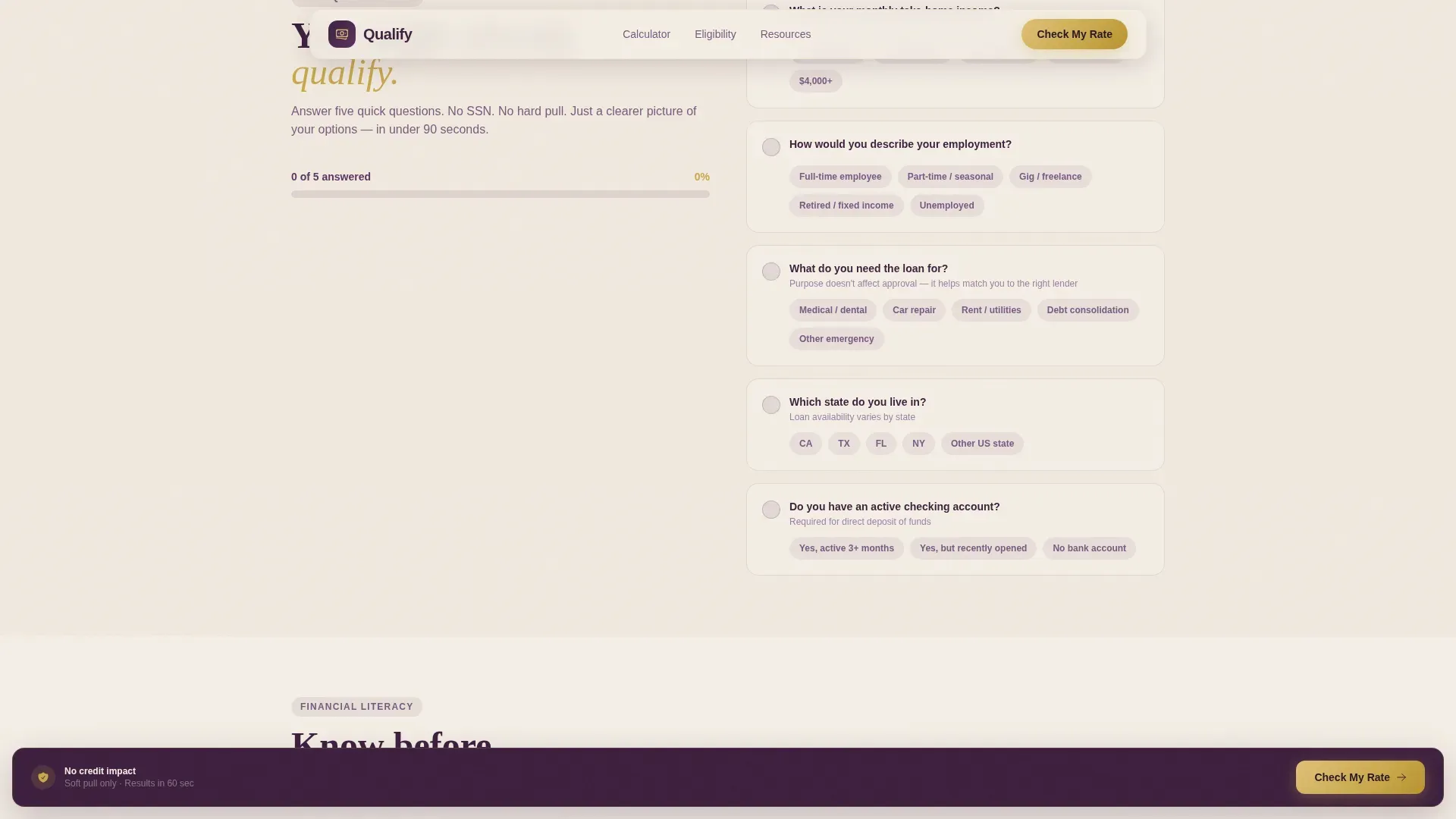
Soft-Qualification Eligibility Checklist
A toggle-style checklist asks low-friction questions about income range, employment type, and state. Each completed answer turns green using GSAP ScrollTrigger transitions. Users realize they are already partway through qualification before they have committed to anything, a best practice in reducing form abandonment.
Progressive Multi-Step Disclosure Form
The primary call-to-action opens a three-step form: name and email first, income range and loan purpose second, and a soft-pull authorization on step three. Multi-step forms break the application into manageable parts, ease users into the process, and help your team capture only sales-ready, qualified leads.
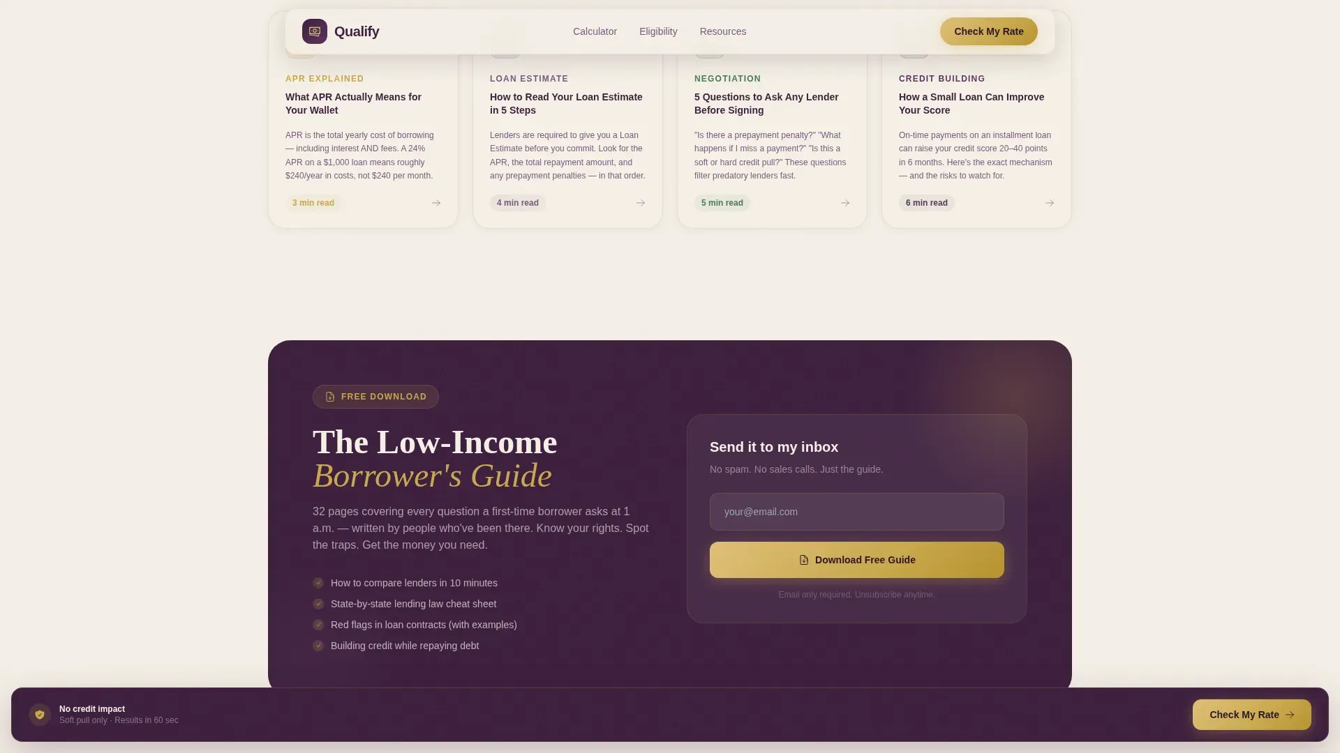
Financial Literacy Resource Cards
Side panel cards share contextual finance education: what Annual Percentage Rate (APR) actually means, how to read a loan estimate, and five questions to ask any lender. These resource cards build trust, add content depth to the page, and give users something valuable in exchange for their attention.
Page sections overview
| Section | Purpose |
|---|---|
| Hero Badge Row | Display trust signals and loan calculator immediately |
| Live Calculator Panel | Show real monthly payments before user interaction |
| Rate Comparison Grid | Compare borrower estimates to national loan averages |
| Eligibility Checklist | Guide soft qualification with low-friction toggle questions |
| Resource Card Panel | Share financial literacy content and loan education |
| Progressive call to action Form | Capture leads through a staged, three-step disclosure form |
| PDF Guide Gate | Offer downloadable guide to capture email-only leads |
| Sticky Footer Bar | Keep the primary call to action visible at all scroll durations |
Design & branding system
The visual identity follows a Dashboard Pro theme with the Plum Executive color system. The palette feels like a velvet-lined bank office, dignified without being cold. Every color choice serves a function: panels signal authority, backgrounds breathe, and gold exclusively signals action.
- Deep plum (#3D1F3E) for data panels, muted mauve (#7A5980) for secondary containers, and warm parchment (#F5EFE6) for the page background
- Gold (#C9A84C) used exclusively for calls to action, active checklist toggles, and the payment display, never decorative
- Plus Jakarta Sans for data and user interface elements; Fraunces serif for editorial headlines
Mobile & speed optimization
Most low-income borrowers search for personal loan options on a smartphone late at night. This landing page is built mobile-first, with large touch-friendly buttons, a responsive layout that automatically adjusts across every screen size, and client-side components that keep the calculator interactive on any device.
- Fully responsive layout that scales cleanly from a phone to a tablet or laptop without layout errors
- Large tap targets and readable typography reduce friction for users on small screens
- Client Components handle all interactive elements; the server shell keeps initial load fast on any device
How this template helps you convert
A well-designed loan landing page is crucial for increasing lead generation and conversions in finance services. This template follows proven practices: show the math first, ask for commitment second, and remove every unnecessary distraction in between.
- The calculator result panel places the primary "Check My Rate, No Impact to Credit" call to action directly beside the monthly payment, so users sign up when confidence is highest.
- The PDF guide gate captures a secondary segment of visitors who are not ready to apply but are ready to learn, protecting your lead funnel from drop-off and improving overall conversion rates.
- The eligibility checklist creates a sense of forward progress, so users who reach the form feel they have already invested in the process, a key driver of qualified leads and lower abandonment.
Other information about this template
This template is ready to use as-is and easy to customize for your brand, your loan products, and your audience. Teams can quickly edit colors, swap icons, update loan duration ranges, adjust payment details, and change checklist questions without coding knowledge. The page is structured so that even small changes produce meaningful results in lead generation metrics.
- Unicorn Platform's drag and drop builder lets you easily customize this loan landing page to match your brand and services without writing a single line of code
- Developers can access the component structure to make deeper changes; non-technical users can edit the default content directly in the visual editor to save time
- The template includes space for compliance details: APR disclosures, fee schedules, repayment terms, and security badge areas for SSL certificates or Equal Housing Lender logos, in line with Truth in Lending Act (TILA) guidelines
- Finance agencies and marketing teams can use the template to run ads, share landing page links across channels, and A/B test page elements to improve conversion rates over time
- Videos, testimonials, and reviews can be added to the resource card section to add social proof as your business grows
- Using pre-built templates like this is the fastest way to launch a high converting loan landing page and start generating qualified leads for your lending services
- The qualify trusted low income personal loan landing page template is built to balance marketing effectiveness with transparency, security, and responsible lending practices
Theme
Dashboard Pro
Creative direction
Calculator/Tool First
Color system
Plum Executive
Style
Dashboard/Data Grid
Direction
Content/Resource
Page Sections
Live Loan Calculator with Payment Display
Award Badge Trust Shield Row
Rate Comparison Data Grid
Soft-qualification Eligibility Checklist
Progressive Multi-step Disclosure Form
Financial Literacy Resource Cards
Related questions
Does this template require coding knowledge to set up?
Can I customize the loan calculator values and duration settings?
How does the multi-step form help capture leads without overwhelming users?
Is this landing page template designed for mobile users?
Can this page include compliance disclosures for finance lending services?


