Underwriting Automation Solution Landing Page Template
Underwrite is a single-column landing page template built for insurtech platforms that deliver binding-ready quotes through automated underwriting. Designed for managing general agents, program administrators, and fintech embedded insurance teams, the template uses a dark Data Command aesthetic, frequently asked question-driven scroll rhythm, and a click-through conversion model that routes prospects to an integration map demo with zero form friction.
by Rocket studio
Quick summary
This is the Underwrite binding ready automated underwriting platform landing page template. It presents a high-conviction, objection-first pitch for insurtech platforms that ingest messy risk data and return binding-ready quotes in seconds. The single-column flow pairs a typographic hero with a structured frequently asked question rhythm, proof interrupts, and a low-commitment click-through call to action.
Who this template is for
This template is built for B2B insurtech startups and risk pricing platforms that serve technical and operational buyers. It assumes your prospect already understands the insurance industry and is evaluating whether your underwriting platform fits their stack.
- Managing general agents (MGAs) tired of spreadsheet-based manual processes and slow turnaround times
- Program administrators managing multiple carrier appetites across commercial insurance lines
- Fintech embedded insurance teams that need API-first underwriting tools without hiring actuaries
What problem this template solves
Manual underwriting processes break down at scale. Underwriters spend hours on repetitive work, chasing data across disconnected systems, and still produce quotes too slowly to meet customer expectations. This template is designed to answer those frustrations before a prospect even scrolls to a call to action.
- Slow, multi-week underwriting workflows that lose deals to faster competitors
- Missing data and poor data quality that stall risk assessment and inflate operational costs
- Prospect skepticism about whether automated underwriting can handle their specific risk classes, carrier connections, and existing systems
What you get with this template
You get a complete, launch-ready single-column landing page structured to move technical buyers from skepticism to curiosity. Every section is designed to support data driven decision making at the prospect level.
- A five-line Stacked Type Tower hero with animated teal monospace stats threading between the letterforms
- A vertically stacked frequently asked question block sequence with proof interrupt cards breaking the rhythm every third question
- A persistent mobile call to action bar and a repeat primary call to action after every fifth frequently asked question block
Feature list
This template ships with a focused set of purpose-built components. Each one reflects the conversion logic of a technical, skepticism-first buyer in the insurtech market.
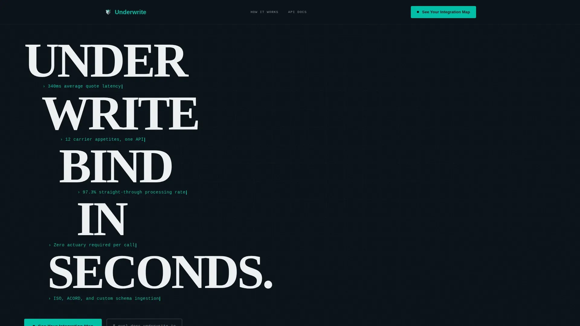
Stacked Type Tower Hero
The hero fills the viewport with the product name broken across five staggered lines in a massive compressed sans-serif. Between each line, animated teal monospace stats display real data points such as quote latency and straight-through processing rate. No illustration is needed. The typography and data carry the proof.
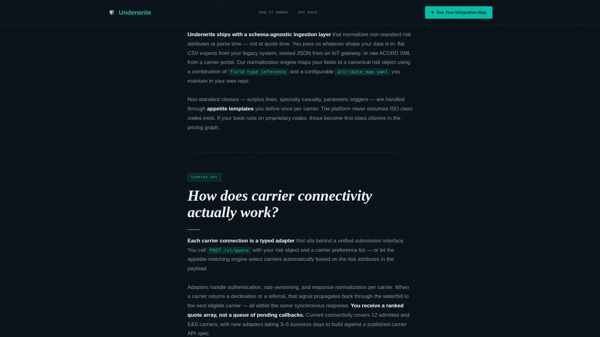
frequently asked question-Driven Objection Sequence
The scroll becomes a vertical stack of real buyer objections in oversized white type. Each question is followed by a jargon-fluent answer that opens with a concrete technical detail. The rhythm alternates confrontation and reassurance, steadily lowering resistance through direct engagement with underwriting workflows and risk analysis concerns.
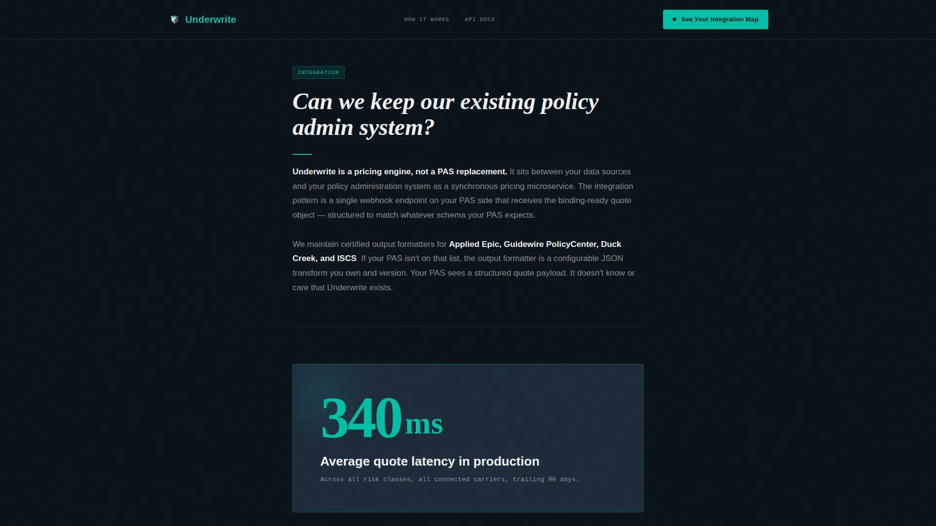
Proof Interrupt Cards
Between every third frequently asked question block, a single teal-highlighted metric card breaks the scroll pattern. These cards surface inline analytics and results such as straight-through processing rates and carrier connectivity figures. They punctuate the persuasion sequence with evidence rather than claims.
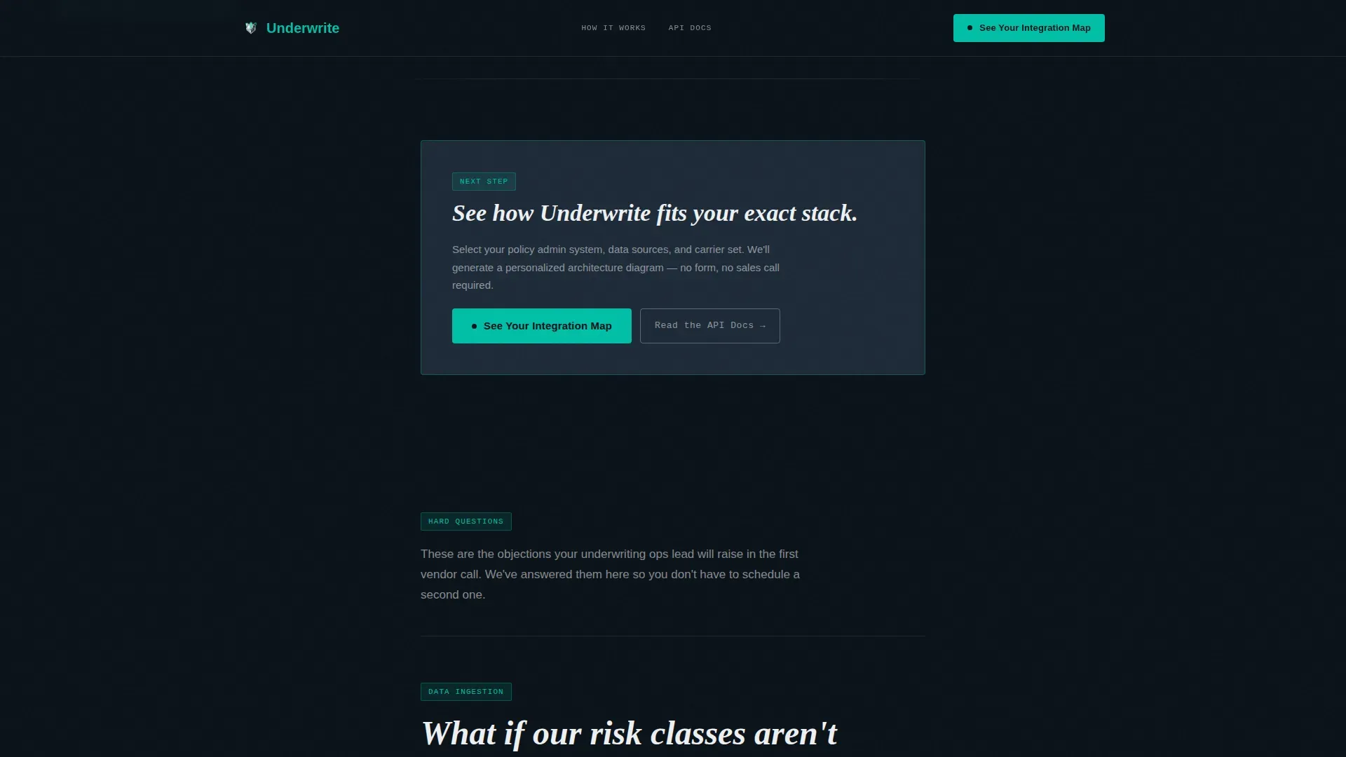
Click-Through Conversion Model
There is no form on the landing page. The primary call to action, "See Your Integration Map," routes prospects to a demo environment where they select their tech stack and receive a personalized architecture diagram. This low-commitment click is designed to convert curiosity into qualified engagement.
Persistent Mobile Call to Action Bar
On mobile, a fixed bottom bar carries the primary call to action alongside a secondary text link for technical buyers who prefer to convert through documentation. The bar ensures the conversion path stays visible throughout the entire scroll without interrupting the content rhythm.
Data Command Visual System
The full Teal Catalyst color system is implemented across every section. Deep operations black forms the base, primary teal signals active states and key data, cool slate surfaces card components, and sharp white delivers body text that reads cleanly on dark panels. Accent coral appears only on error states and risk flags, giving it earned narrative meaning.
Page sections overview
| Section | Purpose |
|---|---|
| Stacked Type Tower | Prove product speed and scale before first paragraph |
| frequently asked question Block One | Address risk class flexibility, carrier connectivity, system compatibility |
| Proof Interrupt Card | Break frequently asked question rhythm with a teal metric highlight |
| frequently asked question Block Two | Address straight-through processing, data ingestion, compliance |
| Final Call to Action | Repeat primary call to action and surface API docs secondary link |
| Minimal Developer Footer | Provide privacy, terms, and contact links in a single row |
Design & branding system
The visual identity follows a Data Command theme built for technical buyers who spend their days in terminals and dashboards. Every color decision carries functional meaning, and the layout feels like a live system status display rather than a marketing page.
- Color palette: deep operations black (#0B1219) for backgrounds, primary teal (#00BFA6) for active states and stats, cool slate (#1E2A38) for card surfaces, sharp white (#EDF0F2) for body text, and accent coral (#FF6B6B) reserved for error states and risk flags
- Typography: compressed sans-serif for the hero tower, JetBrains Mono for animated stats and code-style data, Plus Jakarta Sans for body copy throughout the frequently asked question and proof sections
Mobile & speed optimization
This template is desktop-first, designed for technical buyers evaluating at a workstation. Mobile is addressed through a purpose-built persistent bar rather than a full responsive redesign of complex animations.
- A fixed bottom bar on mobile carries the primary call to action and a secondary API docs text link, keeping the conversion path accessible without restructuring the scroll layout
- Static server components handle the frequently asked question content for fast initial load, while client-side animation handles GSAP entrance sequences, intersection-observer frequently asked question reveals, and monospace stat cycling
How this template helps you convert
The conversion architecture is built on reducing friction at every stage. Prospects arrive skeptical and leave with enough answered questions that only the demo can satisfy what remains.
- The Stacked Type Tower proves product capability through live data points before a single paragraph loads, meeting technical buyers where they focus first: on numbers, not narrative.
- The frequently asked question objection sequence answers the hardest underwriting questions in order, building trust through specificity and lowering the perceived risk of clicking through to the demo environment.
Other information about this template
This template is purpose-built for the insurtech segment but its structural logic applies broadly to any B2B platform selling into process-heavy industries. Several additional details are worth noting for teams evaluating it.
- The underwriting workbench concept underpins the frequently asked question layout. Each question-answer pair functions like a workbench tool, giving business users and underwriting teams a clear, user friendly interface for understanding platform capabilities before a sales conversation begins.
- The template supports predictive analytics messaging. Sections can frame how the platform combines historical risk data with new data to generate reliable risk scores, supporting data extraction and structured data positioning.
- Proof interrupt cards can surface claims processing metrics, global property exposure figures, or straight-through processing rates. These data points directly support risk management and risk selection messaging.
- The call to action model reduces compliance risks associated with aggressive lead capture. No form means no data quality issues at the point of collection and fewer delays in the prospect's decision making process.
- The footer follows a GitHub Developer Minimal pattern, a single row with links to privacy policy, terms of service, and contact information, keeping the page clean and the submission process for legal review straightforward.
- The template is well-suited for digital transformation messaging. It frames automation as the natural replacement for manual work and repetitive work, positioning the platform as the operational efficiency lever that insurers and brokers have been waiting for.
- Business users who need a comprehensive view of carrier appetite, audit trail requirements, and rules engines will find the frequently asked question sequence directly addresses those concerns, supporting better decision making before a demo is ever requested.
- Teams focused on new business growth and more deals will find the click-through model builds pipeline by qualifying prospects through curiosity rather than form submission pressure.
Theme
Data Command
Creative direction
FAQ-Driven
Color system
Teal Catalyst
Style
Single Column Flow
Direction
Click-Through
Page Sections
Stacked Type Tower Hero Section
Faq-driven Objection Scroll
Teal Proof Interrupt Cards
Zero-form Click-through Call to Action
Persistent Mobile Call to Action Bar
Data Command Color System
Related questions
What type of insurtech business is this template designed for?
Does this template include a lead capture form?
Can this template handle objection-heavy sales cycles common in automated underwriting?
How does the template support mobile users?
Is the visual style customizable beyond the default color system?


