Government Marketing Agency Landing Page Template
Clearance is a bento grid landing page built for government web design agencies. It combines a dark, command-center aesthetic with a creator spotlight layout to showcase team expertise, real project outcomes, and compliance credibility. The template drives lead generation through a compliance review form and a gated WCAG checklist download.
by Rocket studio
Quick summary
Clearance is a single-page bento grid template for agencies that build accessible, compliant government websites. The dark immersive design feels like a secure operations center. A collage header, team spotlight cells, and a dual-path lead capture form work together to build trust with state IT directors, federal program managers, and municipal clerks before a single call is booked.
Who this template is for
This template is built for digital agencies that specialize in government web design. It speaks directly to teams whose clients face compliance deadlines, legacy system debt, and citizen-facing usability failures.
- Agencies pitching state IT directors managing legacy content management system migrations
- Teams serving federal program managers ahead of Section 508 accessibility audits
- Studios working with municipal clerks whose sites still run on outdated platforms
What problem this template solves
Government web agencies struggle to communicate credibility quickly. Prospective clients are cautious, risk-averse, and need proof before they engage. A generic portfolio page does not answer the compliance, accessibility, or technical questions these buyers bring.
- No clear way to show real before-and-after results from past government projects
- Generic agency templates do not speak to Web Content Accessibility Guidelines (WCAG) compliance or Section 508 requirements
- Lead forms capture unqualified contacts instead of filtering for decision-makers with real project needs
What you get with this template
The template delivers a fully structured, single-page layout with every section pre-built for government agency positioning. You get a design-ready starting point that connects visual credibility with functional lead capture.
- A collage-style header with overlapping old and new government interface screenshots and handwritten annotation overlays
- A bento grid creator spotlight section featuring individual team member cards with project metrics and case study details
- A dual-path lead generation section with a compliance review form and a gated WCAG checklist download
Feature list
This template packs purpose-driven design features into every cell. Each one is pulled directly from the source brief and built to serve government agency buyers.
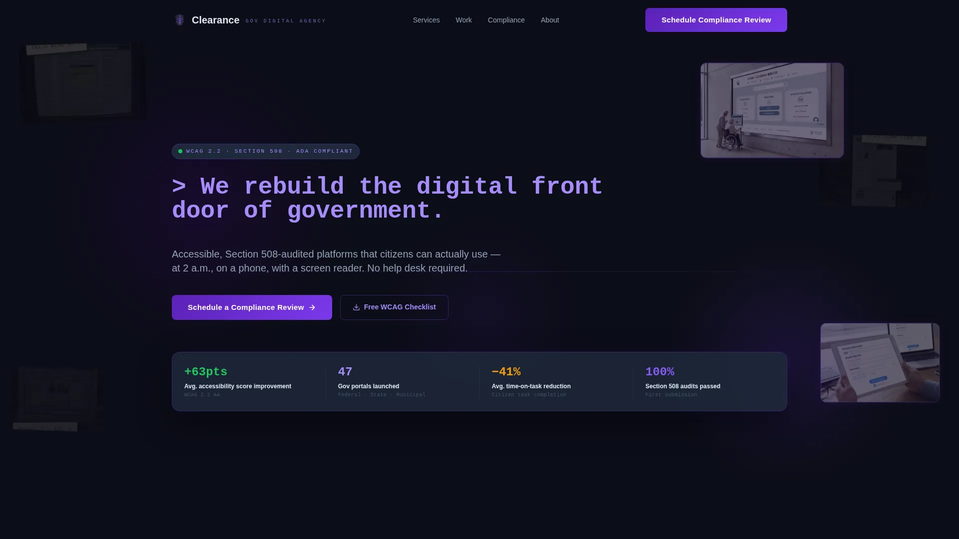
Terminal Typewriter Headline
The header headline types itself in like a terminal command, reading: > We rebuild the digital front door of government._ This animated treatment immediately signals technical precision and sets the tone for the entire page.
Collage Scrapbook Header
Overlapping screenshots layer broken, inaccessible government interfaces beneath crisp redesigns. Sticky note annotations like "fails WCAG AA" and "3.2s load time" are pinned across the old work. New designs pulse with subtle indigo borders, creating a visual before-and-after story without a single word of explanation.
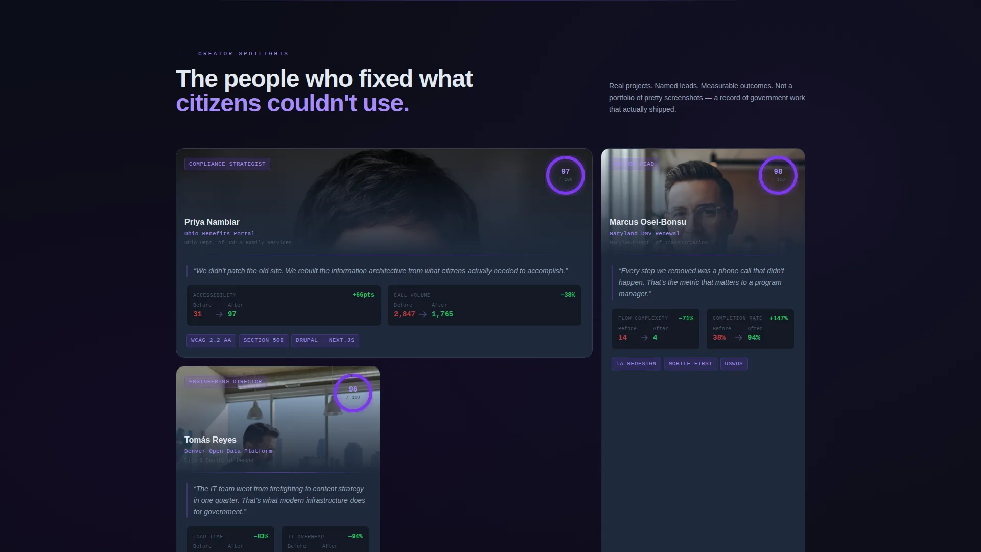
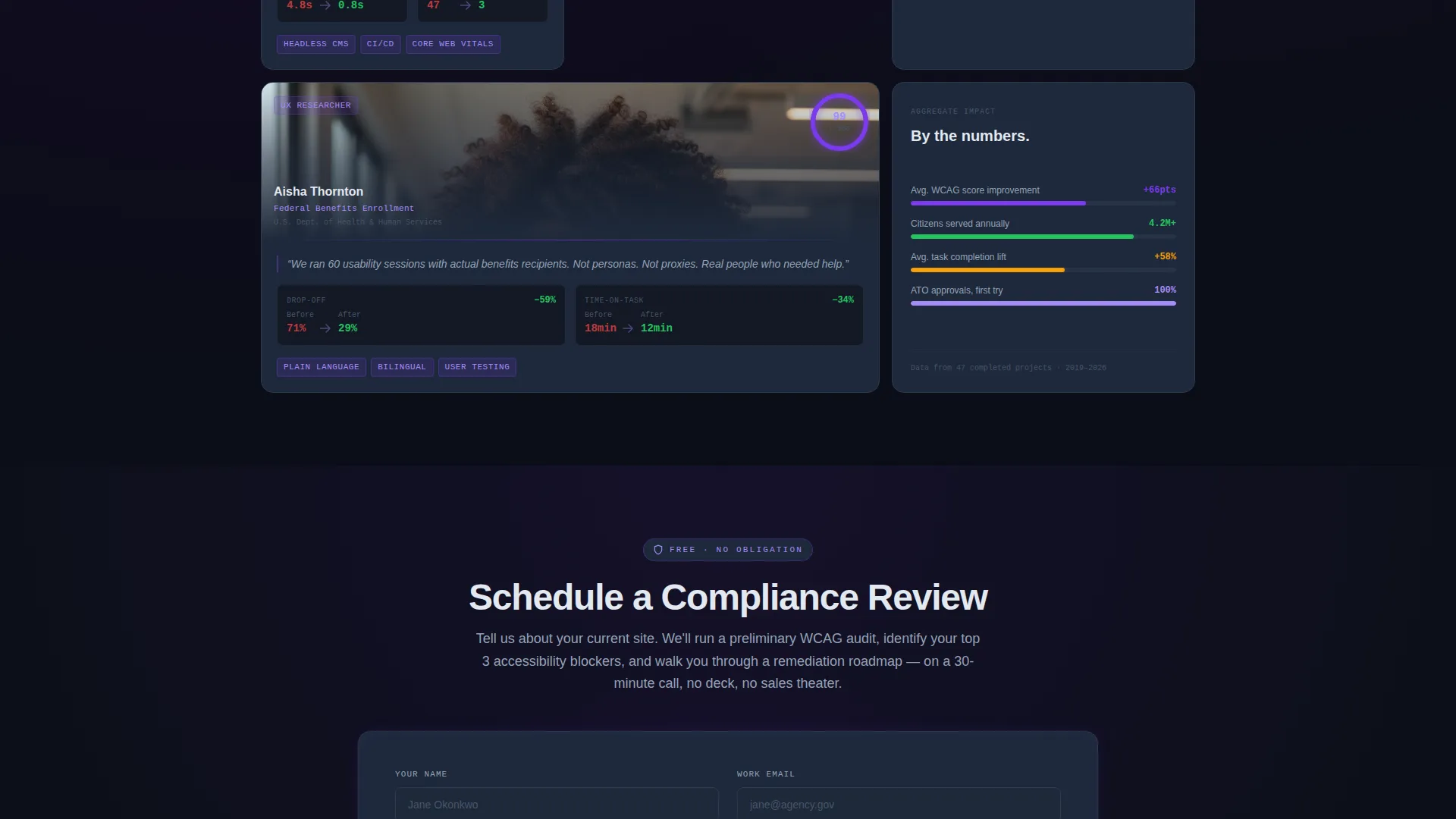
Bento Grid Creator Spotlights
Each bento cell features one team member and the specific government project they led. Cards pair a human portrait with real metrics: time-on-task reductions, accessibility scores before and after, and citizen satisfaction changes. The grid alternates between large cinematic cells and tight data clusters for a breathing, editorial rhythm.
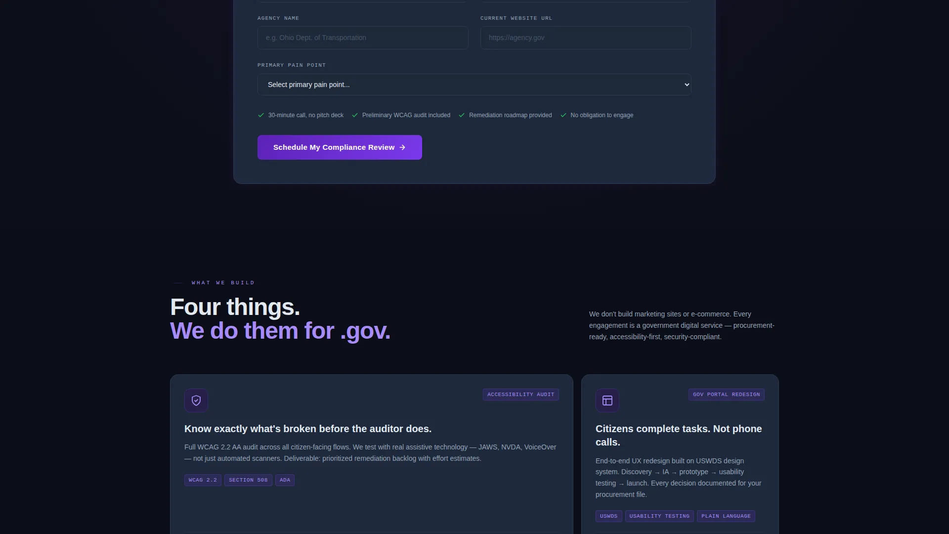
Dual-Path Lead Capture
The primary call to action reads "Schedule a Compliance Review" and appears after the third spotlight, when trust is highest. The form collects agency name, current website URL, and a primary pain point via dropdown. A secondary path offers a free downloadable WCAG checklist in exchange for a verified government or military email address.
Dark Immersive Color System
The palette uses deep command-center black, electric indigo, luminous violet on hover states, cool slate for card surfaces, and phosphor white for body text. Every color choice reinforces the feeling of classified software running on a dark terminal.
Sticky Note Annotation Overlays
Handwritten-style sticky note elements are positioned across outdated interface screenshots in the header. These annotations call out real failure points like inaccessible contrast ratios and slow load times. They make the agency's expertise visible at a glance without requiring the visitor to read a case study.
Page sections overview
| Section | Purpose |
|---|---|
| Collage Header | Establishes before-and-after contrast using overlapping government interface screenshots and sticky note annotations |
| Terminal Headline | Types out the agency's core positioning statement as a command-line prompt |
| Team Spotlight Grid | Features individual contributors with project details, real metrics, and portrait cards inside a bento layout |
| Compliance Review Form | Captures qualified leads after trust is established via agency name, URL, and pain point dropdown |
| WCAG Checklist Download | Qualifies inbound leads by requiring a verified government or military email address |
Design & branding system
The visual identity is built around an Electric Indigo color system applied to a Dark Immersive theme. Every design decision reinforces the feeling of purpose-built government software.
- Color palette: command-center black (#0B0D17), electric indigo (#4B0082), luminous violet (#7C3AED) on hover, cool slate (#1E293B) for cards, and phosphor white (#E2E8F0) for text
- Layout style: bento grid with alternating large cinematic cells and compact data cluster cells for editorial pacing
- Visual overlays: collage and scrapbook composition using faded legacy screenshots, glowing redesign previews, and handwritten sticky note annotations
Mobile & speed optimization
The bento grid layout is designed to translate cleanly across screen sizes. The dark theme and purposeful structure support fast rendering without unnecessary visual overhead.
- Grid cells reflow from multi-column bento arrangements to stacked single-column layouts on smaller screens
- Dark backgrounds and minimal decorative assets reduce rendering load and keep the page feeling fast
- Lead capture forms are kept short and focused, reducing friction for users on mobile government networks
How this template helps you convert
This template is engineered around a single goal: turning cautious government buyers into booked compliance conversations. Every structural decision supports that outcome.
- The collage header establishes instant credibility by showing real failure states alongside real redesigns, so skeptical buyers see proof before they read a word of copy.
- The creator spotlight grid builds trust person by person, using named contributors and specific project metrics instead of generic agency claims.
- The dual-path lead section captures both high-intent buyers ready to book a review and early-stage researchers who qualify themselves by providing a verified government email for the checklist download.
Other information about this template
This section covers additional context that helps buyers understand how to deploy and adapt the Clearance template effectively.
- The template is designed as a single-page bento grid landing page, not a multi-page website, keeping all content in one focused scroll
- The creator spotlight direction is well-suited for agencies with named specialists and documented project histories rather than anonymous portfolio work
- The WCAG checklist lead magnet is positioned as a secondary conversion path, making it useful even when visitors are not yet ready to book a call
- This template suits agencies that want to position around accessibility consulting, Section 508 compliance support, content management system migration, and Authorization to Operate (ATO) readiness services
Theme
Dark Immersive
Creative direction
Creator Spotlight
Color system
Electric Indigo
Style
Bento Grid
Direction
Lead Generation
Page Sections
Terminal Typewriter Headline
Collage Scrapbook Header
Bento Grid Creator Spotlights
Dual-path Lead Capture
Dark Immersive Color System
Sticky Note Annotation Overlays
Related questions
Can I customize the team member spotlight cards?
Is this template suitable for a solo consultant rather than a full agency?
Does the lead form support dropdown options beyond the four listed?
How does the collage header work without real client screenshots?
What if I do not have a downloadable checklist to offer on the secondary lead path?


