Education Department Booking Website Template
Accredit is a hub-and-spoke landing page template built for higher education quality assurance consultancies. It pairs an interactive institution map with an expandable phase timeline, anchor navigation, and contextual call-to-action buttons. The result is a desktop-first, click-through page designed to earn trust through radical process transparency before asking visitors to book a consultation.
by Rocket studio
Quick summary
Accredit is a single-page, anchor-nav landing page template for education quality assurance consultancies. It opens with an interactive map of accredited institutions, guides visitors through a transparent engagement timeline, and closes every spoke section with a contextual booking prompt. The design blends institutional authority with faculty-commons warmth to move provosts, program directors, and quality officers toward a readiness review call.
Who this template is for
This template is purpose-built for professional services firms operating in higher education quality assurance. If your consultancy guides institutions from self-study to final report, this page was designed with your client in mind.
- Provosts and Vice Presidents of Academic Affairs preparing for renewal cycles or site visits
- Program directors and newly appointed quality officers assembling evidence packages under tight deadlines
- Higher education consultancies that want to show process depth before asking for a commitment
What problem this template solves
Accreditation consultancies often lose prospective clients during a long, uncertain sales cycle. Provosts and quality officers need to trust a partner before they pick up the phone. A generic services page does not answer the real question: "Have you done this before, and can I see how?"
- Visitors leave without booking because the process feels opaque or the credentials feel unverifiable
- Decision-makers arrive already overwhelmed, and a vague pitch page adds to that pressure rather than relieving it
- Multiple accreditation bodies and standards create confusion about whether a consultancy truly covers the right scope
What you get with this template
You get a fully structured, desktop-first landing page that leads with evidence and ends with a booking call to action. Every section is built to reduce friction for an institutional buyer who is cautious by nature and pressed for time.
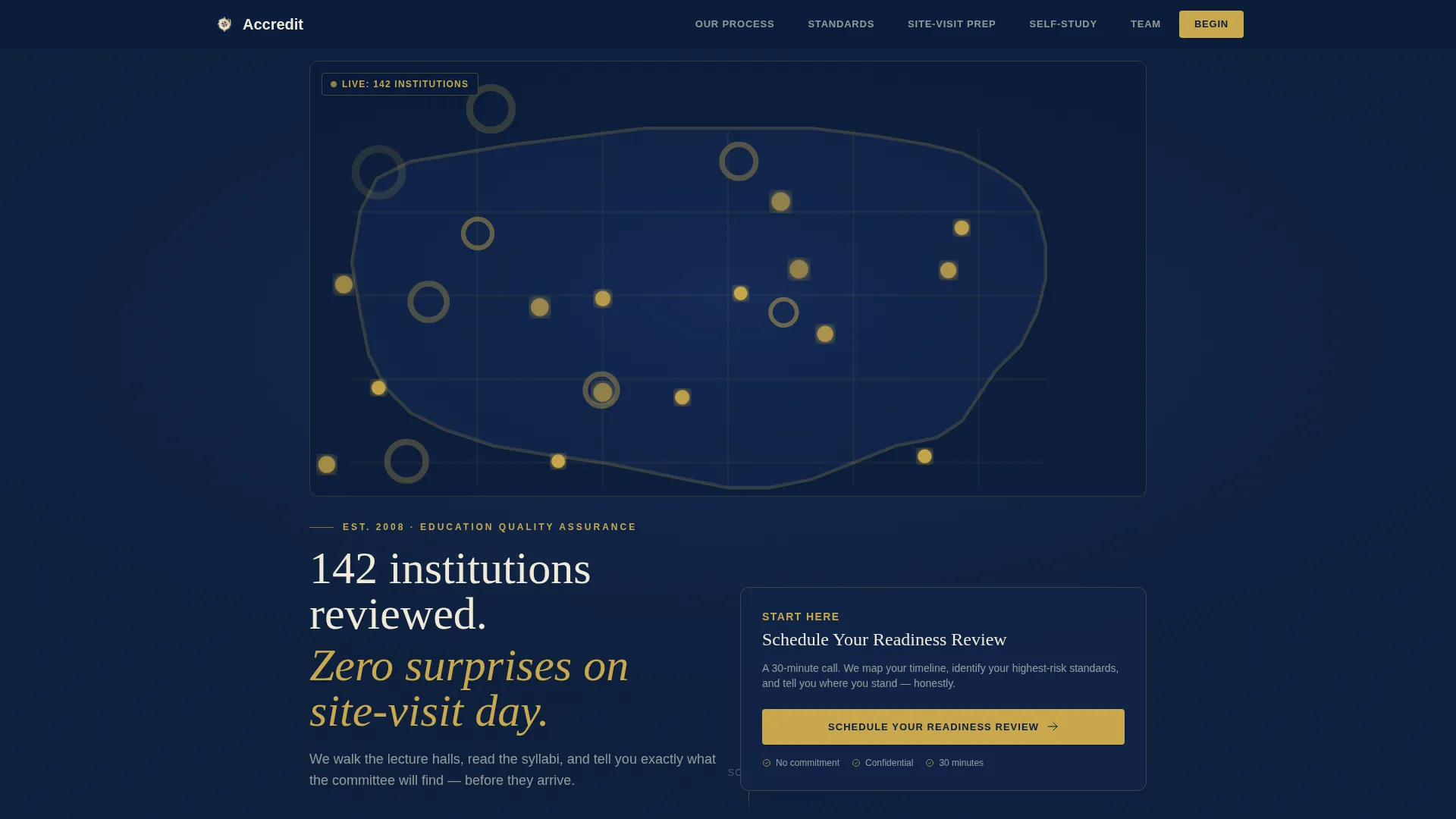
- An interactive SVG map header displaying 142 institution pins with hover-reveal details, paired with a six-tab anchor navigation bar
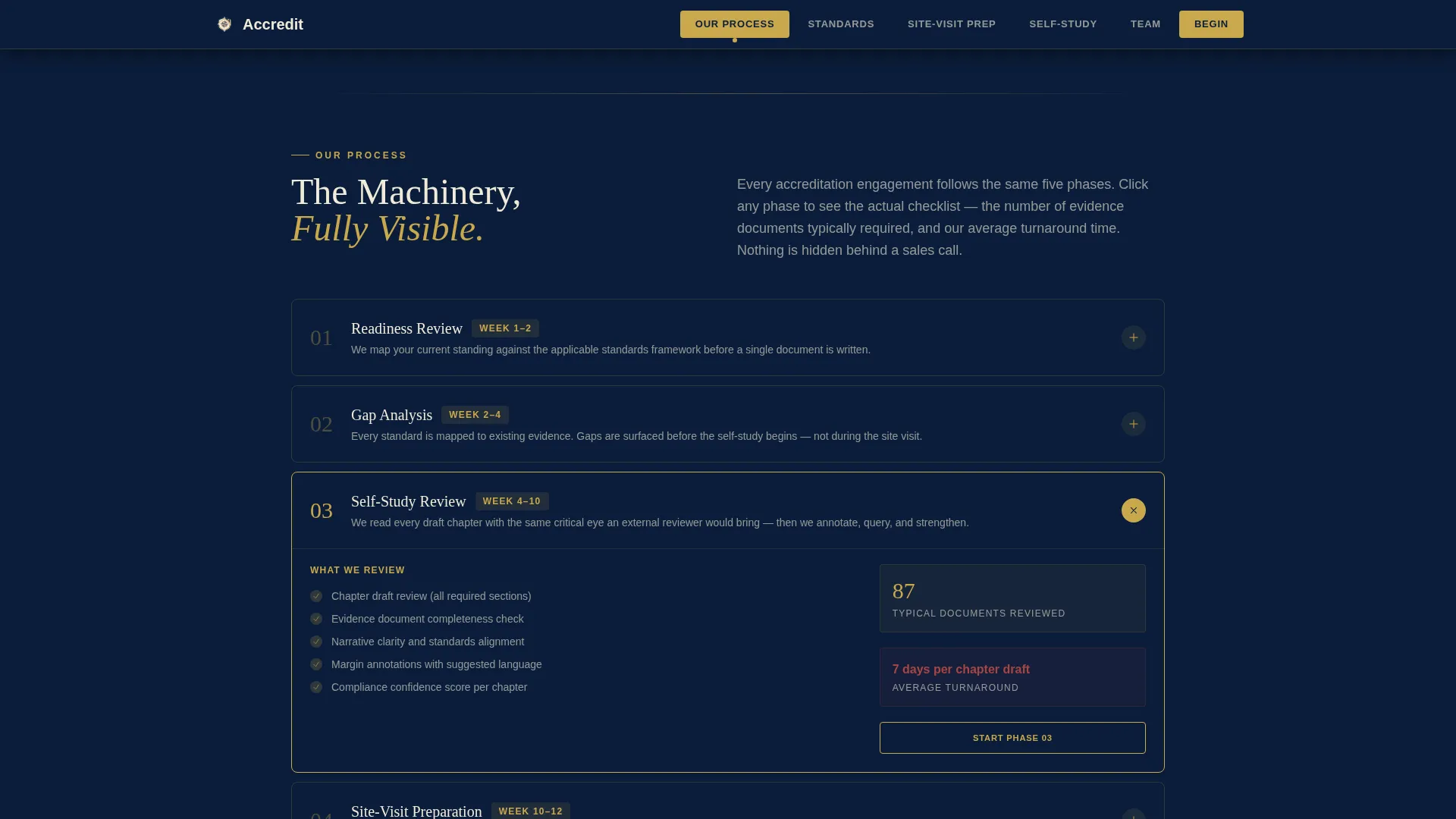
- An expandable phase timeline covering every stage from first call to final report, with checklist categories, document counts, and turnaround times
- Contextual call-to-action buttons at the close of each spoke section, each carrying UTM context about visitor engagement
Feature list
This template ships with six tightly scoped feature systems. Each one addresses a specific moment in the consultancy buyer journey.
Interactive Institution Map Header
A softly illustrated SVG map fills the hero area on a deep navy background. Gold pins mark every institution the consultancy has guided. Pins pulse on hover and reveal the institution name, accreditation body, and outcome year. Below the map, a single animated line reads: "142 institutions reviewed. Zero surprises on site-visit day."
Expandable Phase Timeline
The engagement timeline runs from first call to final report. Each phase renders as a clickable card. Opening a card reveals the real contents: checklist categories, typical document counts, and average turnaround time. This Transparent Process approach lets visitors see the full machinery before they commit.
Anchor Navigation with Active States
A six-tab navigation bar locks to the top of the page. Tabs are labeled "Our Process," "Standards We Cover," "Site-Visit Prep," "Self-Study Support," "Team," and "Begin." Each tab is styled as a warm parchment panel that lights gold when active, keeping visitors oriented across a long scroll.
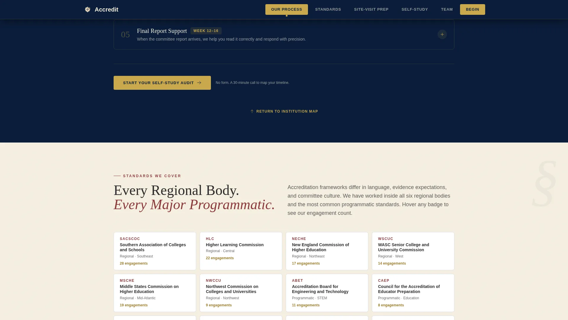
Standards Coverage Grid
A dedicated spoke section displays the accreditation bodies the consultancy covers. Bodies are presented in a visual grid format, giving program directors and quality officers a fast confirmation that their specific standards are in scope.
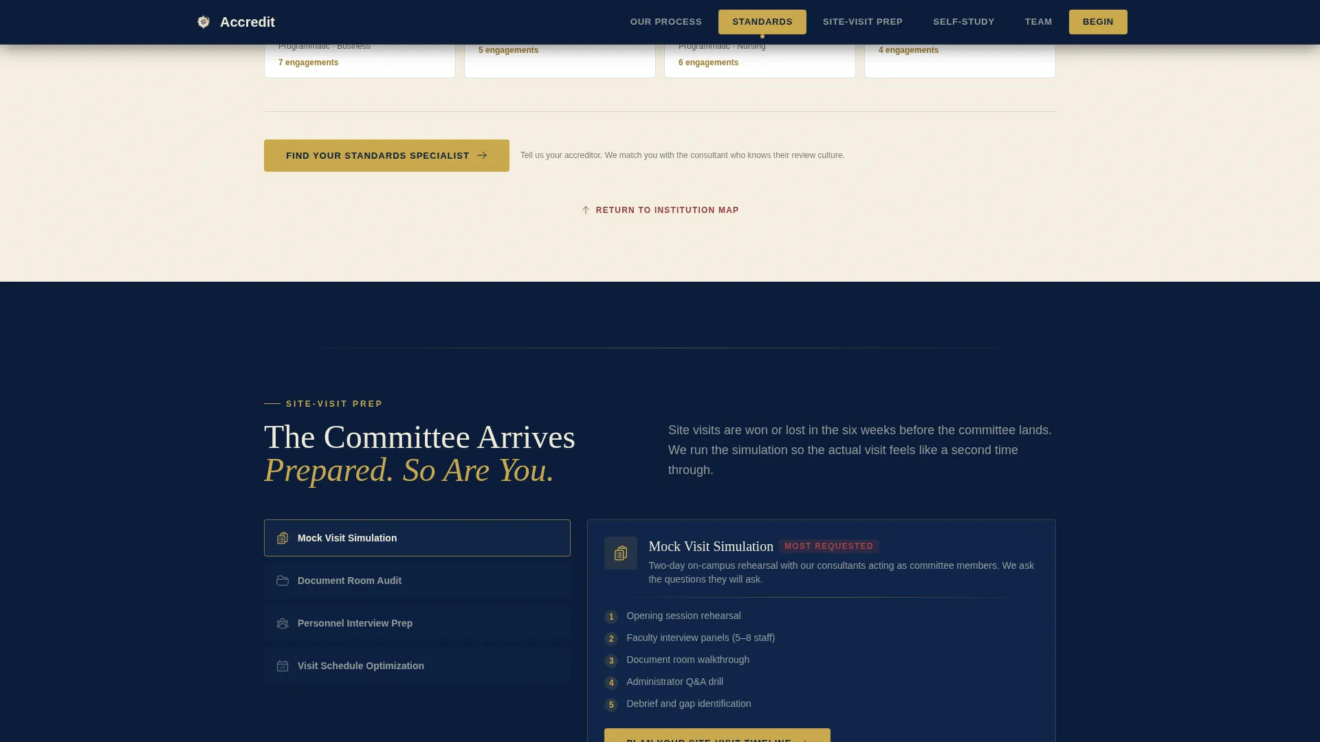
Site-Visit Prep and Self-Study Support Spokes
Two focused spoke sections go beyond a service list. Site-Visit Prep includes a tactical toolkit preview with a mock visit schedule. Self-Study Support displays evidence checklist categories, document counts, and turnaround times so visitors understand the real scope of support before any conversation begins.
Contextual Click-Through calls to action
No form lives on this page. Every call-to-action button links to a separate consultation booking page. Button copy shifts by section: "Schedule Your Readiness Review" beneath the map, "Start Your Self-Study Audit" in the Self-Study spoke, and "Plan Your Site-Visit Timeline" in the Site-Visit section. Each click carries UTM context about which spoke the visitor engaged most.
Page sections overview
| Section | Purpose |
|---|---|
| Hero Map | Establish credibility with interactive institution pins and the "142 institutions" proof stat |
| Anchor Navigation Bar | Lock six spoke labels to the top and highlight active section in gold |
| Our Process | Walk visitors through the full engagement timeline via expandable phase cards |
| Standards We Cover | Confirm scope with an accreditation body grid covering major regional and programmatic bodies |
| Site-Visit Prep | Preview the tactical prep toolkit and mock visit schedule |
| Self-Study Support | Show evidence checklist categories, document counts, and turnaround times |
| Team Section | Introduce partners with credentials in a warm, faculty-commons visual tone |
| Footer | Single-row linear footer with contact and navigation links |
Design & branding system
The visual identity follows a Community Hearth theme interpreted through a Navy Authority color system. Every color carries deliberate meaning: the navy grounds the page in institutional permanence, parchment gives content panels room to breathe, and gold rewards attention at key trust moments.
- Color palette: deep navy (#0B1D3A) for backgrounds and nav, warm parchment (#F5EFE0) for content panels, muted brick red (#8B3A3A) for active states and critical callouts, soft gold (#C9A84C) for progress indicators and trust badges
- Typography: DM Serif Display for headings to carry gravitas, Manrope for body copy to maintain clarity; text appears in warm white on navy and deep charcoal (#2C2C2C) on parchment
- Animation and interactivity: medium-weight cinematic entrance animations, pulse animations on map pins, scroll-reveal transitions, and accordion interactions on phase cards
Mobile & speed optimization
The template is designed desktop-first, reflecting the real usage pattern of provosts and program directors working late on laptops. The architecture separates static and interactive sections to keep the page responsive under load.
- Server Components handle static sections such as standards grids, team bios, and footer for lighter initial rendering
- Client Components power the interactive SVG map, accordion phase cards, and anchor navigation active states
- Desktop-first layout prioritizes the wide-viewport experience where the institution map and side-by-side phase cards have full visual impact
How this template helps you convert
The Transparent Process creative direction turns every scroll into a trust-building moment. Visitors are not being sold to; they are being shown the work. By the time they reach the final spoke, they have already seen enough to feel they are choosing a partner, not responding to a pitch.
- The interactive map and "142 institutions" stat establish proof before a single word of services copy appears, lowering buyer skepticism at the first impression
- Expandable phase cards and redacted sample materials (gap analysis excerpts, feedback annotation screenshots) show the actual process, so visitors arrive at the booking page already informed and pre-qualified
- Contextual UTM-tagged call-to-action buttons at the close of each spoke capture intent signals tied to a specific service area, helping the consultancy team personalize the follow-up conversation
Other information about this template
This template is categorized under Government and Public, Education Department, within the Education Quality Assurance niche. It is built as a hub-and-spoke single-page layout with anchor navigation, a Map-Based header concept, and a Click-Through landing page direction. The page is localized for English-speaking audiences in a United States context, with pricing and institutional references suited to the domestic higher education market.
- Template style: Hub and Spoke with anchor navigation, six spoke sections returning visitors to the hub map via subtle upward scroll prompts
- Niche fit: directly serves B2B professional services for higher education quality assurance, including regional and programmatic accreditation consulting
- Intersection alignment: the template sits at the cross-point of Government and Public sector content, Education Department context, and Education Quality Assurance service delivery
- Broader use: while the brief focuses on accreditation consulting, the template structure can support any institutional professional services firm that needs to demonstrate process depth before a discovery call
Theme
Community Hearth
Creative direction
Transparent Process
Color system
Navy Authority
Style
Hub & Spoke (Anchor Nav)
Direction
Click-Through
Page Sections
Interactive Institution Map with Hover Pins
Expandable Engagement Phase Timeline
Six-tab Anchor Navigation Bar
Accreditation Standards Coverage Grid
Contextual Utm-tagged Call to Action Buttons
Redacted Sample Materials and Social Proof Elements
Related questions
Who is the primary audience for this landing page template?
Does this template include a contact form or booking form?
What accreditation bodies does the Standards section cover?
Can the interactive map and phase timeline be customized?
Is this template suited for mobile visitors?


