Padel Tennis Booking Website Template
Smash is a modular card-grid landing page built for padel tennis communities. It combines a stats-first visual approach with a bold Ruby and Chrome color system to help players track match data, find hitting partners, and book courts. The sticky booking bar, real-time scarcity cues, and escalating card rows guide every visitor from casual curiosity to confirmed court reservation.
by Rocket studio
Quick summary
Smash is a single-page padel community landing page with a modular card grid layout. It leads with live stat counters, surfaces court availability in real time, and walks visitors through a three-step booking flow. The design blends deep ruby red, chrome silver, and asphalt black into a kinetic, sports-grade visual identity built for players who take their game seriously.
Who this template is for
This template is built for padel clubs, court operators, and community organizers who need one place to bring players together and fill courts. It speaks directly to the culture of the game, not just the logistics.
- Padel club owners and court booking operators who want to reduce empty slots
- Community managers running local padel leagues, weekly ladders, or social doubles groups
- Entrepreneurs launching a padel hub for a city or region
What problem this template solves
Most sports booking pages treat the player like a transaction. They bury availability behind forms and offer no reason to commit right now. Smash fixes that by leading with data, scarcity, and community identity before asking for a single click.
- Court slots disappear fast, especially after work, and visitors need a reason to book immediately
- New players converted from tennis need social proof and a low-friction entry point before committing to their first session
- Community stats and leaderboards are scattered across apps instead of living on one engaging page
What you get with this template
You get a fully structured, single-page landing page with a modular card grid that escalates commitment as the visitor scrolls. Every section is designed to serve a specific role in the booking journey.
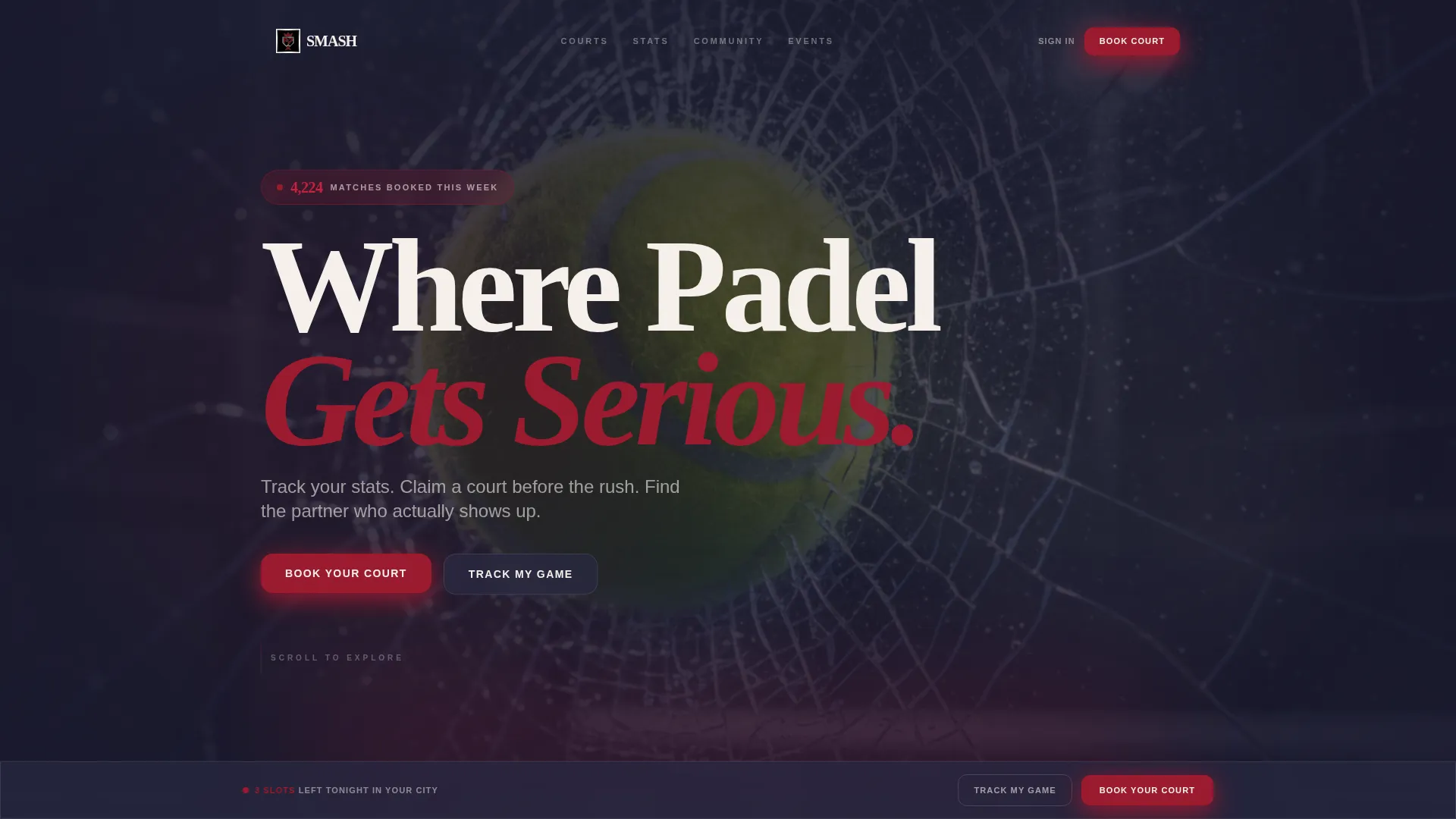
- A macro close-up hero header with a live stat counter animating over the image
- A sticky bottom booking bar with a three-step court reservation flow
- A secondary conversion path for stat-curious visitors who prefer to create a free profile first
Feature list
This template includes a focused set of built-in components drawn directly from the creative brief. Each one serves the core goal of turning page visitors into booked players.
Live Stat Counter Hero
The header opens with an extreme close-up of a padel ball mid-compression against textured glass. A single animated stat counter overlays the image, ticking upward in real time before the tagline appears. The depth of field is intentionally shallow, dissolving the court behind into ruby and chrome bokeh streaks.
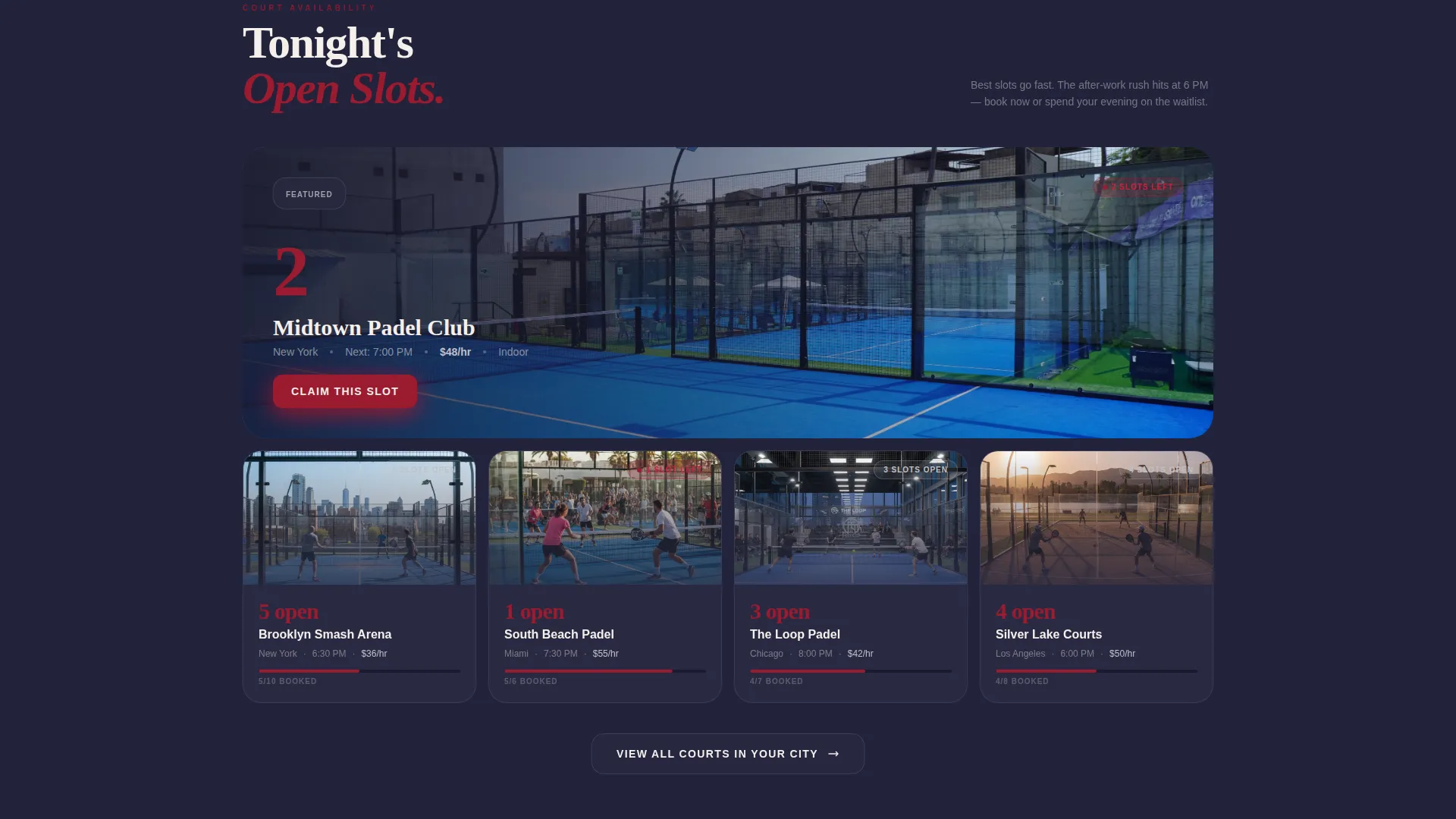
Stats-First Card Grid
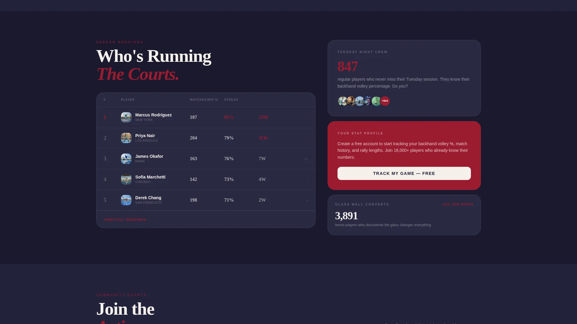
Every card in the modular grid opens with a bold number before revealing its content. Court availability cards show remaining slots in oversized ruby type. Community leaderboards surface win streaks and rally lengths. Player profiles lead with match counts rather than written bios.
Sticky Bottom Booking Bar
After the first scroll, a persistent booking bar anchors to the bottom of the screen. The primary call to action is "Book Your Court," always visible and always one tap away without interrupting the browsing experience.
Three-Step Court Booking Flow
Tapping the booking bar opens a focused three-step flow. The visitor picks a city, selects a date and time slot, then either invites a hitting partner by name or lets the system match one automatically.
Dual Conversion Paths
A secondary call to action, "Track My Game," gives stat-curious visitors a lower-commitment entry point. It captures an email address and playing frequency before gradually nudging the visitor toward their first court booking.
Escalating Scroll Rows
The card grid shifts in purpose as the visitor scrolls. The first row surfaces live data. The second row presents court booking options. The third row introduces community events and league sign-ups. Each row raises the level of commitment naturally.
Page sections overview
| Section | Purpose |
|---|---|
| Hero Header | Anchors attention with close-up imagery and a live match stat counter |
| Live Stats Cards | Shows real-time court availability and community activity numbers |
| Court Booking Cards | Displays open time slots with scarcity cues in ruby type |
| Community Leaderboards | Surfaces win streaks, rally lengths, and player rankings |
| Player Profile Cards | Leads with match counts to establish community credibility |
| Community Event Cards | Promotes leagues, social doubles nights, and group sessions |
| Sticky Booking Bar | Keeps the primary call to action visible throughout the scroll |
| Profile Sign-Up Path | Captures email and playing frequency via the secondary conversion flow |
Design & branding system
The visual identity follows an Adventure Terrain theme expressed through the Ruby and Chrome color system. Every color choice is intentional, referencing the physical materials and atmosphere of a padel court under floodlights.
- Deep ruby red (#9B1B30) for primary cards, stat highlights, and scarcity callouts; polished chrome silver (#C0C0C8) for borders and secondary surfaces
- Asphalt black (#1A1A2E) across the background grid to ground the layout in the dark-court atmosphere
- Hot spark white (#F5F0EB) for all typography and negative space, keeping readability sharp against the dark palette
Mobile & speed optimization
The modular card grid is built to work just as well on a phone screen as on a desktop monitor. Padel players book courts from their phones, often in the last hour before a session, so the layout prioritizes fast scanning and one-thumb interaction.
- The sticky booking bar remains accessible at all screen sizes without overlapping critical content
- Card grid columns reflow into a single column on smaller screens, keeping stat numbers and availability cues prominent
- The three-step booking flow is designed as a focused modal sequence, reducing the number of taps needed to confirm a slot
How this template helps you convert
The page is built around one measurable outcome: filling court slots. Every design and layout decision is in service of that goal.
- Real-time scarcity cues ("3 slots left tonight") create genuine urgency without manufactured pressure, prompting faster decisions from players who are already considering a booking.
- The escalating card grid moves visitors from passive stat browsing to active court selection naturally, so they arrive at the booking step already invested in the community.
- The dual conversion path means visitors who are not ready to book still enter the funnel by creating a free profile, giving the community a second opportunity to convert them later.
Other information about this template
Smash is category-matched to the padel tennis academy and training niche, making it a strong fit for operators who combine court hire with coaching programmes or structured training sessions. The Dynamic Motion theme and Stats-First creative direction are consistent with how competitive padel communities present themselves online.
- The template style is classified as Hero-Dominant with a 90/10 content ratio, meaning the visual hero section carries the primary persuasive weight
- The header concept is Stats and Metrics, aligning the first impression with the data-driven mindset of regular padel players
- The Community Gallery creative direction means the card grid can showcase real player activity, making the page feel alive rather than static

Theme
Dynamic Motion
Creative direction
Community Gallery
Color system
Ruby & Chrome
Style
Hero-Dominant (90/10)
Direction
Booking/Scheduling
Page Sections
Live Stat Counter Hero Header
Stats-first Modular Card Grid
Sticky Bottom Booking Bar
Three-step Court Booking Flow
Dual Conversion Path Design
Escalating Scroll Row Structure
Related questions
Can I customize the color system for my club's brand?
Does the three-step booking flow connect to a live scheduling system?
Is this template suitable for a newly launched padel club with no stats yet?
Can I use this template if my community does not operate its own courts?
How does the sticky booking bar behave on smaller screens?


