Street Team Campaign
Activate is a bold, single-page landing page template built for street team and experiential promo agencies. It leads with a living photo mosaic, walks visitors through three layered case study cards, and closes with a dual-path conversion form. The Tech Glass aesthetic, deep black, electric indigo, and frosted panels, makes every scroll feel like a live activation.
by Rocket studio
Quick summary
Activate is designed for agencies that deploy branded ambassadors at scale. The template combines a photo grid mosaic header, scroll-driven case study cards, and a sticky conversion bar into one sharp, single-page landing page. It targets brand managers, marketing directors, and event agencies who need to see proof before they brief.
Who this template is for
This template speaks directly to buyers who are already moving fast and need an agency partner that can match their pace. It is built for decision-makers who evaluate vendors on results, not promises.
- Brand managers at beverage companies preparing for festival season campaigns
- Marketing directors at sneaker and apparel labels who need trained field reps across multiple cities quickly
- Event agencies looking to subcontract street team and experiential staffing for client activations
What problem this template solves
Most promo agency pages lead with service lists and team headshots. That approach loses the buyer before they reach a single proof point. Activate flips the structure so the evidence appears first and the form appears only after trust is earned.
- Visitors see real activation metrics before they see a contact field
- The case study narrative format answers the brief, deployment, and proof questions buyers actually ask
- Two separate conversion paths capture both ready-to-brief clients and agencies still comparing options
What you get with this template
The template delivers a fully structured landing page with every section pre-built and visually composed. You are not assembling a page from scratch. You are stepping into a ready-made activation story.
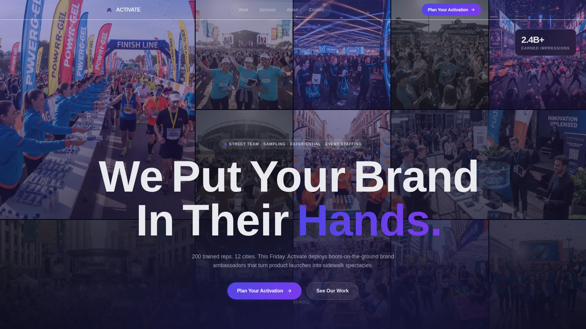
- A photo grid mosaic header with indigo overlay, animated tile color reveals, and a full-bleed headline
- Three layered case study cards with scroll-driven stacking and animated on-scroll metric counters
- A sticky frosted-glass conversion bar with a dual-path form capturing activation type, market count, and launch timeline
Feature list
This template is built around a specific sequence of persuasion. Each feature below reflects a deliberate design and layout decision made to move a B2B buyer from first impression to form submission.
Animated Photo Grid Mosaic Header
Dozens of real activation photos tile edge-to-edge in varying sizes. The images carry a slight desaturation with a unified indigo overlay. Every few seconds one tile flips to full color, pulling the viewer's eye across the grid like a living portfolio wall.
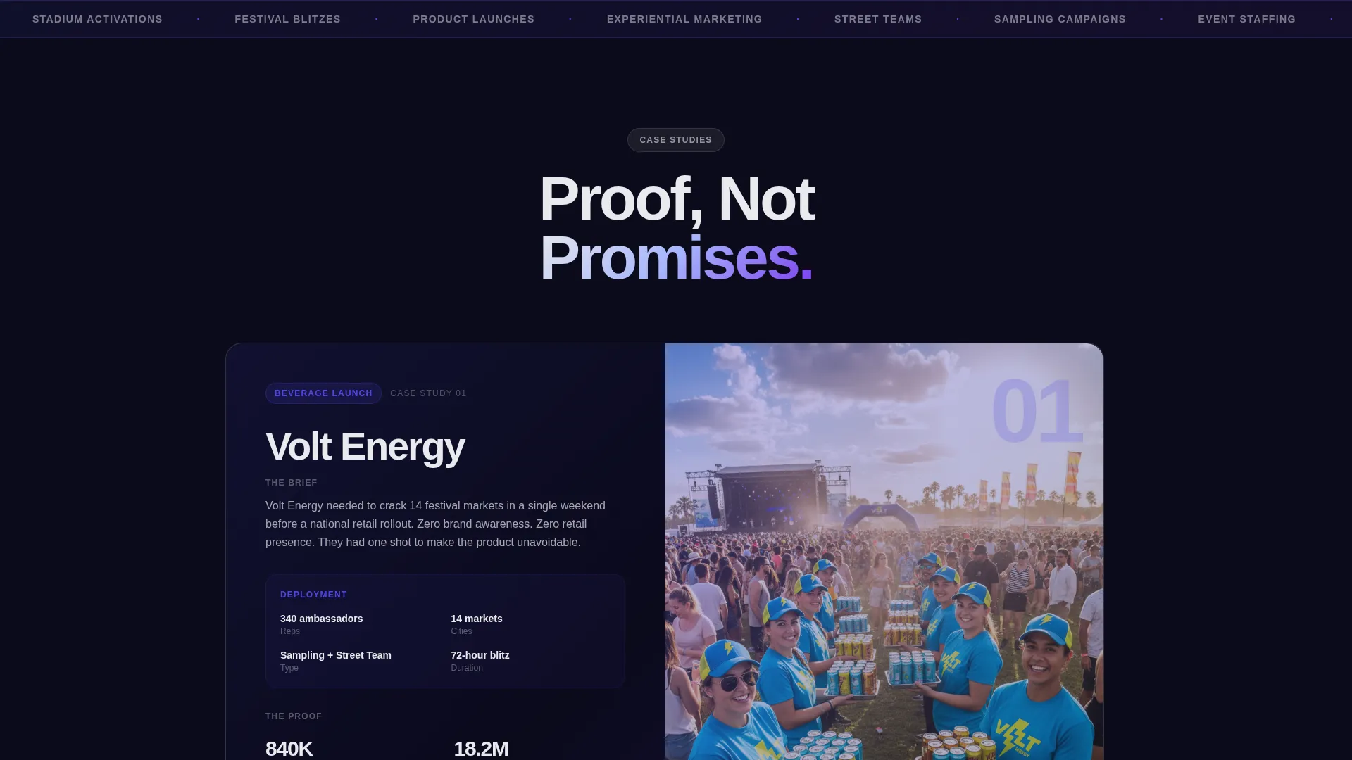
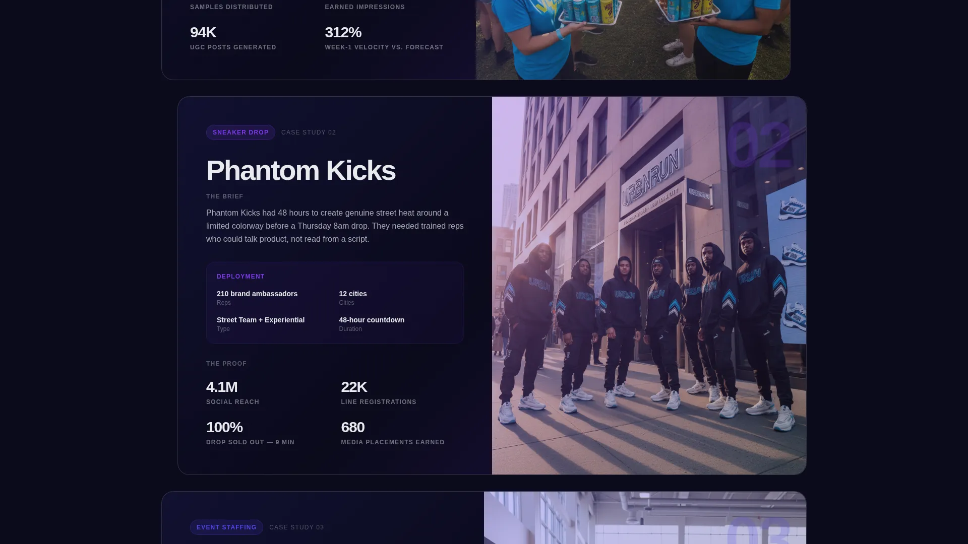
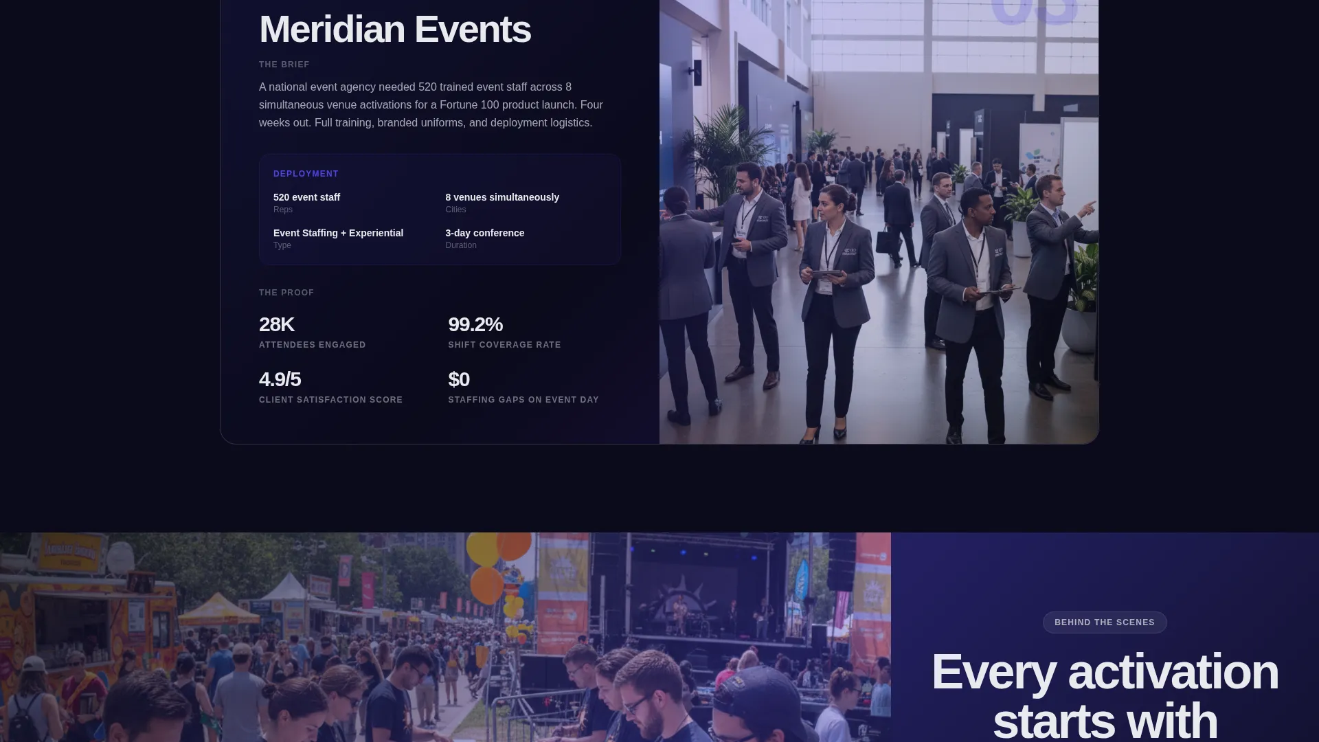
Scroll-Driven Case Study Cards
Three case study cards stack and overlap as the visitor scrolls, each sliding forward like a dossier being opened. Every card follows a consistent rhythm: the brief, the deployment details, and the proof metrics. This keeps the reader oriented and builds momentum toward the form.
On-Scroll Metric Counters
Key performance figures inside each case study animate as they enter the viewport. Counter ticks are styled in electric indigo, reinforcing the brand palette while drawing attention to the numbers that matter most to a prospective client.
Sticky Frosted-Glass Conversion Bar
A persistent call-to-action bar appears after the visitor passes the first case study. It stays anchored as they scroll, capturing the moment they are ready to act. The bar carries the primary "Plan Your Activation" prompt and does not interrupt the reading flow.
Dual-Path Lead Capture Form
The primary form collects company name, activation type, estimated market count, and launch timeline. A secondary path offers a capabilities deck download gated behind a business email field. This qualifies two distinct buyer stages without requiring separate pages.
Full-Bleed Behind-the-Scenes Photography Breaks
Between each case study card, a full-bleed photograph grounds the glass panel aesthetic in real fieldwork. These image breaks shift the visual rhythm, prevent scroll fatigue, and reinforce the agency's operational credibility.
Page sections overview
| Section | Purpose |
|---|---|
| Photo Grid Header | Opens the page with a living mosaic of activation photos and the primary headline |
| Case Study One | Shows the brief, deployment scope, and proof metrics for the first activation |
| Photography Break One | Grounds the tech aesthetic with a full-bleed behind-the-scenes field photo |
| Case Study Two | Presents the second activation narrative with animated counter metrics |
| Photography Break Two | Provides a visual pause and reinforces operational scale between cards |
| Case Study Three | Completes the three-card proof sequence before the conversion section |
| Sticky call to action Bar | Anchors the primary call-to-action after the first case study scroll point |
| Primary Contact Form | Captures company name, activation type, market count, and launch timeline |
| Capabilities Deck Gate | Secondary lead path collecting a business email for qualified download access |
Design & branding system
The visual identity is built on a Tech Glass theme using an Electric Indigo color system. The palette is designed to feel like a phone screen glowing inside a dark venue, sharp edges, translucent layers, and color that reads instantly at a distance.
- Core colors: deep digital black (#0B0B1A) for backgrounds, electric indigo (#4F46E5) for primary accents, frosted glass white (#E8EAED) for card surfaces, and neon violet (#7C3AED) for hover states and active elements
- Frosted glass panels overlap and stack with translucent blur effects, letting indigo gradients bleed through layers like light through acrylic
- Oversized knockout headline typography floats above the mosaic header, keeping the brand message immediately readable against the layered image grid
Mobile & speed optimization
The overlap and layered template style is designed with scroll behavior and stacking logic that works across screen sizes. The visual hierarchy holds at smaller viewports so the case study sequence reads clearly on a phone.
- Frosted glass panels and blur effects are applied in a way that preserves readability on mobile displays
- The sticky conversion bar remains accessible at the bottom of the screen as visitors scroll through the case study sequence
- Full-bleed photography breaks scale proportionally, maintaining visual impact without disrupting the page flow on smaller screens
How this template helps you convert
The page is structured as a deliberate persuasion sequence. Every layout decision is made to reduce friction between first impression and form submission.
- The animated photo mosaic and oversized headline establish agency credibility before any claims are made in text, pulling the visitor into the first case study naturally
- Three stacked case study cards answer the exact questions a brand manager or marketing director asks when evaluating a street team agency, so the form arrives only after the buyer has already seen the proof three times
- The dual-path form captures both immediate leads and comparison-stage prospects, ensuring no qualified visitor leaves the page empty-handed
Other information about this template
This template is part of the Overlap and Layered template style family, which is well suited for agencies that need to communicate scale, credibility, and operational depth on a single page. The case study narrative creative direction is a strong fit for experiential and field marketing agencies competing for B2B retainer or project contracts.
- The template is built for the street team and promo agency niche, sitting within the broader Events and Experiential Agency subcategory and Portfolio and Agency category
- The Electric Indigo color system and Tech Glass theme can be adapted to match a specific agency's existing brand colors by adjusting the palette variables
- The capabilities deck download path is a practical tool for agencies attending trade shows or pitching at events, where a qualified lead may not be ready to brief on the same day
Theme
Tech Glass
Creative direction
Case Study Narrative
Color system
Electric Indigo
Style
Overlap/Layered
Direction
Partnership/B2B
Page Sections
Animated Photo Grid Mosaic Header
Scroll-driven Case Study Cards
On-scroll Metric Counters
Sticky Frosted-glass Conversion Bar
Dual-path Lead Capture Form
Full-bleed Photography Breaks
Related questions
Who is this landing page template built for?
Can I update the case study content with my own activation data?
How does the dual-path form work?
Does the sticky conversion bar stay visible the whole time?
Can the color palette be customized to match my agency's brand?


