Subscription Box Services Pre-Launch & Coming Soon Website Template
Dread is a horror and dark fiction subscription box landing page built for midnight browsers and collectors who live for the macabre. The template blends a Neo-Retro Lavender Dream palette with flickering countdown timers, a UGC photo wall, flip-card item galleries, and a sold-out archive that proves scarcity is real. Every section nudges visitors toward one click: claiming the box before it disappears.
by Rocket studio
Quick summary
Dread is a single-page subscription box landing page designed to sell monthly horror curation drops. It opens with a dense mosaic of real subscriber photos, moves through a reveal gallery of this month's items, and closes with a sold-out archive that makes hesitation feel costly. The entire page points to one action: claim the box before the timer runs out.
Who this template is for
This template is built for independent subscription box brands that sell curated physical goods to passionate niche communities. It suits founders who lead with atmosphere and storytelling rather than generic product grids.
- Horror and dark fiction subscription box creators launching or refreshing their storefront
- Indie collectors and book curators selling limited monthly drops to devoted audiences
- Creative entrepreneurs who want their landing page to feel like an experience, not just a product listing
What problem this template solves
Most subscription box pages look identical: a hero image, a bullet list of perks, and a signup form. That approach fails when your audience is a late-night reader who decides with their gut, not a checklist. Dread solves the emotional gap between a good product and a page that actually feels like that product.
- Generic templates cannot create the slow-burn tension that moves a collector to subscribe
- Scarcity claims feel hollow when the page offers no visible proof that boxes actually sell out
- Visitors who are skeptical need a secondary path that shows them past boxes before they commit
What you get with this template
You get a fully structured single-page layout that carries visitors from curiosity to checkout through atmosphere, evidence, and urgency. Every section is purpose-built for the horror subscription niche and requires no off-brief additions to work.
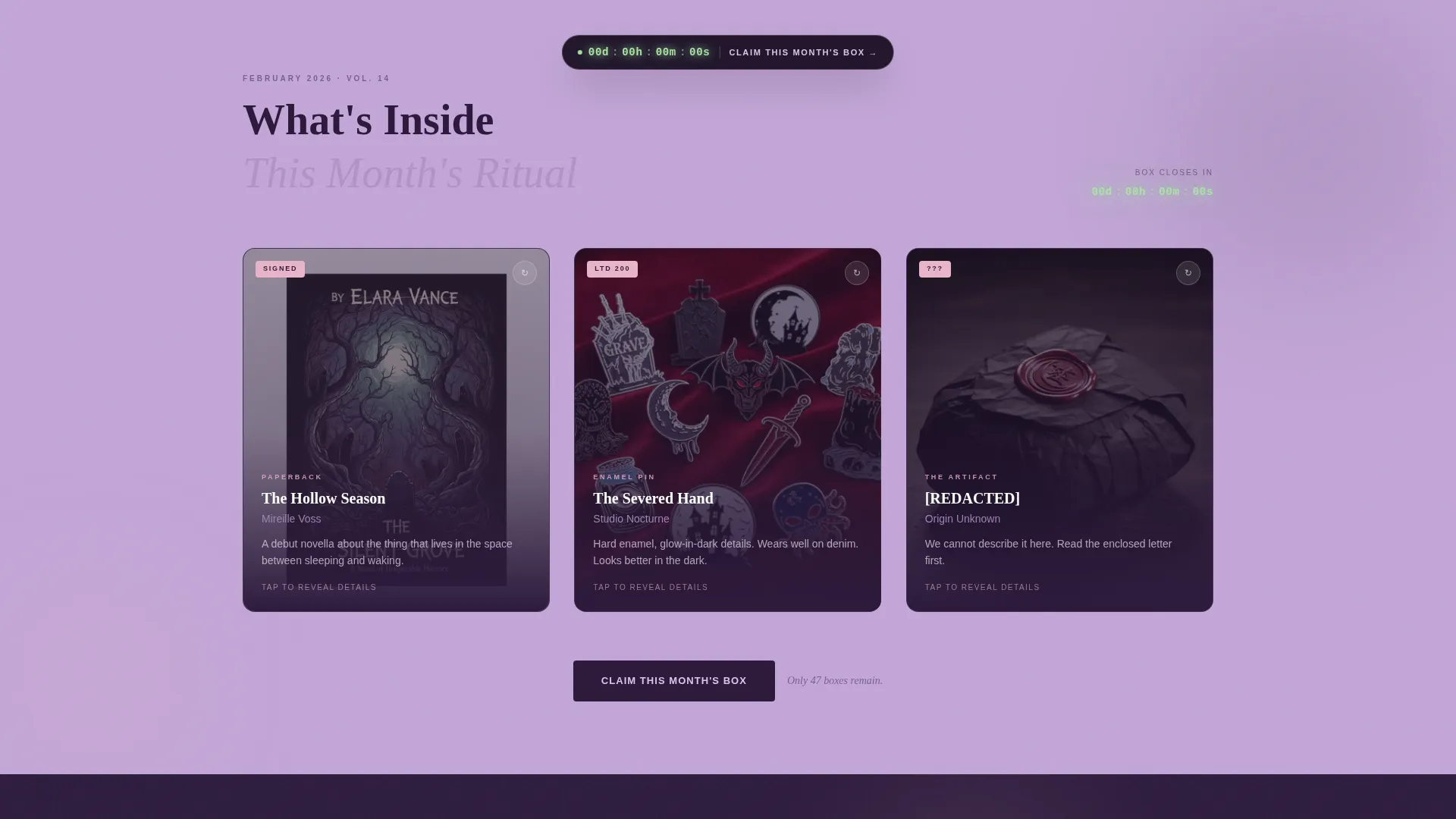
- A UGC photo wall header with scanned-Polaroid treatment, parallax drift, and a live phosphor-green countdown timer
- A flip-card item reveal gallery showing each box item one at a time, with detail panels, author bios, pin dimensions, and a teaser line from the enclosed letter
- A sold-out past box archive grayed and stamped "SOLD OUT", plus a secondary lightbox path for skeptical visitors
Feature list
This template includes the following built-in components and design capabilities drawn directly from the source brief.
UGC Photo Wall Header
A dense, slightly tilted mosaic of real subscriber photos covers the header. Images carry a scanned-Polaroid treatment with rounded corners and faint light leaks. A subtle parallax drift activates on load, so the wall feels alive the moment the page opens.
Phosphor-Green Countdown Timer
A prominent LED-style countdown sits directly beneath the header headline. The phosphor-green digits tick in real time and are styled like an old clock display. Smaller echo timers repeat in section corners as visitors scroll deeper, keeping urgency present without being aggressive.
Flip-Card Item Reveal Gallery
This month's box contents are revealed one item at a time through gallery cards that flip on click. Each card back shows a detail panel with author bios, pin dimensions, and a cryptic teaser line from the enclosed letter. The reveal format builds anticipation and gives collectors the depth they want.
Marginalia-Style Pull Quotes
Subscriber testimonials appear typeset like handwritten notes scrawled in the gutter of a used book. This presentation keeps social proof in character with the page's editorial atmosphere. It reads like a recommendation from a fellow reader, not a marketing widget.
Sold-Out Archive Gallery
Past boxes are displayed in a grayed gallery section, each stamped with a pink "SOLD OUT" badge. The archive is visible proof that boxes sell out and scarcity is real. Seeing a wall of unavailable editions makes the current live box feel genuinely urgent.
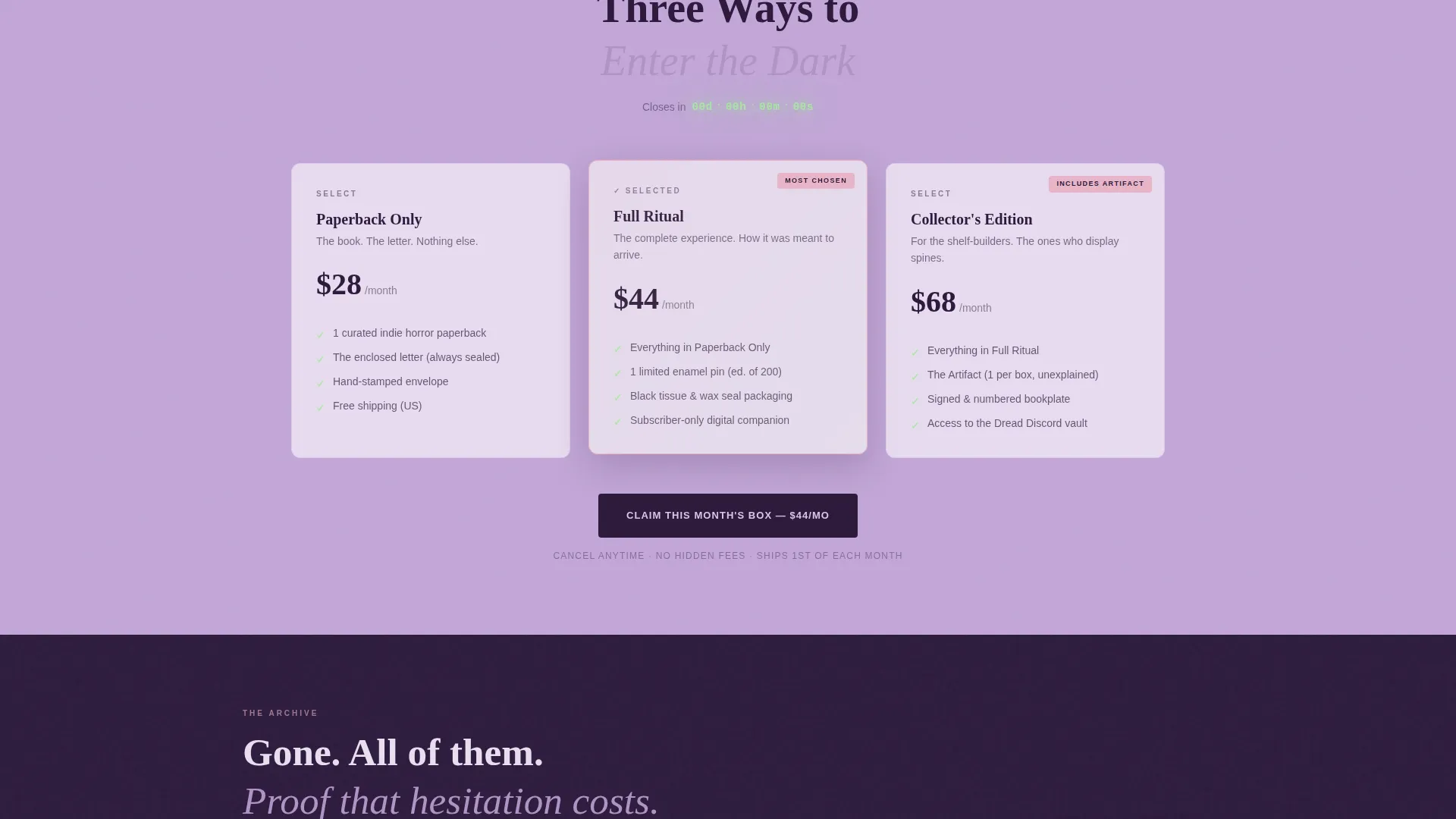
Tiered Click-Through call to action System
The primary call to action, "Claim This Month's Box", appears three times: beneath the header, floating after the item gallery, and as a full-width banner before the archive. Each click passes the selected box tier (Paperback Only, Full Ritual, or Collector's Edition) as a parameter into the checkout flow. A secondary text link loops skeptics through the detail lightbox before returning them to the same call to action.
Page sections overview
| Section | Purpose |
|---|---|
| UGC Photo Wall | Opens with subscriber photos and a live countdown to create immediate atmosphere and urgency |
| Item Reveal Gallery | Flips through this month's box contents card by card to build anticipation |
| Floating call to action Strip | Keeps the primary subscribe action visible after the item gallery without interrupting flow |
| Marginalia Testimonials | Places subscriber pull quotes as handwritten marginalia to maintain editorial tone |
| Sold-Out Archive | Displays past boxes as grayed, stamped entries to prove real scarcity |
| Full-Width call to action Banner | Final conversion push before the archive with all three box tier options |
| Skeptic Lightbox | Secondary detail view of last month's box for visitors who need more proof before clicking |
Design & branding system
The visual identity follows a Neo-Retro theme built on the Lavender Dream color system. The palette feels like a horror paperback cover left in sunlight until it faded soft, pastel on the surface and unsettling underneath.
- Core colors: hazy lilac (#C3A6D8) as the primary background, deep crypt purple (#2D1B3D) for text and dividers, faded VHS pink (#E8B4C8) for hover states and badges, and sickly phosphor green (#A8E6A1) reserved exclusively for countdown timers and urgency cues
- Typography centers on a distressed serif headline face that bleeds into the photo wall, evoking hand-lettered staff picks in a late-night video rental store
- Section backgrounds alternate between the lilac wash and crypt purple, giving each scroll segment the feeling of turning a page in a book you probably should not have opened
Mobile & speed optimization
The template is structured with a single-page, section-led layout that adapts cleanly across screen sizes. The overlapping and layered template style from the design brief is handled at the layout level without relying on heavy dependencies.
- The photo wall mosaic and flip-card gallery are built to reflow gracefully on smaller viewports so detail panels remain readable on mobile screens
- Countdown timer digits and the floating call to action strip are sized for thumb-friendly interaction on phones and tablets
- The alternating background sections and Polaroid-treated images are designed for visual clarity without requiring excessive asset loading
How this template helps you convert
This template converts through atmosphere, evidence, and architecture, not pressure tactics alone. Every design decision serves the goal of moving a curious visitor into a paying subscriber before the timer expires.
- The photo wall and countdown create genuine first-impression urgency, showing real people already in the ritual and a ticking clock that confirms the box is leaving soon
- The flip-card reveal gallery earns trust by giving collectors the detail they need, item by item, so the "Claim This Month's Box" click feels informed rather than impulsive
- The sold-out archive and tiered call to action system close the loop, making it clear that past buyers missed their chance and that this click carries real consequence
Other information about this template
This template is categorized under Retail and E-Commerce, specifically within the Subscription Box Services segment. It is designed as a click-through landing page with no on-page form, keeping the path from browse to checkout frictionless.
- The page type is a single-page click-through landing page, not a multi-page website
- Box tier selection (Paperback Only, Full Ritual, or Collector's Edition) is passed as a URL parameter into the checkout, so no additional configuration is needed on the landing page itself
- The Overlap and Layered template style creates depth across sections without requiring custom development work
- The Neo-Retro theme and Lavender Dream color system are pre-configured and ready to adapt to other dark or horror-adjacent brand identities
- This template suits any limited-run physical product drop, not only horror boxes, wherever scarcity and atmosphere are part of the brand story


Theme
Neo-Retro
Creative direction
Curated Collection
Color system
Lavender Dream
Style
Overlap/Layered
Direction
Marketplace/Multi
Page Sections
UGC Photo Wall with Parallax Drift
Led-style Countdown Timer
Flip-card Item Reveal Gallery
Marginalia Subscriber Testimonials
Sold-out Past Box Archive
Tiered Click-through Call to Action System
Related questions
Does this template include a subscription sign-up form?
Can I update the countdown timer to match my actual ship date?
How do I add my own subscriber photos to the photo wall?
Can I use this template for a non-horror subscription box?
What happens when I click the secondary peek inside link?


