FAQ & Resource Hub Landing Page Template
A sharp editorial landing page built for actuarial resource hubs and exam prep platforms. This template translates dense risk mathematics into a browsable, magazine-style layout that earns trust from chief actuaries, HR directors at insurance carriers, and exam prep partners. It combines a manifesto header, curated credibility signals, and a structured partnership conversion flow into one authoritative page.
by Rocket studio
Quick summary
This is an editorial landing page designed for actuarial FAQ and resource hubs. It opens with a typographic manifesto, builds authority through a curated logo wall, and guides B2B visitors toward partnership tiers or a low-commitment media kit download. The layout feels like a well-indexed professional journal, organized for working actuaries and institutional partners alike.
Who this template is for
This template serves organizations and professionals who need a credible, content-rich presence in the actuarial space. It is built for institutions that want to attract serious, qualified visitors and convert them into partners.
- Chief actuaries and credentialing teams vetting continuing education partners
- HR directors at insurance carriers sourcing onboarding and exam prep materials
- Exam prep companies seeking co-branded content placement for a captive study audience
What problem this template solves
Actuarial content is dense and often scattered. Most pages in this niche either overwhelm visitors with raw mathematics or undersell the depth of their resources with generic layouts. This template fixes both.
- It organizes complex risk topics into scannable, magazine-style FAQ clusters by exam track
- It establishes institutional credibility before making any partnership ask
- It gives cautious B2B prospects two conversion paths: a high-commitment partnership form and a low-friction media kit download
What you get with this template
You get a complete single-page layout built around editorial structure and B2B conversion. Every section is purposefully sequenced to earn trust before requesting action.
- A manifesto-style header with a typographic statement and thin rule descriptor
- A monochrome logo wall for social proof, followed by organized resource sections with pull-quotes and read-time cards
- A two-step partnership form, a gated media kit download, and a sticky conversion bar that activates on scroll
Feature list
This template packages every major editorial and conversion element into one cohesive page structure. Each feature below is drawn directly from the page design described in the brief.
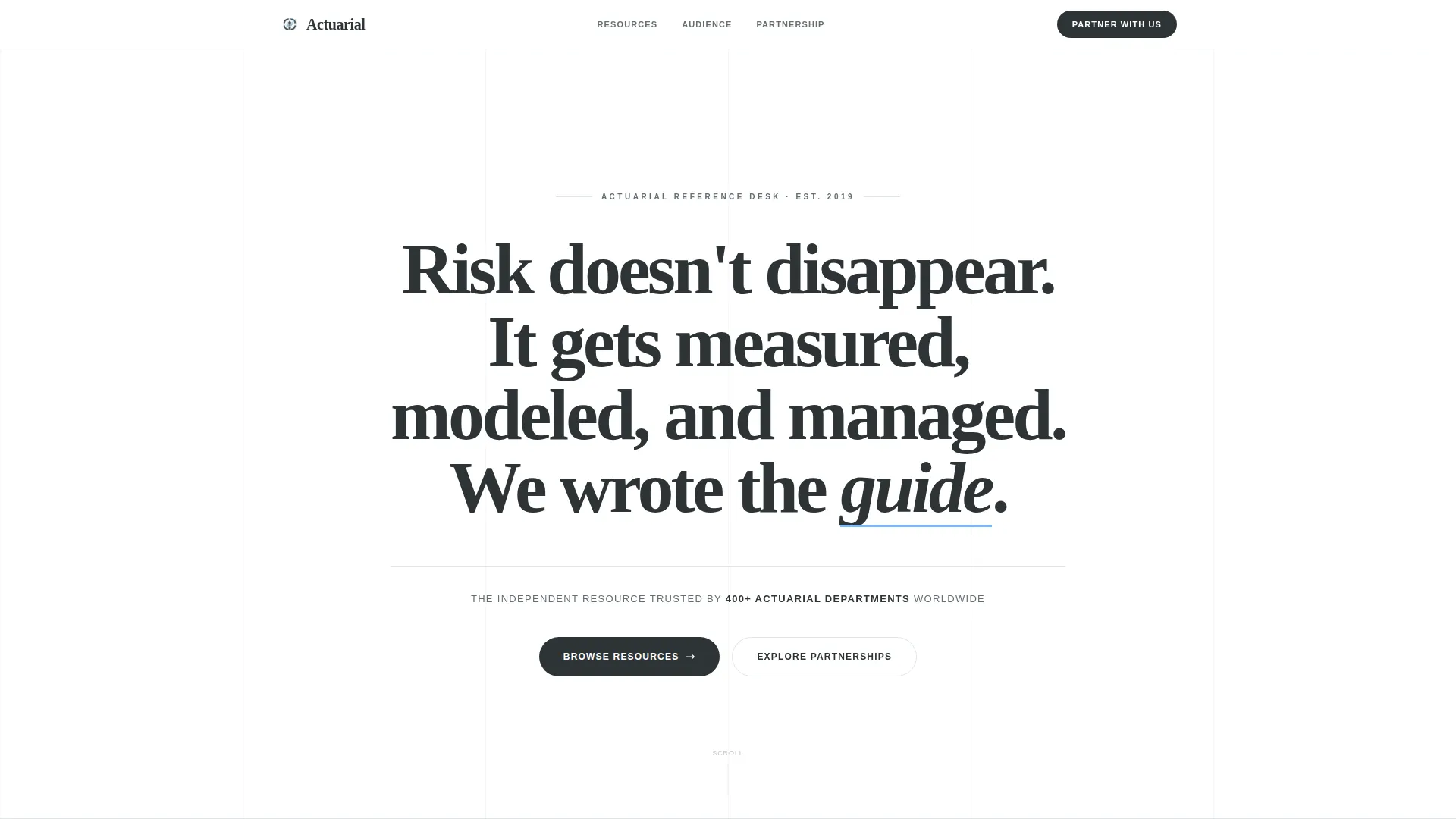
Typographic Manifesto Header
The header opens with a single bold statement that builds line by line: "Risk doesn't disappear. It gets measured, modeled, and managed. We wrote the guide." Set in a sharp editorial serif at large scale, charcoal on white, with the sky-blue accent underlining the word "guide" like a careful annotation. A thin horizontal rule and a single-line trust descriptor follow below.
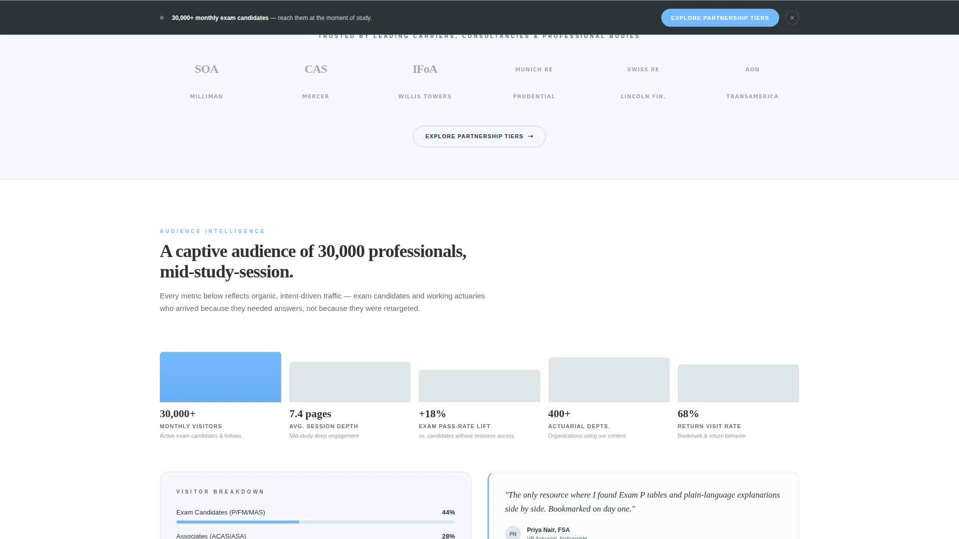
Logo Wall Authority Section
A curated grid of carrier logos, consulting firm marks, and professional body identifiers fades in with restrained animation. Every logo renders in monochrome slate so no single brand dominates the visual weight. This section answers the trust question before the visitor consciously asks it.
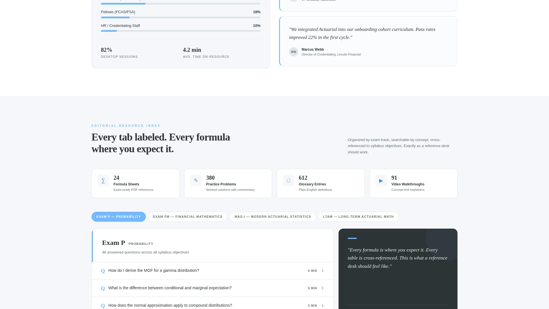
Magazine-Style Editorial Layout
Content unfolds in multi-column magazine format below the logo wall. FAQ clusters are organized by exam track, resource cards carry estimated read times, and pull-quote callouts from fellows highlight key ideas. Each scroll depth surfaces a new content vertical: life, health, pension, and enterprise risk.
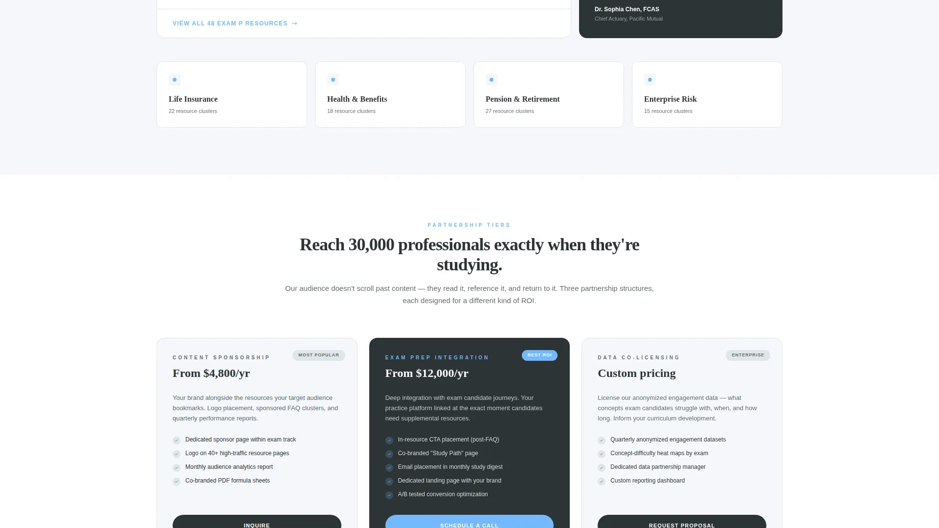
Two-Step Partnership Conversion Form
The primary call to action reads "Explore Partnership Tiers." The form is progressively disclosed: step one captures only company name and work email, while step two expands to partnership type (content sponsorship, exam prep integration, or data co-licensing) and estimated audience size.
Gated Media Kit Download
A secondary conversion path offers "Download the Media Kit" as a gated PDF. It requires only an email address, giving cautious prospects a low-commitment entry point before they engage with the full partnership flow.
Sticky Conversion Bar
A sticky bar element activates once the visitor scrolls past the resource sections. It repeats the primary "Explore Partnership Tiers" call to action, keeping the conversion path visible without interrupting the reading experience.
Page sections overview
| Section | Purpose |
|---|---|
| Manifesto Header | Opens with authority via typographic statement |
| Trust Descriptor Line | Reinforces credibility with a single-line claim |
| Logo Wall Grid | Builds social proof through monochrome partner logos |
| Primary call to action Block | Introduces partnership tiers after credibility is set |
| Editorial FAQ Clusters | Organizes content by exam track and topic vertical |
| Resource Cards | Displays browsable content with estimated read times |
| Pull-Quote Callouts | Highlights expert voices from fellows and credential-holders |
| Audience Infographics | Shows visitor demographics and session data editorially |
| Partnership Form | Captures partner leads via a two-step progressive form |
| Media Kit Download | Offers gated PDF for low-commitment prospect entry |
| Sticky Conversion Bar | Keeps the primary call to action visible during scroll |
Design & branding system
The visual identity follows an Educational Guide theme using a Slate and Sky color system. The palette is inspired by a well-lit university library at early morning: stone floors, tall windows, and the calm authority of organized knowledge.
- Deep charcoal slate (#2D3436) for body text and section dividers; mid-tone graphite (#636E72) for secondary copy and sidebar frames
- Open-sky blue (#74B9FF) as the primary accent on links, pull-quotes, and interactive elements
- Clean cloud white (#F5F6FA) across all backgrounds, keeping the layout pale and recessive so typography carries the authority
Mobile & speed optimization
The editorial layout is structured to remain readable and navigable at smaller viewport widths. The sticky conversion bar and progressive form are designed to work across screen sizes without cluttering the reading experience.
- Multi-column magazine sections reflow into single-column stacks on narrower screens
- The two-step progressive form limits visible fields at each stage, reducing cognitive load on mobile visitors
How this template helps you convert
This template earns the click by proving audience quality before making any ask. The conversion architecture is sequenced so trust is fully established before a form or download prompt appears.
- The logo wall and editorial infographics demonstrate audience depth and institutional reach, making the partnership value clear before any call to action is visible
- The progressive two-step form lowers the barrier to entry by asking only for email and company name first, then expanding to partnership details on the second screen
- The media kit download gives risk-averse prospects a no-pressure entry point, capturing the lead even when they are not yet ready for a full partnership conversation
Other information about this template
This template is purpose-built for the actuarial niche and professional services category. It is particularly well-suited for organizations operating at the intersection of credentialing, risk education, and B2B content partnerships.
- The page references a reach of 400-plus actuarial departments worldwide and approximately 30,000 monthly visitors as proof-of-audience claims available to customize within the template
- The content verticals built into the editorial layout cover life, health, pension, and enterprise risk management, making it relevant across multiple actuarial practice areas
- Professional bodies such as the Society of Actuaries (SOA), the Casualty Actuarial Society (CAS), and the Institute and Faculty of Actuaries (IFoA) are represented as logo wall examples within the template structure
- The template style is Editorial and Magazine, and the theme is Educational Guide, making it suitable for platforms that want to position themselves as a trusted reference rather than a product vendor
Theme
Educational Guide
Creative direction
Logo Wall Authority
Color system
Slate & Sky
Style
Editorial/Magazine
Direction
Partnership/B2B
Page Sections
Typographic Manifesto Header
Logo Wall Authority Section
Magazine-style Editorial Layout
Two-step Partnership Form
Gated Media Kit Download
Sticky Conversion Bar
Related questions
Who is the primary audience for this landing page template?
What conversion paths does the template include?
Can this template work for an exam prep company?
Does the template include a sticky call-to-action element?
What visual style does this template use?


