Patient Booking Landing Page
Triage is a single-column booking landing page built for micro-hospital and urgent care clinics that need to convert anxious patients fast. It pairs an animated stats wall, a board-certified physician panel, and a streamlined scheduling form into one clear, calming page. The design uses a Soft Mist color system and Corporate Precision layout to make every visitor feel ready to act before they second-guess themselves.
by Rocket studio
Quick summary
Triage is a booking landing page template for micro-hospital facilities and urgent care clinics. It proves speed and credentials before asking for anything, so patients arrive at the scheduling form already convinced. Clean, calm design and a persistent mobile call-to-action make the page easy to use during real emergencies.
Who this template is for
This page template is built for healthcare operators who need a high-conversion medical landing page without months of custom design work. It suits facilities that sit between a standard urgent care clinic and a full-scale hospital, serving patients who need fast, credible answers online.
- Micro-hospital and emergency-grade clinic operators
- Healthcare marketing teams building a medical website for a specific facility or service line
- Employer health groups promoting faster access to care for their workforce
What problem this template solves
Most hospital landing pages overwhelm stressed visitors with dense text, slow load times, and unclear calls to action. Patients in distress need a simple, quick, and easy page that tells them what they need to know and gets out of the way. Delays in finding information translate directly into lost appointments and reduced trust.
- Visitors cannot quickly determine wait times, credentials, or whether the facility handles their condition
- Traditional hospital landing page design buries the booking action under navigation menus and marketing copy
- Patients on mobile phones during emergencies abandon pages that are not built for fast, one-thumb use
What you get with this template
This landing page template delivers a fully structured, single-column flow ready for a micro-hospital or urgent care setting. Every section is designed to present proof before persuasion, ensuring patients trust the facility before they fill in a single field.
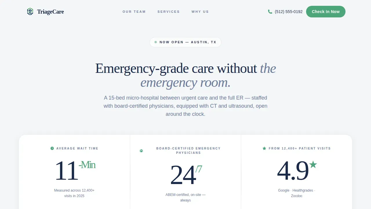
- An animated stats wall with three oversized figures confirming wait time, physician availability, and patient feedback ratings
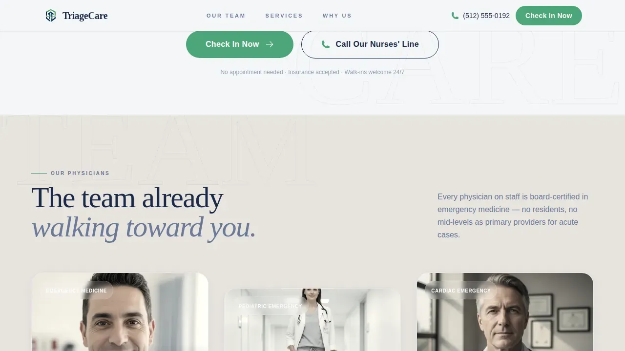
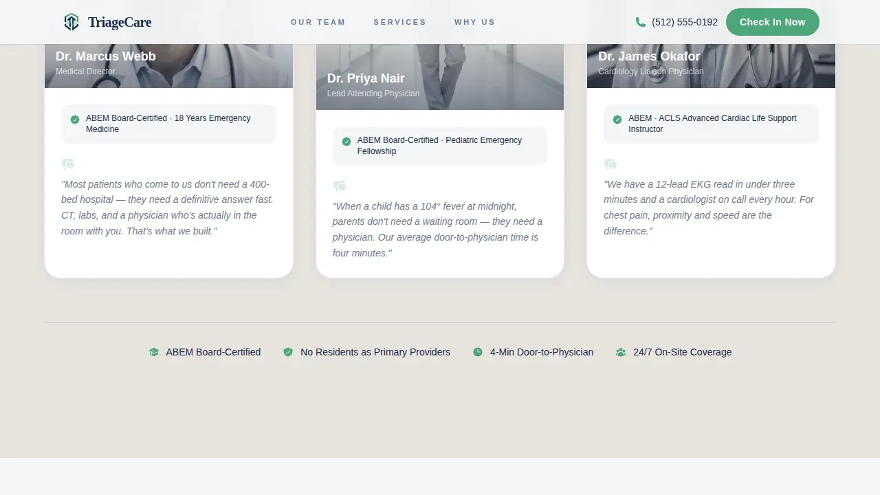
- A physician expert panel with portrait placeholders, board certification labels, and quote slots for each doctor on the team
- A structured scheduling form collecting only essential information: reason for visit, preferred time, name, phone number, and insurance provider
Feature list
This page template includes six purpose-built sections and a set of design and interaction components selected specifically for healthcare booking use cases.
Animated Stats Wall Header
Three oversized metric figures load with a GSAP count-up animation on page entry. The figures cover average wait time, physician availability, and patient visit ratings, setting clear expectations before any visitor scrolls. No stock photography is needed; the numbers carry the credibility.
Board-Certified Physician Panel
Three physician portrait cards appear in a staggered reveal using ScrollTrigger. Each card shows a headshot placeholder, the doctor's name, board certification, and a personal quote about their approach to medicine. This section builds human trust through people, not paragraphs.
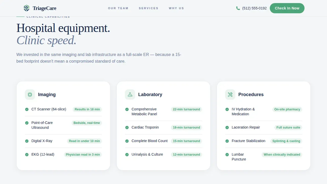
Clinical Capabilities Section
Equipment specifications, a conditions list, and lab turnaround details are presented in a scrolling marquee ticker format. This section gives patients and employer groups the clinical proof they need to determine whether this facility can handle their specific health situation.
ER Comparison Table
A side-by-side comparison shows the traditional emergency room experience versus this facility. Each row uses vitals-green checkmarks to highlight advantages, making it easy for visitors to see the difference in waiting times, services, and overall patient experience at a glance.
Streamlined Scheduling Modal
The booking form opens in a modal and asks only for essential information: reason for visit via a simple dropdown, a date and time selector with an "I need care now" toggle, patient name, phone number, and insurance provider. A secondary tap-to-call button supports patients who will not fill out a form during acute emergencies.
Persistent Mobile Call-to-Action Bar
A fixed bottom bar appears on mobile devices, ensuring the primary "Check In Now" button is always visible. This design choice is crucial for patients accessing the page on a smartphone during emergencies, allowing them to start the intake process immediately without searching for the action.
Page sections overview
| Section | Purpose |
|---|---|
| Header and Navigation | Logo, nurses' line link, and primary booking call-to-action |
| Stats Wall Hero | Animated wait time, physician availability, and rating figures |
| Expert Physician Panel | Three doctor portraits with credentials and personal quotes |
| Clinical Capabilities | Equipment specs, conditions list, and lab turnaround ticker |
| ER Comparison Rows | Side-by-side checkmark table versus traditional emergency room |
| Scheduling Modal Form | Streamlined intake form with tap-to-call secondary path |
| Footer | Single-row linear footer with contact and facility information |
Design & branding system
The Soft Mist color system keeps the page calm without feeling generic. Backgrounds alternate between clinical fog white (#F4F6F8) and sterile linen (#E8E4DF), creating breathing room between sections. Calming colors and large, legible fonts avoid overwhelming stressed users who arrive on the page in a heightened state.
- Steady-pulse navy (#1B2A4A) anchors all body text and headlines for clear readability across devices
- Vitals-green (#4DA67A) appears only on calls to action and positive-outcome indicators, ensuring every green element feels like good news
- Typography pairs Fraunces for display headlines with DM Sans for body copy, balancing authority with approachability
Mobile & speed optimization
This template is built mobile-first because most users will be accessing it during emergencies on their smartphones. The single-column layout stacks cleanly at every screen size, ensuring the hospital landing page works perfectly on all devices without horizontal scrolling or pinching.
- Persistent bottom call-to-action bar on mobile keeps the booking action one tap away at all times
- Server Components handle static content while Client Components manage animations and the scheduling form, supporting fast initial page rendering
- High-contrast navy text on light backgrounds supports readability under stress, outdoors, or on older screens
How this template helps you convert
A hospital landing page for emergency care must earn the click before it asks for information. This template is structured to present proof at every scroll depth, so by the time a visitor reaches the scheduling form, the only remaining question is when, not whether.
- The stats wall and physician panel establish credentials and speed within the first viewport, reducing the anxiety that causes people to leave without booking appointments
- The ER comparison section removes remaining doubt by showing clear, relevant advantages over the traditional emergency room experience in a simple, scannable format
- The HIPAA-aligned intake form asks only for essential information, making the final step easy and protecting the patient experience from unnecessary friction
Other information about this template
This template is ready to customize for any micro-hospital or urgent care facility. Teams can update physician portraits, conditions lists, stat figures, and service descriptions to match their specific offering. The page is also suitable for clinics exploring online booking for the first time, as the pre-built components simplify creating a professional medical website quickly.
- The scheduling form supports common use cases including patient registration, triage, and appointment scheduling, with fields for name, phone, reason for visit, and insurance provider
- Conditional logic can be applied to the form fields, allowing the page to show or hide relevant fields based on patient responses and ensuring relevant data collection
- Multi-language support can be added to help non-English speakers access the page during urgent situations, broadening the facility's reach
- Real-time wait time display and interactive map integration with directions to the facility are layout-ready sections that can be updated as the site goes live
- The template references Woorise-compatible form hosting, allowing teams to host the intake form on a custom domain or subdomain and use conditional logic for smarter data collection
- All booking form fields should meet HIPAA standards to protect patient information; the template's form structure is designed to capture only essential, HIPAA-compliant data to minimize input time and protect patient privacy
Theme
Corporate Precision
Creative direction
Expert Panel
Color system
Soft Mist
Style
Single Column Flow
Direction
Booking/Scheduling
Page Sections
Animated Stats Wall with Count-up Figures
Staggered Physician Expert Panel
Clinical Capabilities Marquee Ticker
ER Comparison Checkmark Table
Streamlined Scheduling Modal Form
Persistent Mobile Booking Bar
Related questions
What sections are included in this landing page template?
Can I customize the physician cards and stat figures?
Is the scheduling form suitable for collecting patient intake information?
Does this template work on mobile phones?
Can urgent care clinics and employer health groups use this template?


