Disability-Owned Business Professional Website Template
Adapt is a bold, card-grid landing page built for an adaptive clothing brand that centers disabled bodies without apology. With a Playful Geometric visual identity, a citrus-bright color system, a live flash-deal countdown, and a personalized fit quiz, this template turns product discovery into an urgent, joyful, and deeply personal shopping experience.
by Rocket studio
Quick summary
Adapt is a single-page, modular card-grid landing page designed for a disability-owned adaptive clothing brand. It combines a live flash-deal countdown, an asymmetric product grid, and a full-screen fit quiz to create an experience that feels urgent, inclusive, and completely on-brand. The citrus-burst color system and playful geometric layout make every scroll feel like a celebration.
Who this template is for
This template is built for adaptive fashion founders who are done with the clinical, afterthought aesthetic that most accessible-clothing pages default to. It speaks directly to a community that wants to shop with energy, not patience.
- Disability-owned clothing brands running timed flash drops or limited-stock sales
- Adaptive apparel shops whose customers include wheelchair users, amputees, and people managing chronic conditions
- Fashion founders who want conversion tools baked into the page design itself
What problem this template solves
Standard e-commerce templates were not designed with adaptive clothing in mind. They hide the details that matter most to this audience and bury personalization behind generic filters. This template fixes that by leading with the product features that make adaptive clothing worth buying.
- Shoppers cannot easily find pieces suited to their specific body needs without a guided experience
- Flash-deal urgency is hard to communicate with static layouts and no countdown mechanics
- Generic retail templates fail to reflect the bold, unapologetic identity that disability-owned brands deserve
What you get with this template
You get a complete, ready-to-customize landing page that handles product discovery, flash-deal urgency, and personalized recommendations in a single flowing layout. Every component is designed with intention and visual rhythm.
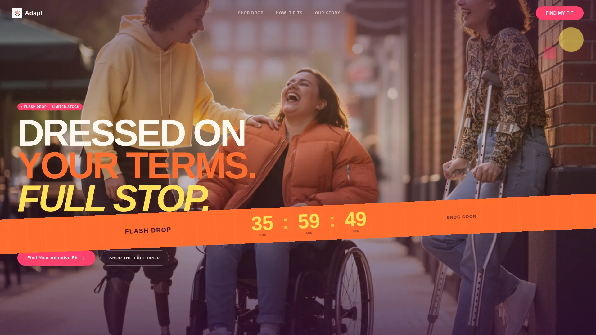
- A lifestyle hero header with a geometric diagonal flash-deal banner and a live countdown timer
- An asymmetric modular card grid mixing product shots, detail video tiles, and bold customer pull-quote blocks
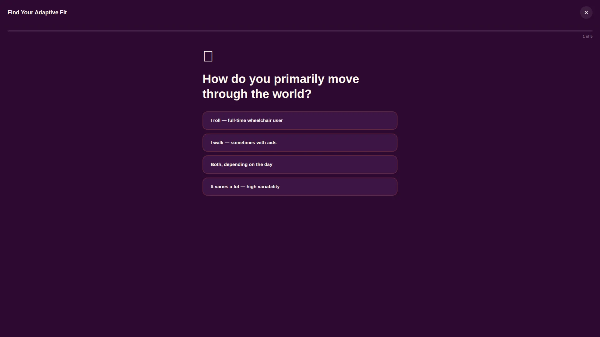
- A five-question full-screen fit quiz with geometric animations and a personalized capsule checkout path
Feature list
This template includes purpose-built features drawn directly from the brand brief. Each one does a specific job in the visitor journey.
Live Flash-Deal Countdown Banner
A diagonal tangerine banner cuts across the hero header, displaying a ticking countdown in lemon numerals. It communicates urgency from the very first frame without requiring a pop-up or interstitial.
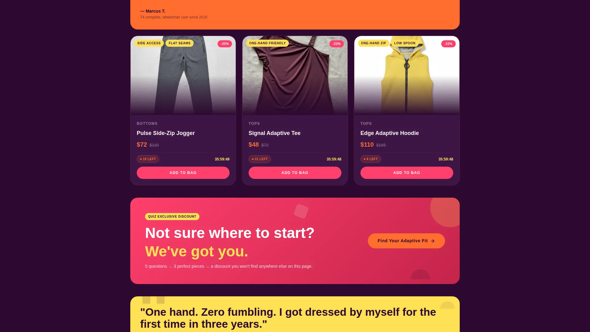
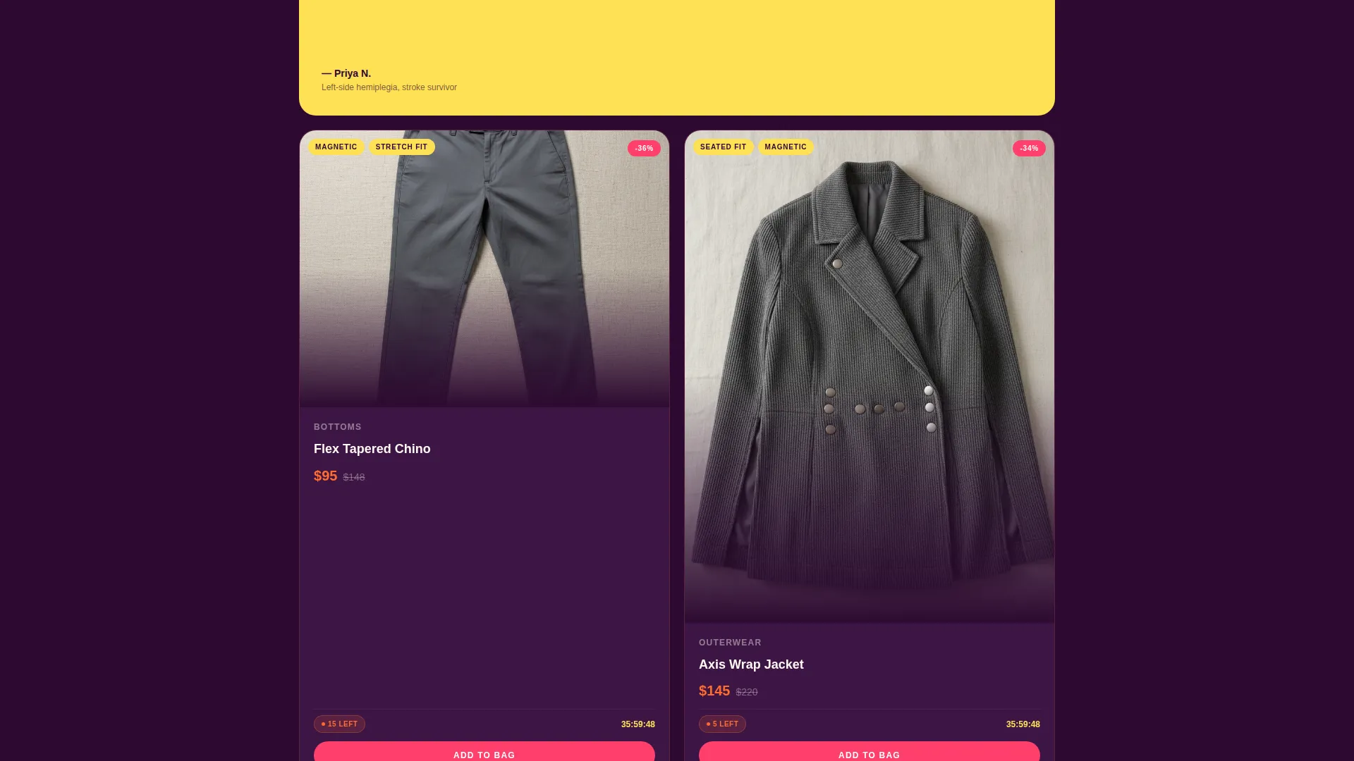
Asymmetric Modular Card Grid
Product cards cascade in an offset, asymmetric grid that alternates between product photography, close-up detail video tiles showing magnetic closures and one-handed zippers, and oversized pull-quote tiles from disabled customers. The rhythm accelerates as visitors scroll, mimicking the kinetic energy of a sample sale.
Per-Card Stock Countdown Badges
Each product card carries a "12 left at this price" style badge. These scarcity indicators are built into the card design, not added as an overlay afterthought. They reinforce purchase urgency at the individual product level.
Full-Screen Personalized Fit Quiz
A five-question illustrated quiz opens in a full-screen overlay. Questions cover mobility style, body-side ease, fastener preference, style vibe, and a free-text frustration field. Completing the quiz delivers a personalized capsule of three recommended pieces with flash pricing and a "Grab My Capsule" checkout button.
Geometric Kaleidoscope Quiz Animations
Between each quiz answer, geometric shapes rearrange in a kaleidoscope-style transition. This keeps the experience feeling like the brand rather than a standard survey tool, and it rewards engagement before the result is even shown.
Pinned and Embedded Quiz call to action
The primary "Find Your Adaptive Fit" call-to-action button is pinned to the bottom of the viewport on mobile and embedded after every third card row on desktop. Quiz completers receive an exclusive discount badge that does not appear anywhere else on the page.
Page sections overview
| Section | Purpose |
|---|---|
| Hero Lifestyle Header | Introduces the brand with three friends mid-laugh, a low-angle wide shot, and the diagonal flash countdown banner |
| Flash Countdown Banner | Displays the live drop timer in a diagonal tangerine strip across the hero lower third |
| Asymmetric Card Grid | Cascades product cards, detail video tiles, and pull-quote blocks in an accelerating scroll rhythm |
| Product Detail Cards | Shows individual pieces with stock badges, adaptive feature labels, and add-to-cart actions |
| Detail Video Tiles | Highlights magnetic closures and one-handed zippers through close-up inline video |
| Customer Pull-Quote Tiles | Features bold customer quotes in oversized geometric type to build social proof |
| Fit Quiz Overlay | Runs the five-question full-screen personalized fit assessment with animated transitions |
| Personalized Capsule Result | Delivers three recommended pieces with flash pricing and the exclusive quiz-only discount |
| Direct Shop Path | Lets visitors skip the quiz and browse the full flash grid without friction |
Design & branding system
The visual identity follows a Playful Geometric theme rooted in a Citrus Burst color system. Every color in the palette has a defined role, and every shape choice reinforces the zine-page energy of the brand.
- Aubergine (#2D0A31) grounds card backgrounds and typography; electric tangerine (#FF6D2E) fires on hover states and countdown timers; grapefruit pink (#FF3F6C) marks active selections and all primary call-to-action buttons; sun-bleached lemon (#FFE156) highlights badge labels like "Seated Fit" and "One-Hand Friendly"
- Geometric shapes including half-circles, offset grids, and chunky rounded rectangles frame product cards at playful angles, giving each module the energy of a zine spread rather than a catalog page
- The hero photo is shot low and wide, angling slightly upward so subjects tower against the sky, centering the people who actually wear adaptive clothing
Mobile & speed optimization
The card-grid layout is modular by design, which makes it straightforward to adapt across screen sizes. The pinned call to action behavior is specifically defined for mobile, keeping the quiz entry point always within reach.
- The "Find Your Adaptive Fit" button is pinned to the bottom of the mobile viewport so it stays accessible without scrolling back up
- The modular card structure allows individual tiles to reflow and stack cleanly on smaller screens without breaking the asymmetric visual rhythm
- Detail video tiles are embedded inline within the card grid rather than as separate full-width sections, keeping load impact contained
How this template helps you convert
The conversion strategy in this template is layered. Urgency, personalization, and social proof each work at a different scroll depth to build momentum toward purchase.
- The flash countdown and per-card stock badges create time and scarcity pressure from the first second, pushing visitors to act before they overthink
- The fit quiz guides visitors to products that genuinely match their needs, and it rewards completion with an exclusive discount that is not available anywhere else on the page
- Customer pull-quote tiles in bold geometric type interrupt the product scroll with real voices from disabled shoppers, reinforcing trust at the exact moment it matters most
Other information about this template
This template was designed at the intersection of adaptive retail and bold visual identity. It is well-suited for brands that want to lead with community and convert through personalization.
- The template style is a card-grid modular layout, which makes it easy to add, remove, or reorder product tiles without redesigning the page
- The flash-deal creative direction supports limited-time drops, seasonal launches, and exclusive capsule releases equally well
- Adaptive feature labels such as "Seated Fit," "One-Hand Friendly," and "Magnetic Closure" are built into the badge design system and can be updated per product
- The quiz overlay includes a secondary path for visitors who prefer to skip personalization and shop the full flash grid directly, so no shopper is left without a clear route to purchase
- This template falls under the Retail and E-Commerce category with a focus on disability-owned business, making it a strong fit for brands building community-first storefronts
Theme
Playful Geometric
Creative direction
Flash Deal
Color system
Lavender Dream
Style
Gallery + Detail
Direction
Upsell/Upgrade
Page Sections
Live Flash-deal Countdown Banner
Asymmetric Modular Card Grid
Per-card Stock Countdown Badges
Full-screen Personalized Fit Quiz
Geometric Kaleidoscope Quiz Animations
Pinned and Embedded Quiz Call to Action
Related questions
Can I use this template without running a flash deal?
How does the fit quiz personalization work?
Is the quiz the only way to reach the product grid?
Can I update the adaptive feature badge labels on each product card?
Who is this landing page template designed for?


