Landing Page Template for Insurance Adjusting Firms
The Adjuster landing page template is built for independent adjusting firms that need to win B2B partnerships fast. A split-screen layout pairs bold operational metrics with partner testimonials, and a gold-accented call to action drives capacity requests from carriers, independent agencies, and third-party administrators who need field-ready adjusters deployed within hours of a loss event.
by Rocket studio
Quick summary
This is a single-page, split-screen landing page template designed for professional insurance adjusting firms targeting carriers, independent agencies, and third-party administrators. It pairs credibility-building testimonials with hard deployment data, and drives two clear conversion paths: a capacity request form and a gated catastrophe playbook download.
Who this template is for
This template is built for adjusting businesses that sell their services to other businesses, not to individual policyholders. If your firm is competing for overflow contracts, catastrophe deployment agreements, or multi-line adjusting relationships, this layout was designed around your sales conversation.
- Independent adjusting firms seeking carrier or third-party administrator contracts
- Regional catastrophe response teams that need to demonstrate deployment speed and geographic reach
- Adjusting businesses presenting themselves to independent insurance agencies during peak claim seasons
What problem this template solves
Most adjusting firms have no structured way to present operational proof to a prospective partner. A generic website cannot show claim cycle times, reinspection rates, or state licensure maps at a glance. Carriers and administrators need evidence fast, and a mismatched or cluttered page loses the deal before the conversation starts.
- There is no clear visual rhythm that builds trust incrementally through data paired with human testimonials
- Conversion paths are unclear, leaving prospects unsure whether to call, email, or keep browsing
- The page fails to differentiate deployment speed and geographic coverage, which are the two factors that close B2B adjusting contracts
What you get with this template
You get a fully structured, single-page layout that guides a prospective carrier or administrator from first impression through to a contact form submission or gated asset download. Every section is designed to carry its weight with either a metric or a human voice, and the two conversion paths are clearly separated.
- A split-screen hero section with a bold headline and a credibility-first visual of hands-on field work
- A scrolling testimonial mosaic that alternates partner quotes with operational data callouts
- A dual conversion system: a slide-in capacity request form and a secondary gated playbook download
Feature list
This template delivers a focused set of purpose-built components drawn directly from the brief.
Split-Screen Layout Throughout
The 50/50 split-screen structure persists from the header all the way through the scrolling content sections. One side always carries a human element, the other always carries a data point or operational metric. This rhythm creates a consistent reading pattern that builds credibility with every scroll.
Giant Headline Hero Panel
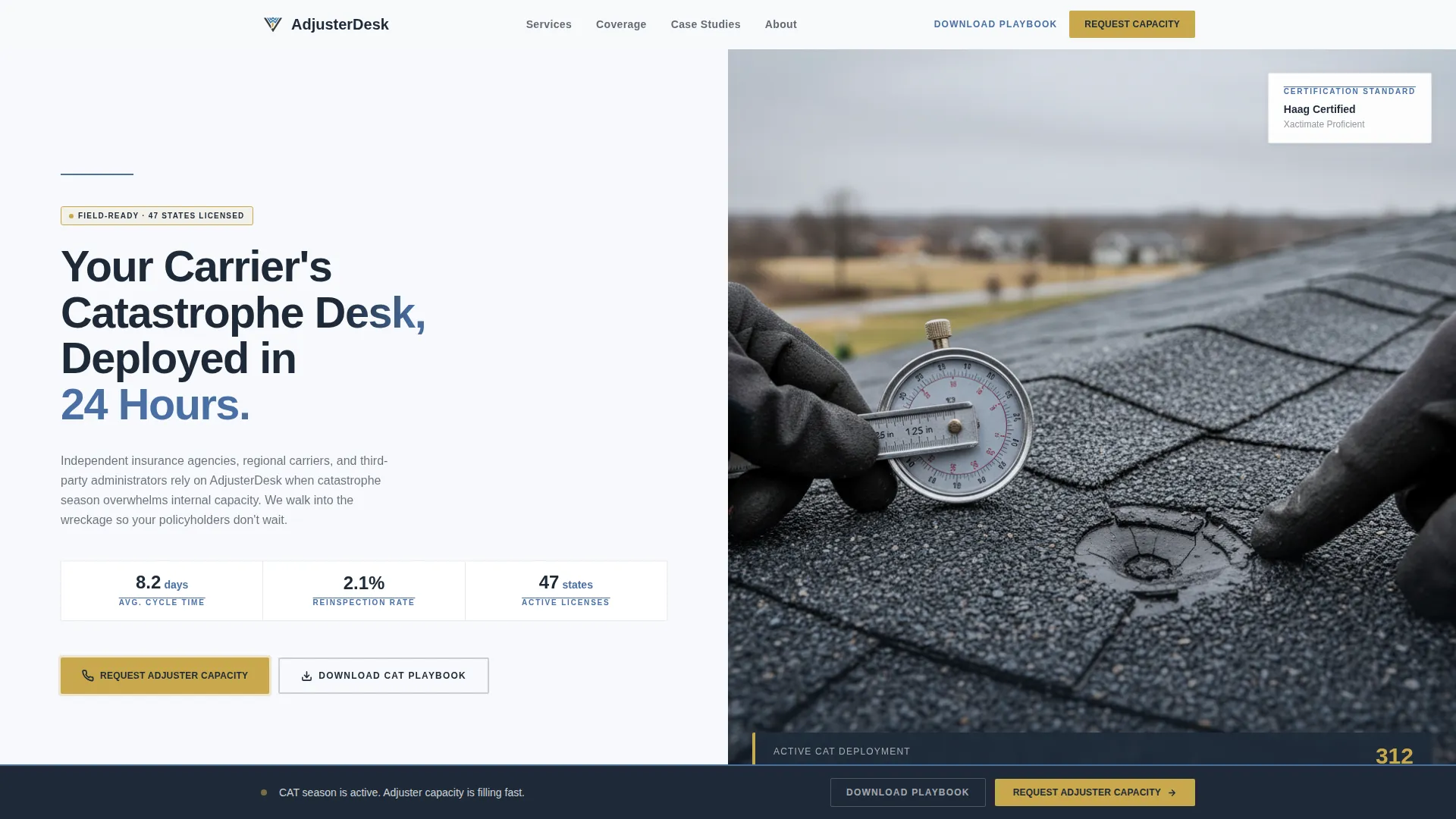
The left panel of the header holds a bold, stacked sans-serif headline set in case-file charcoal against glacial white. The right panel holds a single tightly cropped photograph of an adjuster measuring hail damage. The composition communicates field competence immediately, without any explanatory copy needed.
Testimonial Mosaic Sections
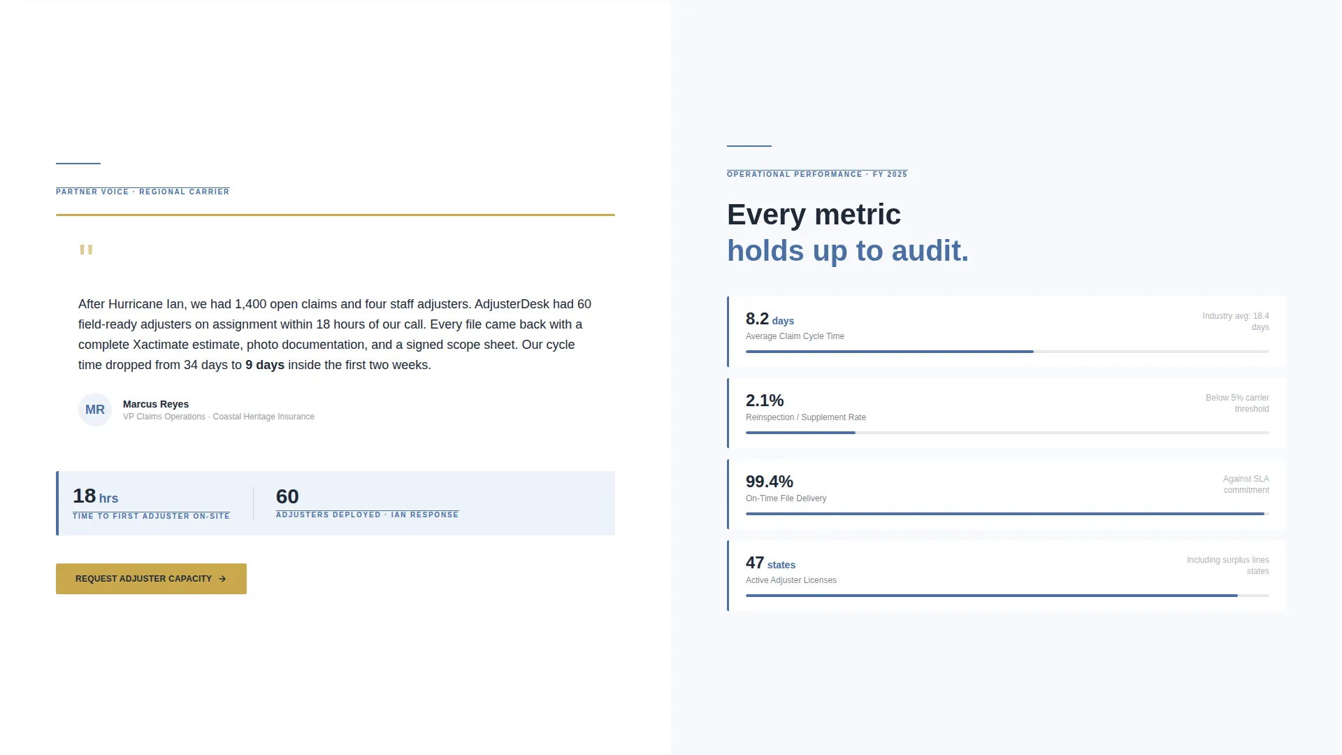
Scrolling past the hero, each content section pairs a real partner testimonial with a hard operational figure: average claim cycle time, reinspection rate, state licensure count, or adjuster headcount by catastrophe event. The mosaic alternates which side holds the quote and which holds the metric, so neither element becomes predictable.
Dual Conversion Path Design
The primary call to action, "Request Adjuster Capacity," opens a slide-in form on the right panel. The form collects carrier or third-party administrator name, monthly volume tier, lines of business, and a direct phone number. A secondary path, "Download Our Catastrophe Playbook," captures email and company name only, serving prospects who are not yet ready to commit.
Geographic Coverage Map Section
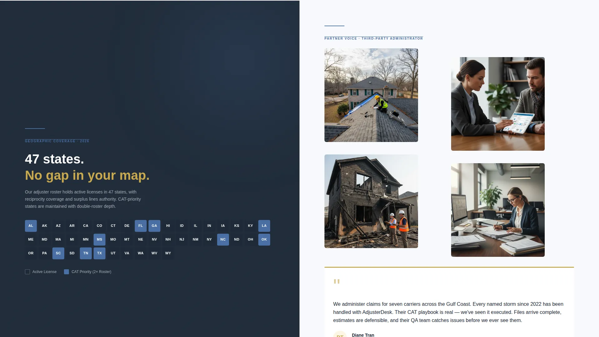
The page ends on a coverage map that makes state-by-state licensure and deployment reach visually undeniable. This section closes the credibility arc started in the hero, turning geographic data into a closing argument for prospective partners evaluating regional capacity.
Pinned Call-to-Action Repeats
The "Request Adjuster Capacity" call to action in notary-seal gold is pinned at each major section break and repeated at the bottom of the page. This ensures the primary conversion action is always visible without requiring the prospect to scroll back to find it.
Page sections overview
| Section | Purpose |
|---|---|
| Split-screen hero | Headline and field-work photograph establish authority immediately |
| Operational data callout | Cycle time, reinspection rate, and headcount figures build proof |
| Partner testimonial block | Real carrier and agency voices validate the operational claims |
| Licensure map panel | State-by-state coverage makes geographic reach concrete |
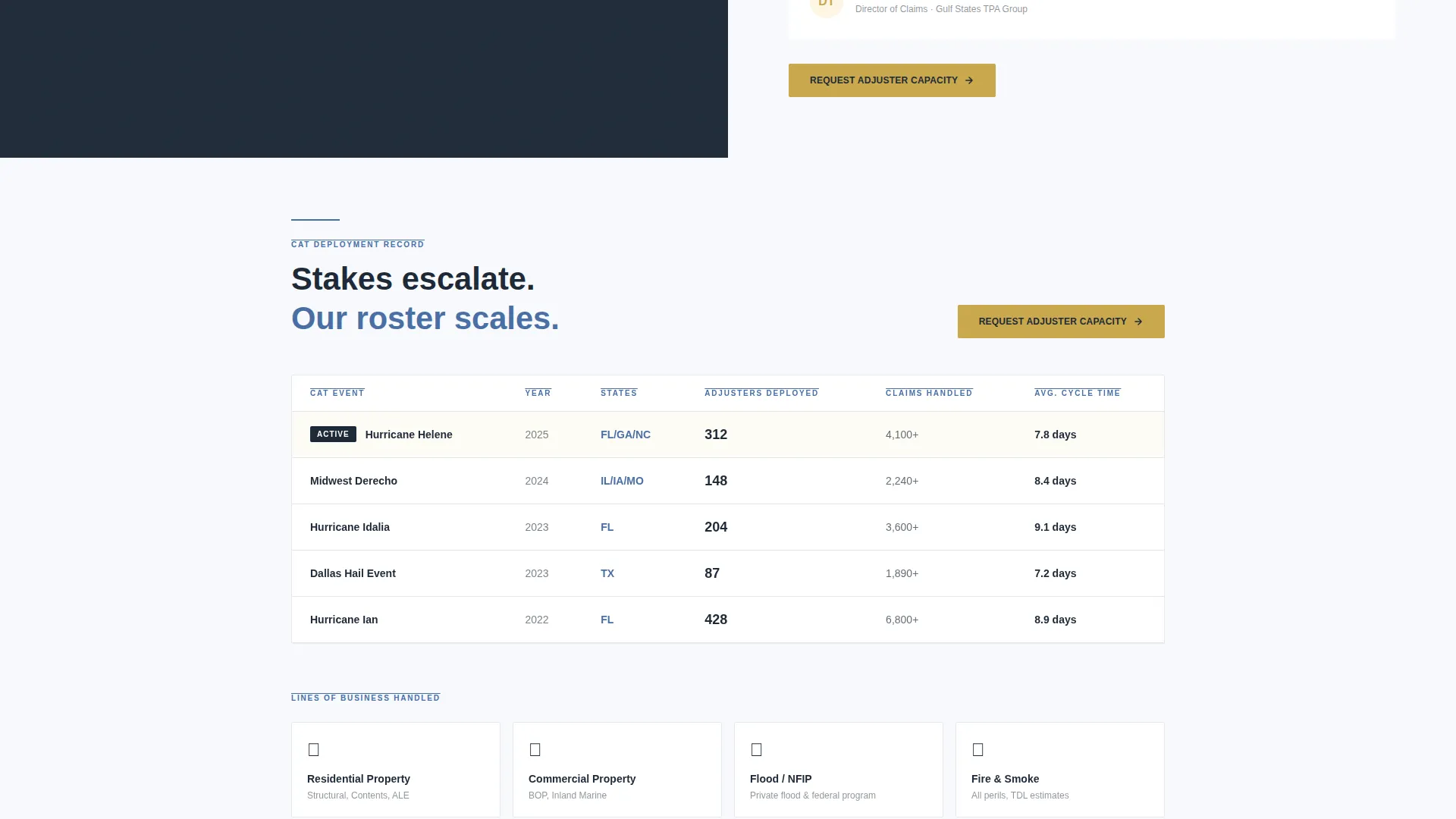
| CAT deployment case study | Escalating catastrophe scenarios demonstrate full-scale capacity |
| Capacity request form | Slide-in panel collects partner details and volume tier |
| Playbook download gate | Secondary form captures email for prospects not ready to commit |
| Pinned call to action section breaks | Repeated gold call to action anchors the conversion path throughout the page |
Design & branding system
The visual identity follows a Legal Shield theme built on the Arctic White color system. The palette feels authoritative and precise, like a well-organized claims file on a clean desk. Every color has a defined role and stays within it.
- Glacial white (#F7F9FC) dominates all section backgrounds, keeping the page clean and readable
- Case-file charcoal (#1E2A38) is used for all primary headlines and body text, delivering a formal and serious tone
- Deposition blue (#4A6FA5) appears on section dividers and data callouts, providing structural contrast without competing with the text
- Notary-seal gold (#C9A84C) is reserved exclusively for calls to action and trust badges, making every conversion prompt visually distinct
Mobile & speed optimization
The split-screen layout is structured to reflow cleanly on smaller screens, stacking the two panels vertically so that neither the headline nor the supporting visual is cropped or hidden on mobile devices.
- The slide-in form panel is designed to open as a full-screen overlay on mobile, keeping the form fields accessible without requiring horizontal scrolling
- Data callout figures and testimonial blocks restack into single-column cards on narrow viewports, preserving the credibility-building rhythm of the desktop layout
How this template helps you convert
The page earns each conversion by proving value before asking for anything. The structure is deliberately sequenced so that trust is established through evidence before a prospect ever sees a form field.
- The hero section opens with a bold deployment promise and a photograph of active field work, establishing competence in the first viewport without a single marketing claim
- The alternating testimonial and metric mosaic builds a cumulative case for the firm across multiple scroll depths, so a prospect who reads three sections or ten sections both reaches the same conclusion
- The dual conversion paths serve two distinct buyer readiness levels, capturing both the partner ready to request capacity today and the evaluator who wants to read the playbook first
Other information about this template
This template is designed specifically for the insurance adjuster business website use case within the professional services category. It is built to serve the insurance adjuster online presence niche where the primary audience is institutional, not consumer.
- The template style is Split Screen (50/50), meaning every section is divided into two equal panels that carry complementary content
- The creative direction is Testimonial Mosaic, a structured alternation of social proof and quantitative data that prevents either element from feeling isolated
- The header concept is Giant Headline Left, where the left panel holds the headline and the right panel holds the visual
- The landing page direction is Partnership/B2B, meaning all copy, form fields, and calls to action are aimed at institutional buyers such as carriers, independent agencies, and third-party administrators
- The theme is Legal Shield, which informs the precise, document-like aesthetic of the color system and typography choices
Theme
Legal Shield
Creative direction
Testimonial Mosaic
Color system
Arctic White
Style
Split Screen (50/50)
Direction
Partnership/B2B
Page Sections
Split-screen Layout Throughout
Giant Headline Hero Panel
Testimonial Mosaic Sections
Dual Conversion Path Design
Geographic Coverage Map Section
Pinned Call-to-action Repeats
Related questions
Who is this landing page template designed for?
What are the two conversion paths included in this template?
Can I update the operational data callouts with my own firm's metrics?
What does the coverage map section show?
Does the capacity request form collect everything a carrier or TPA would expect?



