State Education Authority Landing Page Template
Govern is a single-column landing page template built for state boards of education. It pairs a monumental serif headline with a warm Forest Trust color system to create a civic resource hub that feels trustworthy and easy to navigate. Parents, educators, administrators, and students can find policies, forms, and meeting information quickly, without hitting a wall of jargon or hiding links.
by Rocket studio
Quick summary
Govern is a state board of education landing page template designed around one idea: every person who lands here should find what they need within thirty seconds. The page flows from a civic headline through a mission section, an audience-filtered resource hub, a board-updates signup form, and a meeting transparency section. It earns trust before it asks for anything.
Who this template is for
This template is built for public education departments and state-level school governance bodies that need a clear, authoritative online presence. It is specifically shaped for teams that serve multiple audiences from a single page without making any one group feel lost.
- School-board superintendents checking updated graduation requirements late at night
- First-year teachers hunting licensure renewal forms or course approval details
- Parents and families looking for public-comment dates, meeting schedules, and policy updates
What problem this template solves
State education websites often bury the most-needed resources behind three menus and a confusing sitemap. Visitors arrive with urgent, specific goals and leave frustrated when the page feels like an obstacle. This template removes that wall entirely.
- It replaces jargon-heavy layouts with plain-language sections that direct each audience to the right resource immediately
- It eliminates hiding of key links by surfacing policies, forms, and meeting information at the right scroll depth
- It gives the department a page that communicates authority and warmth at the same time, so trust is built before any action is requested
What you get with this template
You get a complete, single-column landing page layout that introduces the board's mission, presents strategic priorities with supporting data points, and opens into a filtered resource hub. Every section earns the next one with clarity and civic purpose.
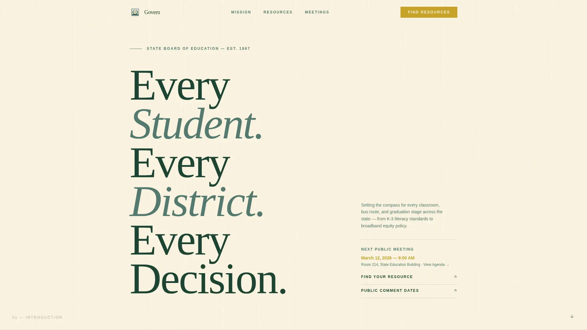
- A Giant Headline Left hero section with serif typography and an amber-highlighted meeting-date link
- An audience-selector resource hub with four filter buttons (Parent, Educator, Administrator, Student) that reveal relevant cards without a page reload
- A slim board-updates email signup form and a meeting transparency section listing upcoming dates, public-comment windows, and agenda links
Feature list
The Govern template is built around a set of purposeful, prompt-backed capabilities. Each one serves a real user need on a state education landing page.
Giant Headline Left Hero
The hero section leads with enormous serif type set in deep evergreen on birch cream. The headline acts as the visual anchor of the entire page, the way chiseled letters stand above a courthouse door. A single amber-colored meeting-date link sits beside it as the only active call to action in the opening view.
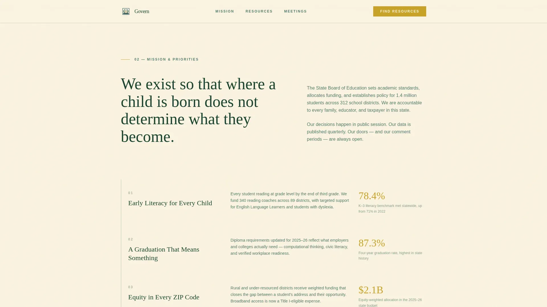
Mission and Strategic Priorities Section
After the hero, a plain-language mission statement sets the board's purpose clearly. The section then descends through strategic priorities in a claim-and-evidence rhythm, pairing each priority with a single supporting data point such as a graduation rate, a literacy benchmark, or a funding allocation figure. This pattern builds cumulative trust as the user scrolls.
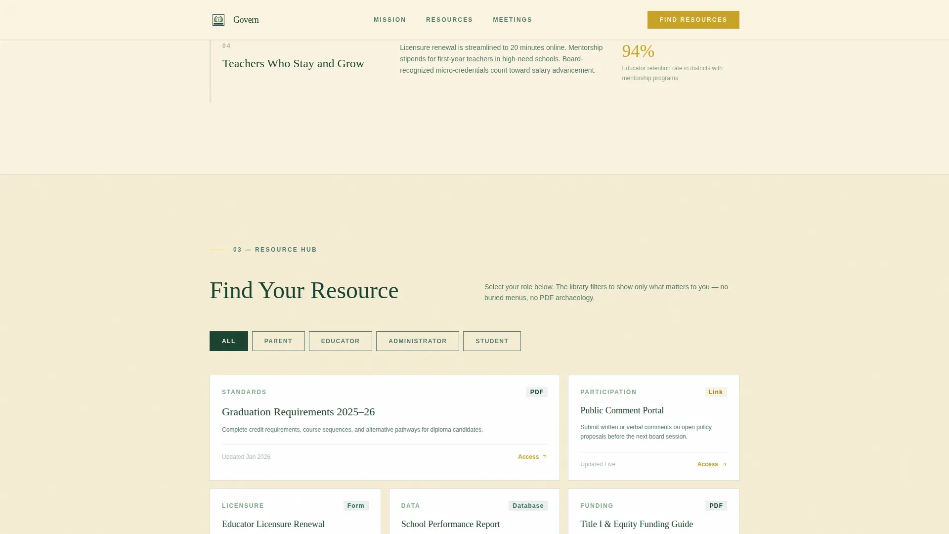
Audience-Filtered Resource Hub
The resource hub is the primary functional section of the page. Four labeled filter buttons (Parent, Educator, Administrator, Student) enable visitors to filter the resource library below. Each filtered view surfaces relevant cards linking to downloadable documents, policy databases, and meeting archives. No page reload is required, keeping the experience fast and direct.
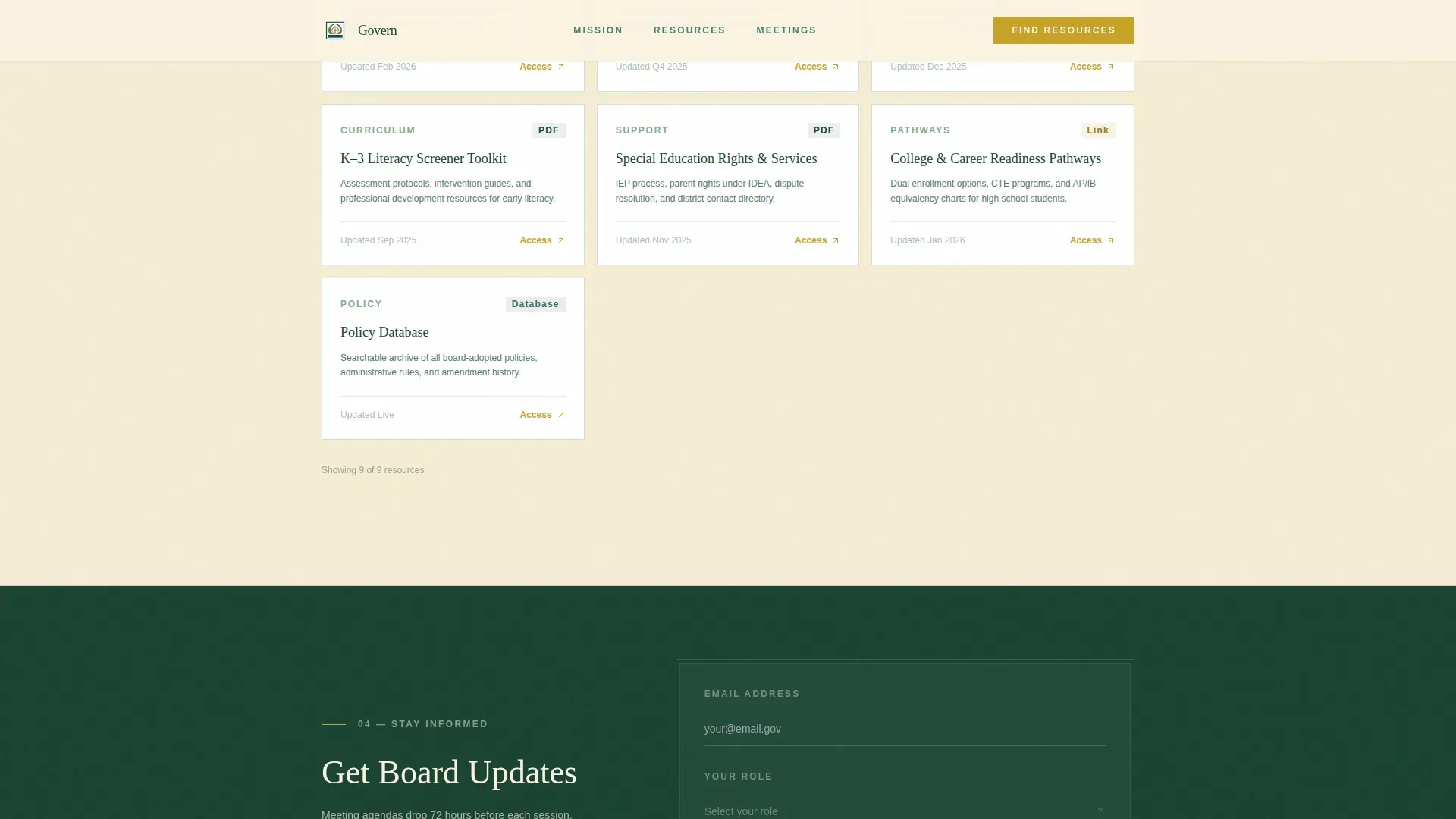
Board Updates Email Signup
A slim signup form placed after the resource hub asks only for an email address and a role selection from a dropdown. Positioned at that scroll depth, the form arrives after trust has already been established. Reducing form fields to just two keeps friction low and helps convert passive readers into active subscribers.
Meeting and Transparency Section
This section lists upcoming board meetings with public-comment dates and live agenda links. It answers the most time-sensitive questions families and community members bring to the site. The layout keeps dates and links visible at a glance, without burying them in a calendar widget or a secondary page.
Forest Trust Color and Typography System
Deep evergreen (#1B4332) anchors headers and navigation. Birch cream (#FAF3E0) keeps the background breathable for long-form reading. Moss stone (#52796F) guides secondary text and dividers. Amber (#C9A227) is reserved for action buttons and active-state highlights. Headlines use a civic serif typeface and body copy uses a clean sans-serif, balancing authority with readability.
Page sections overview
| Section | Purpose |
|---|---|
| Hero Headline Left | Establish civic authority and surface the next meeting date |
| Mission Statement | Communicate the board's purpose in plain, human language |
| Strategic Priorities | Present claim-and-evidence pairs with real data points |
| Resource Hub | Filter resources by audience role with no page reload |
| Email Signup Form | Capture board-update subscribers with minimal form friction |
| Meeting Transparency | List upcoming meetings, comment dates, and agenda links |
| Footer | Provide linear single-row navigation and contact information |
Design & branding system
The design follows a Community Hearth theme that feels like a well-maintained state park lodge: pine-paneled warmth, natural light, and a brass lamp left on for the late reader. Every color and type choice reinforces civic credibility without severity.
- Color system: deep evergreen for headers and navigation, birch cream as the dominant background, moss stone for secondary text and dividers, amber reserved for buttons and active highlights
- Typography: a civic serif typeface for headlines gives the page monumental weight, while a clean sans-serif body font keeps long-form content easy to read across every screen size
- The logo placement and clear authority identification follow standard patterns for government and public education websites, so visitors recognize the source of information immediately
Mobile & speed optimization
Over 60% of education website traffic often arrives from mobile devices, so this template is built with a responsive single-column layout that adapts cleanly from desktop to phone. A superintendent reviewing policy on a laptop at 11 p.m. and a parent on a phone after a town hall both get the same clear, readable experience.
- The single-column flow means no horizontal scrolling, no collapsed menus hiding critical links, and no layout breaks on smaller screens
- Staggered scroll-reveal animations and a minimal client-side component approach for the audience filter keep the page feeling active without adding unnecessary load
- The mobile app landing pattern of progressive content disclosure, where each section earns the next, works especially well on phone screens where attention is shorter
How this template helps you convert
An education landing page converts when it respects the visitor's time and removes every unnecessary step between arrival and action. Govern is structured to do exactly that.
- The audience-selector resource hub is the primary conversion path: visitors select their role, see immediately relevant resources, and complete their task without hunting through the site. This reduces friction for every school-year program cycle and supports enrolling visitors who need licensure or graduation information fast.
- The slim email signup form, placed after the resource hub when trust has already been built, uses low-friction design to convert readers into subscribers. Two fields only: email and role. No jargon, no wall of checkboxes, no buried submit button.
Other information about this template
This template is designed to serve the full scope of a state education department's public-facing needs. Several additional details are worth noting for teams evaluating it.
- The Govern trusted state education authority landing page template is built for the Government and Public category, specifically the State Board of Education niche, and is designed to meet the expectations of civic information portals
- The page is built on a platform-ready single-column structure using the template style "Single Column Flow," which enables teams to create a complete education website landing page without needing to plan multiple page builds
- The resource hub can support additional resources over time, including online course enrollment links, program registration details, and references to federal education policy context such as the Higher Education Act as amended by Congress and overseen at the federal level by the Secretary of Education
- The inquiry form and registration form placements follow established education landing page best practices: low field count, clear labels, and visible call-to-action buttons that do not rely on color alone to communicate purpose
- The template uses a testimonial-ready section structure and data-point pairing in the strategic priorities area, so teams can introduce outcome evidence, such as graduation rates, tuition assistance program details, or literacy benchmark success figures, without restructuring the layout
- Institutional credibility does the heavy lifting in building trust on education landing pages, and the logo placement, color contrast, and authority-first headline structure here are all oriented toward that goal
- The amber call-to-action color, applied to buttons and active links, helps visitors identify the next step immediately, reducing the risk of a confusing or engaging-but-directionless scroll experience
- The differences between this template and a generic education website template are meaningful: Govern is tuned for civic warmth, audience-role filtering, and transparent governance communication, not course sales or tuition comparison pages
- For teams that need to protect public access to policy documents and meeting records, the meeting transparency section and resource hub provide a clear, organized way to surface those documents without hiding them behind additional navigation layers
- Prices for use of this template are visible on the platform product page, and teams can refer to the full template tour for a live preview of every section and color in context
Theme
Community Hearth
Creative direction
Vision & Mission
Color system
Forest Trust
Style
Single Column Flow
Direction
Content/Resource
Page Sections
Giant Headline Left Hero Section
Audience-filtered Resource Hub
Mission and Strategic Priorities Block
Slim Board Updates Signup Form
Meeting and Transparency Section
Forest Trust Color and Type System
Related questions
Who is the primary audience for this template?
Can I use this template to create a filtered resource hub for different user roles?
Does this template include a form for collecting email subscribers?
Is this template suitable for displaying meeting dates and public-comment information?
How does the design system support a civic, trustworthy feel?


