Community Hearth Human Rights Direct Service Provider Landing Page
The Advocate Community Hearth Human Rights Direct Service Provider Landing Page Template is built for nonprofit legal aid and direct service organizations. It uses a warm Desert Rose color system, zigzag alternating sections, an origin story scroll, and two clear conversion paths to guide immigrants, domestic violence survivors, and community members toward help without hesitation.
by Rocket studio
Quick summary
This template gives human rights direct service organizations a ready-to-use landing page that feels like a warm, trusted community space. It pairs a Half-Page Photo and Text hero with an Origin Story scroll, zigzag alternating sections, a persistent call-to-action bar, and a Desert Rose color system that is grounded, readable, and quietly defiant. The primary goal is click-through to an intake or services page.
Who this template is for
This template is built for organizations that show up for people when the stakes are highest. It is specifically shaped for providers who serve communities facing legal, health, and safety concerns at the intersection of immigration, housing, and civil rights. If your work involves direct support for people navigating complex systems, this layout gives you the structure to present that work with clarity and warmth.
It suits organizations and teams who:
- Run a community-based legal aid or human rights direct service office serving immigrants, domestic violence survivors, or people with disabilities
- Need to present multiple service programs in one place without overwhelming first-time visitors on a phone in a waiting room or shelter
- Want to recruit donors and volunteers alongside serving clients, using two separate but visible conversion paths on the same page
What problem this template solves
Most nonprofit landing pages either feel transactional and cold or so emotionally dense that visitors cannot find the action they need to take. For a human rights direct service provider, that failure has real consequences. A person who needs help should never leave a page more confused than when they arrived.
This template solves four problems at once:
- It removes friction for first-contact visitors by placing the primary "Find Help Now" call to action above the fold and again as a persistent bottom bar, so someone on a phone in a shelter can always find the door
- It builds trust gradually through an Origin Story structure that reveals the organization's history, its people in motion, and real anonymized client voices instead of generic program descriptions
- It separates the donor and volunteer path from the help-seeking path without hiding either, so every visitor finds a way to be involved that matches their situation
What you get with this template
You get a single-page layout with five clearly defined sections, each designed to accumulate trust one scroll at a time. The design is mobile-first and built for people who may be accessing the page on an older phone with a slow connection. Every component is intentional, from the waist-height hero photograph framing to the persistent magenta call-to-action bar that never disappears after the second section.
Included in this template:
- A Half-Page Photo and Text hero with a headline slot, a terracotta accent sentence for local impact stats, and the primary "Find Help Now" button in prickly pear magenta
- Five section blocks in zigzag alternating layout covering the hero, the origin story, the services with anonymized client voice quotes, the team in motion, and a community impact stats bar with a persistent bottom call-to-action bar
- A two-path conversion system with a primary magenta button for people seeking help and a secondary terracotta text link for donors and volunteers
Feature list
This template ships with a specific set of design and layout features drawn directly from the project brief. Each one serves the primary goal of helping visitors trust the organization and take action.
Zigzag Alternating Section Layout
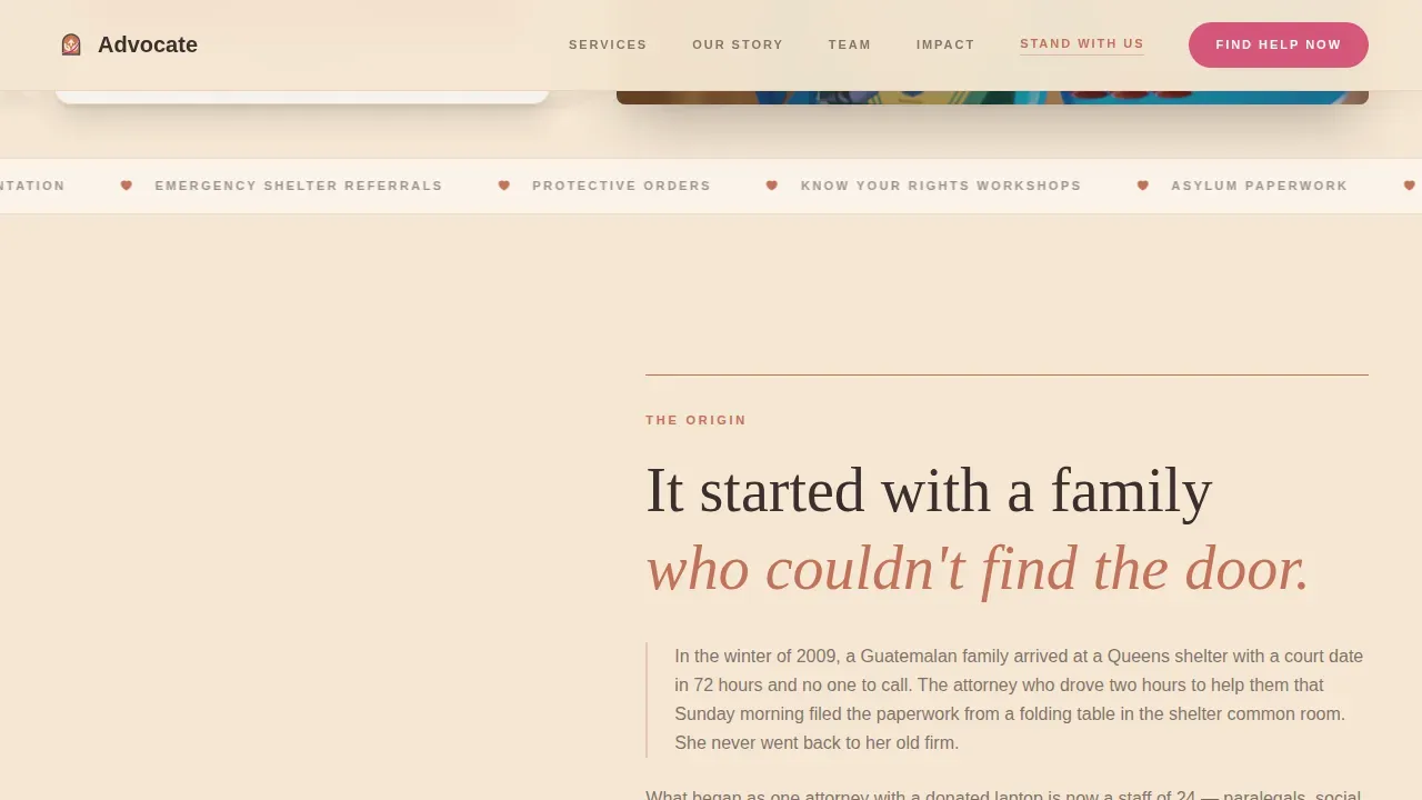
The page is built on a zigzag alternating structure where content and imagery switch sides with each new section. This rhythm creates a natural reading flow that keeps visitors engaged as they scroll. It also allows each section to stand on its own visually, which matters when visitors arrive mid-page from a shared link. The alternating layout is especially effective for the Origin Story scroll, where each section adds a new layer of organizational credibility.
Half-Page Photo and Text Hero
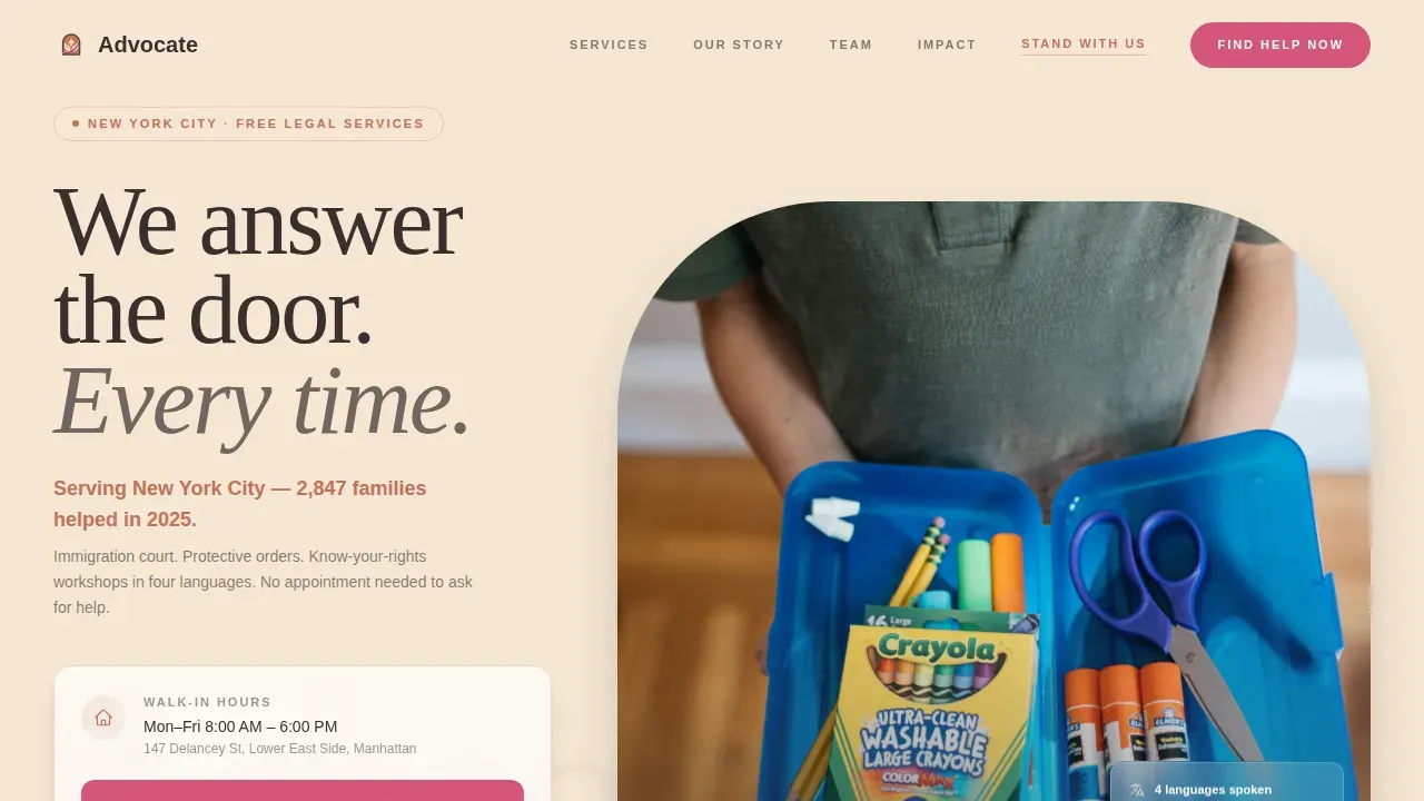
The hero splits the screen into two equal halves. The left side holds a photograph taken at waist height, a child's-eye perspective showing hands across a desk, intake forms, and a box of crayons. No faces appear, protecting client privacy while evoking immediate human warmth. The right side carries the headline in mesquite charcoal and a single terracotta sentence naming the city and the number of people served last year. This specific, real number builds trust immediately and sets the tone for everything that follows.
Origin Story Scroll with Client Voice Quotes
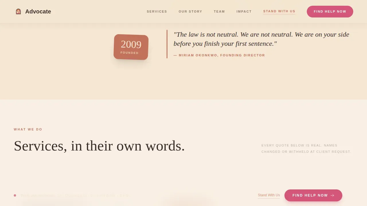
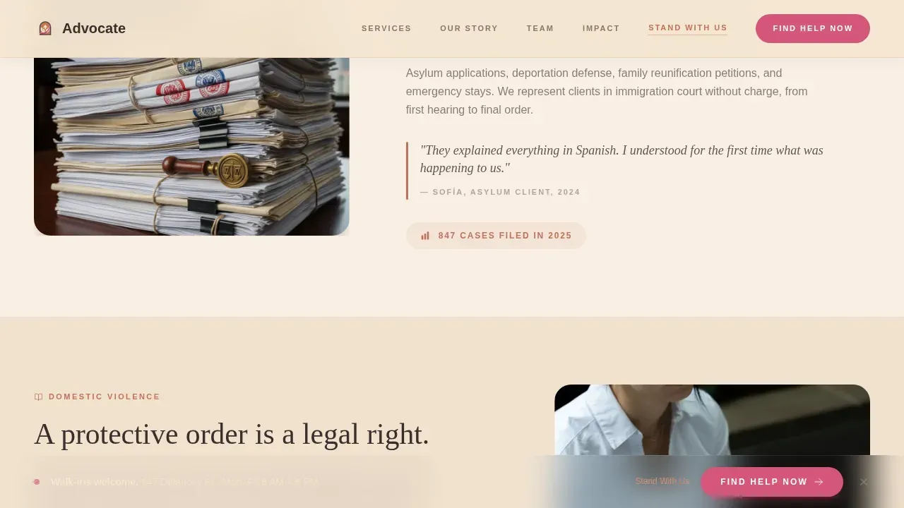
The second and third zigzag sections carry the organization's founding moment and its current services. The founding section names a specific year and a specific injustice. The services section presents each program not through icons or bullet points but through a single anonymized and translated sentence from a real client. This approach to personal stories grounds the page in lived experience rather than institutional language, which is particularly important for visitors who may be in crisis or unfamiliar with legal aid organizations.
Team in Motion Photography Blocks
The fourth section features staff photographed not in formal portraits but in action: mid-conversation, carrying file boxes, unlocking the front door at seven in the morning. This approach is intentional. It communicates that real people are present, working, and ready. It also reinforces the Origin Story direction by showing the human machinery behind the mission rather than a polished organizational facade.
Persistent Bottom Call-to-Action Bar
After the second section, a persistent bottom bar appears and stays visible for the rest of the scroll. It carries the "Find Help Now" button in prickly pear magenta. This means that no matter where a visitor pauses to read, the path to help is always one tap away. For someone accessing the page on a phone in a shelter or waiting room, this removes a critical barrier to taking the first step.
Two-Path Conversion System
The template includes two clearly separated conversion paths. The primary path is the "Find Help Now" button in prickly pear magenta, which drives visitors to the intake or services page. The secondary path is a "Stand With Us" text link in terracotta, styled to be visible without competing with the primary action. This allows organizations to serve help-seekers and recruit supporters on the same page without confusing either audience.
Page sections overview
| Section | Purpose |
|---|---|
| Hero Photo Split | Introduces mission with waist-height photo, headline, local impact stat, and primary call to action |
| Origin Story Block | Tells the founding moment with a specific year and injustice that opened the first office |
| Services with Voices | Presents three service areas using a single anonymized client quote per service |
| Team in Motion | Shows staff working in real moments to build human credibility |
| Community Impact Bar | Displays impact stats and activates the persistent bottom call-to-action bar |
| Footer Row | Single linear footer with navigation, contact, and secondary links |
Design & branding system
The Desert Rose color system gives this template its character. It is warm without being soft, and grounded without being heavy. The palette draws from sun-baked clay, dried flowers on a windowsill, and the afternoon light that hits adobe walls in the late afternoon. Every color has a defined role, and nothing competes for attention except the magenta, which is reserved exclusively for urgent action.
The design system includes:
- Four-color Desert Rose palette: adobe wall cream (#F5E6D3) for backgrounds, sun-warmed terracotta (#C2725A) for section dividers and pull quotes, mesquite charcoal (#3B2F2F) for body text and headlines, and prickly pear magenta (#D4567A) exclusively for buttons and urgent callouts
- Fraunces serif for headlines and Danila DM Sans for body text, creating a pairing that feels literary and warm but never precious or inaccessible
- Cream-dominant backgrounds, terracotta anchors at section breaks, charcoal body text with enough weight to feel serious without feeling severe
Mobile & speed optimization
This template is built mobile-first because its intended users are most likely to arrive on a phone. A recently arrived family reviewing their options, a domestic violence survivor in a shelter, or a community organizer sending a link from a street corner are all more likely to be on a mobile device than at a desktop computer. The layout reflects that reality in every structural decision.
Key mobile and speed considerations include:
- Scroll-reveal animations built with Intersection Observer so content fades in naturally without blocking the page load or delaying the first meaningful paint
- Staggered fade-ins, parallax on the hero image, and a marquee element are implemented through native CSS and JavaScript, keeping the animation layer lightweight and the page responsive on older devices
- The persistent bottom call-to-action bar is specifically sized and positioned for thumb reach on a phone screen, so the primary action is always accessible without stretching or zooming
How this template helps you convert
This template earns its clicks through the quiet accumulation of proof rather than pressure tactics. Each section adds one more reason to trust the organization before asking for anything. The conversion architecture is deliberate and layered, not aggressive.
- The hero places the primary "Find Help Now" call to action above the fold in prickly pear magenta, so someone who already knows what they need can act immediately without scrolling. This satisfies the best practice of placing a single dominant button above the fold.
- The Origin Story, client voice quotes, and team in motion sections build credibility section by section. Each scroll deepens the visitor's confidence that the organization is real, present, and already doing the work. By the time the persistent bottom bar appears after the second section, the visitor has enough context to act with confidence rather than hesitation.
Other information about this template
This template was designed at the intersection of direct service delivery and community advocacy. It reflects practices that human rights and disability services organizations have developed over decades of front-line work. The following context is useful for organizations evaluating whether this template fits their mission and audience.
- Home and Community-Based Services (HCBS) providers and direct support professionals who need to communicate their service offerings to family members and case managers will find this layout adaptable for their programs. Home and community based care organizations can use the services section to describe community based services in plain language, helping visitors understand the difference between in-person and remote support options.
- The settings rule under HCBS guidelines requires that services be delivered in home and community based settings rather than institutional ones. Organizations addressing this requirement can use the origin story and services sections to explain their community based services model and the philosophy behind it, giving providers, case managers, and participants a better understanding of what to expect.
- Community based services HCBS programs serve a wide range of populations, including people with physical disabilities, cognitive disabilities, and serious mental health needs. The services section of this template can present each program with a client voice quote that speaks directly to lived experience, which helps visitors self-identify as eligible and feel safe enough to make contact.
- Direct support professionals, case managers, and HCBS providers who want to communicate training resources, technical assistance offerings, or know-your-rights education will find the zigzag layout effective for presenting each resource category as its own moment in the scroll rather than a list item buried in a block of text.
- The template supports organizations that want to communicate the importance of mental health services, disability services, and employment support alongside legal aid. The community impact stats bar can display numbers across multiple program areas, giving donors and community members a full picture of how the organization serves its neighbors.
- Organizations working on advocacy for people with disabilities will find the two-path conversion system useful for separating help-seekers from supporters. The Americans with Disabilities Act (ADA) prohibits discrimination in employment and public accommodations, and advocacy organizations that want to speak clearly about those rights can use the origin story and services sections to frame that message with specificity and warmth.
- The template is suited to organizations that want to document their advocacy efforts and provide answers to common questions through the visible structure of the page. A visitor who may be unable to make a phone call can find enough information about services through the page itself to decide whether to reach out.
- Advocacy groups addressing concerns at local, state, and national levels can adapt the community impact section to present their reach and their plan for future work, giving donors and community members a sense of where the organization is headed and why their involvement matters.
- This template is categorized under Community and Nonprofit with a subcategory of Human Rights Nonprofit. It is the advocate community hearth human rights direct service provider landing page template in the Advocate series, built specifically for organizations in the Human Rights Direct Service Provider niche.
Theme
Community Hearth
Creative direction
Origin Story
Color system
Desert Rose
Style
Zigzag/Alternating
Direction
Click-Through
Page Sections
Zigzag Alternating Layout with Origin Story Scroll
Half-page Photo and Text Hero
Anonymized Client Voice Quotes in Services Section
Persistent Bottom Call-to-action Bar
Two-path Conversion System
Desert Rose Color System with Defined Role Palette
Related questions
Can this template be used for organizations that serve people with disabilities?
Is this template designed for mobile users?
How does the two-path conversion system work?
Can I adapt the origin story section to fit a different founding narrative?
Does this template include sections for service descriptions and impact stats?


