Elder Care Marketing Agency Website Template
Advocate is a bold brutalist bento grid landing page built for digital agencies that design websites exclusively for senior care communities. It speaks directly to marketing directors, owners, and regional operators who need to turn an outdated web presence into a high-performing front door. The template uses a cinematic scroll sequence, a structured lead capture form, and an Electric Indigo palette to convert B2B visitors into booked consultations.
by Rocket studio
Quick summary
Advocate is a single-page bento grid landing page designed for a senior care web design agency. It leads with an architectural headline, walks visitors through a cinematic three-act scroll sequence, and closes with a dual-path conversion structure. The template is built for B2B audiences and uses a bold brutalist visual identity to project authority and trust.
Who this template is for
This template is built for digital agencies that serve senior living communities and want a landing page that earns partnership inquiries rather than casual clicks. It is designed for teams pitching to sophisticated buyers who vet vendors carefully before committing.
- Senior care web design agencies targeting marketing directors at multi-facility networks
- Boutique agency founders positioning themselves against generic website builders
- Regional operators and growth-stage agencies expanding into assisted living or memory care markets
What problem this template solves
Senior care marketing decision-makers see dozens of agency pitches. A generic portfolio page does not cut through. Advocate solves the credibility gap by showing the problem first, proving the transformation second, and making the ask feel like a professional invitation rather than a cold sales move.
- Agencies lose warm leads because their own site does not reflect the quality they promise clients
- Prospects need social proof and clear metrics before booking a discovery call
- Standard portfolio templates lack the structure to walk a B2B buyer through a full narrative arc
What you get with this template
You get a fully structured single-page layout organized around a cinematic scroll experience. Every section has a defined job, and the conversion architecture is already in place so you can customize content without rethinking the strategy.
- A three-act bento grid sequence covering problem, transformation, and results
- Two distinct conversion paths: a full portfolio walk-through request form and a gated PDF checklist download
- An Electric Indigo brutalist design system with deliberate color roles and no decorative filler
Feature list
This template ships with a focused set of components built specifically for B2B agency positioning in the senior care niche.
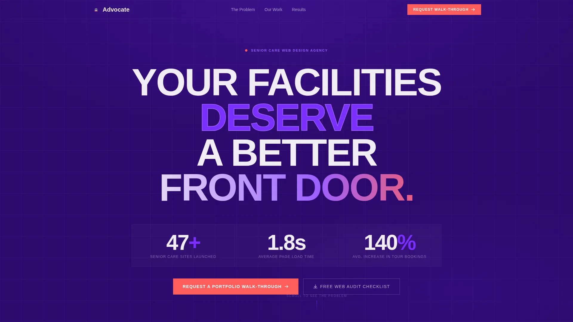
Giant Headline Header Block
The header opens with enormous, weight-stacked brutalist sans-serif type reading "YOUR FACILITIES DESERVE A BETTER FRONT DOOR" set against a flat indigo background. No hero image, no subhead for a full beat. A single line fades in beneath the headline showing the agency's launched site count, average load time, and average increase in tour bookings.
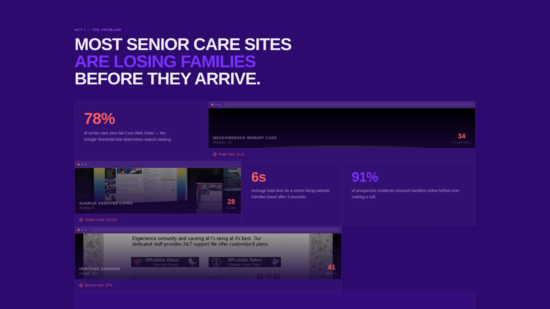
Cinematic Bento Grid Scroll Sequence
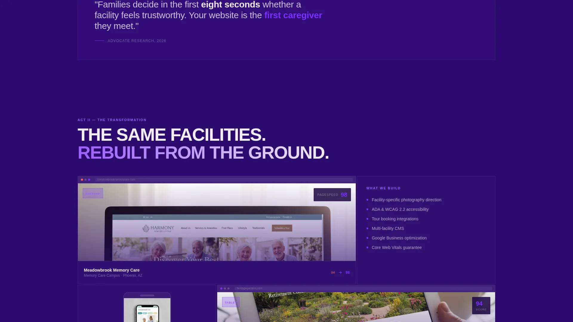
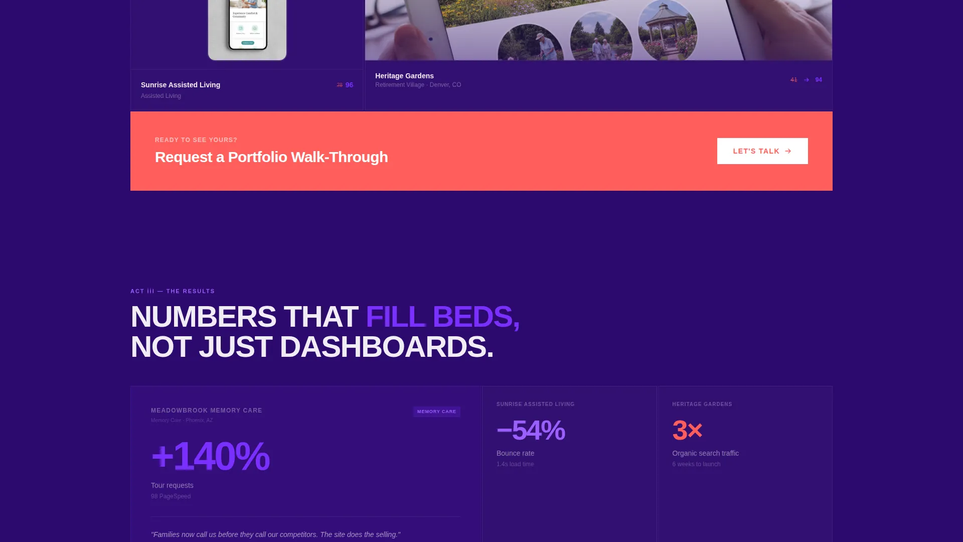
Scrolling triggers a slow, deliberate reveal of bento grid tiles that populate like scenes in a film. The first act surfaces screenshots of broken senior care sites with audit scores overlaid. The second act shows redesigned versions across mobile, tablet, and desktop viewports. The third act transforms tiles into data cards, each pairing a facility name with a single standout metric.
Dual-Path Lead Capture System
The primary call to action, "Request a Portfolio Walk-Through," appears pinned at the grid's midpoint and again at the base of the page. A secondary path offers a gated PDF download titled "Download the Senior Care Web Audit Checklist," capturing only email and organization name for leads not yet ready to talk.
Role-Segmented Contact Form
The portfolio walk-through form collects facility count, current website URL, and a role selector with three options: marketing director, owner/operator, and regional VP. This segmentation lets the agency route and prioritize leads without a follow-up qualification call.
Results-Driven Data Tile Layer
The third act of the bento sequence replaces visual redesigns with data cards. Each card carries a real facility name and a single concrete metric, such as tour requests up 140 percent, bounce rate halved, or page speed score of 98. The data layer builds trust through specificity rather than general claims.
Dynamic Tile Weight and Scale Shifts
As new rows of the bento grid enter the viewport during scroll, tiles shift weight and scale to give the layout a rhythmic pulse. The grid never feels static. This motion reinforces the cinematic pacing of the page without relying on decorative animation.
Page sections overview
| Section | Purpose |
|---|---|
| Giant Headline Header | Opens with bold architectural type and fades in a single line of agency proof metrics |
| Problem Act Tiles | Shows screenshots of underperforming senior care sites with audit score overlays |
| Transformation Act Tiles | Displays the same facilities redesigned across mobile, tablet, and desktop viewports |
| Results Data Cards | Pairs facility names with single concrete performance metrics to prove impact |
| Portfolio call to action Block (mid) | Pins the primary call to action at the grid's midpoint to capture mid-scroll intent |
| Checklist Download Path | Offers a gated PDF lead magnet for visitors not yet ready to request a consultation |
| Portfolio call to action Block (base) | Repeats the primary call to action at the page base to close the narrative arc |
Design & branding system
The Advocate template follows a Bold Brutalist theme using an Electric Indigo color system. Every color in the palette has a single assigned role. Nothing is decorative, and warmth arrives through contrast and light rather than softness or gradients.
- Deep structural indigo (#2D0A6E) as the primary background, charged violet (#7B2FFF) on hover states and interactive tiles, and clinical white (#F0EDF5) for card surfaces and body typography
- A single spark of electric coral (#FF5E5B) reserved exclusively for call-to-action elements, ensuring those buttons never compete with surrounding content
- Enormous brutalist sans-serif type stacked with architectural weight, giving the layout the visual density of poured concrete paired with the warmth of a sunlit courtyard
Mobile & speed optimization
The bento grid layout is structured to perform across device sizes. The cinematic scroll sequence and tile-based layout are designed with viewport-aware proportions so the experience holds on smaller screens without collapsing into a list.
- The header loads as flat indigo type with no heavy image assets, keeping first-paint weight low
- Bento grid tiles are sized and spaced to remain readable and tappable on mobile viewports
- The dual-path conversion forms are compact by design, asking only for the fields necessary to qualify or capture a lead
How this template helps you convert
The page is engineered around a B2B buyer's natural decision journey. It earns trust before it makes an ask, and it offers two exits so no qualified visitor leaves empty-handed.
- The three-act cinematic sequence moves visitors from recognizing the problem to seeing proof of the fix, building purchase confidence before the first call to action appears.
- The pinned mid-page and base-page call-to-action blocks catch visitors at peak intent moments, while the secondary checklist download path captures email addresses from leads who need more time before committing to a consultation.
Other information about this template
This template is part of the Advocate series and is specifically positioned for the senior care web design agency niche. It sits within the Portfolio and Agency category on the marketplace.
- The template style is Bento Grid, the theme is Bold Brutalist, and the creative direction is Cinematic Sequence, all matching the intersection context fields provided for this release
- The landing page direction is Partnership/B2B, meaning the layout prioritizes lead qualification and relationship-building over transactional or e-commerce conversion patterns
- The header concept is Giant Headline Centered, which is a deliberate structural choice to project authority and stop scroll immediately on page load
Theme
Bold Brutalist
Creative direction
Cinematic Sequence
Color system
Electric Indigo
Style
Bento Grid
Direction
Partnership/B2B
Page Sections
Giant Headline Header Block
Cinematic Three-act Bento Grid
Dual-path Lead Capture System
Role-segmented Contact Form
Results Data Tile Layer
Dynamic Tile Scale and Weight Shifts
Related questions
Who is this landing page template designed for?
Can I adapt the form fields to match my own intake process?
Does the template include the actual bento grid animations?
Is this template suitable for a single-facility senior care home?
What makes the dual-path conversion approach effective?


