Nonprofit Marketing Agency Landing Page Template
Advocate is a nonprofit PR agency landing page template built on an overlap and layered layout. It uses a darkroom-inspired Monochrome Steel palette, floating documentary photography, and a Gallery Walk scroll experience to show outcomes before asking for anything. The lead generation flow guides visitors through three proof-filled rooms and ends with a focused contact form.
by Rocket studio
Quick summary
Advocate is a single-page template for nonprofit PR agencies that need to earn trust fast. The layout layers documentary images, impact metrics, and editorial typography into a darkroom-inspired scroll. Visitors move through three distinct gallery rooms, each adding another layer of proof, before reaching a lead generation form that feels like a natural next step.
Who this template is for
This template is built for communications professionals who serve nonprofits and social-sector organizations. It speaks directly to the work of turning a mission into a media story.
- Nonprofit PR agency founders and strategists pitching earned media services
- Development officers preparing for capital campaign launches who need a polished first impression
- Coalition leaders and policy advocates who want their story to land with funders or legislators
What problem this template solves
Most agency landing pages lead with credentials and bury the proof. Nonprofit clients visit with skepticism and a tight budget, so they need to see results before they trust anyone. This template fixes that by front-loading outcomes and letting the design itself communicate editorial authority.
- Visitors see impact metrics and case study proof before any form appears
- The layered scroll experience builds credibility room by room, reducing early bounce
- The dual conversion path catches both ready-to-talk visitors and research-phase visitors
What you get with this template
The template delivers a fully structured, single-page layout with distinct visual sections, a branded contact modal, and a secondary lead capture path. Every component is intentional and directly tied to the brief.
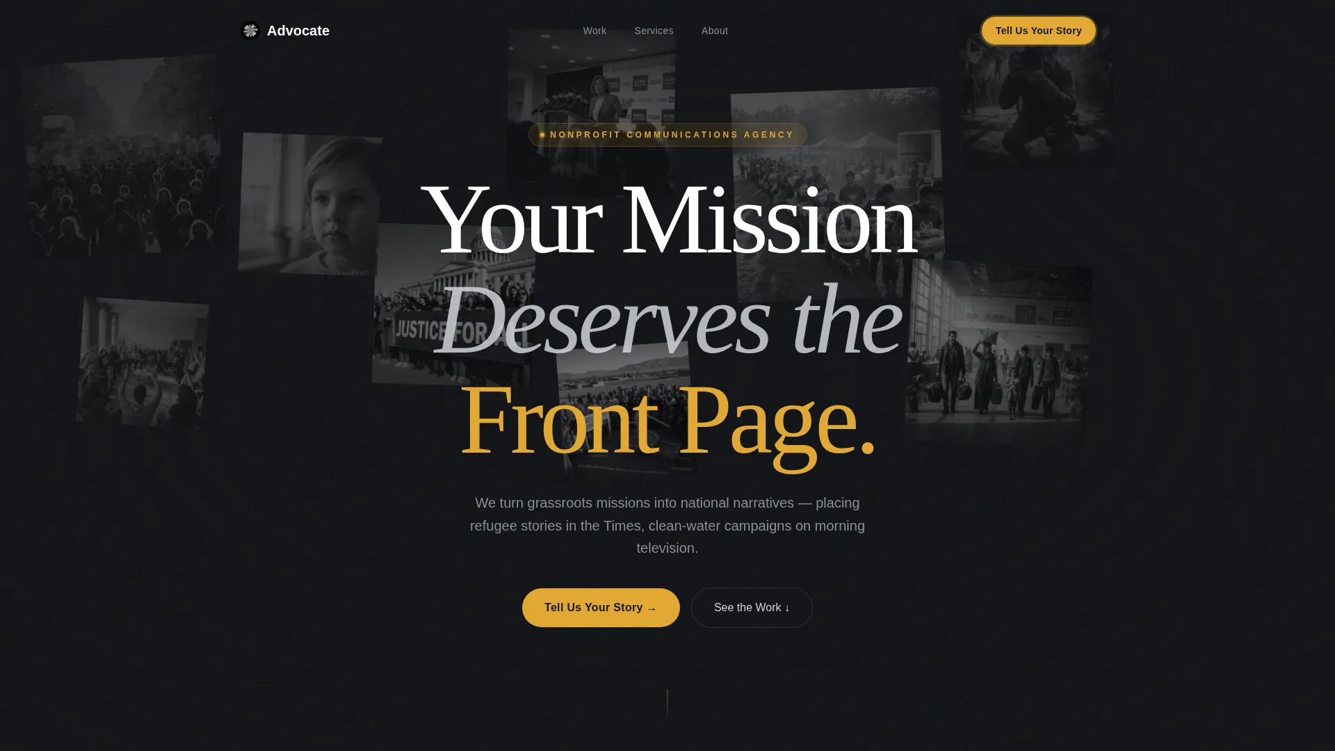
- A floating documentary photo header with soft parallax depth and condensed serif headline
- Three layered gallery rooms with expanding imagery, floating metric cards, quote overlays, and a before-and-after media landscape panel
- A persistent amber call-to-action pill in the nav, a full-width call to action section, a three-field contact modal, and a gated downloadable case study path
Feature list
A paragraph introduction to the features: every capability listed below comes directly from the template brief and reflects what the layout is built to do.
Floating Photo Header
Eight to ten black-and-white documentary images sit at varying scales and slight rotations, layered over one another. As the visitor scrolls, soft parallax depth makes the images drift gently, as though pinned to an invisible wall. The headline threads between the images like a gallery wall label.
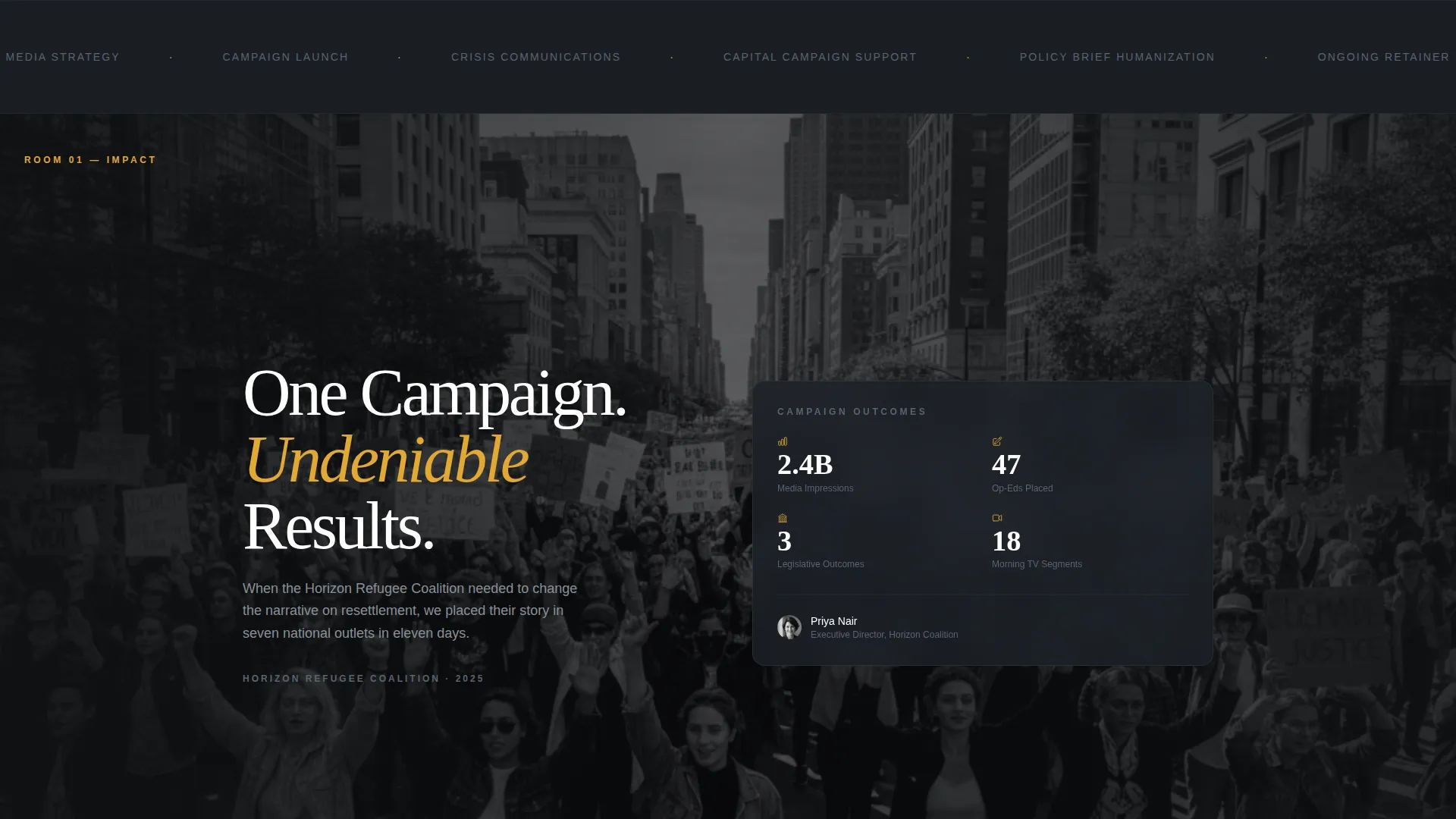
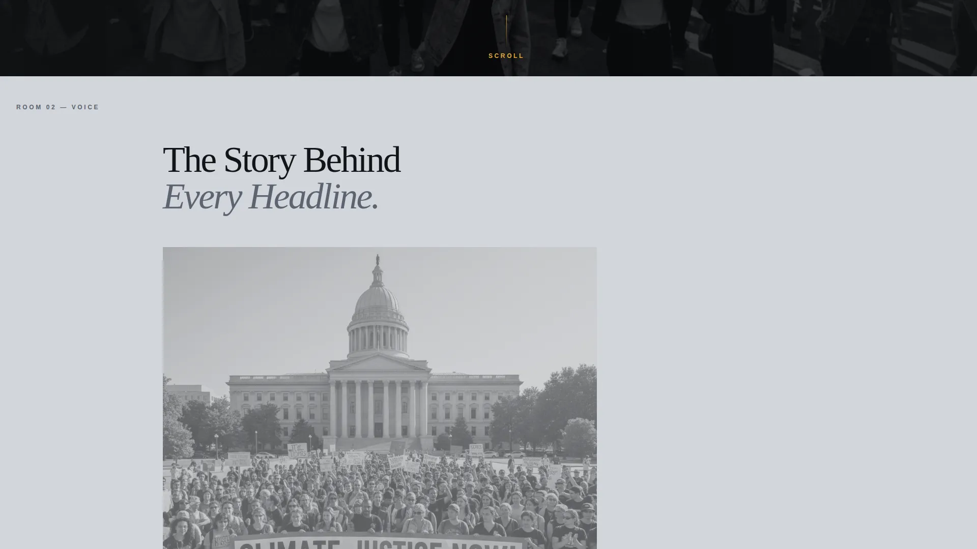
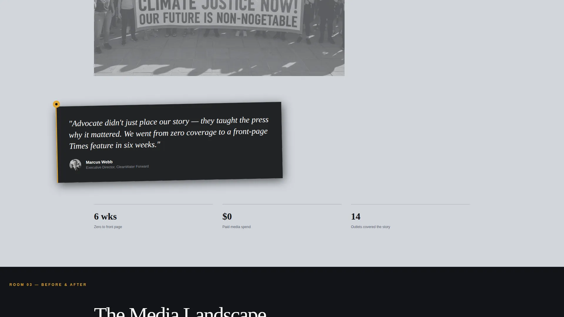
Gallery Walk Scroll Rooms
The page is divided into three scroll rooms. Each room lets content planes slide over and under each other as new material surfaces. Room one expands a campaign image to full bleed with floating metric cards. Room two brings a rotated quote from a nonprofit executive director over the receding image. Room three presents a before-and-after media landscape with coverage logos stacking on the right.
Persistent Amber Call-to-Action
The primary call-to-action, labeled "Tell Us Your Story," appears first as an amber pill in the top navigation. It reappears as a full-width section after the third gallery room. The amber accent migrates down the page like a guide light, always marking the next interactive moment.
Overlapping Contact Modal
Clicking the primary call-to-action opens an on-brand modal form. The form presents three fields in sequence: organization name, a dropdown for engagement type, and a short text area labeled "What does the world need to know?" The modal stays within the Monochrome Steel visual identity throughout.
Gated Case Study Download
A secondary conversion path offers a downloadable case study PDF gated behind a single email field. This path is designed to capture visitors who want more proof before committing to a conversation. It widens the top of the lead funnel without distracting from the primary call to action.
Translucent Metric Cards
Impact figures such as media impressions, op-eds placed, and legislative outcomes float above full-bleed imagery on translucent steel cards. The cards keep data readable without obscuring the photography underneath, reinforcing the editorial tone of the entire page.
Page sections overview
| Section | Purpose |
|---|---|
| Floating Photo Header | Establishes editorial identity and hooks attention with layered documentary images |
| Top Navigation Bar | Houses the persistent amber "Tell Us Your Story" pill call to action |
| Gallery Room One | Expands a campaign image to full bleed and surfaces key impact metrics |
| Gallery Room Two | Overlays a rotated nonprofit ED quote over the receding campaign image |
| Gallery Room Three | Shows the before-and-after media landscape with stacking coverage logos |
| Full-Width call to action Section | Delivers the primary lead generation prompt after three rooms of proof |
| Contact Modal Form | Captures organization name, engagement type, and mission brief in sequence |
| Case Study Download Gate | Secondary email capture for visitors not yet ready to start a conversation |
Design & branding system
The visual identity follows a Lens and Frame theme built on a Monochrome Steel color system. The palette references a photojournalist's proof sheet on a steel light table: cool, editorial, and stripped of decoration.
- Colors: deep darkroom black (#121417) and silver gelatin (#D1D5DB) alternate as section backgrounds; brushed gunmetal (#5C6370) carries body text; contact-sheet amber (#E2A832) is reserved exclusively for calls to action and hover states
- Typography: a tall, condensed serif headline knocks out in pure white against black; body copy stays in gunmetal for legibility and restraint
- Imagery: black-and-white documentary photography throughout, with no frame borders and no grid, letting overlapping prints carry the visual weight
Mobile & speed optimization
The overlap and layered layout is designed to translate the Gallery Walk experience across screen sizes without losing its editorial depth. Key visual moments are preserved on smaller viewports.
- Floating photo layers and parallax depth are structured to remain legible and visually distinct on mobile screens
- Translucent metric cards and quote overlays are positioned so they do not obscure critical content on narrow viewports
- The contact modal and gated download path are accessible from any screen size, keeping both conversion paths open on mobile
How this template helps you convert
The page earns the click by showing outcomes before asking for anything. By the time the call to action appears, the visitor has already walked through three walls of undeniable results.
- The Gallery Walk builds trust room by room, so visitors arrive at the call to action already convinced rather than skeptical
- The dual conversion path serves both ready-to-engage visitors and research-phase visitors, capturing leads at two different levels of intent
Other information about this template
This template is categorized under Portfolio and Agency, with a specific focus on Nonprofit Marketing and Agency work. It is well suited to any nonprofit PR agency that wants its landing page to feel like a curated editorial exhibition rather than a standard services page.
- The template style is Overlap and Layered, making it distinct from flat or card-grid agency layouts
- The creative direction is Gallery Walk, a scroll storytelling approach where each section deepens the evidence
- The header concept is Floating Photos, a constellation of documentary images at varying scales with soft parallax behavior
- The primary direction is Lead Generation, with the page architecture built around showing proof first and prompting action second
- The Lens and Frame theme and Monochrome Steel color system give the template a photojournalist aesthetic that feels native to the earned media space
Theme
Lens & Frame
Creative direction
Gallery Walk
Color system
Monochrome Steel
Style
Overlap/Layered
Direction
Lead Generation
Page Sections
Floating Documentary Photo Header
Three-room Gallery Walk Scroll
Persistent Amber Call to Action Pill
On-brand Overlapping Contact Modal
Gated Case Study Download Path
Translucent Impact Metric Cards
Related questions
Who is this landing page template designed for?
Can I customize the gallery room content and impact metrics?
What does the contact modal form collect from visitors?
How does the secondary case study download path work?
Is the amber accent color used throughout the whole page?


