In-Home Services
Advocate is a sidebar companion landing page for home health agencies. It pairs a low-friction three-step intake form with an educational scroll experience built for adult children researching care for an aging parent. Forest Trust colors, stats-first typography, and a persistent sidebar keep visitors oriented and moving toward a qualified care inquiry.
by Rocket studio
Quick summary
Advocate is a single-page template designed for home health agencies. It combines a guided multi-step form with a chapter-marked sidebar and a scroll experience that leads with large, trust-building statistics. The layout speaks directly to adult children making long-distance care decisions, turning anxious late-night research sessions into a clear next step.
Who this template is for
This template is built for home health agencies that serve adult children managing care for aging parents from a distance. It fits teams who want to generate qualified inquiries without overwhelming visitors with intake forms or pricing tables upfront.
- Home health agencies offering certified aide and registered nurse services
- Agencies targeting adult children in their 40s and 50s as primary decision-makers
- Organizations focused on Medicare-covered skilled nursing and daily living support
What problem this template solves
Adult children researching home care are anxious, time-pressed, and often unsure what questions to even ask. Generic agency websites greet them with phone numbers and brochure copy that feels cold and institutional. This template fixes that.
- Removes the pressure of a full intake form by breaking the process into three low-friction steps
- Replaces clinical jargon with a warm, educational tone that builds trust before asking for a commitment
- Gives remote caregivers a clear sense of where they are and what comes next through persistent sidebar chapter markers
What you get with this template
You get a complete, ready-to-customize landing page that balances emotional resonance with practical structure. Every section earns its place by serving the visitor before asking anything of them.
- A multi-step form header with illustrated icon-card choices and a sidebar progress label
- Five structured scroll sections, each opening with a typographically dominant statistic
- A floating sidebar with chapter markers, a trust badge, a care advisor call-to-action, and a click-to-call number
Feature list
This template ships with a focused set of components that work together to guide anxious visitors toward a confident care decision.
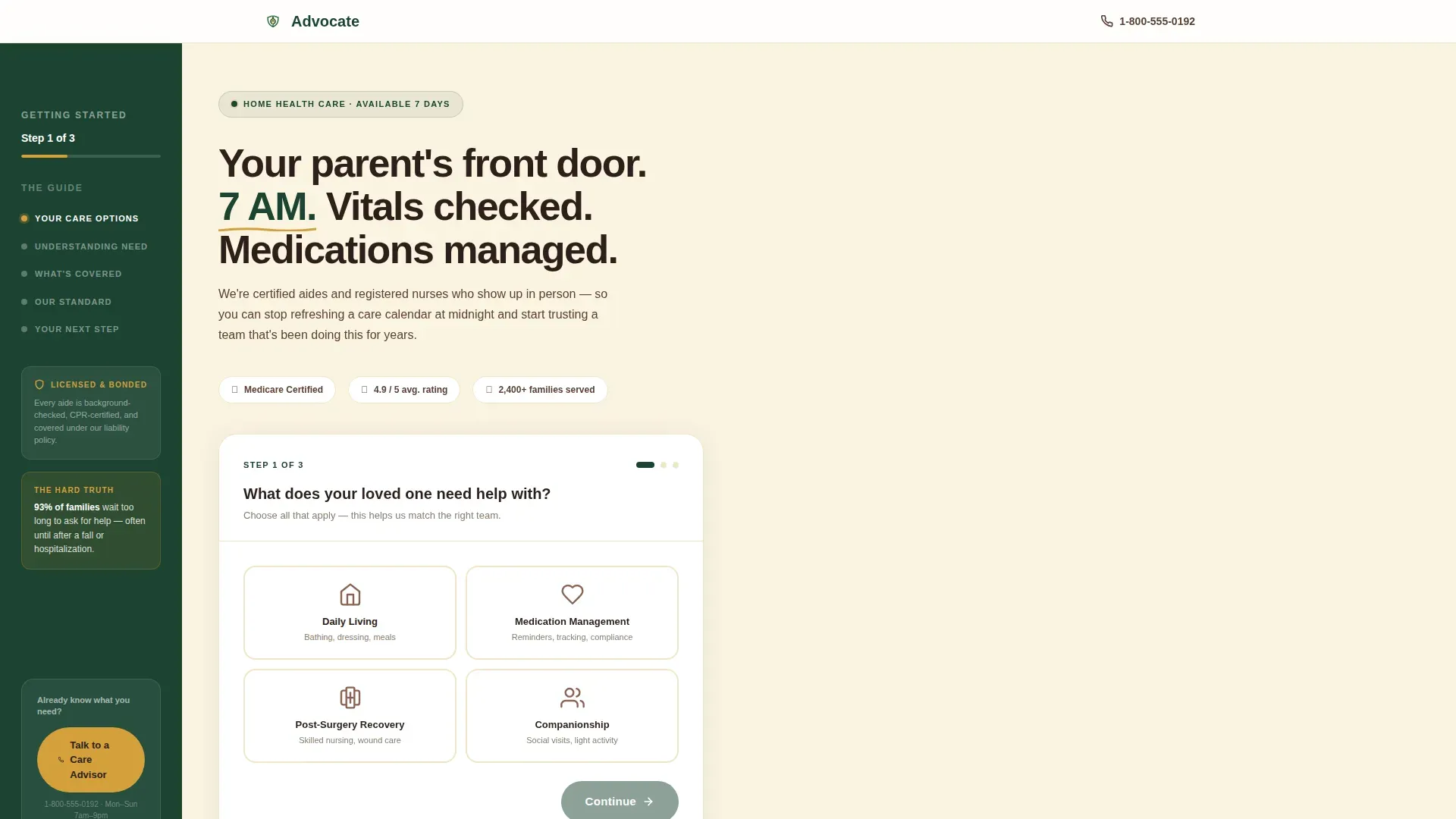
Multi-Step Intake Form
The header form opens with a single illustrated question: "What does your loved one need help with?" Visitors choose from four icon-card options: Daily Living, Medication Management, Post-Surgery Recovery, and Companionship. Steps two and three collect zip code and preferred start window. No email field or last name appears until after the form is complete.
Persistent Sidebar with Chapter Markers
The sidebar runs the full length of the page and displays four chapter markers: Understanding Need, What's Covered, Our Standard, and Your Next Step. A quiet progress label at the top reads "Step 1 of 3" during the form. A floating secondary call-to-action at the bottom lets ready visitors tap straight to a care advisor.
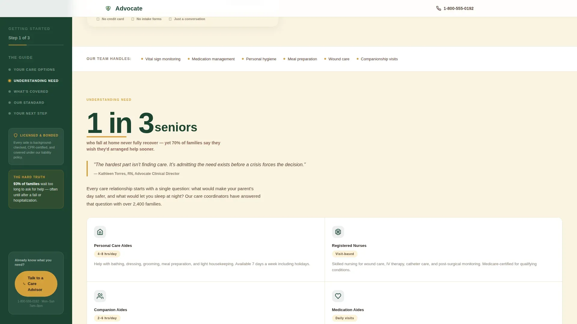
Stats-First Scroll Sections
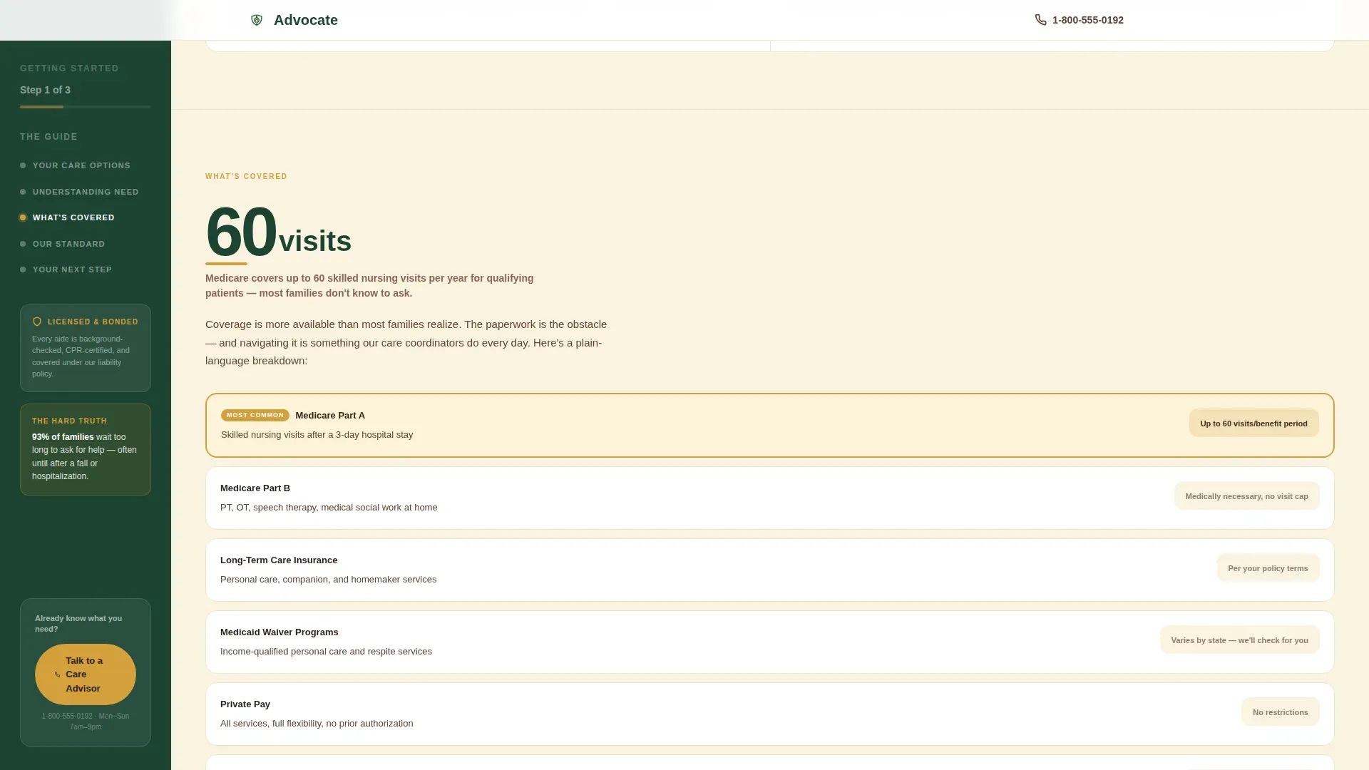
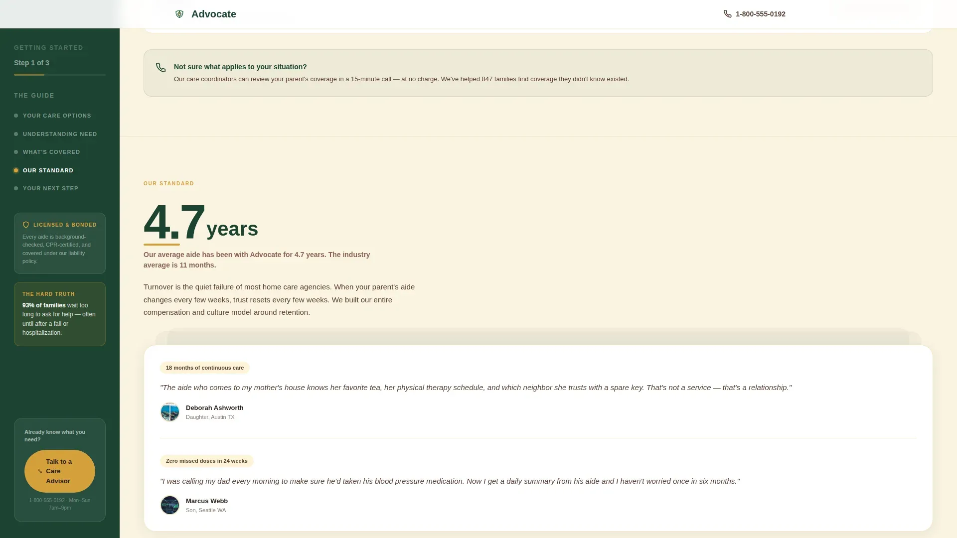
Each of the five main content sections opens with a large, bold statistic before any paragraph text appears. Examples built into the template include figures on fall recovery, Medicare visit coverage, and average aide tenure. The stat earns the explanation that follows it.
Forest Trust Color System
The template uses four purposeful colors. Deep evergreen anchors the sidebar and section headers. Linen white opens the main content column. Bark brown carries body text. Amber highlights every statistic, pull-quote, and call-to-action button, functioning like a careful reader's underlining throughout the page.
Click-Through Call-to-Action Architecture
The primary button, "See Your Care Options," appears at the bottom of the multi-step form and routes visitors to a service page personalized to their selections. A secondary "Talk to a Care Advisor" button with a click-to-call number floats in the sidebar for visitors who are already decided.
Testimonial and Social Proof Stack
The "Our Standard" section displays stacked testimonial cards alongside staff tenure and vetting details. The sidebar also surfaces a trust badge and a single high-impact stat during the form step to reassure first-time visitors before they make any selection.
Page sections overview
| Section | Purpose |
|---|---|
| Hero with Form | Opens the page with the three-step intake form and sidebar progress label |
| Understanding Need | Leads with a senior fall statistic and explains care categories |
| What's Covered | Presents Medicare and insurance coverage figures in a bento breakdown |
| Our Standard | Highlights staff tenure, vetting process, and stacked testimonial cards |
| Your Next Step | Delivers the final amber-highlighted call-to-action with reassurance copy |
| Footer | Closes the page with a horizontal flow pattern and agency contact details |
Design & branding system
The visual style follows an Educational Guide theme. It feels like a well-worn field guide left on a cabin shelf: authoritative without being clinical, warm without being sentimental.
- Evergreen (#1B4332), linen white (#FAF3E0), bark brown (#5C4033), and amber (#D4A03C) form the complete palette
- Plus Jakarta Sans is used throughout, with 900-weight bold for statistics, 500-weight medium for body text, and tight tracking on all numbers
- Amber is reserved exclusively for statistics, pull-quotes, and interactive highlights so important information stands out immediately
Mobile & speed optimization
The template is designed desktop-first and transitions cleanly to smaller screens. The sidebar adapts so the layout stays usable on any device.
- On mobile, the persistent sidebar collapses into a top progress bar so content takes full-width priority
- Static content is the default, with interactive components such as the multi-step form and FAQ accordion loaded only as needed
- Scroll-fade reveals and step transition animations are set to medium intensity to keep the experience smooth without adding heavy overhead
How this template helps you convert
The page is built around one goal: moving a hesitant visitor from uncertainty to a submitted care inquiry. Every design decision serves that path.
- The three-step form removes commitment anxiety by asking only need type, zip code, and start window before showing care options, keeping friction low from the very first click.
- The stats-first scroll educates visitors section by section, so by the time they reach "Your Next Step," the decision to reach out feels obvious rather than pressured.
- The floating sidebar call-to-action captures ready-to-act visitors at any scroll point, ensuring no qualified lead leaves the page just because they finished reading.
Other information about this template
This template is part of a broader set of health and medical landing page designs suited to service-based agencies in the home health and hospice space. A few additional details worth knowing:
- The template title in the system is listed as Advocate and is filed under the Home Health Agency niche within the Health and Medical category
- Animation effects include slideInBlur entrances and scroll-fade reveals, all set to a medium intensity level
- The FAQ section inside the page uses an accordion interaction pattern for a clean, uncluttered reading experience
- The footer follows a horizontal flow layout pattern designed for clear, scannable agency contact information
- The template is localized for United States audiences, using English (US), USD currency format, MM/DD/YYYY date format, and standard US phone number formatting
Theme
Educational Guide
Creative direction
Stats-First Impact
Color system
Forest Trust
Style
Sidebar Companion
Direction
Click-Through
Page Sections
Multi-step Intake Form
Persistent Sidebar with Chapter Markers
Stats-first Scroll Sections
Forest Trust Color System
Testimonial and Social Proof Stack
Click-through Call-to-action Architecture
Related questions
What kind of agency is this template built for?
Does the multi-step form ask for personal contact details upfront?
Can I update the statistics displayed in each scroll section?
How does the sidebar work on a mobile screen?
What is the primary call-to-action on this landing page?


