Cancer Care Services
This oncologist insurance and billing landing page gives newly diagnosed cancer patients a clear, organized view of every accepted plan, covered service, and prior-authorization step. A credential badge row builds immediate trust, while a plans-versus-services comparison table and a pre-appointment audit checklist reduce anxiety before the first consultation. The primary call to action moves visitors directly to scheduling.
by Rocket studio
Quick summary
This landing page template is built for oncology practices that want to eliminate coverage confusion before a patient's first appointment. It pairs a trust-first badge header with a detailed insurance comparison table and an expandable pre-appointment checklist. Every section answers a coverage question before asking the visitor to do anything.
Who this template is for
This template is designed for oncology practices that handle their own insurance coordination and want patients to arrive prepared. It speaks directly to the people most likely to be reading insurance information at a vulnerable moment.
- Newly diagnosed cancer patients who need to confirm their plan is accepted before booking
- Family caregivers comparing in-network oncologists and checking coverage late at night
- Insurance coordinators verifying prior-authorization status before scheduling chemotherapy consultations
What problem this template solves
Patients and caregivers often face a gap between receiving a cancer diagnosis and understanding what their insurance will actually cover. That uncertainty delays care and erodes trust in the practice before the first visit.
- No clear summary of which insurance plans are accepted and which services each plan covers
- Patients arrive at consultations without confirming referral status, prior authorizations, or out-of-pocket maximums
- Practices lose scheduling opportunities because visitors cannot find coverage answers and leave the page without acting
What you get with this template
This template delivers a fully structured, single-page layout organized around one goal: getting a covered patient onto the scheduling calendar. Every visual element and content section works toward that outcome.
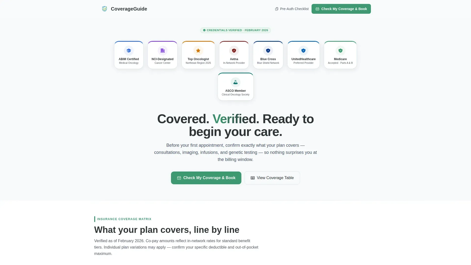
- A header credential row displaying board certifications, cancer center affiliations, and accepted-carrier network logos
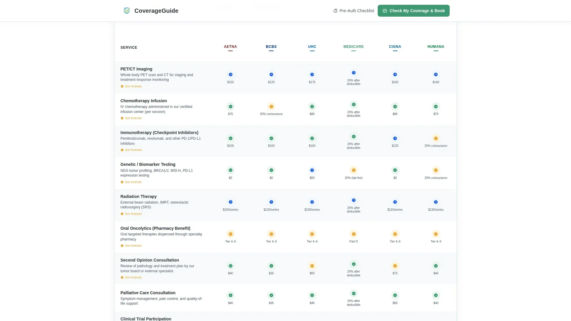
- A plans-versus-services comparison table with color-coded coverage indicators and footnotes
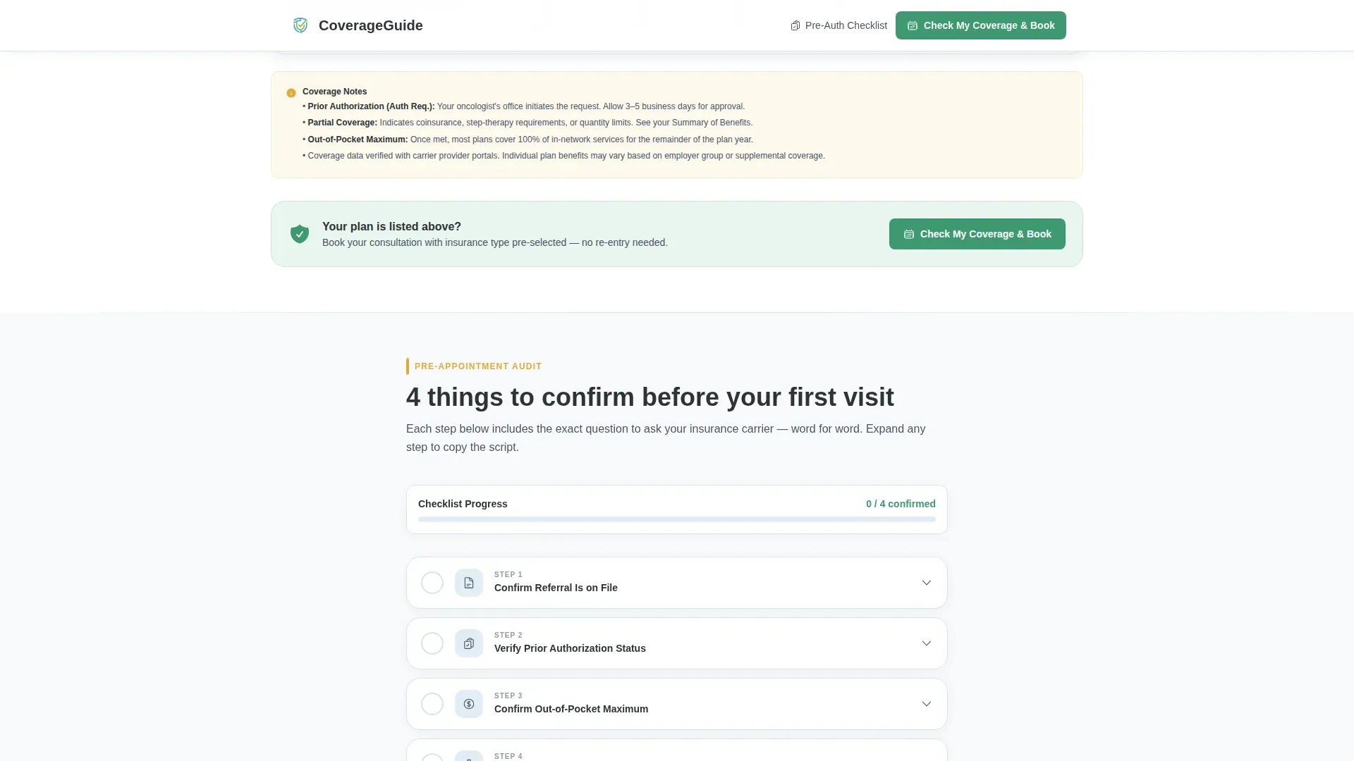
- A four-step pre-appointment audit checklist with expandable drawers containing exact scripts for calling insurers
Feature list
This template includes six purpose-built components. Each one is designed to reduce friction between a patient's coverage question and their first booked appointment.
Credential Badge Header Row
A horizontal row of embossed medallion-style badges opens the page. It displays board certification seals, cancer center affiliations, regional recognition awards, and accepted-carrier logos. The badges load with a staggered hover-in animation that draws the eye naturally from left to right.
Insurance Coverage Comparison Table
A matrix table maps each accepted insurance plan against key covered services: initial consultation, imaging, chemotherapy infusion, immunotherapy, genetic testing, and second opinions. Green checkmarks indicate full coverage, amber markers indicate partial coverage, and footnotes clarify conditions. Table rows fade in on scroll for a clean reveal.
Expandable Pre-Appointment Audit Checklist
A four-step checklist walks patients through what to confirm with their carrier before the first appointment. Each step includes an expandable drawer with the exact question to ask, word for word. Steps cover referral status, prior authorization, out-of-pocket maximum, and pharmacy benefits for oral medications.
Fixed Mobile Call-to-Action Bar
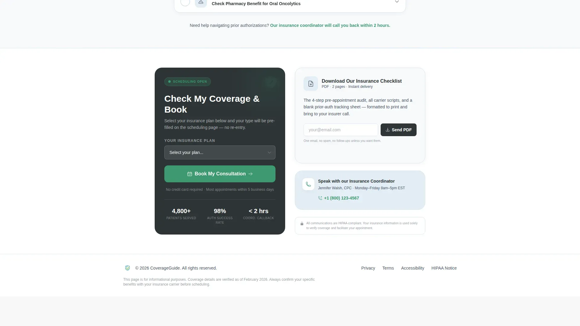
On mobile devices, the primary call-to-action button stays pinned to the bottom of the screen as the visitor scrolls. This ensures the "Check My Coverage & Book" action is always one tap away, regardless of where the visitor is on the page.
Secondary Lead-Capture Action
A text link below the primary call to action offers a downloadable insurance checklist in PDF format. Visitors who are not ready to book can provide their email to receive the checklist, giving the practice a way to follow up with undecided patients.
GSAP Scroll Animations
Section content reveals using a GSAP blur-reveal effect as the visitor scrolls. The table rows and checklist steps animate in with a staggered fade, reinforcing the step-by-step audit feeling of the page without distracting from the clinical content.
Page sections overview
| Section | Purpose |
|---|---|
| Header Navigation | Logo and primary call-to-action link |
| Award Badge Row | Display trust credentials and accepted-carrier logos |
| Hero Headline | Anchor the page with a single reassurance statement |
| Coverage Comparison Table | Map plans against services with color-coded indicators |
| Pre-Appointment Checklist | Walk patients through four confirmation steps with insurer scripts |
| Call-to-Action Block | Drive bookings and capture email for PDF download |
| Footer | Single-row linear pattern with practice contact links |
Design & branding system
The visual identity follows a Medical Clarity theme. The palette is clinical without feeling cold, organized in a way that lowers rather than raises patient anxiety.
- Arctic White (#F8FAFB) backgrounds, Glacier Blue (#E3EEF5) alternating table rows, and Charcoal (#2D3436) body text for a chart-like reading experience
- Reassurance Green (#3D9970) reserved for checkmarks, verified badges, and the primary call-to-action button; Amber (#E8A838) used only for partial-coverage markers
- DM Sans for headings and Manrope for body text and table content, keeping the typography clean and medically readable
Mobile & speed optimization
The template is built mobile-first, recognizing that caregivers and patients often search for coverage information on a phone during evenings or waiting-room visits.
- Fixed bottom call-to-action bar on mobile keeps the booking action visible throughout the scroll
- Server Components handle static content while Client Components manage accordion drawers and table interactions, keeping the page light for mobile connections
- Staggered animations are scoped to scroll-triggered reveals so they do not delay the initial page paint
How this template helps you convert
Every section earns the next click by reducing one more layer of uncertainty before asking the visitor to act.
- The credential badge row establishes immediate trust so the visitor keeps reading instead of bouncing to another practice's page.
- The comparison table answers the single most urgent question, "Is my plan covered?", before the visitor has to ask it, making the booking call to action feel like a natural next step rather than a sales push.
- The expandable checklist turns passive readers into active participants by giving them a specific task, preparing for their carrier call, which primes them to complete the scheduling action on the same visit.
Other information about this template
This template is categorized under Health and Medical as an Oncologist Website, specifically targeting the Oncologist Insurance and Billing Page niche. It is designed for United States-based oncology practices billing in USD and referencing domestic insurance carriers.
- Localization is set for English-language content referencing US carriers including Aetna, Blue Cross Blue Shield, UnitedHealthcare, Medicare, Cigna, and Humana
- The template style is Comparison Table with a Click-Through landing-page direction, meaning the primary conversion goal is moving the visitor to an external scheduling system
- The Checklist and Audit creative direction reinforces the step-by-step scroll rhythm, and the Award Badges header concept is paired with the Arctic White color system throughout
Theme
Medical Clarity
Creative direction
Checklist & Audit
Color system
Arctic White
Style
Comparison Table
Direction
Click-Through
Page Sections
Credential Badge Header Row
Insurance Coverage Comparison Table
Expandable Pre-appointment Checklist
Fixed Mobile Call-to-action Bar
Secondary PDF Lead Capture
GSAP Scroll Reveal Animations
Related questions
What type of practice is this landing page built for?
Can I customize the insurance plans and services in the comparison table?
What does the pre-appointment audit checklist cover?
How does the secondary PDF download option work?
Is this template designed for mobile users?


