Proven Results
Advocate is a masonry-layout landing page template built for senior care pay-per-click agencies. It pairs an Ink & Paper visual identity with a Creator Spotlight content strategy, using a Before/After Slider header, named strategist cards, and a pinned audit form to turn operator curiosity into qualified partnership conversations.
by Rocket studio
Quick summary
Advocate is a single-page, masonry-layout template designed for a pay-per-click agency serving senior living operators. It opens with a data-rich Before/After Slider, flows through a grid of named strategist cards, and closes prospects with a pinned audit form. Every design choice reinforces authority, specificity, and trust.
Who this template is for
This template is built for specialist pay-per-click agencies that serve the senior care industry. It speaks directly to the buyers those agencies court: operators who have already wasted budget with generalist firms and need proof of niche expertise before they pick up the phone.
- Senior living operators, home care franchise owners, and continuing care retirement community directors
- Pay-per-click agency founders and lead strategists who want a portfolio page that does the selling
- Business development teams pitching to prospects who compare vendors carefully before committing
What problem this template solves
Generalist agency portfolio pages all look the same. They promise results but show no evidence that they understand the difference between a Medicare lead and a Medicaid lead. Senior care operators are burned-out buyers; they need to feel understood before they trust anyone with their ad spend.
- Operators cannot tell from a standard agency page whether the team has ever run a senior care campaign
- Generic lead forms collect contact details but fail to qualify spend level, community count, or actual pain points
- Portfolio pages that list logos and percentages feel fabricated; buyers want named people and documented results
What you get with this template
Advocate delivers a fully structured, single-page layout that functions as both a case file and a conversion engine. Every section is intentional: the header proves the agency works, the masonry grid proves the team behind it, and the form qualifies prospects without friction.
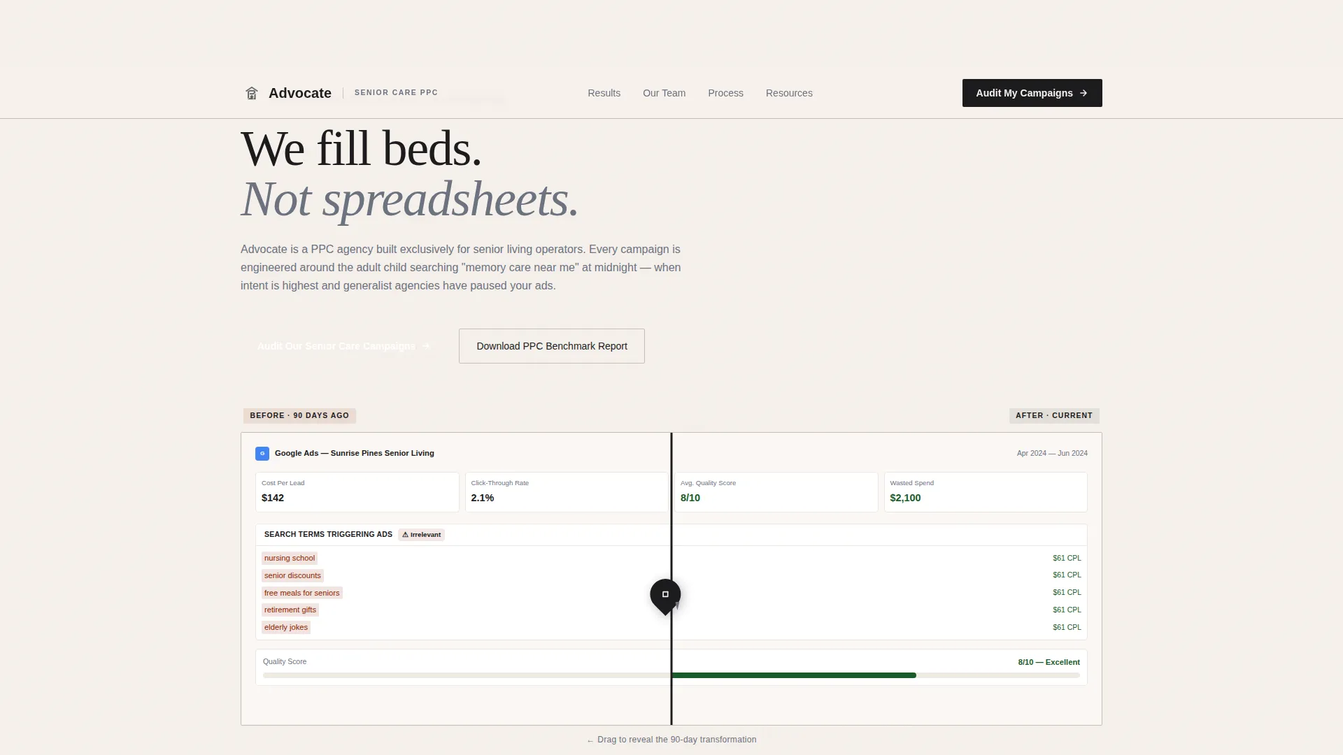
- A Before/After Slider header with real campaign metrics ($142 cost-per-lead reduced to $61, click-through rate improved from 2.1% to 7.8%)
- A masonry card grid featuring named strategist profiles paired with specific, documented client victories
- A pinned audit call-to-action bar and a gated benchmark report download as a secondary lead path
Feature list
This template packages several distinct components that work together to establish credibility and drive qualified inquiries.
Before/After Campaign Slider
The header features a slider that compares a bleeding Google Ads dashboard against the same account after ninety days of specialist management. Specific figures like halved cost-per-lead and tripled conversion rate are baked into the layout, giving any operator who recognizes those numbers an immediate reason to keep reading. The slider handle is styled as a steel pen nib to reinforce the Ink & Paper visual identity.
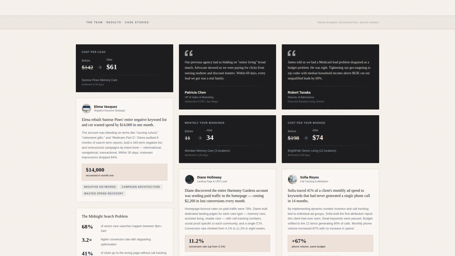
Creator Spotlight Masonry Grid
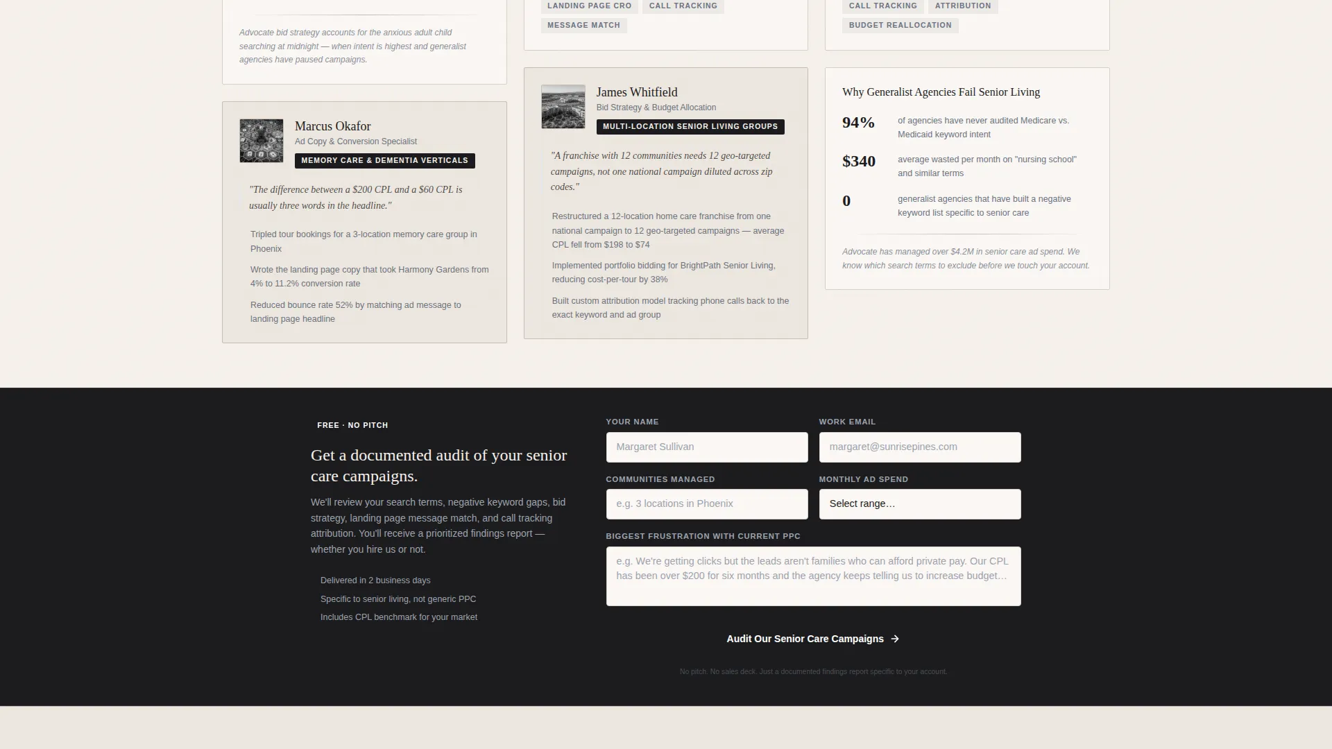
Each card in the masonry grid features a named strategist alongside a specific client win. One card documents how a strategist rebuilt a negative keyword list and cut wasted spend by $14,000 in a single month. Another shows how targeted ad copy tripled tour bookings for a three-location memory care group. The varied card depths create the feeling of rifling through a drawer of evidence.
Pinned Audit Call-to-Action Bar
After the third row of masonry cards, a steel-colored bar pins itself to the layout and invites operators to request a campaign audit. The form collects the number of communities managed, current monthly ad spend (via a tiered dropdown), and the prospect's biggest frustration with their current pay-per-click setup. This combination qualifies leads before a single phone call happens.
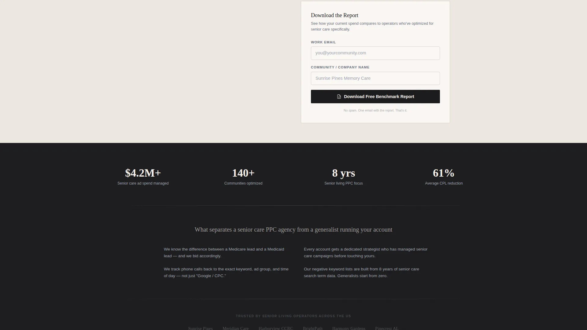
Gated Benchmark Report Download
A secondary conversion path offers a Senior Living Pay-Per-Click Benchmark Report gated behind an email address and company name. This path captures prospects who are not ready to talk but are actively comparing vendors, keeping them in the funnel without pressure.
Ink & Paper Visual Identity System
The color system uses deep charcoal ink, brushed steel gray, aged parchment, and a single archival red accent reserved for calls-to-action and key metrics. Backgrounds alternate between parchment and charcoal to create natural visual rhythm. Every masonry card carries a subtle paper-grain texture that makes the page feel tactile and deliberate rather than disposable.
Page sections overview
| Section | Purpose |
|---|---|
| Before/After Slider | Prove campaign transformation with real metrics |
| Named Strategist Cards | Build personal trust through documented victories |
| Pinned Audit Bar | Qualify and convert ready-to-talk prospects |
| Benchmark Report Gate | Capture and nurture comparison-stage leads |
| Metric Callout Cards | Highlight key performance numbers at a glance |
| Footer Contact Path | Provide a low-friction final conversion option |
Design & branding system
The Monochrome Steel color system is the backbone of this template. It communicates authority without relying on photography or lifestyle imagery, which lets the data and the people carry the page.
- Color palette: deep charcoal (#1C1C1E), brushed steel gray (#6B7280), aged parchment (#F5F0EB), and archival red (#8B2500) used exclusively for calls-to-action and standout metrics
- Backgrounds alternate between parchment and charcoal sections; text appears in steel on light backgrounds and in parchment on dark ones
- Each masonry card uses a subtle paper-grain texture, and the slider handle adopts a steel pen nib form to keep the Ink & Paper theme consistent throughout
Mobile & speed optimization
The masonry grid and slider layout are structured to reflow cleanly on smaller screens without losing the card-depth hierarchy that makes the page distinctive.
- Masonry columns collapse to a single-column stack on mobile, preserving the card-by-card storytelling rhythm
- The pinned audit bar adapts to a full-width sticky footer on smaller viewports so the primary call-to-action stays visible during scroll
- Paper-grain textures are applied as lightweight CSS effects rather than image overlays, keeping the visual character intact without adding unnecessary load weight
How this template helps you convert
Every layout decision in Advocate is made to move a skeptical, time-pressed operator from doubt to booked call.
- The Before/After Slider uses numbers specific enough to be credible ($142 to $61 cost-per-lead, 2.1% to 7.8% click-through rate) so operators self-identify with the problem before reading a single word of copy.
- Named strategist cards replace anonymous case studies with real people and real wins, reducing the perceived risk of handing over an ad budget to a new agency.
- The tiered audit form pre-qualifies spend level and pain point, so the agency's sales team enters every conversation knowing exactly who they are talking to.
Other information about this template
Advocate is category-matched to the Portfolio & Agency template category with a Senior Care Marketing and Agency subcategory. The template style is Masonry/Pinterest, the theme is Ink & Paper, and the layout direction is Partnership/Business-to-Business. The intersection match score for this niche-template pairing is 13, indicating a very strong alignment between the design system and the target audience's expectations.
- The template is a single landing page, not a multi-page website, making it fast to deploy and easy to maintain
- The creative direction is Creator Spotlight, meaning the agency's individual strategists are the portfolio rather than a logo wall
- The header concept is a Before/After Slider, a format that communicates transformation more efficiently than a static headline alone
- This template is suited for agencies pitching at industry events, running paid traffic to their own site, or sending as a direct outreach link to warm prospects
Theme
Ink & Paper
Creative direction
Creator Spotlight
Color system
Monochrome Steel
Style
Masonry/Pinterest
Direction
Partnership/B2B
Page Sections
Before/after Campaign Slider Header
Creator Spotlight Masonry Grid
Pinned Audit Conversion Bar
Gated Benchmark Report Path
Ink & Paper Visual Identity
Related questions
Can I update the metrics and strategist names in this template?
Does the template include both lead capture paths described in the brief?
Is this template suitable for a solo PPC consultant rather than a full agency team?
What type of results work best in the masonry cards?
Can this template support a niche outside senior care PPC?


