A-Frame House Real Estate Booking Website Template
This landing page template is built for A-frame home stagers who want to turn empty mountain cabins into bookable, sellable spaces. The design feels like a slow Sunday morning in the Catskills: warm, unhurried, and deliberately beautiful. Before-and-after card grids, a three-step booking form, and a persistent mobile call-to-action bar make it easy for hosts and sellers to take the next step.
by Rocket studio
Quick summary
The Aframe Pastoral Staging Walkthrough landing page template is a modular card-grid landing page created for a two-person A-frame staging team. It blends gallery-walk editorial design with a clear booking goal. Visitors move through before-and-after project cards, read owner quotes, and arrive at a three-step inline form ready to commit.
Who this template is for
This landing page is a standalone webpage created specifically for a staging service that works inside triangular cabins, alpine builds, and second-home listings. Every design choice targets a person who makes decisions on a phone, often outdoors, often in a hurry.
- Airbnb hosts in the Catskills or Blue Ridge who need photo-ready staging before a listing goes live
- Second-home sellers whose realtor said the space photographs cold and needs warmth added before sale photography
- Boutique developers flipping alpine lots who need each unit to feel loved before it hits the market
What problem this template solves
Empty A-frames are hard to photograph and harder to sell. A cold, bare interior makes a buyer scroll past without feeling anything. This landing page gives a staging team the design source to show proof, communicate warmth, and earn the booking before a competitor does.
- Hosts and sellers land on the page from an email, an ad, or a social share and immediately see finished work rather than vague promises
- The page removes unnecessary distractions, keeping visitors focused on one action: booking a walkthrough
- Without a focused landing page, a staging business loses leads to services that present their work more clearly online
What you get with this template
This template is a fully structured landing page with a clear goal at every scroll depth. Content is concise, readable, and easy to scan on any device. The design is structured to support conversion-driven communication from the first pixel to the final form field.
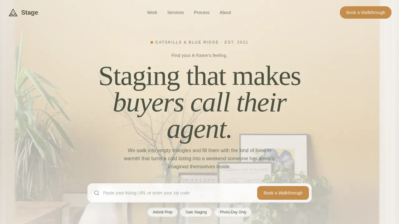
- A full hero section with a Ken Burns background, a centered search box, and three quick-select chips for service type
- A staggered before-and-after card grid with hover-reveal owner quotes and a sticky season counter
- A three-step inline booking form plus a secondary email capture path for leads still browsing
Feature list
This landing page was created with six core components working together. Each one serves the single goal of moving a person from curious visitor to confirmed booking.
Ken Burns Hero with Search Box
The header opens on a slow cinematic drift across a staged A-frame interior. A centered search box sits above three soft filter chips: Airbnb Prep, Sale Staging, and Photo-Day Only. The composition is still-life, no people, letting the staging work speak directly to each person who lands on the page.
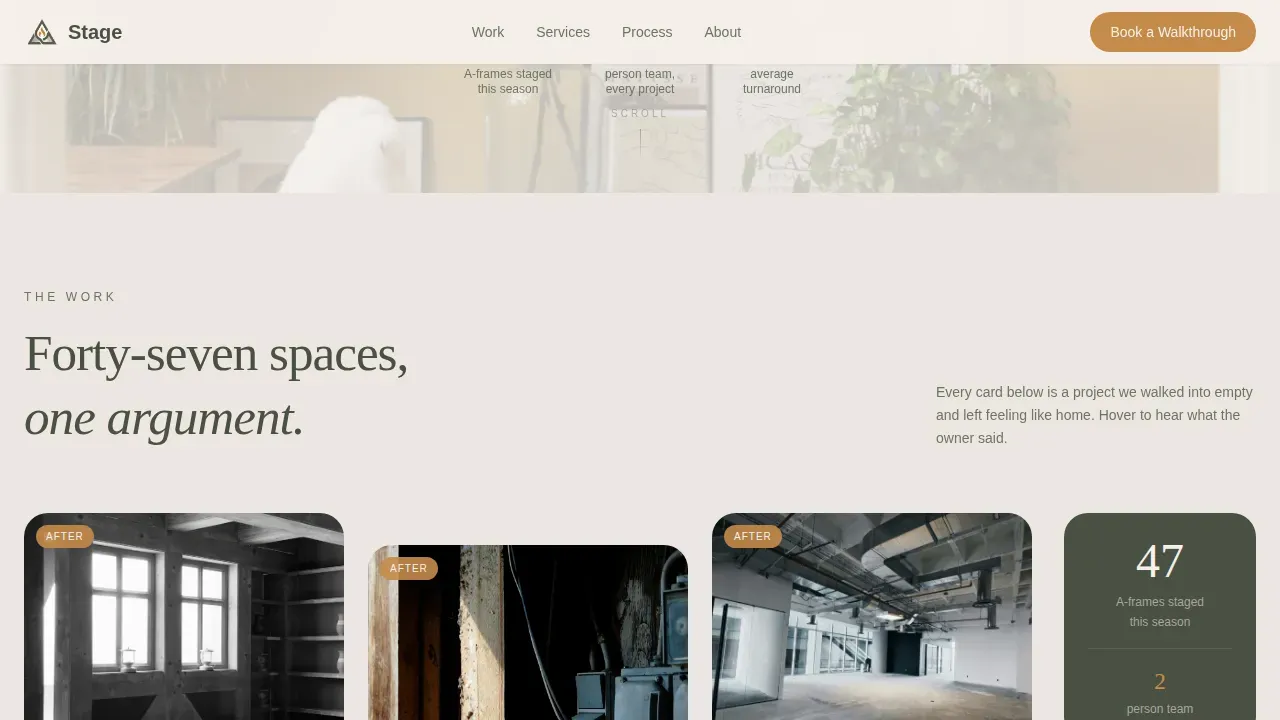
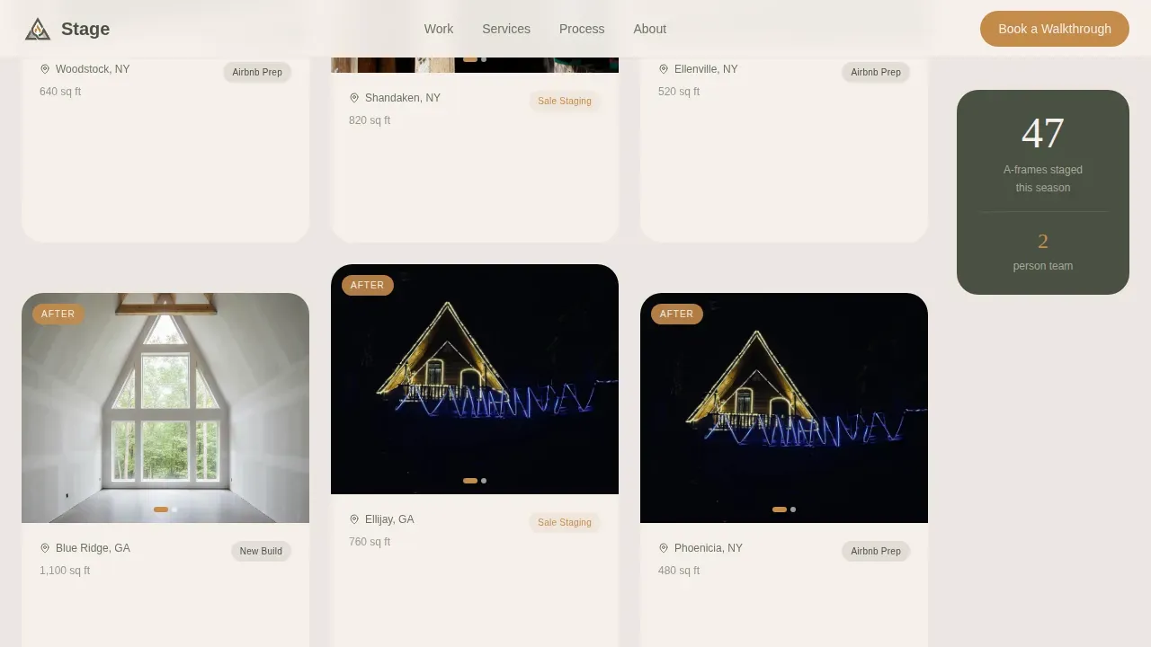
Before-and-After Gallery Grid
Each card in the grid shows one project as a diptych with a location tag and square footage. Cards stagger slightly on scroll, mimicking the pace of a gallery walk. Hovering lifts a card and reveals a one-sentence owner quote in warm amber italic, giving visitors social proof at the moment they are most engaged.
Sticky Season Counter
A quiet side counter tallies staged spaces this season. It reads: "47 A-frames staged this season." The number builds credibility without interrupting the gallery rhythm. Social proof like client testimonials and staging statistics builds trust, and this counter delivers that proof passively as users scroll.
Three-Step Inline Booking Form
The booking form opens inline after a visitor clicks the primary call to action. Step one asks for property type. Step two offers a calendar date picker with the nearest open date pre-highlighted. Step three collects address and name. The form is easy to navigate and avoids frustrating potential buyers with too many fields at once.
Secondary Email Capture Path
A soft secondary path reads: "Not ready yet? Get our A-Frame Staging Lookbook." This captures the email address of a lead still browsing and keeps the relationship alive. A landing page designed with a single goal in mind benefits from one clear primary action, and this secondary path handles everyone who is not yet ready without distracting from the main conversion.
Testimonials Pull-Quote Section
Owner quotes appear with amber borders and property details beneath each name. Floating testimonial panels placed near staged areas enhance credibility. A landing page structured to support conversion-driven communication needs this layer of trust, and the testimonial section delivers it in a format that is quick to read and easy to believe.
Page sections overview
| Section | Purpose |
|---|---|
| Hero Search Box | Orients visitors and filters service intent immediately |
| Before-After Grid | Proves staging value through visual project diptychs |
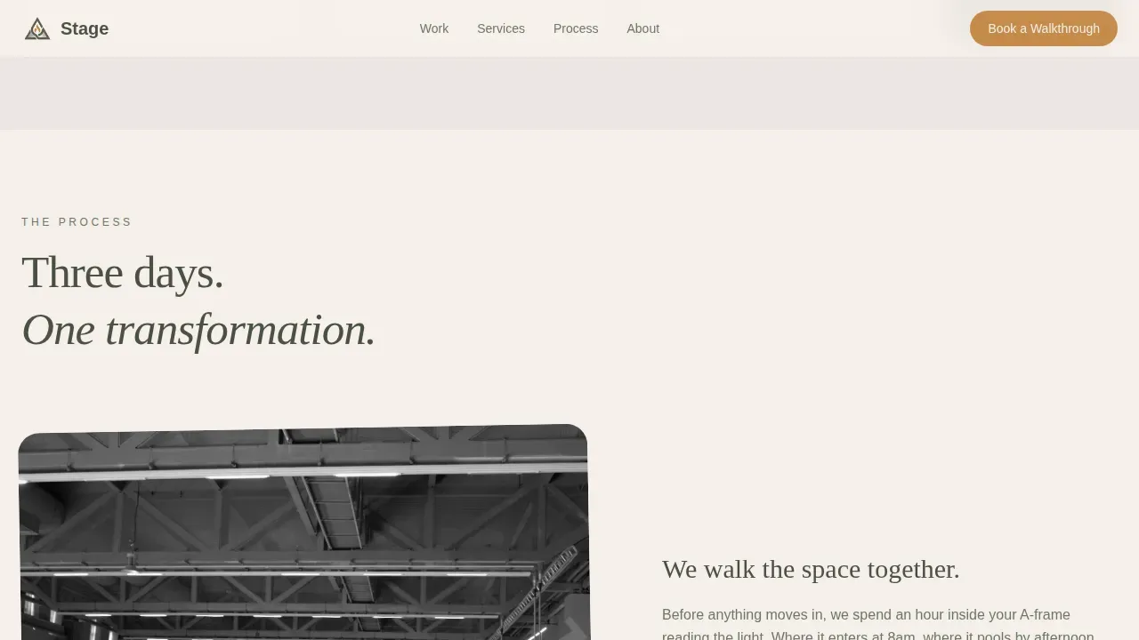
| How It Works | Explains the three-step staging process with imagery |
| Testimonials Pull Quotes | Builds trust with owner words and property context |
| Booking Form | Converts intent into a confirmed walkthrough appointment |
| Email Lookbook Capture | Retains browsing leads via a free staging resource |
| Footer | Provides contact and navigation in a single linear row |
Design & branding system
The design follows a Pastoral Calm theme using the Cloud Canvas color system. The palette feels like watercolor paper left on a windowsill: bleached by light, softened by weather, never harsh. Typography pairs Fraunces serif headlines with DM Sans body text, creating a contrast that feels editorial and trustworthy.
- Linen white (#F5F0EB) and morning fog gray (#D6CFC7) alternate as card and section backgrounds, giving each unit its own quiet room
- Pine shadow (#4A5043) carries all body text so words feel planted and easy to read at any scroll depth
- Hearthstone amber (#C48B4A) is reserved for buttons, hover states, and pull-quote borders, drawing the eye to every call to action without overwhelming the palette
Mobile & speed optimization
This landing page is designed mobile-first because Airbnb hosts check listing performance on their phones. The template adjusts seamlessly for tablet and smartphone users, which matters given the high volume of mobile real estate searches. A persistent bottom call-to-action bar keeps the "Book a Walkthrough" button visible on smaller screens at all times.
- The A-frame scene is responsive to smaller screens with easy-to-use touch controls so mobile users navigate without friction
- Assets are structured for fast loading to prevent bounce rates from slowing the page down on rural connections
- The booking form stays easy to complete on a small screen, with large tap targets and a clean step-by-step layout
How this template helps you convert
A landing page helps communicate one message clearly and motivate action. This template is structured to do exactly that, moving each person from first impression to confirmed booking in a predictable sequence.
- The hero search box and filter chips qualify intent immediately, so visitors self-sort before they scroll deeper, keeping attention focused on one action at a time
- The gallery grid accumulates visual proof across forty-seven staged spaces, teaching trust without lecturing, so that by the time a person reaches the booking form the decision already feels made
- The three-step inline form and the secondary email path together ensure that no lead leaves the page without a next step, whether that is a confirmed date or a free lookbook in their inbox
Other information about this template
This template was created for a service business that lives in a specific geography and a specific moment in the year. The design choices reflect that specificity. Builders and authors who adapt this landing page for similar mountain markets will find the color system and card layout transfer cleanly to other regions and seasons.
- The template works well for short-term campaigns tied to peak listing seasons as well as ongoing year-round staging services
- The content structure is easy to update: swap location tags, project photos, and owner quotes to refresh the page each year without rebuilding it
- The design source includes a linear single-row footer, making the site feel complete without adding extra pages or navigation complexity
- Unlike generic service page templates, this landing page is built around a gallery-walk creative direction that treats each project card as proof rather than decoration
- The page is free of unnecessary distractions by design: one primary action, one secondary action, and a clear visual hierarchy that guides every person from arrival to commitment
- Authors working with this template can choose to pre-load high-resolution photos and 3D scene assets using asset management tags to keep the experience fast and smooth
- The landing page structure supports a single goal per session, consistent with the principle that a high-converting landing page maintains an attention ratio of one action per page visit
- Cookies used by booking and analytics tools embedded in this template should be disclosed in your site privacy policy; ensure your website footer includes a cookies notice for visitors in relevant jurisdictions
- Year over year, staging businesses that use focused landing pages report stronger lead quality because visitors arrive pre-qualified from a specific email campaign, ad, or referral link
- The template design bridges rustic pastoral aesthetics with high-performing interactive landing page structure, making it a practical source for teams who want warmth and results on the same page
Theme
Pastoral Calm
Creative direction
Gallery Walk
Color system
Cloud Canvas
Style
Card Grid (Modular)
Direction
Booking/Scheduling
Page Sections
Ken Burns Hero with Search Box
Before-and-after Gallery Grid
Sticky Season Counter
Three-step Inline Booking Form
Secondary Email Capture Path
Testimonials Pull-quote Section
Related questions
Can I use this template if I stage properties outside the Catskills or Blue Ridge?
How does the before-and-after grid display project work?
What happens when a visitor clicks Book a Walkthrough?
Is there a way to capture leads who are not ready to book?
Can the page be updated each season without a full redesign?


