Podcasters Community Professional Website Template
Aircheck is a lead generation landing page template built for independent podcaster accountability groups. It uses a modular card grid layout, a Hero's Journey scroll structure, and a warm field-journal visual identity to guide visitors from recognition to application. The template includes a dual conversion path: a seat application form and a free checklist download for early-stage visitors.
by Rocket studio
Quick summary
Aircheck is a single-page, card grid landing page template designed for a weekly podcaster accountability circle. It combines a Hero's Journey narrative scroll with a warm, editorial visual style to move independent podcasters from "stuck" to "signed up." The page supports two conversion paths: a seat application and a free checklist email capture.
Who this template is for
This template is built for organizers running a peer accountability group for independent podcasters. It speaks directly to the people those organizers want to attract: solo hosts, co-hosted duos, and narrative producers who have lost their publishing rhythm.
- Independent podcasters running or launching a group accountability circle
- Community builders targeting solo hosts stuck under 300 downloads per episode
- Organizers who want a warm, story-driven page instead of a generic sign-up form
What problem this template solves
Most accountability group pages look like course sales pages. They lead with features, not feelings. Podcasters who are already doubting themselves scroll past a wall of bullet points and close the tab.
- Visitors don't see their own story reflected in the page, so they don't feel spoken to
- Generic lead forms ask for commitment before earning trust, which kills conversions
- There's no narrative arc guiding the visitor from pain to proof to action
What you get with this template
You get a fully structured, single-page layout that earns the application before asking for it. Every section is purposeful and sequenced to reduce drop-off at each scroll depth.
- A Hero's Journey card grid with member transformation stories, milestone metrics, and inline audio play buttons
- A dual conversion section combining a multi-field seat application form and a single-field checklist email capture
- A sticky bottom call-to-action bar that reappears after the third card row to recapture scrollers
Feature list
This template is built around one core idea: show transformation evidence before asking for commitment. Every component supports that goal.
Half-Page Hero Split Header
The header divides into a candid desk-session photo on the left and direct headline copy on the right. The photo shows a condenser mic, open notebook, headphones on a laptop displaying a waveform, and a half-empty mug under warm desk lamp light. The right side names the visitor's pain plainly and immediately.
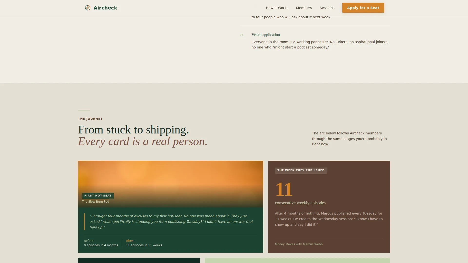
Modular Hero's Journey Card Grid
Member story cards are arranged in a bento-style grid that escalates commitment row by row. Cards alternate between member portrait pull-quotes, milestone metrics such as download counts and publishing streaks, and simulated inline audio clips. The sequence moves from "lurking" to "joining" to "leading" as the visitor scrolls.
Sticky Call-to-Action Bar
A campfire amber "Apply for a Seat" bar appears fixed at the bottom of the viewport after the visitor passes the third card row. It stays visible without interrupting reading, keeping the primary conversion action always one tap away.
Dual Conversion Section
The page closes with two side-by-side paths. The primary path is a seat application form collecting podcast name, publishing frequency via dropdown, biggest obstacle in open text, and email. The secondary path offers a free "21-Day Publishing Streak" checklist download captured with a single email field.
Scroll Reveal and Card Stagger Animations
Sections and cards animate into view as the visitor scrolls. Cards stagger their entrance so the grid feels alive rather than static. A marquee element adds ambient motion between sections without distracting from the copy.
Forest Trust Color and Typography System
The layout uses Fraunces as the serif display typeface and DM Sans for body text. The color palette pairs deep evergreen and morning fog white as structural tones, with campfire amber reserved exclusively for calls to action so every action prompt glows with clear intent.
Page sections overview
| Section | Purpose |
|---|---|
| Hero Header Split | Establish pain and identity immediately |
| Pain and Structure | Introduce the group format as the solution |
| Member Journey Cards | Show real transformation through modular social proof |
| How Sessions Work | Explain the weekly process in warm editorial tone |
| Application and Checklist | Capture leads via two commitment-matched paths |
| Sticky call to action Bar | Persistent conversion anchor after card rows |
| Footer Row | Single-row linear footer with minimal links |
Design & branding system
The visual identity follows an Educational Guide theme styled after a well-loved field journal. Every color and type choice feels intentional: earthy, dependable, and quietly purposeful.
- Color palette: deep evergreen (#1B4332) for structure, morning fog white (#F0EDE5) for backgrounds, soft lichen (#A3B18A) for supporting tones, worn trail brown (#5C4033) for warmth, and campfire amber (#D4842A) for all calls to action
- Typography pairing: Fraunces serif display for headlines that feel editorial and grounded, DM Sans for body text that stays clean and readable at every size
- Visual tone: candid overhead desk photography, warm directional lamp light, and annotation-style layout details that reinforce the field journal aesthetic throughout
Mobile & speed optimization
The template is designed desktop-first with strong mobile adaptation built in. Podcasters work from home studios, coffee shops, and everywhere between, so the layout holds up across screen sizes.
- Card grid rows reflow into single-column stacks on smaller screens so member stories remain readable without horizontal scrolling
- The sticky call-to-action bar adapts to mobile viewport height so it never covers form fields or key content
- Scroll reveal and card stagger animations are implemented via client-side components while static sections use server-rendered markup to keep initial load lean
How this template helps you convert
The conversion strategy is sequenced deliberately. Visitors earn trust through evidence before they ever see a form field. That sequencing is what separates this template from a generic sign-up page.
- The Hero's Journey card grid places transformation evidence, real member quotes, before-and-after publishing calendars, and milestone download numbers, before either conversion form appears, so the application feels like a natural next step
- The dual conversion path meets visitors where they are: those ready to commit apply for a seat, while those still evaluating download the free checklist and enter the email list at a lower friction point
Other information about this template
This template is categorized under Community and Nonprofit with a subcategory focus on podcasters communities. It is designed specifically for the podcasters accountability group niche and carries a strong intersection match for that use case.
- Template style: Card Grid (Modular) with Hero's Journey creative direction
- Page direction: Lead Generation with a Half-Page Photo and Text header concept
- Color system label: Forest Trust
- The page footer follows a Pattern 1 Linear Single-Row layout for minimal distraction near the conversion zone
- The checklist lead magnet is titled "21-Day Publishing Streak" and is positioned as a no-commitment entry point for visitors not yet ready to apply


Theme
Educational Guide
Creative direction
Hero's Journey
Color system
Forest Trust
Style
Card Grid (Modular)
Direction
Lead Generation
Page Sections
Half-page Hero Split Header
Hero's Journey Card Grid
Sticky Campfire Amber Call to Action Bar
Dual Conversion Section
Scroll Reveal and Card Stagger Animations
Forest Trust Branding System
Related questions
What type of community is this landing page template designed for?
Can both conversion paths run on the same page at once?
What fields does the application form include?
Is the card grid flexible enough for a new group without many member stories?
When does the sticky call-to-action bar appear while scrolling?


