Ductless Mini-Split HVAC Installation Website Template
The Vent landing page template is built for ductless mini-split installation companies that need to earn trust fast and turn curious homeowners into booked assessments. It combines an illustrated service-area map, three full homeowner case studies, and a focused lead-generation form into one scroll-driven, mobile-first page that makes the argument through real neighbors before the visitor ever sees a form field.
by Rocket studio
Quick summary
Vent is a single-page, gallery-plus-detail landing page template designed for residential ductless mini-split installation businesses. It opens with a pulsing illustrated map of completed installations, moves through three narrative case studies with before-and-after photography, and closes with a streamlined multi-step lead capture form. The entire page is built around one goal: convert hesitant homeowners into qualified comfort assessment leads.
Who this template is for
This template suits established ductless mini-split installation contractors and HVAC equipment businesses that serve homeowners in established neighborhoods with no existing ductwork. It is a strong fit for regional companies building local credibility through real project storytelling rather than generic promotional copy.
- Contractors targeting homeowners in century-old colonials, capes, and ranches who are frustrated with window units and rising energy bills
- HVAC professionals servicing addition and sunroom owners, garage-to-studio converters, and anyone exploring ductless systems for the first time
- Local installation businesses that want a trusted landing page layout centered on neighborhood social proof and transparent process communication
What problem this template solves
Most ductless mini split installation companies lose potential leads because their pages feel like spec sheets rather than real conversations. A homeowner browsing on a phone at 9 p.m. does not want to read a feature table. They want to see a house that looks like their house and learn what happened after the hvac professional showed up.
- Visitors arrive skeptical about whether mini split systems actually work in older homes, and generic air conditioning pages do not answer that concern with credible evidence
- The path from "interested" to "contact us" is usually too long and too vague, making it easy for visitors to leave before committing
- Without visual proof of real installations and clear savings figures, the perceived cost of a ductless mini split system feels like a barrier rather than an investment
What you get with this template
You get a fully structured, section-led landing page ready to represent a ductless mini-split installation business with confidence. Every section has a defined job: the map establishes local reach, the case studies accumulate proof, the interstitial stat bands add momentum, and the form closes with minimal friction.
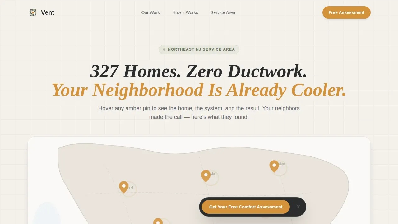
- An illustrated, interactive service-area map with pulsing amber pins and hover-triggered home thumbnails showing system model, homeowner name, and town
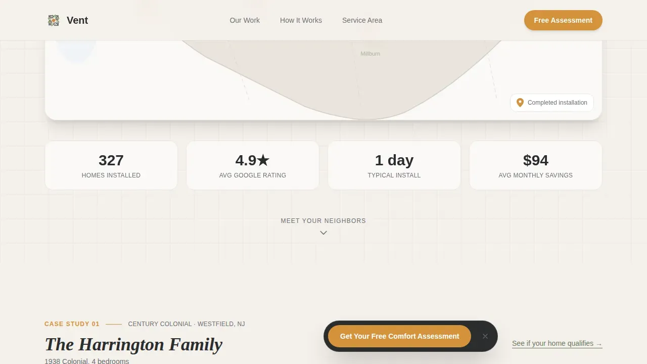
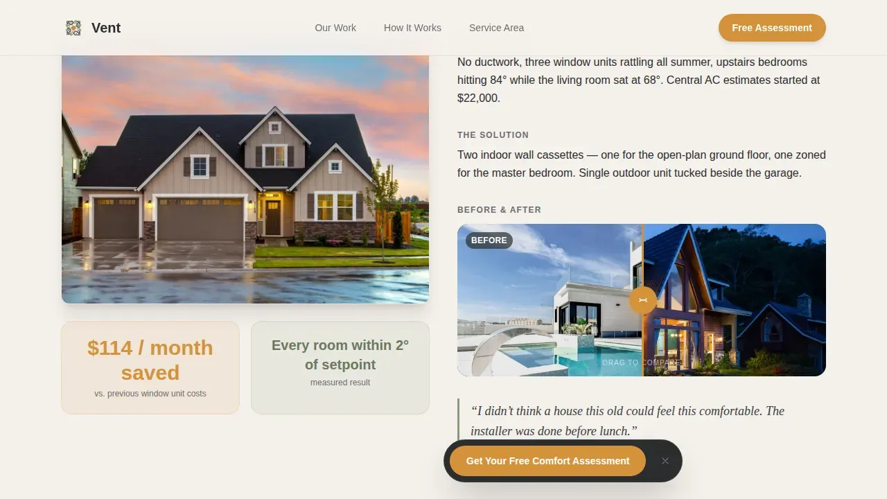
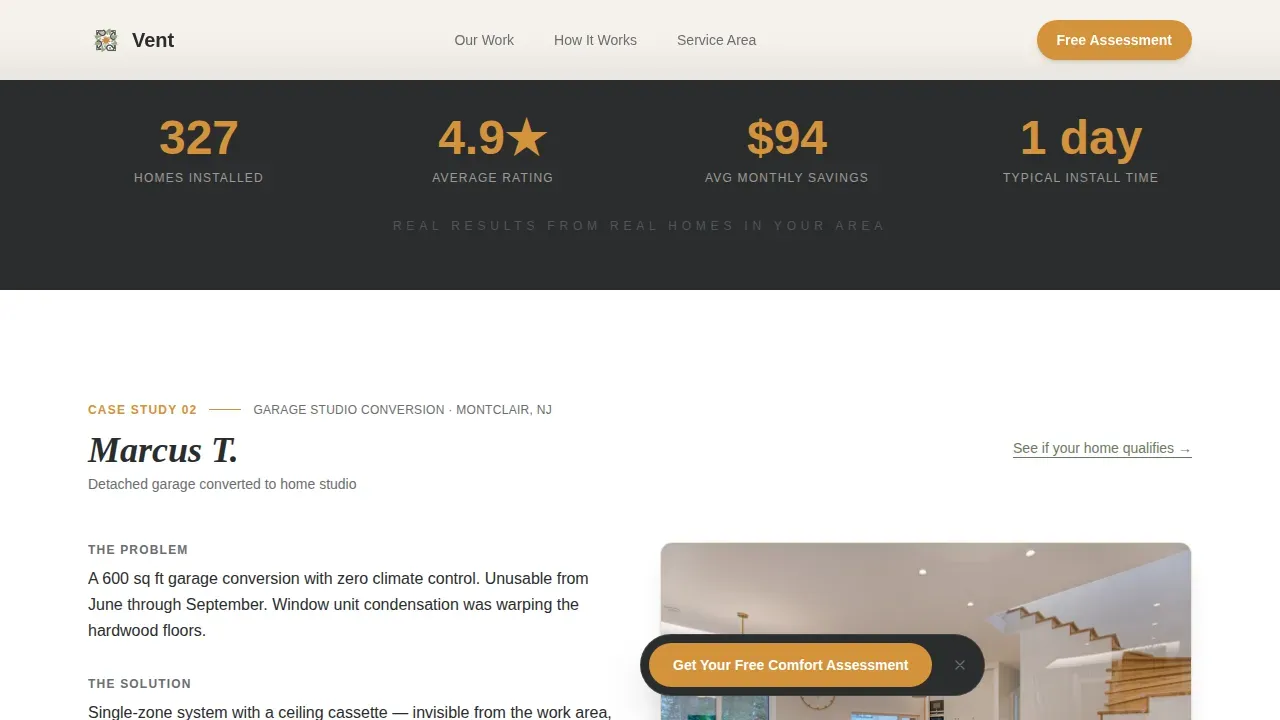
- Three complete homeowner case study blocks, each with a house photo, a two-image before-and-after room reveal, and a bold single-number result such as savings per month or temperature consistency
- A multi-step lead generation form with sequential questions covering home type, existing ductwork status, zip code, contact details, and preferred callback time
Feature list
Illustrated Map with Pulsing Installation Pins
The header section features a hand-drawn regional map rendered in linen and sage tones. Amber pins mark real completed installations across the service area, and each pin pulses gently to draw the eye. On hover or tap, a thumbnail slides out showing the home exterior, the mini split system model installed, and the homeowner's first name and town. The map feels local enough to be trusted and precise enough to feel like a real track record.
Three-Case-Study Narrative Scroll
Scrolling past the map drops the visitor into three sequential homeowner stories. Each case study opens with a photograph of the actual home, then walks through the problem, the installation day in a two-image before-and-after, and the result as one bold number. One story is relatable. Two stories form a pattern. Three stories are proof. Between each case study, a narrow charcoal interstitial band displays a rotating stat to maintain momentum and reinforce credibility.
Multi-Step Lead Capture Form
The primary conversion element is a sequential three-question form that asks home type via dropdown, whether existing ductwork is present via yes or no toggle, and zip code, followed by name, phone, and preferred contact time. The form is designed to feel like a short conversation rather than a data request. Keeping the form short reduces abandonment, especially for mobile visitors browsing on a phone. A floating amber call-to-action button labeled "Get Your Free Comfort Assessment" appears after the second case study, then anchors the page base as a full-width form.
Secondary In-Page Conversion Links
Beneath each case study, a plain text link reading "See if your home qualifies" scrolls the visitor directly to the form. This creates a secondary conversion path for readers who are convinced early and do not want to scroll the entire page. The link is subtle enough not to interrupt reading but present enough to capture anyone already sold by the first or second story.
Pastoral Calm Visual System
The template uses a four-color palette built around deep charcoal for headlines and dividers, warm amber for calls to action and highlighted savings figures, soft linen for open backgrounds, and muted sage as a secondary accent on icons and testimonial borders. Typography pairs DM Sans in headlines with Crimson Text in pull quotes. The visual result feels like a farmhouse kitchen at golden hour rather than a cold corporate HVAC brochure.
Scroll-Triggered Animation and Interactivity
The page uses scroll reveals and staggered case study entry animations to guide attention naturally. Map pin interactions rely on hover and tap events. The before-and-after room images use a reveal mechanic. All interactions are built for medium animation complexity without relying on heavy external libraries, keeping the experience smooth across devices without sacrificing load behavior.
Page sections overview
| Section | Purpose |
|---|---|
| Hero Map Header | Establish local reach with pulsing installation pins and "327 Homes" headline |
| Case Study One | Colonial homeowner story with uneven temps problem and bold savings result |
| Rotating Stat Band | Charcoal interstitial displaying a single credibility stat between case studies |
| Case Study Two | Garage studio conversion story with before-and-after room photography |
| Second Stat Band | Second rotating stat keeping scroll momentum between stories |
| Case Study Three | Sunroom owner story focused on energy bills and temperature consistency |
| Floating call to action Button | Amber "Get Your Free Comfort Assessment" button appearing after case study two |
| Lead Gen Form | Multi-step form with home type, ductwork status, zip, and contact fields |
| Page Footer | Horizontal footer pattern with business contact and supporting links |
Design & branding system
The Pastoral Calm design theme runs through every section of this template. The palette is warm and grounded, designed to make a technical service feel approachable and trustworthy without losing credibility. Charcoal anchors every headline, amber draws the eye only where action is expected, sage softens technical sections so they never read like a data sheet, and linen keeps backgrounds open and breathable.
- Color system: deep charcoal (#2B2D2F) for primary text and section dividers, warm amber (#D4923A) on calls to action and highlighted savings figures, soft linen (#F4F0EB) across open backgrounds, muted sage (#8A9A7B) as a secondary accent on icons and testimonial borders
- Typography: DM Sans for headlines delivers clean readability at all sizes, while Crimson Text in pull quotes adds warmth and editorial character to homeowner statements
Mobile & speed optimization
This template is built mobile-first, reflecting that homeowners researching heating and air conditioning options increasingly do so from their phones rather than a desktop. Every section, from the interactive map to the multi-step form, is designed to work cleanly on a small screen without requiring a pinch or a zoom.
- Scroll behavior relies on CSS scroll-based techniques and Intersection Observer for animation triggers, avoiding heavy JavaScript libraries that would slow the experience
- The multi-step form reduces visible fields at any one moment, keeping the interaction feel short and manageable for mobile visitors and lowering abandonment on small screens
How this template helps you convert
A trusted landing page for ductless mini-split installation must blend technical credibility with user-friendly elements. This template does both. It earns belief through real homeowner stories before it ever asks for a name or a phone number, which means visitors arrive at the form already convinced rather than still skeptical.
- The map header establishes immediate local authority by showing dozens of completed installations in the visitor's own region, answering the top concern of whether this company actually works in their area
- The case study narrative accumulates social proof across three real homes, each story building on the last so that by the third, the visitor is not wondering whether ductless systems work but rather how quickly they can get one
Other information about this template
This template is designed specifically for the ductless mini-split niche within residential HVAC and home services. It draws on well-established truths about how homeowners make decisions about heating and air conditioning investments.
- Ductless mini-split installation involves connecting an outdoor condenser to indoor air handlers through small refrigerant lines routed through a compact pass-through hole in the interior wall or exterior wall
- A ductless mini split system consists of two major components: one indoor unit, typically a wall mounted air handler, and one outdoor unit housing the compressor and heat sink
- The indoor and outdoor unit connect via refrigerant lines, electrical wiring, and a condensate drain, all bundled through a single small opening rather than installing distribution ductwork throughout the home
- During professional installation, technicians use a vacuum pump to evacuate moisture and air from the refrigerant lines before pressure testing the system and releasing refrigerant into the circuit
- Refrigerant handling requires certified technicians; copper tubing must be properly flared and sealed to prevent leaks, and refrigerant handling errors are a top concern that can void warranty protection
- The indoor unit must be mounted perfectly level to ensure proper drainage; a concrete pad is often used to support the outdoor condenser on the ground outside
- Electrical requirements include a dedicated circuit, usually 120V or 240V, and all electrical work must comply with local codes; a licensed hvac professional handles electrical wiring connections during installation
- Many ductless mini split systems use inverter technology and inverter driven compressors that adjust speed to match the load, reducing energy consumption and keeping rooms closer to setpoint
- Systems supporting multiple indoor units allow a single outdoor unit to serve multiple zones across an entire home, making them practical for room additions, retrofit additions, and spaces where central air is not feasible
- Installing distribution ductwork in century-old homes is often expensive and disruptive; ductless systems bypass that cost entirely, making them a practical alternative to a central air conditioner in older structures
- Ductless mini split installation costs typically range from $2,000 to $10,500 or more depending on system size, number of zones, and complexity; proper sizing by square footage is critical for peak efficiency and comfort
- Leaky distribution ductwork in central systems can waste up to 30% of heating and cooling energy; ductless systems eliminate that loss entirely
- Non ducted heating systems improve indoor air quality by removing the dust and allergen pathways that accumulate inside traditional ductwork; this is a growing consideration for allergy-sensitive households
- DIY installation carries significant risk; most system failures trace back to installation errors, and many manufacturers require professional installation to preserve warranty protection
- DIY installation may appear to save money upfront but can result in refrigerant handling violations, improper electrical work, and voided coverage; it is strongly recommended to use a certified hvac professional
- Industry surveys indicate that 90% of customers check reviews before making a purchase; the case study narrative in this template directly addresses that behavior by surfacing local, named homeowner experiences
- The form in this template is kept to a short sequential flow because simplifying contact forms to 3 to 5 fields max is strongly recommended to reduce abandonment, especially on mobile
- High-efficiency ductless mini split systems can qualify for federal tax credits and utility rebates, which can significantly reduce the perceived cost barrier for homeowners considering the upgrade
- The Vent trusted ductless mini split installation landing page template is well suited for contractors serving small apartments, multifamily housing, and institutional buildings in addition to single-family residential clients
- Outside air exchange, regular maintenance such as monthly filter cleaning, and a clear understanding of the indoor air handling unit's role in circulating cold air are details the template can surface in case study captions and testimonial callouts
Theme
Pastoral Calm
Creative direction
Case Study Narrative
Color system
Charcoal & Amber
Style
Gallery + Detail
Direction
Lead Generation
Page Sections
Interactive Service-area Map with Pin Hover
Three Homeowner Case Study Blocks
Multi-step Lead Generation Form
Secondary In-page Conversion Links
Pastoral Calm Visual Identity System
Scroll-triggered Animations and Before-and-after Reveal
Related questions
Does this template work for companies serving multiple service areas?
Can the case study sections be customized with my own homeowner photos and results?
Is professional installation required for ductless mini-split systems?
How does the lead capture form reduce abandonment?
What types of homes does this template address?


