Editorial Talk Podcast Landing Page Template
Airtime is an editorial magazine-style landing page template built for interview and talk podcasts. It uses a masonry card layout, a short-form reel header, and an Obsidian and Gold color system to pull visitors deep into the guest stories. Every section is designed to earn the click before the call-to-action even appears.
by Rocket studio
Quick summary
Airtime is a single-page template built for interview and talk podcasts that want to feel like a heavyweight publication. The masonry layout cascades featured episodes as editorial spreads. A short-form reel header, pull-quote cards, and a curated starter episode guide visitors from first impression to first listen without friction.
Who this template is for
This template suits podcast creators who have real conversations worth showing off. It is built for hosts whose guests carry genuine weight and whose episodes deserve more than a plain list of links.
- Interview and talk podcast hosts targeting ambitious mid-career professionals and aspiring founders
- Independent creators who want a premium editorial look without a large design budget
- Podcasters ready to move from a basic link-tree page to a full landing page presence
What problem this template solves
Most podcast pages bury the best content. Visitors land on a generic episode list with no context, no emotional pull, and no reason to hit play. Airtime solves the cold-start problem by leading with the story first.
- Visitors leave before engaging because the page gives them no reason to stay
- Pull quotes and guest portraits go unused even though they are the most persuasive assets a podcast owns
- There is no clear guided path from browsing to subscribing or listening
What you get with this template
You get a fully structured landing page that puts guest stories at the center of every scroll interaction. The layout does the convincing so your call-to-action lands on a warm audience.
- A short-form reel header with waveform animation and muted autoplay, cycling through visceral episode moments
- A masonry card grid where each card renders as an editorial spread with a guest portrait, bold pull quote, and listen-time badge
- A primary call-to-action block featuring a curated starter episode, a thirty-second embedded audio preview, and one-tap platform buttons
- A secondary email subscription card styled as a gold-bordered editorial block for early-access sign-ups
Feature list
A paragraph introducing the feature set keeps this section grounded before diving into individual capabilities.
Each feature below maps directly to a section or interaction described in the source brief. Together they form a landing page experience that earns trust through design and storytelling before asking for any commitment.
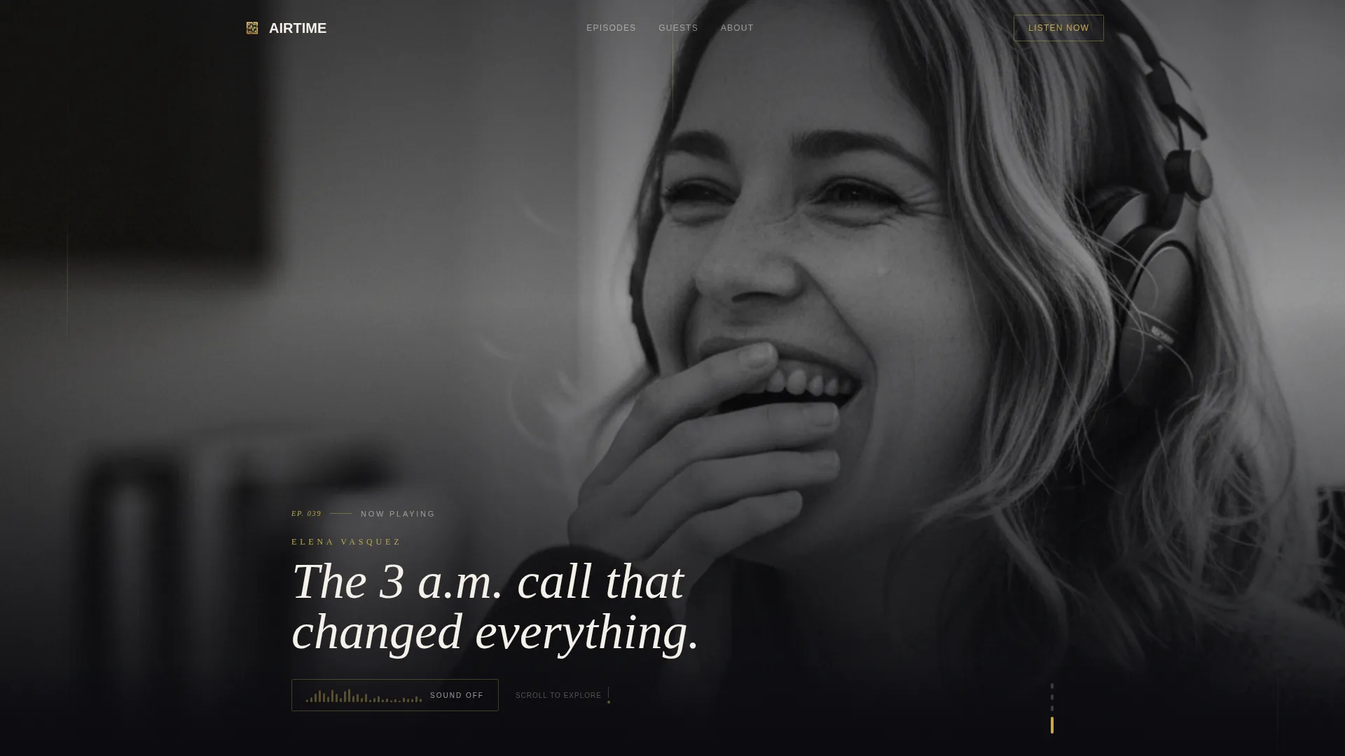
Short-Form Reel Header
The header opens with a vertical-format video montage cut to rhythm. It autoplays muted and cycles through three-second clips of guest reactions, candid gestures, and emotional pauses. A waveform animation invites visitors to turn on sound. Text punches in between cuts showing guest names, episode numbers, and one-line hooks.
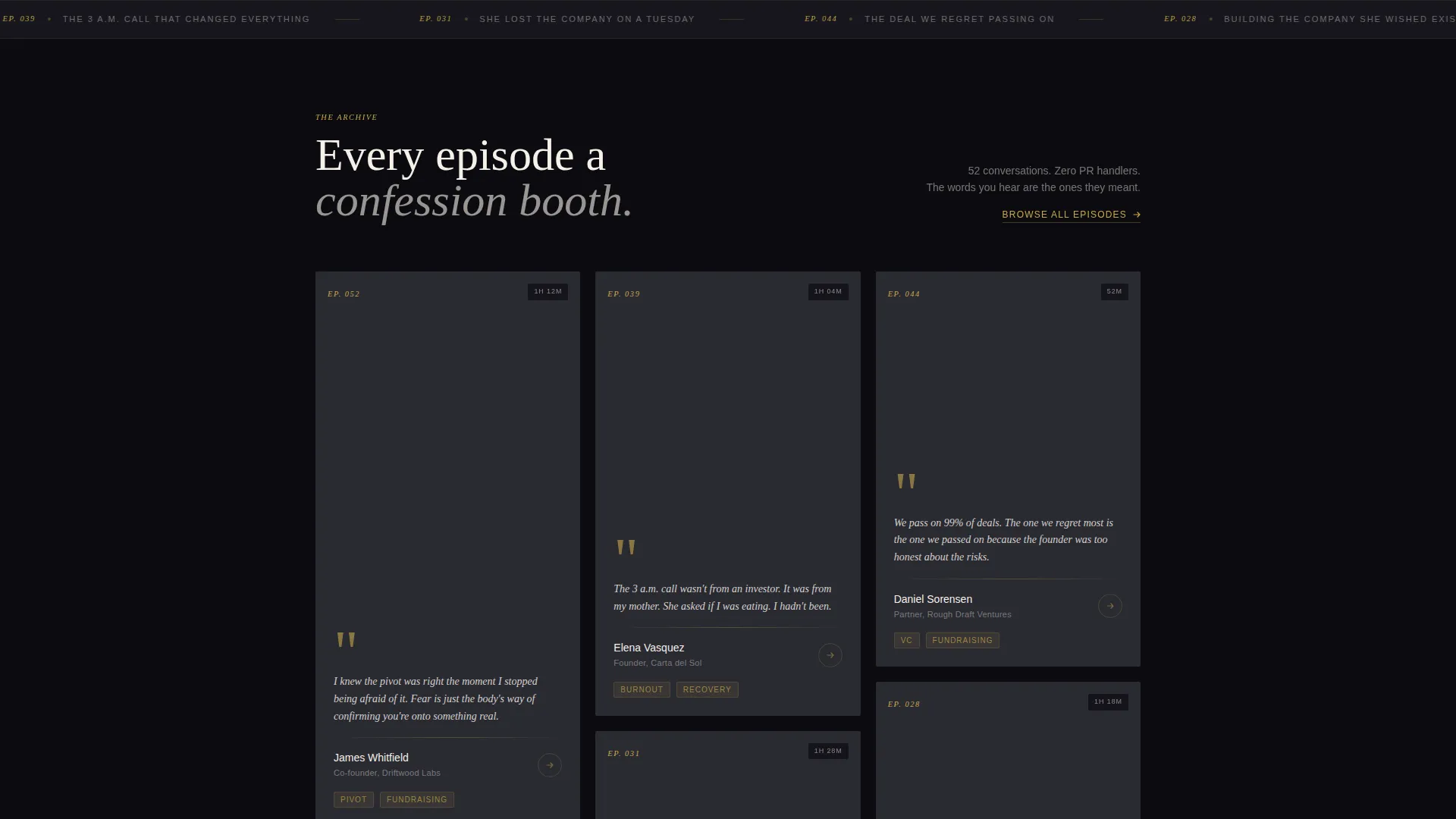
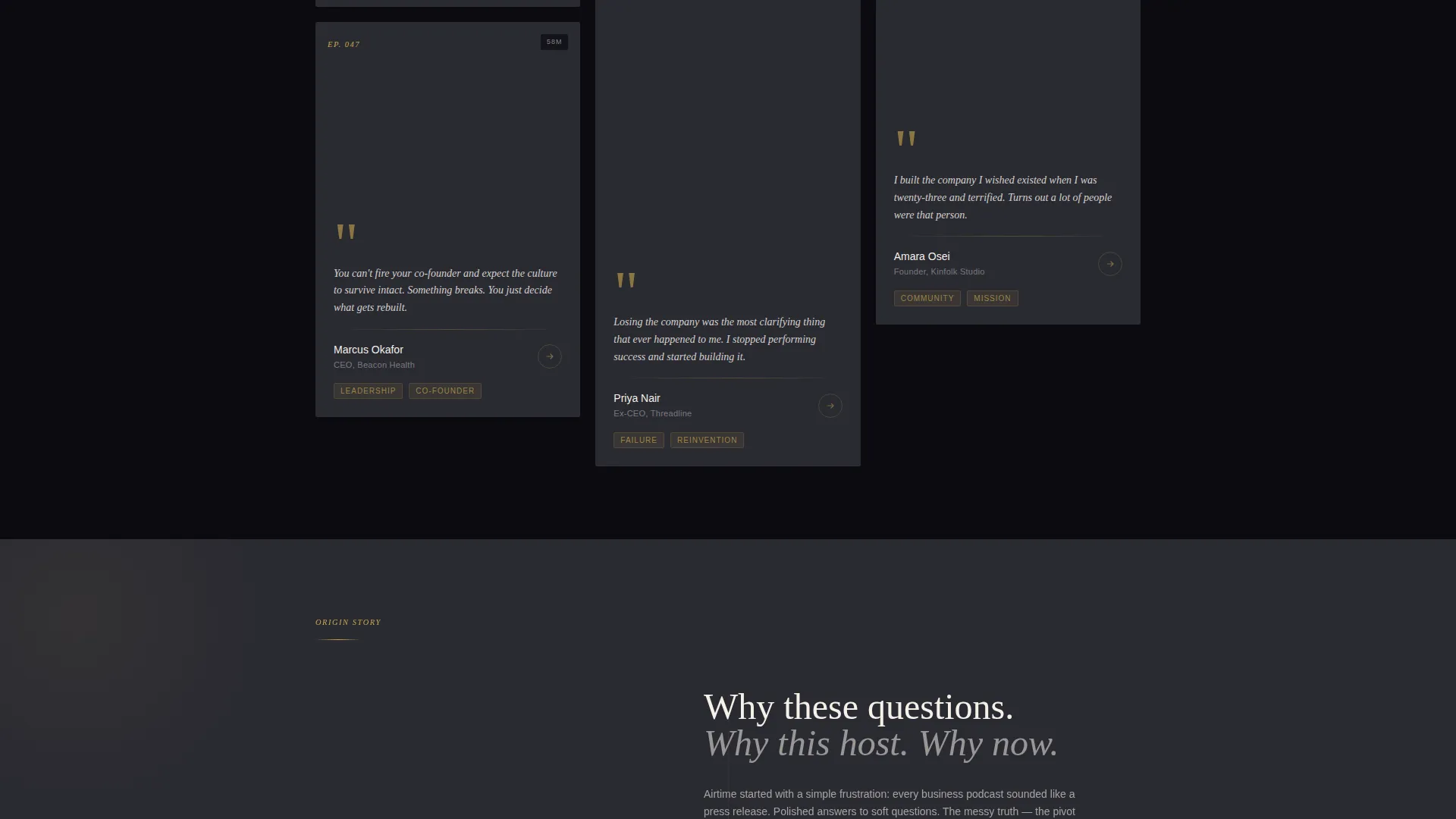
Masonry Episode Card Grid
Episodes are laid out in a masonry grid that feels like magazine clippings arranged across a layout desk. Each card holds a large guest portrait, a bold pull quote, and a listen-time badge. The cards cascade as visitors scroll, building emotional weight from recent episodes down to the founding story.
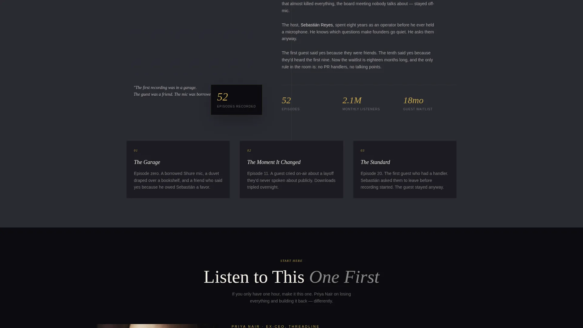
Origin Story Scroll Arc
The page unwinds the podcast's own narrative as visitors scroll deeper. Recent episodes appear first. The layout then shifts toward the founding moment, the first awkward recording, and the guest who said yes early. This arc builds credibility through genuine history rather than celebrity names.
Curated Starter Episode Block
A pinned section above the primary call-to-action presents one recommended episode with a thirty-second embedded audio preview. One-tap buttons route visitors directly to their listening platform of choice. This block removes the paralysis of choosing from a full back catalog.
Pull-Quote Tap Targets
Every pull quote, guest portrait, and episode card is a tap target. Each one routes to the listening platform of choice. By the time a visitor reaches the call-to-action, they have already read several quotes they want the full story behind.
Email Subscription Card
A secondary conversion path offers early access to new episodes. The sign-up block uses a single email field styled inside a gold-bordered editorial card. It fits naturally into the scroll flow without interrupting the editorial reading experience.
Page sections overview
| Section | Purpose |
|---|---|
| Short-Form Reel Header | Opens the page with a muted autoplay video montage and waveform animation |
| Featured Episode Cards | Displays guest portraits, pull quotes, and listen-time badges in masonry layout |
| Origin Story Scroll | Shifts narrative from recent episodes to the founding moment as the visitor scrolls |
| Starter Episode Block | Pins a curated first listen with embedded preview and one-tap platform buttons |
| Email Subscription Card | Captures early-access sign-ups via a gold-bordered single-field form |
Design & branding system
The visual identity follows an editorial magazine theme. Every color and layout decision reinforces the feeling of a leather-bound journal with gold-leaf edges: authoritative, intimate, and worth spending time with.
- Deep obsidian black (#0B0B0F) dominates the background; warm parchment (#F5F0E8) surfaces card backgrounds and readable text blocks
- Brushed gold (#C9A84C) accents episode numbers, pull-quote marks, and hover states throughout the page
- Muted charcoal (#2A2A32) fills secondary containers and dividers, keeping the hierarchy clear without competing with the gold details
Mobile & speed optimization
The masonry layout and vertical reel header are structured with mobile viewing in mind. Vertical-format video is native to phone screens, and the tap-target approach on every card means the experience translates cleanly from desktop to handheld.
- The vertical reel format aligns naturally with how mobile users hold and scroll their phones
- Episode cards in the masonry grid resize and reflow to maintain readability on smaller screens
- One-tap platform buttons remove extra steps for mobile listeners ready to open their preferred app
How this template helps you convert
The page earns the click before the call-to-action appears. Every visual and structural choice guides visitors from curiosity to commitment in a single scroll.
- The reel header hooks visitors within seconds using real emotional moments from past episodes, giving them a reason to keep scrolling before they have read a single word
- Masonry episode cards place the guests' own words front and center, so visitors build trust through the content itself rather than through promotional copy
- The pinned starter episode block with an embedded preview removes the biggest barrier to a first listen by making the decision obvious and the action effortless
Other information about this template
This template sits inside the Media and Entertainment category under the Podcast and Radio Show subcategory. It is designed specifically for the interview and talk podcast niche where storytelling depth and guest credibility are the primary conversion assets.
- The template style is masonry and Pinterest-inspired, making it a strong fit for creators with a growing episode back catalog to showcase
- The intersection match between the Editorial Magazine theme and the Obsidian and Gold color system gives the page a look that stands apart from typical podcast link pages
- The Click-Through landing page direction means every design element, from card layout to color hover states, is oriented toward routing visitors to a listening platform or an email sign-up
Theme
Editorial Magazine
Creative direction
Origin Story
Color system
Obsidian & Gold
Style
Masonry/Pinterest
Direction
Click-Through
Page Sections
Short-form Reel Header with Waveform
Masonry Editorial Episode Grid
Origin Story Scroll Arc
Pinned Starter Episode Block
Pull-quote Tap Targets
Editorial Email Subscription Card
Related questions
Is this template suitable for a new podcast with only a few episodes?
Can I update the episode cards as I publish new content?
Does the page support links to more than one listening platform?
How does the email subscription card fit into the page flow?
Can I adapt the color system to match a different brand identity?


