Bold Podcast Production Landing Page Template
Airwave is a bold, editorial-style landing page template built for pop culture podcast production companies. It pairs kinetic headline typography with a deep indigo and neon coral color system to make an immediate impression. The hero section dominates the viewport, a scrollable show gallery builds credibility, and tiered pricing cards drive direct conversions from first visit to signed package.
by Rocket studio
Quick summary
Airwave is a hero-dominant landing page template designed for podcast production companies that specialize in pop culture audio. The layout leads with full-viewport kinetic type, moves visitors through a masonry show gallery, and closes with a clear pricing section. Every design decision signals quality, range, and creative confidence.
Who this template is for
This template is built for production studios and creators who need a page that reflects the energy of their work, not just lists their services.
- Podcast hosts who have outgrown basic setups and need a professional production partner
- Media brands launching dedicated audio verticals for pop culture content
- Creators with an established audience who want to signal a step up in production quality
What problem this template solves
Most podcast service pages read like a rate card. They list deliverables in plain text and hope the price is compelling enough. That approach does not work when your audience already has taste.
- Generic layouts fail to communicate the creative standard of a high-quality production house
- Linear service descriptions do not show range the way an active roster of produced shows does
- Scattered calls to action lose visitors who need a lower-commitment entry point before committing to a full package
What you get with this template
This template gives you a complete, single-page layout that argues for your production quality through design before a visitor reads a word of copy.
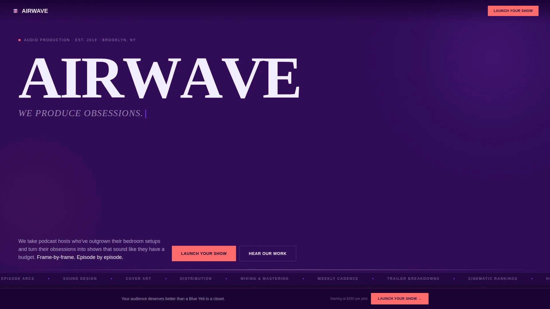
- A full-viewport hero section with kinetic rotating taglines rendered in oversized editorial serif type
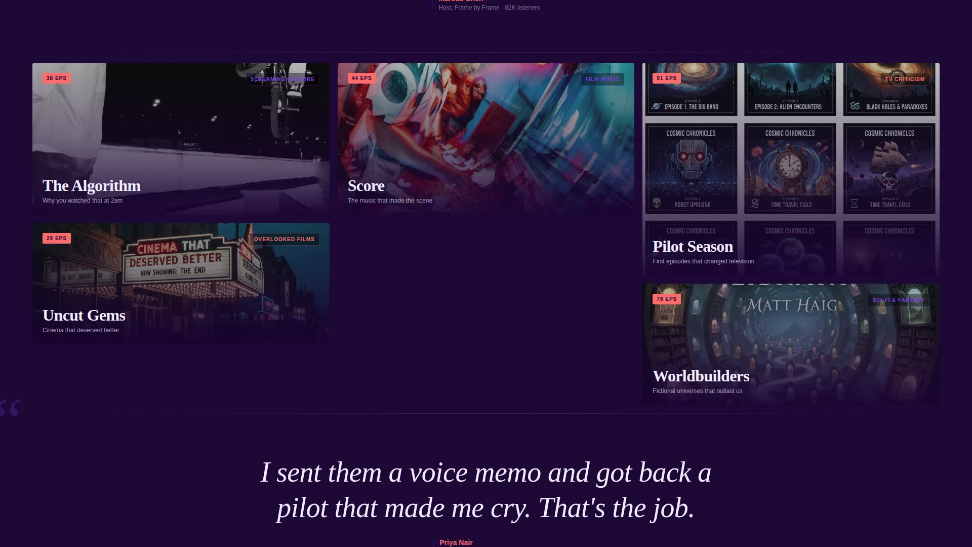
- A masonry community gallery of produced shows, each styled as a magazine cover with episode badges and hover-activated waveform snippets
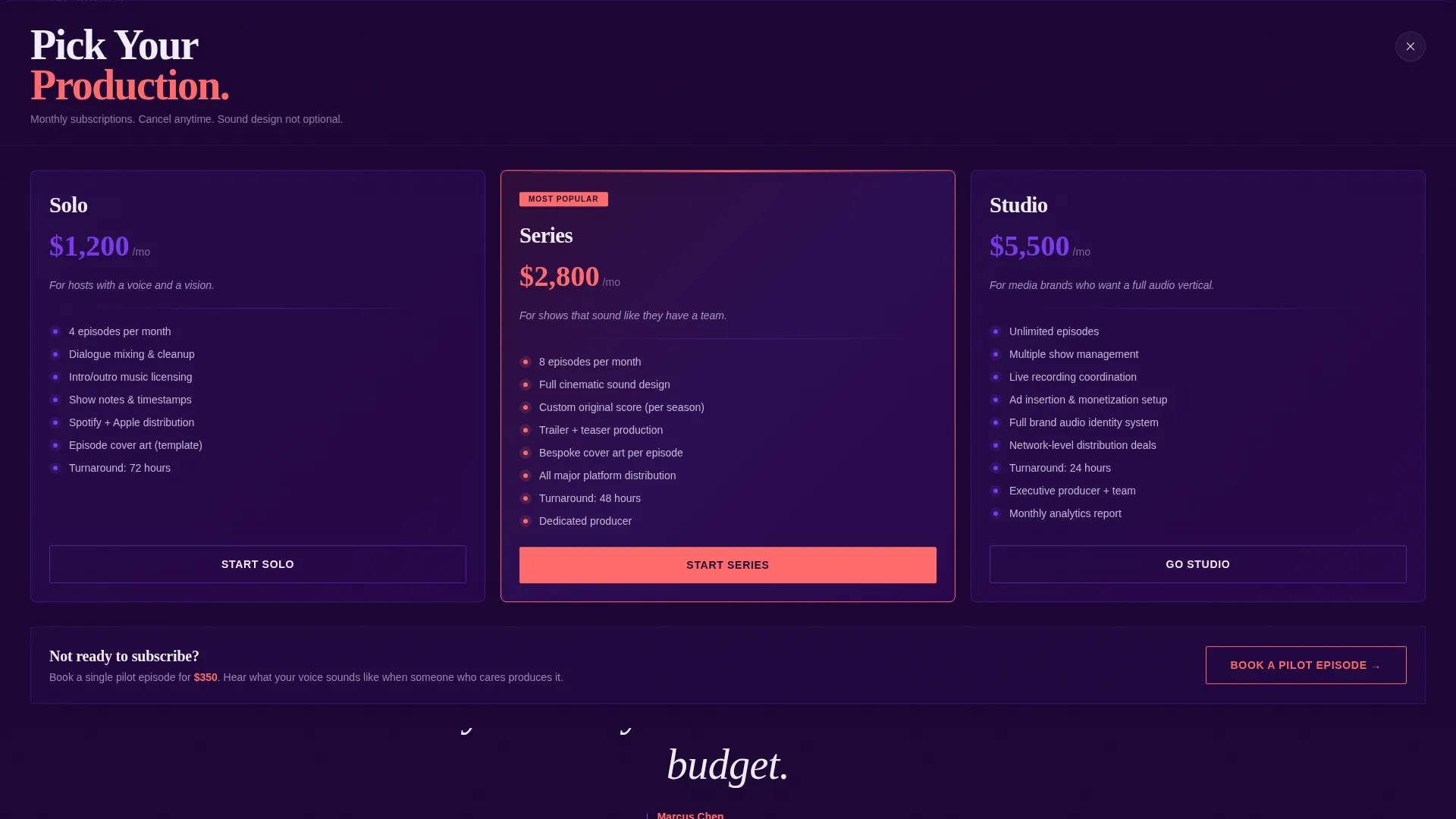
- A tiered pricing panel with three production packages displayed as magazine subscription cards, plus a secondary "Book a Pilot Episode" option
Feature list
This template ships with six distinct design and layout features, each contributing to the editorial magazine identity of the page.
Kinetic Hero Typography
The header occupies ninety percent of the viewport. A rotating tagline cycles through three phrases in oversized editorial serif, each word animating in like a typesetter striking letters into a press. Individual letters flash neon coral on beat, giving the type a visible rhythm.
Masonry Show Gallery
Below the hero, produced shows are arranged in a masonry grid. Each tile is styled as a magazine cover with custom typography and episode count badges. Hovering a tile plays a waveform snippet, letting the work speak before any description does.
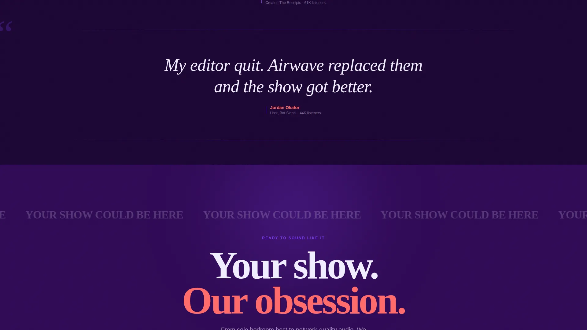
Editorial Pull Quote Testimonials
Between gallery rows, host testimonials appear as oversized italic callouts. They are formatted like magazine pull quotes rather than review blocks, so they feel editorial and credible rather than promotional.
Sticky Conversion Bar
After the third gallery row, a sticky bottom bar appears with the primary call to action in neon coral. It stays visible as visitors scroll, keeping the conversion path present without interrupting the browsing experience.
Tiered Pricing Panel
Clicking the primary call to action opens a pricing panel with three production packages: Solo, Series, and Studio. Each card is designed as a magazine subscription tile and lists specific deliverables including episodes per month, mixing complexity, cover art, and distribution setup.
Pilot Episode Entry Path
A secondary call to action offers a single pilot episode at a lower commitment price. This path captures creators who are curious but not yet ready to commit to a monthly package, giving them a low-risk way to experience the production standard firsthand.
Page sections overview
| Section | Purpose |
|---|---|
| Kinetic Hero Header | Establishes identity and creative tone with animated taglines |
| Show Gallery Grid | Demonstrates production range through a roster of styled show tiles |
| Pull Quote Rows | Delivers host testimonials in an editorial magazine callout format |
| Sticky call to action Bar | Keeps the primary conversion action visible throughout the scroll |
| Full-Width call to action Section | Closes the page with a high-impact final call to action |
| Tiered Pricing Panel | Presents three production packages as subscription-style cards |
| Pilot Episode Option | Offers a lower-commitment entry point for undecided visitors |
Design & branding system
The Electric Indigo color system is built to feel like a magazine printed on black paper with UV ink. Every element has visual weight and presence.
- Deep transmission indigo (#2E0854) as the primary background, hot violet (#7C3AED) on headlines and hover states, signal white (#F0EDFF) for body text, and neon coral (#FF6B6B) reserved exclusively for calls to action and pull quotes
- The editorial serif typeface handles all display text at oversized scale, reinforcing the magazine-cover aesthetic across the hero and gallery sections
- The palette and type system work together so the page feels loud and opinionated without relying on photography or illustration
Mobile & speed optimization
The layout is designed to translate the editorial magazine impact to smaller screens without losing the visual hierarchy that makes the desktop experience compelling.
- The kinetic hero scales to fill mobile viewports while keeping the oversized type readable and the animation intentional
- The masonry gallery reflows into a single-column scroll on narrow screens, preserving the magazine-cover tile format and waveform hover behavior
- The sticky call to action bar and pricing panel are built to remain functional and clear at all common screen sizes
How this template helps you convert
The page is structured to move a skeptical visitor from first impression to booking inquiry through the quality of the work itself, not through persuasive copy alone.
- The hero section creates immediate emotional alignment. Visitors who care about pop culture audio recognize the energy within seconds, which filters for the right audience before any service is described.
- The show gallery replaces a service pitch with a portfolio experience. Visitors scroll through produced shows and form their own opinion about quality, making the case more convincingly than a feature list would.
- The dual conversion paths close visitors at two different commitment levels. The primary "Launch Your Show" call to action captures ready buyers, while the pilot episode option converts visitors who need one good experience before they commit.
Other information about this template
This template is suited for production companies that want their landing page to function as both a portfolio and a sales tool in a single scroll.
- The template uses the Hero-Dominant (90/10) layout style, meaning the hero section commands most of the visual real estate and sets the tone for everything below
- The Community Gallery creative direction is specifically chosen to let the roster of shows do the persuasion work, which is more effective for creative services than a conventional services page
- The Direct Sales landing page direction means every section is sequenced toward a conversion action, with no dead-end pages or navigation away from the primary goal
Theme
Editorial Magazine
Creative direction
Community Gallery
Color system
Electric Indigo
Style
Hero-Dominant (90/10)
Direction
Direct Sales
Page Sections
Kinetic Hero Typography
Masonry Show Gallery
Editorial Pull Quote Testimonials
Sticky Conversion Bar
Tiered Pricing Panel
Pilot Episode Entry Path
Related questions
Who is this template designed for?
Can I customize the pricing packages shown in the template?
Does the template include the waveform animation and kinetic text effects?
Is this a single-page layout or a multi-page site?


