Premium Peruvian Restaurant Landing Page Template
A moody, interactive landing page built for a Peruvian casual dining restaurant. This template pairs a full-screen video hero with a modular before/after card grid, letting visitors drag raw ingredients into finished ceviche dishes before they ever book a table. The Parchment and Rust color system, neo-retro typography, and sticky reservation bar work together to turn browsers into diners.
by Rocket studio
Quick summary
This template is a single-page, card grid layout built specifically for a ceviche restaurant serving authentic Peruvian cuisine. It combines a cinematic video hero, interactive before/after dish reveals, full-bleed quote strips, and a sticky reservation bar. Every design choice earns the click by letting visitors taste the transformation before they arrive.
Who this template is for
This template suits any casual dining restaurant that wants its food to do the persuading. It is especially well-matched for owners and operators whose audience browses on phones and books on impulse.
- Peruvian restaurant owners showcasing fresh fish and ceviche dishes to local diners
- Hospitality teams targeting young couples, office groups, and families who search for dinner spots off the main strip
- Event hosts who need a secondary booking path for private group ceviche nights
What problem this template solves
Most restaurant pages show a static menu and a phone number. That approach loses visitors who need to feel the food before they commit. This template closes that gap.
- Visitors can drag an interactive slider and watch raw fish become a plated ceviche clásico, building appetite and trust at once
- The sticky reservation bar keeps the call to action in view without interrupting the food content
- Quote strips pulled from real reviews replace generic testimonials and surface the specific lines that make people book again
What you get with this template
You get a fully structured landing page with every section pre-built and ready to customize. The layout escalates from single to double to triple column cards, so the page feels like a table filling up with food.
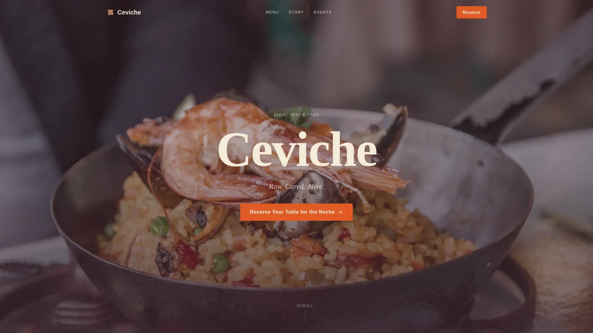
- Full-screen video hero with grain overlay, poster fallback, and delayed serif restaurant name reveal
- Modular before/after card grid with drag sliders covering bar snacks through shareable feasts
- Sticky reservation bar, vintage calendar modal form, and a secondary private event inquiry path
Feature list
This template ships with six core interactive and visual features, all grounded in the brief.
Full-Screen Video Hero
A handheld, 16mm-graded clip opens on hands squeezing lime over corvina, then cuts to the dining room at golden hour. The video lazy-loads with a poster fallback, and the restaurant name appears in a heavy serif only on the second cut. Lighting design drives the mood from the first frame.
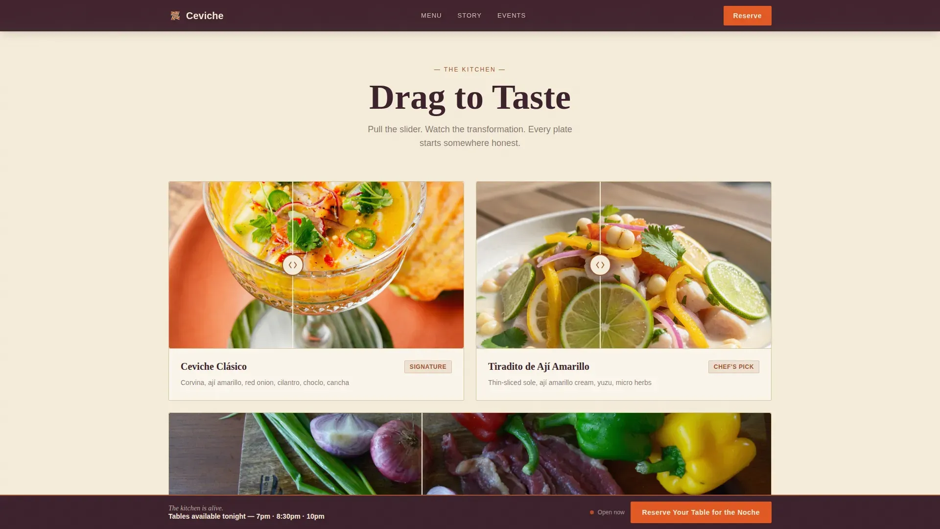
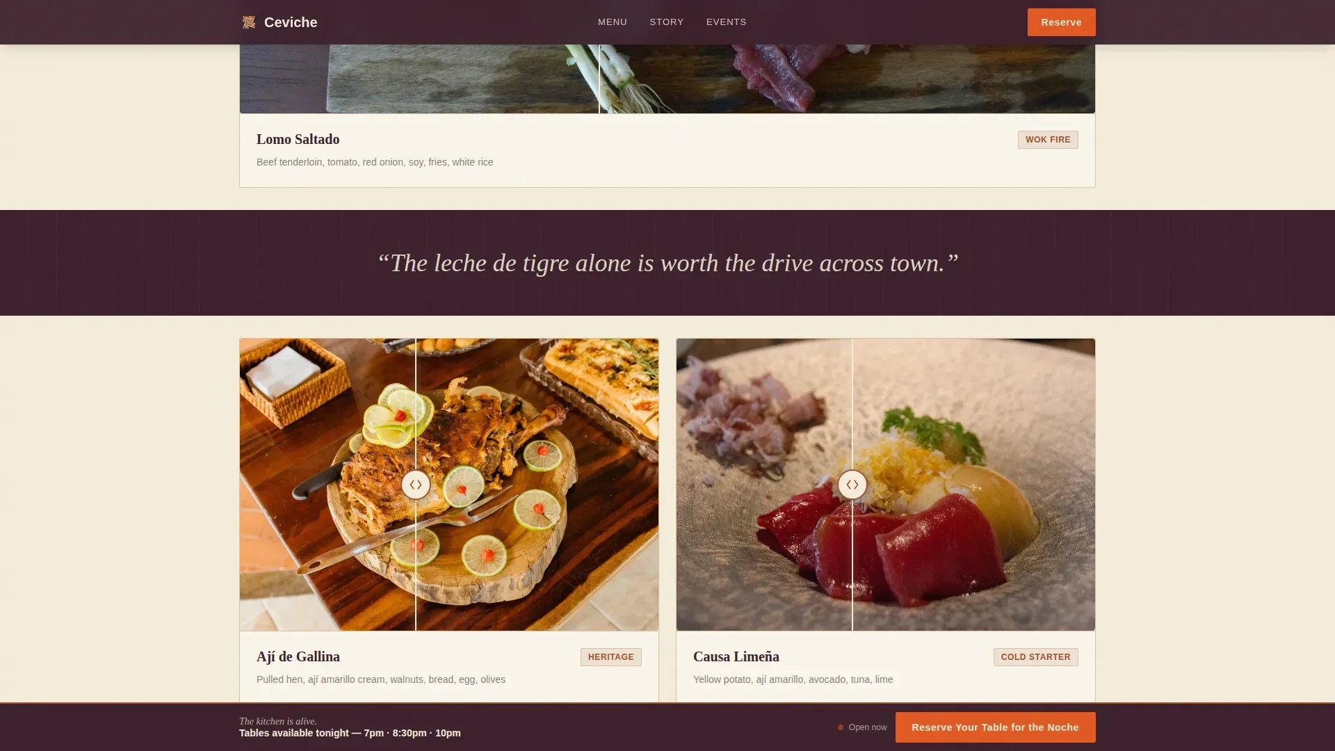
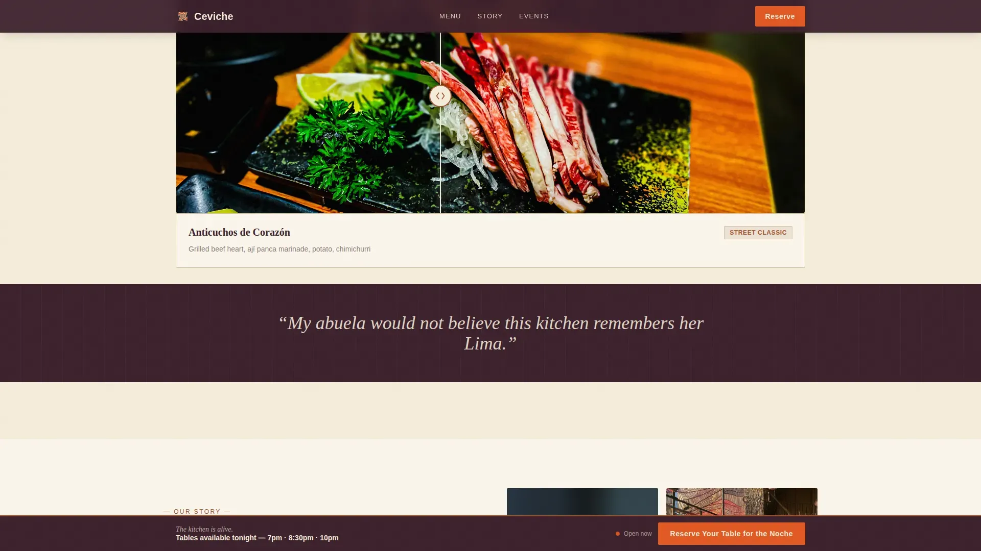
Before/After Drag Slider Grid
Each modular card pairs a raw ingredient with its finished dish. Visitors drag the slider themselves, pulling raw corvina beside plated ceviche clásico or dried ají panca beside lacquered lomo saltado. Cards escalate from one to three columns, and the interactive reveal makes every user feel involved before they select a table.
Sticky Reservation Bar and Modal Form
After the second card row, a sticky bar appears with a single call to action. The modal form includes a vintage wall calendar date picker, a party size counter, an occasion dropdown, and fields for name and phone. The user can set their visit details without leaving the page.
Full-Bleed Quote Strips
Between card rows, chicha purple bands display single review lines with no attribution. The format trusts the sentence to carry weight, which mirrors how social proof works best near the restaurant menu content.
Private Event Inquiry Path
A secondary section below the card grid invites groups of twelve or more to host a private ceviche night. A separate inquiry form captures the details needed for larger bookings, giving the restaurant a second conversion path beyond individual dinner reservations.
Neo-Retro Typography System
Fraunces handles heavy serif headlines while DM Sans covers body text. This pairing gives the page high-contrast readability, a key element of any successful Peruvian cuisine landing page. The type set feels warm and intentional, not decorative.
Page sections overview
| Section | Purpose |
|---|---|
| Video Hero | Cinematic restaurant name reveal |
| Before/After Grid | Interactive dish transformation cards |
| Quote Strip One | Social proof between card rows |
| Expanding Card Rows | Menu escalation to feasts |
| Quote Strip Two | Second review line band |
| Sticky Reservation Bar | Persistent table booking prompt |
| Reservation Modal | Date, party, and occasion form |
| Private Event call to action | Group inquiry secondary path |
| Footer | Single-row linear contact strip |
Design & branding system
The color system uses earthy neutrals as a base, contrasted with deep jewel tones to reflect the Pacific coast. Vibrant fresh colors sit alongside warm rustic textures, creating a cozy yet modern atmosphere that matches the food.
- Parchment (#F5EDDA) backgrounds, oxidized rust (#A0522D) on headlines and card borders, chicha morada purple (#3B1F2B) for body text and footer
- Rocoto accent (#E25822) reserved for buttons and hover states, giving every call to action a single electric pop
- Fraunces serif for display headings, DM Sans for body copy, grain overlay texture across the hero for a faded Lima travel poster feel
Mobile & speed optimization
Most diners search for a dinner spot on a phone, often minutes before they want to go. This template is built mobile-first and designed for quick decisions.
- Video lazy-loads with a static poster image so the hero renders immediately on slower connections
- GPU-accelerated transforms power the drag sliders and sticky bar without blocking the main thread
- Scroll-triggered animations activate only when the element is in view, keeping the experience smooth as the user scrolls through the card grid
How this template helps you convert
The page is designed to move a visitor from curiosity to a confirmed reservation by letting the food content do the persuading first.
- The before/after sliders build appetite and engagement early; by the time a user has dragged through six cards, they are choosing what to order, not whether to go
- The sticky reservation bar keeps the booking action in persistent view after the second row, so a user never has to search for where to reserve
- The private event path captures group bookings that a single reservation form would miss, expanding the restaurant's revenue opportunities
Other information about this template
This template sits at the intersection of immersive food content and practical hospitality marketing. It covers the full range of conversion intent a casual dining restaurant needs on a single page.
- The design blends modern aesthetics with traditional Peruvian culinary themes, reflecting the trend of restaurants creating unique dining experiences through visual storytelling
- Lighting design in the video hero sets the ambiance digitally, echoing how physical lighting shapes the in-room dining experience
- The social proof format, authentic review lines near the restaurant menu cards, aligns with the principle that real quotes build trust more effectively than star ratings alone
- The page structure supports Instagrammable visual content through high-contrast food imagery, which can strengthen social media marketing efforts and influencer outreach
- The occasion dropdown in the modal form captures dinner intent across birthday, date night, and team dinner scenarios, making the template affordable to operate without additional booking software
- The ceviche neo retro peruvian casual dining landing page template is category-matched for Food and Beverage operators in the Peruvian Dining subcategory
- The vector-based icon set used for the counter controls and calendar picker scales cleanly across screen sizes without losing quality
- The cookie notice block can be set within the footer row to keep the single-row design compact and compliant with common web practice
- Beyond ceviche and fish dishes, the card grid layout can accommodate avocado-forward starters, stuffed potato causas, or other peruvian cuisine items as needed
- While the template does not include tortillas or quesadillas by default, the modular card structure means any food content can be swapped in to match the actual restaurant menu
Theme
Neo-Retro
Creative direction
Before/After Reveal
Color system
Parchment & Rust
Style
Card Grid (Modular)
Direction
Event Registration
Page Sections
Full-screen Video Hero with Grain Overlay
Before/after Drag Slider Card Grid
Sticky Reservation Bar with Modal Form
Full-bleed Review Quote Strips
Private Event Secondary Path
Neo-retro Typography and Color System
Related questions
Can I change the dishes shown in the before/after cards?
Does the sticky reservation bar work on mobile?
Can I use this template for a restaurant that serves more than ceviche?
Is the private event form separate from the main reservation modal?
How do I update the review quote strips?


