US Government FAQ Website Template
The Forecast "Fund the Next Warning" donation landing page template is built for National Weather Service offices and weather-ready community programs. It uses a zigzag FAQ-driven layout, a half-page hero split, and an Alpine Fresh color system to move potential donors from curiosity to commitment. Every section answers a real donor question and ties each gift to a specific, life-saving outcome.
by Rocket studio
Quick summary
This is a single-page fundraising landing page designed for a National Weather Service office's community preparedness campaign. It combines corporate precision design with emotionally grounded storytelling. The layout alternates between navy and white sections, each answering one donor objection. The primary call-to-action "Fund the Next Forecast" appears in alert amber and drives toward a focused donation form with preset giving levels.
Who this template is for
This donation landing page is built for weather-ready organizations, government outpost programs, and community emergency management offices that need to raise funds outside standard federal budget lines. It is equally useful for any nonprofit or public-service team running a focused fundraising campaign that requires trust, clarity, and a clean donation flow.
- Emergency management offices and National Weather Service programs seeking community investment
- Volunteer storm spotter networks that need a secondary sign-up path alongside the main donation page
- Civic-minded fundraising teams that want a distraction free layout with strong conversion logic built in
What problem this template solves
Most government or public-service organizations struggle to explain why donations matter when people assume tax dollars cover everything. This donation landing page is designed specifically to close that gap. It answers the hardest donor questions before they become reasons to leave. The FAQ-driven zigzag structure means each section does one job: remove one objection, then move the visitor forward.
- Donors arrive with skepticism about where funds go and whether federal budgets make private giving redundant
- First time contributors need clear impact explanation before they trust a donation form with payment details
- Organizations lack a focused fundraising landing page that feels authoritative without feeling bureaucratic
What you get with this template
You get a complete, ready-to-customize fundraising landing page with five structured content sections, a full donation form, and a secondary volunteer capture path. Every block is pre-mapped to a donor question, so the editorial work is largely done. The visual system is fully defined, from color codes to typography choices, giving your team a clear starting point.
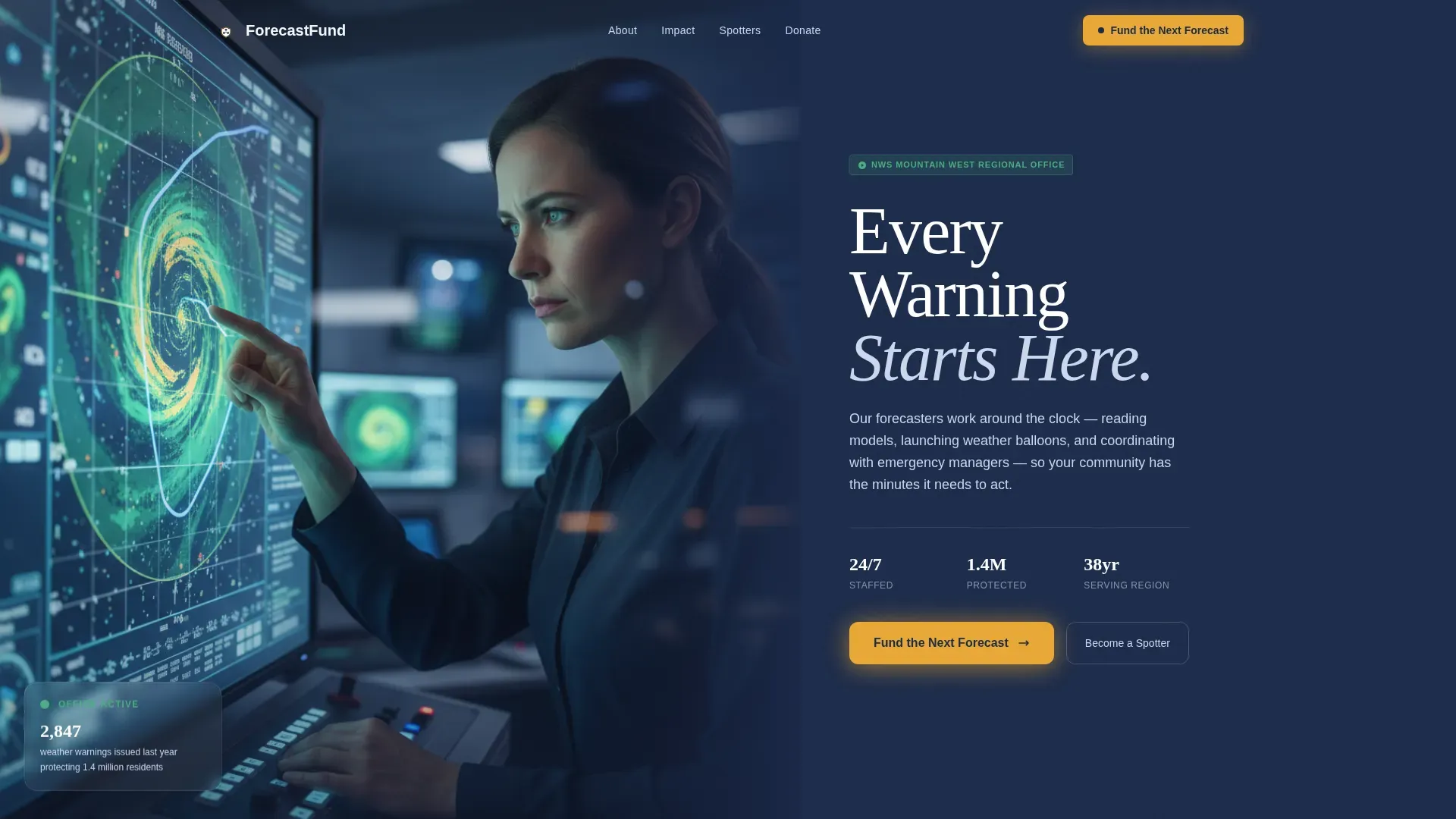
- Hero split with a half-page photo panel and a navy text panel carrying social proof statistics and a primary amber call-to-action
- Four zigzag content sections that alternate navy and cirrus white backgrounds, each anchored by a real donor question and a photographic answer
- A full-width donation form section with preset donation amounts, a monthly toggle for recurring donations, a custom amount field, and a separate spotter sign-up form
Feature list
This landing page template delivers a tightly scoped set of features. Each one is grounded in the brief and designed to serve both donors and the organization running the campaign.
Half-Page Hero Split
The hero section divides the screen into two equal panels. The left side holds a wide-angle operations center photograph. The right side carries a bold headline, a single-line social proof stat, and the primary call-to-action donation button in alert amber. This layout immediately communicates the mission and the stakes without scrolling.
FAQ-Driven Zigzag Sections
Four alternating content blocks each open with a real question a potential donor would ask. Paired photography answers each question visually while the body copy answers it in plain language. This structure keeps visitors engaged by building a case through accumulated clarity rather than emotional pressure alone. The emotional storytelling is grounded in facts, not sentiment.
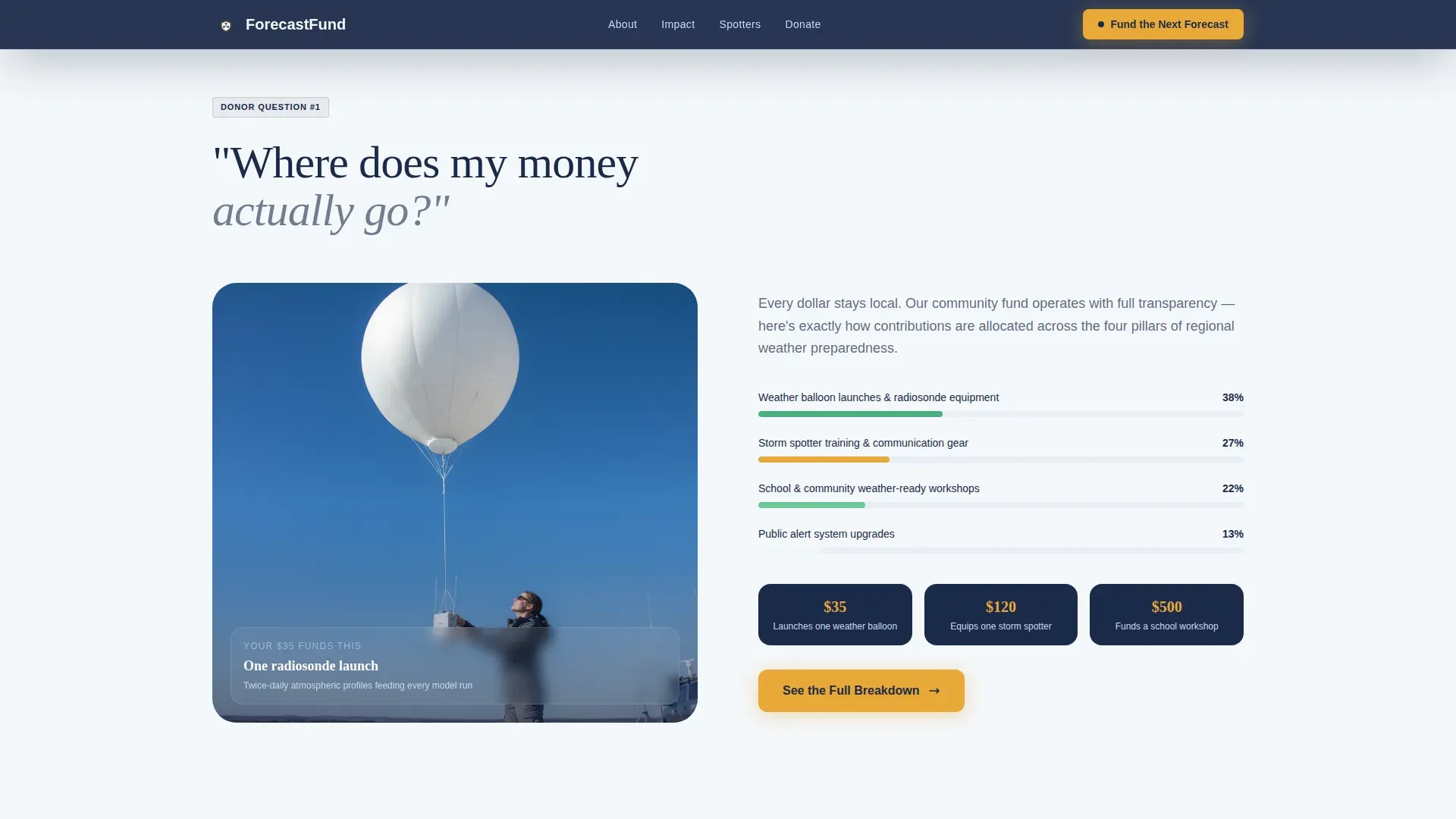
Preset Donation Amounts with Impact Labels
The donation form includes three preset donation amounts tied to tangible outcomes. Each suggested donation amount tells donors exactly what their gift funds: one weather balloon, one spotter kit, or one school weather-ready workshop. Suggested donation amounts reduce decision friction and improve completion rates, especially for first time contributors who need clear impact context before committing.
Monthly Giving Toggle
A recurring donations toggle sits inside the donation form, letting donors switch between one-time and monthly giving in a single click. Promoting recurring donations matters because six in ten donors only give once. The monthly option builds predictable revenue for the organization and deepens the emotional connection between donors and the mission over time.
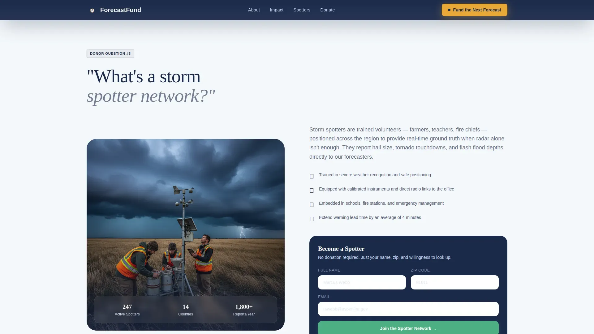
Secondary Volunteer Capture Form
Alongside the main donation form, a simpler name-and-zip spotter sign-up form gives non-donors a meaningful way to contribute. This second path keeps visitors engaged even when they are not ready to give financially. It reduces overall abandonment and expands the spotter network, which is itself a form of community investment.
Sticky Amber Donation Bar
After the visitor scrolls past the third zigzag section, a sticky bottom bar appears carrying the "Fund the Next Forecast" call-to-action in alert amber. This persistent element keeps the primary call visible without interrupting the reading flow. It reinforces the campaign goal at the exact moment donors have absorbed enough context to act.
Page sections overview
| Section | Purpose |
|---|---|
| Hero Split Panel | Introduce mission, show social proof, deliver primary call-to-action |
| Money Destination Block | Answer "Where does my money go?" with radiosonde launch photo and breakdown |
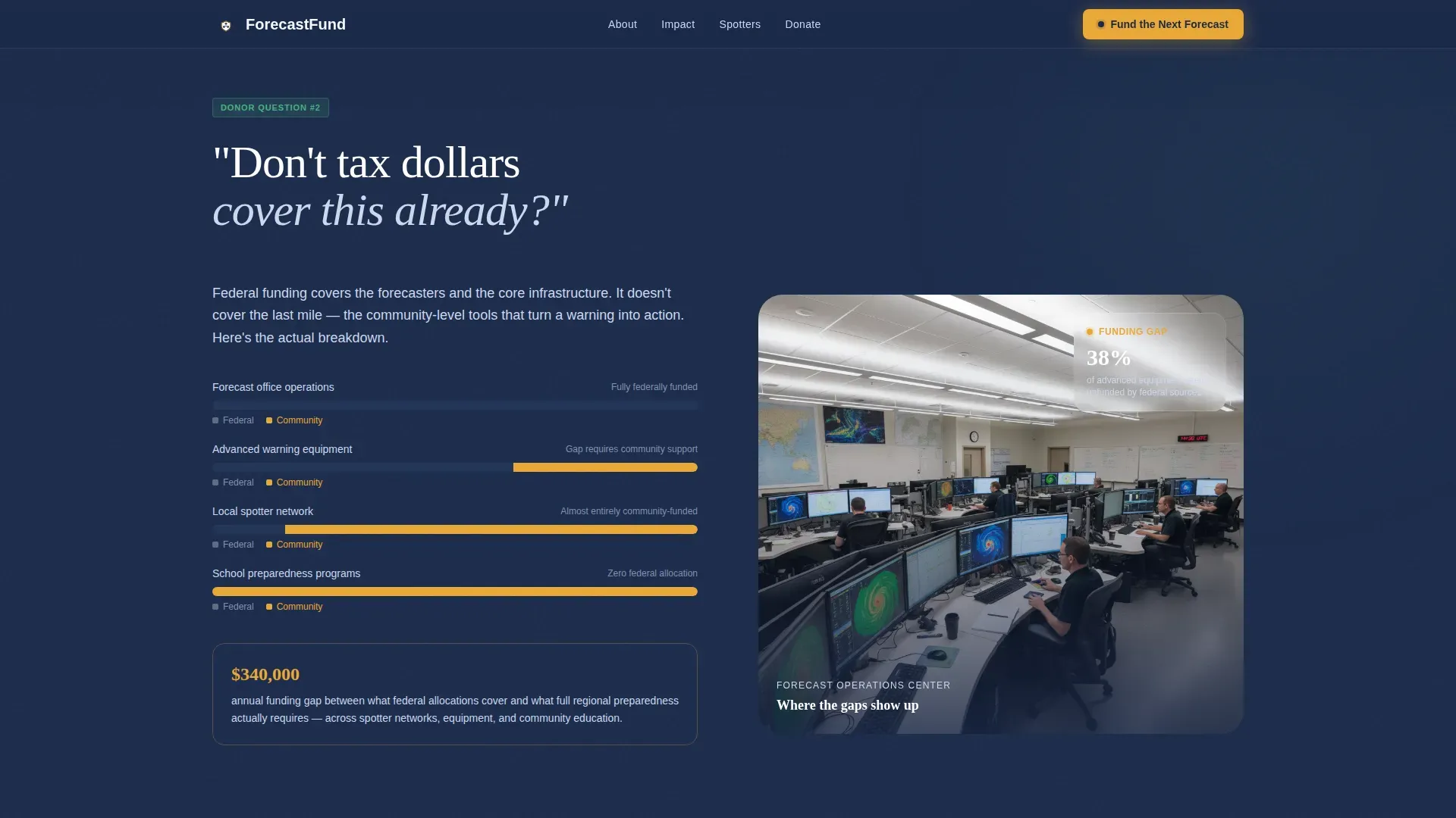
| Federal Funding Gap | Answer "Don't tax dollars cover this?" with a visual funding gap comparison |
| Storm Spotter Network | Answer "What's a storm spotter network?" and capture volunteer sign-ups |
| Full-Width Donation Form | Present preset giving levels, monthly toggle, custom amount, and spotter form |
| Footer Row | Single linear row with office contact and navigation links |
Design & branding system
The Alpine Fresh color system gives this donation landing page the visual authority of a professional operations center. Summit navy (#1B2A4A) dominates headers and alternating section backgrounds. Cirrus white (#F4F7FA) provides breathing space between blocks. Radar green (#4CAF82) marks data points, icons, and supporting callouts. Alert amber (#E8A838) is reserved exclusively for calls-to-action and urgent highlights, so every amber element carries real weight.
- Typography pairs Fraunces for display headlines (authority with warmth) and DM Sans for body text and interface elements (clarity and readability)
- Compelling visuals anchor each section: an operations center photo at golden hour, a radiosonde launch, a funding gap breakdown, and storm spotters in the field
- The overall design tone is corporate precision with calm technical mastery, matching the quiet authority of the forecast office itself
Mobile & speed optimization
The template is built desktop-first to match its primary audience of emergency managers at workstations. However, mobile responsiveness is fully addressed because many community donors and first time contributors will arrive via mobile devices. Mobile optimization ensures the donation form, preset buttons, and the sticky bar all function cleanly on smaller screens.
- The donation form uses a minimal field structure; reducing form fields is one of the highest-impact ways to improve completion rates and lower cognitive friction
- Mobile users see the sticky amber donation bar and preset donation amounts in a touch-friendly layout that does not compromise the distraction free layout of the desktop experience
- The GSAP ScrollTrigger animation system uses intersection observer stagger, meaning reveal animations load only when visible, protecting performance for mobile users on slower connections
How this template helps you convert
An effective donation landing page template must balance a frictionless experience with strategic transparency. This template achieves that balance by guiding visitors through a logical sequence: understand the mission, trust the organization, choose a giving level, and complete the donation process. The donation flow is deliberate and builds confidence at each step.
- The hero immediately communicates the campaign objective with a bold headline, a real social proof stat, and a primary amber call-to-action. Clear messaging defines the campaign goal within seconds of arrival. Trust signals such as warning counts and population protected figures serve as credibility signals right at the top.
- Each zigzag section reduces a specific barrier. The funding gap visual addresses skepticism about tax dollars. The impact breakdown addresses concerns about where funds go. Combining clear messaging with strong visuals and emotional storytelling means donor behavior shifts from hesitation to confidence across each scroll.
- The donation form section consolidates action. Preset donation amounts simplify decision making. The monthly toggle encourages recurring donations. Flexible payment options including modern digital payment methods remove the final friction point. After completing a gift, donors can be directed to a thank-you page that confirms their impact and strengthens the donor relationship.
Other information about this template
This template is built within a broader landscape of high-performing donation landing pages used by organizations ranging from large national causes to local community programs. Understanding what makes those pages work helps clarify why the design choices here are deliberate. Donation security is a recognized concern for online donors, and this template's layout anticipates that by placing trust signals near the donation form, reflecting best practices for nonprofit fundraising pages.
- Organizations like Feeding America, food banks across the country, and large hospital campaigns such as Great Ormond Street Hospital show that emotional resonance and clear impact explanation are the two most consistent drivers of donation conversion, regardless of cause size
- Programs like the Pointe Autism Foundation and the North Texas Food Bank demonstrate that suggested donation amounts tied to concrete outcomes consistently raise the average donation and improve donor confidence among first time contributors
- The Pointe Autism Foundation also illustrates how a multi step form, used carefully, can guide donors without adding perceived effort, while the double the donation matching gift concept can be incorporated as a campaign efficiency tool to motivate faster giving decisions
- This fundraising landing page is no-code-friendly by design, meaning teams without development resources can adapt and launch it quickly; no-code tools enable organizations to create and optimize donation pages without extensive coding skills
- Fundraising data and online fundraising research consistently show that digital giving is trending upward, making a well-structured donation landing page one of the most cost-effective assets compared to direct mail campaigns
- Campaign efficiency improves when organizations track fundraising efforts using campaign-specific metrics; reviewing donor behavior by segment rather than only in aggregate gives teams clearer signals for improving the donation process over time
- High abandonment on the payment step is a known signal of distrust or insufficient payment options; this template anticipates that friction point by designing the donation flow to be transparent and intuitive from the first scroll
- Visitor behavior research supports the importance of intuitive navigation and a single campaign goal per page; this template removes secondary navigation and side paths except for the deliberate spotter sign-up, which serves the same campaign objective
Theme
Corporate Precision
Creative direction
FAQ-Driven
Color system
Alpine Fresh
Style
Zigzag/Alternating
Direction
Donation/Fundraising
Page Sections
Half-page Hero Split with Social Proof
Faq-driven Zigzag Content Blocks
Preset Giving Levels with Impact Labels
Monthly Giving Toggle
Sticky Amber Donation Bar
Secondary Volunteer Sign-up Form
Related questions
Can I customize the preset donation amounts in the template?
Does this template support recurring monthly donations?
Can visitors sign up as volunteers without making a financial gift?
Is the zigzag layout flexible enough for other fundraising campaigns?
How does the sticky donation bar appear on the page?


