Emergency Communication Landing Page Template
Alert is a single-page emergency communication landing page template built for county emergency managers, city IT directors, and school district safety officers. It opens with a live Coverage Gap Estimator, walks visitors through a four-step detect-to-confirm process, and anchors every claim in a consequence-driven comparison table that makes the case before any form appears.
by Rocket studio
Quick summary
Alert is a purpose-built emergency communication landing page template designed for public-sector buyers. It leads with an interactive Coverage Gap Estimator, guides visitors through a four-step operational flow, and closes with a side-by-side comparison table. Every section is structured to quantify the cost of inaction and move serious decision-makers toward a full county assessment.
Who this template is for
This template is built for professionals who are responsible for public safety communications at a county, city, or institutional level. They are under compliance pressure, managing aging infrastructure, and need to justify a platform switch to leadership or council.
- County emergency managers tracking Federal Emergency Management Agency (FEMA) compliance deadlines
- City IT directors replacing legacy pager systems with a unified notification platform
- School district safety officers who need reliable lockdown alerts that do not depend on Wi-Fi
What problem this template solves
Emergency communication programs often run on a patchwork of siloed tools. Sirens, email blasts, robocalls, and SMS systems operate independently, creating dangerous gaps in coverage and response time. This template gives buyers a structured way to see those gaps clearly and understand what a unified platform changes.
- Fragmented notification channels leave parts of a population unreached during critical events
- Legacy systems cannot document delivery, making post-event audits and compliance reporting difficult
- Decision-makers lack a clear side-by-side view of what staying with the old system actually costs
What you get with this template
The template delivers a full-funnel, single-page layout organized around the buyer's decision process. It leads with a tool that quantifies the visitor's current situation, then builds the case through structured content, and ends with two conversion paths suited to different buyer readiness levels.
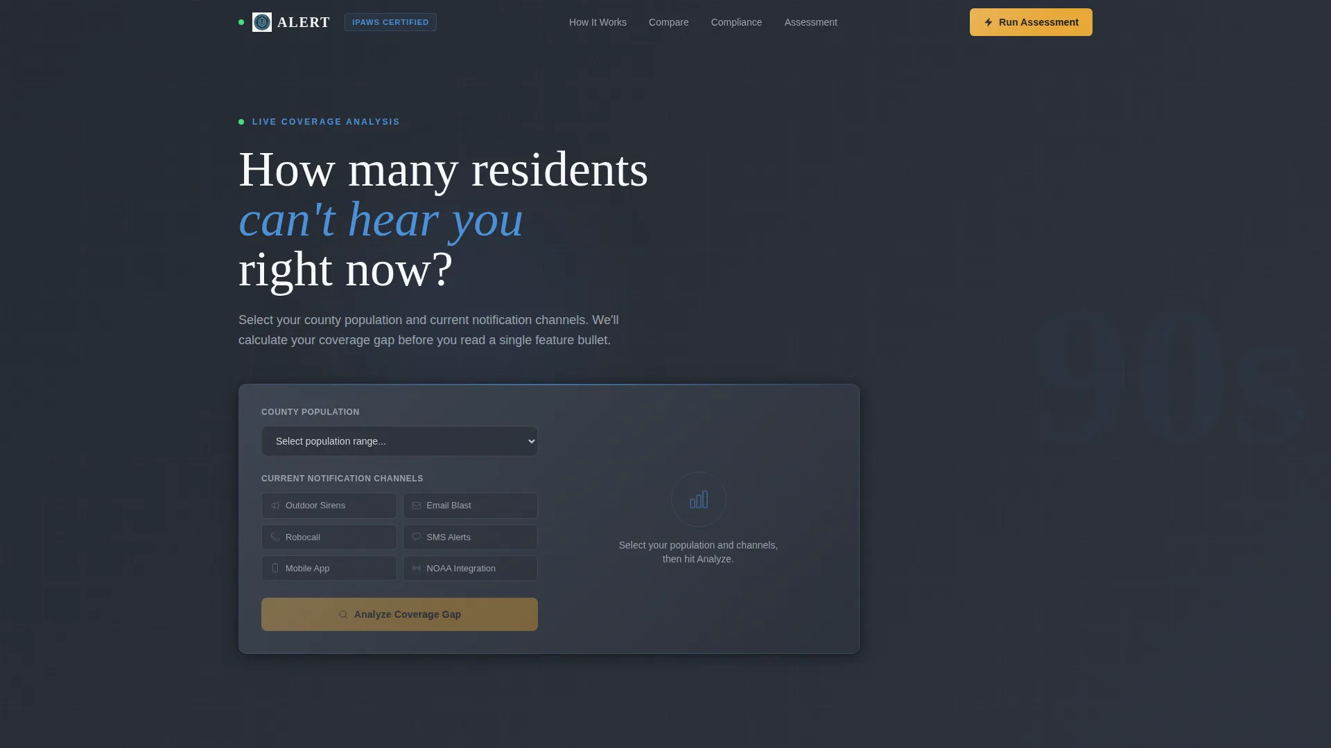
- A live Coverage Gap Estimator in the header that scores current notification coverage and returns a projected notification time
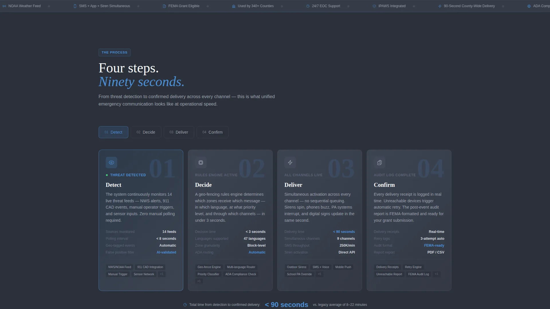
- A four-step countdown sequence covering Detect, Decide, Deliver, and Confirm with per-step metrics
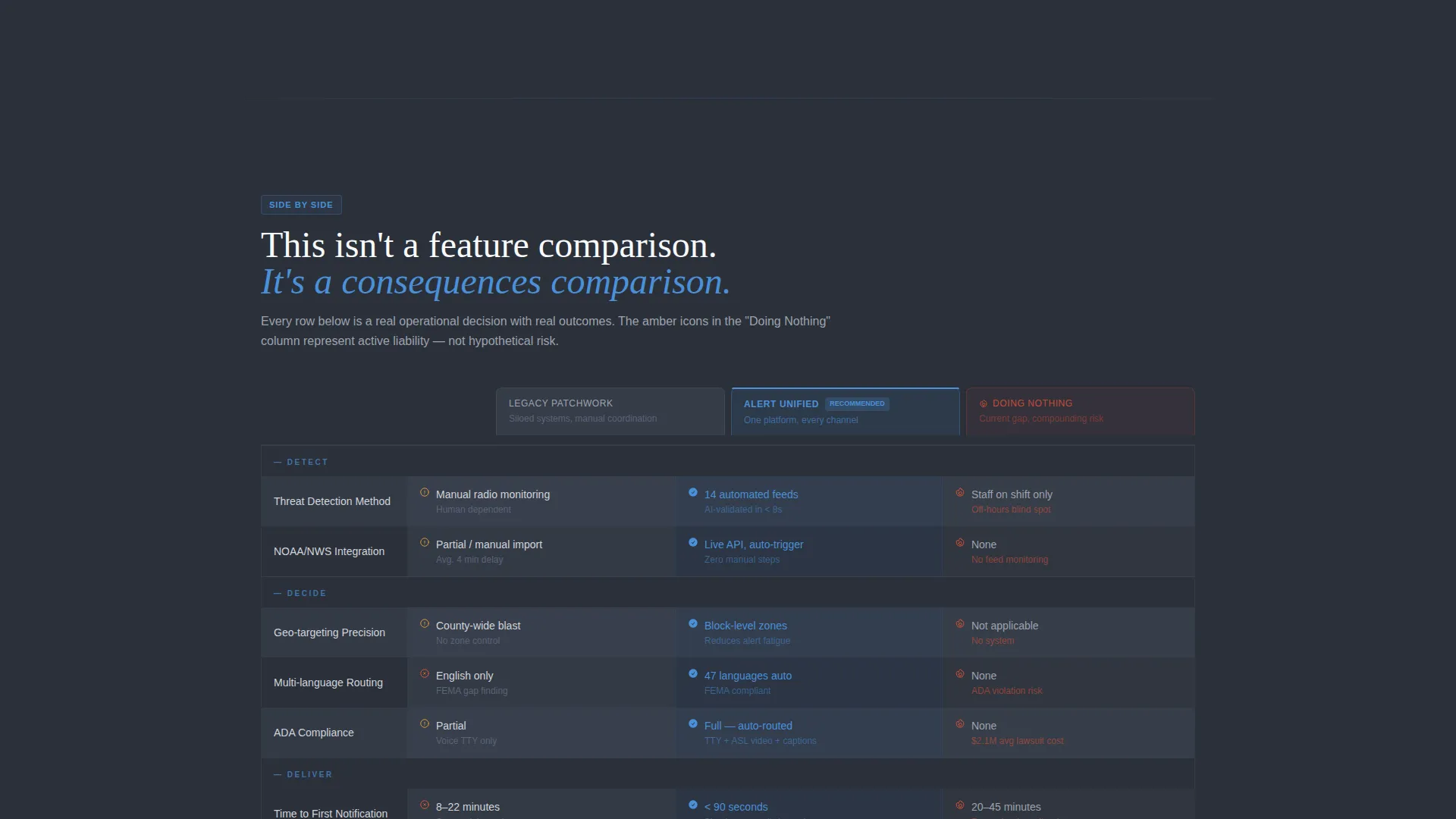
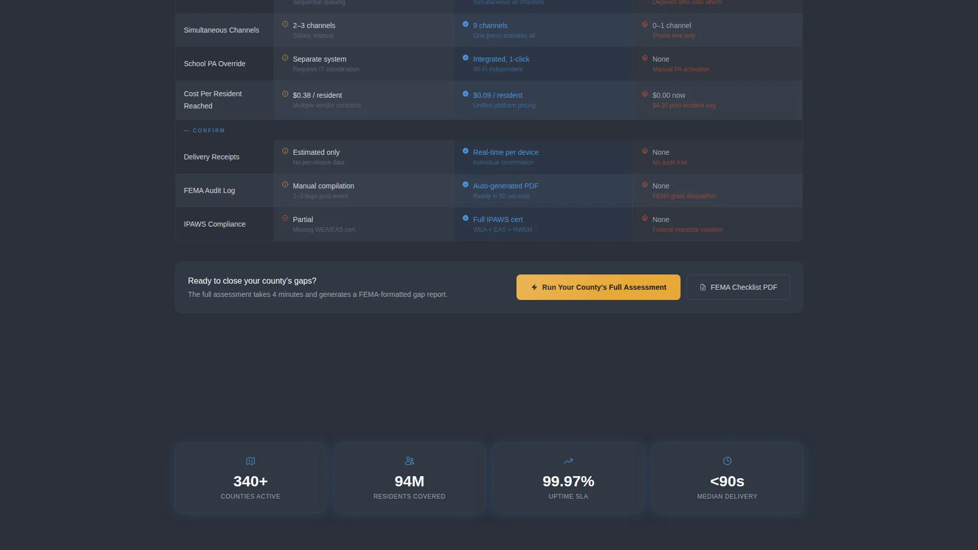
- A consequence-driven comparison table with three columns and amber warning icons that highlight the cost of doing nothing
Feature list
This template includes the following built-in components and layout systems.
Live Coverage Gap Estimator
The header section opens with an interactive estimator tool. Visitors select their county population from a dropdown, check the communication channels they currently use, and click "Analyze." The tool instantly returns a coverage score out of 100, a projected notification time in seconds, and a gap summary rendered in sky blue numbers against a charcoal background field.
Four-Step Countdown Sequence
The page body is structured as a countdown: Step 1 Detect, Step 2 Decide, Step 3 Deliver, Step 4 Confirm. Each step is its own row inside the comparison table, with columns for legacy patchwork systems, the unified platform, and the cost of doing nothing. Each cell contains a specific metric such as delivery time, a compliance checkbox, or a cost-per-resident figure.
Consequence-Driven Comparison Table
The comparison table does not just list features. It maps the consequences of each approach side by side. Amber warning icons appear in the "Doing Nothing" column to signal risk at a glance, making the stakes visible without requiring the visitor to read every line.
Dual Conversion Path System
The page supports two conversion paths. The primary call to action is "Run Your County's Full Assessment," placed beneath the estimator results and pinned as a sticky bottom bar once the comparison table scrolls into view. A secondary path offers a downloadable FEMA Compliance Checklist in PDF format for buyers who need documentation before committing to a conversation.
Progressive Assessment Form
Clicking the primary call to action opens a short multi-step form. Fields include county name and state with auto-suggest from the FIPS database, current annual emergency communications budget, biggest compliance concern selected from a dropdown, and a work email address.
Civic Service Visual Theme
The page uses a dispatch-console color system with charcoal-to-slate gradients as backgrounds, soft aluminum body text, and sky blue for column headers and trust indicators. Amber is reserved exclusively for calls to action and alert-state highlights, so it only appears when something needs clicking.
Page sections overview
| Section | Purpose |
|---|---|
| Coverage Gap Estimator | Interactive header tool that scores current notification coverage and surfaces gaps before copy loads |
| Estimator Results Display | Renders coverage score, projected notification time, and gap summary to prime the comparison |
| Step 1: Detect | Explains how the system ingests weather feeds, 911 CAD alerts, and manual triggers |
| Step 2: Decide | Covers the rules engine, geo-fencing, and multi-language routing logic |
| Step 3: Deliver | Details simultaneous siren activation, SMS, voice calls, digital signage, and school PA override |
| Step 4: Confirm | Shows delivery receipts, retry logic for unreachable devices, and the post-event audit log |
| Comparison Table | Side-by-side consequence view across legacy patchwork, unified platform, and doing nothing |
| Primary call to action Block | "Run Your County's Full Assessment" button anchored below estimator and pinned as sticky bar |
| Secondary Lead Capture | FEMA Compliance Checklist PDF download for buyers not yet ready to book an assessment |
| Progressive Assessment Form | Short multi-step form collecting county details, budget, compliance concern, and work email |
Design & branding system
The visual identity follows a Civic Service theme that feels like the calm inside an emergency operations center late at night. Dark infrastructure anchors the layout, with open sky blue marking the paths forward. Every color carries a functional role, and nothing decorative competes with the content.
- Background gradients run from deep dispatch-console charcoal (#2B303A) to storm-cloud slate (#5A6378), with data rows alternating between slate and gunmetal (#3D4451)
- Sky blue (#4A90D9) marks column headers, trust indicators, and estimator result numbers, while soft aluminum (#D1D5DB) handles all body text
- Emergency-beacon amber (#E8A838) is used exclusively for calls to action and alert-state highlights, ensuring it retains full visual urgency every time it appears
Mobile & speed optimization
The template layout is built to work across screen sizes without losing the structure that makes the comparison table readable. The sticky call-to-action bar adapts to smaller viewports so the primary conversion path is always within reach.
- The Coverage Gap Estimator dropdown and channel checkboxes are touch-friendly and sized for mobile interaction
- The comparison table columns stack or compress cleanly on narrow screens so metric cells remain legible
- The progressive form uses a step-by-step flow that reduces visual load on mobile, asking for one or two fields at a time
How this template helps you convert
The page is designed so the visitor quantifies their own problem before reading a single paragraph of promotional copy. That sequence builds trust and urgency at the same time.
- The Coverage Gap Estimator returns a personalized score in the header, making the visitor's current gap feel real and measurable before any sales claim appears
- The consequence-driven comparison table uses specific metrics and amber risk icons to make inaction feel costly, which moves buyers toward the primary call to action with genuine motivation
- The dual conversion path captures both ready-to-engage buyers through the full assessment form and early-stage researchers through the downloadable FEMA Compliance Checklist PDF
Other information about this template
This template sits at the intersection of emergency preparedness and business continuity planning, making it relevant for procurement cycles that involve both public safety leadership and IT governance teams. The card grid layout style means individual content modules can be updated independently as compliance requirements or platform capabilities evolve.
- The template is designed for a Partnership and Business-to-Business sales motion, supporting longer buying cycles with a lead-nurture secondary conversion path
- The FEMA Compliance Checklist download gives sales teams a natural follow-up reason to re-engage leads who downloaded but did not book an assessment
- The FIPS database auto-suggest in the form field reduces friction for county-level buyers entering jurisdiction data
- The amber icon system in the comparison table is built to draw attention to risk without using alarmist copy, keeping the tone calm and authoritative throughout
Theme
Service Utility
Creative direction
Case Study Narrative
Color system
Charcoal & Amber
Style
Card Grid (Modular)
Direction
Partnership/B2B
Page Sections
Live Coverage Gap Estimator
Four-step Countdown Sequence
Consequence-driven Comparison Table
Dual Conversion Path Layout
Progressive Assessment Form
Sticky Call-to-action Bar
Related questions
Who is this landing page template designed for?
Can the Coverage Gap Estimator be customized for different population sizes?
What are the two conversion paths included in this template?
Does the comparison table show specific metrics or just feature checkboxes?
Is this template suited for a longer Business-to-Business sales cycle?


