Specialist Digital Government Services Professional Website Template
The Alertdispatch landing page template is built for public safety platforms that need to earn trust before asking for a form fill. It follows an industry report structure, leading visitors through key findings, methodology, and anonymized case studies before presenting a gated download. The result is a single-column flow that converts emergency managers and public safety directors into qualified leads.
by Rocket studio
Quick summary
This template frames your emergency notification platform as a primary research authority. It opens with a search-centered report header, moves through data cards and expandable methodology sections, and closes with a gated download form. The calm, civic-service aesthetic signals credibility to county emergency managers and public safety directors who read government white papers, not marketing brochures.
Who this template is for
Emergency notification and public safety platforms need a different kind of landing page. This template is built for teams selling to government buyers who require data before they trust a vendor. It suits organizations that have real benchmarks and compliance evidence worth sharing.
- County emergency managers running lean, budget-constrained teams
- University public safety directors accountable to students, faculty, and trustees
- Municipal IT coordinators inheriting undocumented legacy alert systems
What problem this template solves
Government buyers do not respond to standard product landing pages. They need evidence, methodology, and peer context before they will identify themselves to a vendor. Most SaaS landing pages ask for the form fill too early and lose the reader before trust is built.
- No credible data hook to justify the download or justify budget approval
- No structured path from casual skimming to deep engagement with methodology
- No conversion option for visitors who are not ready to share their agency details yet
What you get with this template
The template delivers a full single-column flow designed around a research report narrative. Every section earns the next one, from the header through to the gated form. The layout is calm and document-like, built for desktop workstation readers at any hour.
- A search-box header with a clean headline and three linked topic chips
- Three data-card key findings section, methodology accordions, anonymized case study snapshots, and a comparative framework table
- A progressive three-field gated form plus an ungated two-page executive summary path
Feature list
This section outlines the core structural and interactive components included in the template.
Search-Centered Report Header
A centered search input field sits beneath a clean editorial headline. Ghost text guides visitors to search by hazard type, compliance standard, or agency size. Three linked chips below the field provide immediate topic shortcuts without requiring a search query.
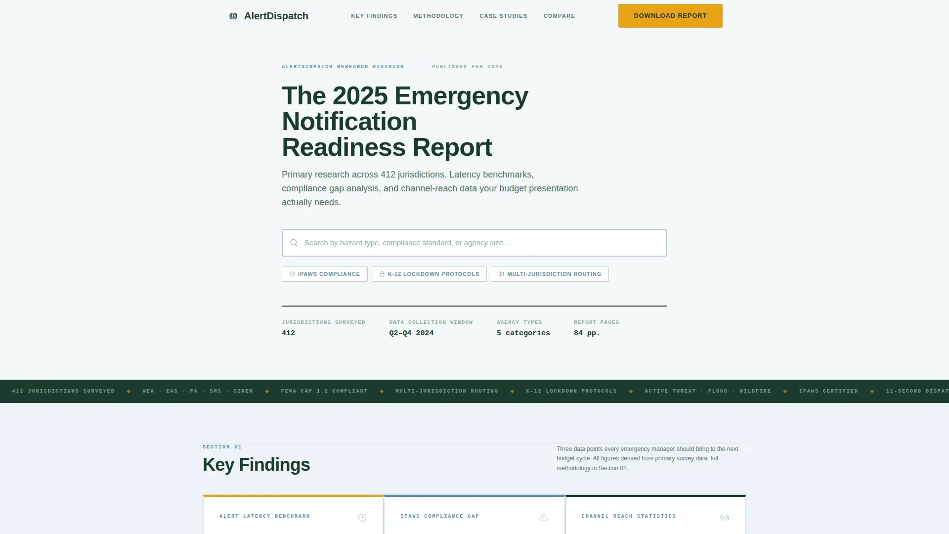
Data Card Key Findings Block
Three scroll-reveal data cards display frontloaded research findings. Each card surfaces a distinct metric category: alert latency benchmarks, compliance gap percentages, and channel-reach statistics. The IBM Plex Mono typeface renders figures with the visual authority of a government data table.
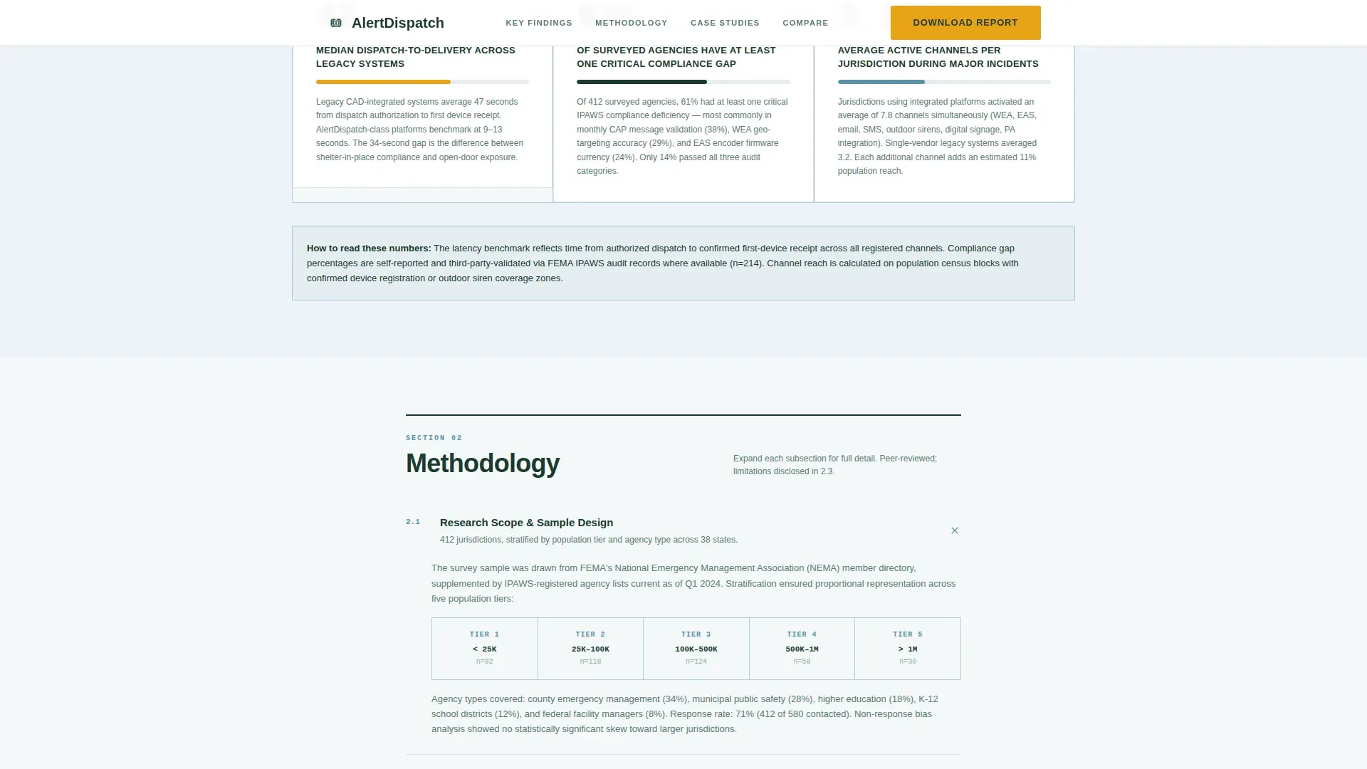
Expandable Methodology Accordions
The methodology section uses accordion components so readers can expand only the detail they need. Each accordion covers a discrete research scope area: data sources, validation approach, or sample criteria. The interaction is low-animation and precise, matching the calm operations-center aesthetic.
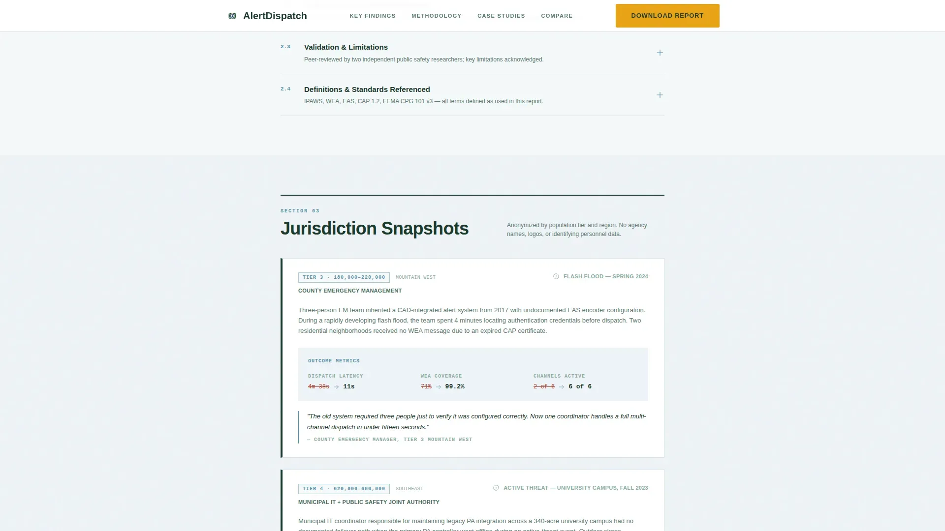
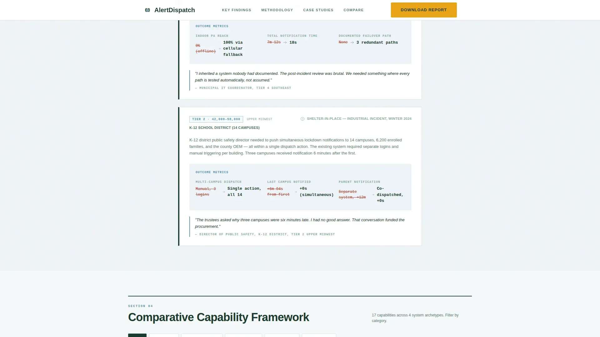
Anonymized Case Study Snapshots
Case study blocks present jurisdiction findings by population tier rather than by organization name. This approach maintains analytical credibility while protecting agency identity. Readers can relate findings to their own jurisdiction scale without needing named references.
Comparative Framework Table
A tab-switchable comparison table lets visitors evaluate alert system capabilities side by side. The table is the final analytical section before the conversion form. It gives budget-meeting attendees a ready-made framework they can reference in procurement discussions.
Progressive Gated Conversion Form
The primary download is gated behind a three-field progressive form: work email, agency type dropdown, and jurisdiction population range. A secondary ungated path offers a two-page executive summary PDF for visitors not ready to fully identify themselves. Both paths serve different buyer readiness levels within the same page flow.
Page sections overview
| Section | Purpose |
|---|---|
| Report Search Header | Establish editorial authority and orient the visitor with topic chips |
| Key Findings Cards | Front-load real data to justify continued reading and the eventual form fill |
| Methodology Accordions | Build methodological credibility for readers who need to validate the research |
| Case Study Snapshots | Provide peer-context by population tier to help readers benchmark their jurisdiction |
| Comparative Framework Table | Give buyers a ready-made decision tool for internal procurement discussions |
| Progressive Download Form | Convert engaged readers into qualified leads through a staged data-collection form |
| Executive Summary Path | Offer an ungated brief for visitors not ready to share full agency details |
| Footer | Provide a clean linear single-row close consistent with the white paper aesthetic |
Design & branding system
The visual identity follows a civic service theme that prioritizes legibility under stress over decorative appeal. The palette recalls a national park service sign: trustworthy, high-contrast, and readable at a distance. Every color has a specific functional role and is not used interchangeably.
- Glacier white (#F4F7F9) backgrounds and evergreen authority (#1B3A2D) body text anchor all reading surfaces
- Altitude blue (#5B92A8) marks section dividers and data callouts, while high-visibility amber (#E8A317) appears exclusively on calls to action and interactive highlights
- Plus Jakarta Sans handles headline and body authority; IBM Plex Mono renders all numeric data and statistics
Mobile & speed optimization
The template is designed desktop-first for emergency operations center operators working at workstations. The layout still provides a solid mobile fallback for visitors reviewing the report on a phone between meetings. Animation is intentionally minimal throughout.
- No hero animation; subtle accordion transitions and scroll-reveal effects on data cards only
- Server Components handle static content sections, keeping JavaScript to a minimum
- Single-column flow collapses cleanly to narrow viewports without sacrificing the data card or table layouts
How this template helps you convert
The conversion strategy is built around earning trust before asking for identification. The page front-loads enough real data that visitors feel they already have partial value, making the full report feel essential rather than speculative.
- The search header and key findings data cards give visitors an immediate, tangible reason to keep reading, so they arrive at the form with intent rather than skepticism.
- The two-path conversion model captures both high-intent buyers ready to fill the full form and early-stage researchers who will only accept an ungated two-page brief, reducing drop-off across both segments.
Other information about this template
This template is suited for government technology and public safety software platforms operating in a business-to-government or business-to-business content marketing context. The design language deliberately mirrors the kind of documentation that emergency managers already trust and use daily.
- The page uses United States English localization with government-format dates (MM/DD/YYYY) and no currency symbols
- The footer uses a linear single-row pattern consistent with the overall white paper document aesthetic
- The template is categorized under Government and Public, Digital Government Services, and the Emergency Alert and Notification System niche
- The Civic Service theme and Alpine Fresh color system are purpose-built for this category intersection, making the template immediately recognizable to public sector buyers
Theme
Civic Service
Creative direction
Industry Report
Color system
Alpine Fresh
Style
Single Column Flow
Direction
Content/Resource
Page Sections
Search-centered Report Header
Scroll-reveal Data Cards
Expandable Methodology Accordions
Anonymized Case Study Snapshots
Comparative Framework Table
Progressive Gated Download Form
Related questions
Who is the intended buyer for this template?
What makes the two-path conversion model useful?
Does the template include real research data?
Can the comparative framework table be adapted to my platform's feature set?
Is this template suitable for a desktop-first audience?


