Home Care Agency FAQ Website Template
A single-page medical alert landing page built for senior care fundraising. It uses a zigzag FAQ layout to answer real caregiver fears one section at a time, then guides visitors to gift a wrist-worn alert device to a senior in need. The design blends documentary warmth with clinical clarity to build trust before the donation ask.
by Rocket studio
Quick summary
This is a single-page fundraising landing page for a wrist-worn medical alert system. It answers caregiver fears in a scrolling FAQ zigzag layout, then presents a three-tier donation selector to gift coverage to a senior. The tone is calm and steady, built for adult children, veterans, and social workers who need information before they can act.
Who this template is for
This template is designed for organizations and campaigns that connect isolated seniors with emergency support. It speaks directly to the people doing the research on someone else's behalf.
- Adult children researching options after a parent's fall, often late at night on a phone
- Retired veterans living alone in rural areas who need cellular-first coverage details
- Social workers assembling discharge planning resources for aging clients
What problem this template solves
Many caregiver landing pages push a product before earning trust. This template flips that order. It surfaces the real questions first and answers them honestly, so visitors feel informed rather than pressured.
- Fear and uncertainty stall decisions; the FAQ zigzag dissolves hesitation section by section
- Donation framing feels awkward without context; this layout builds the case before the ask
- Rural and low-connectivity audiences need specific reassurance; a cellular coverage section addresses this directly
What you get with this template
You get a fully structured single-page layout with every section pre-built and purposefully sequenced. The page moves from emotional credibility to practical detail to a clear giving action.
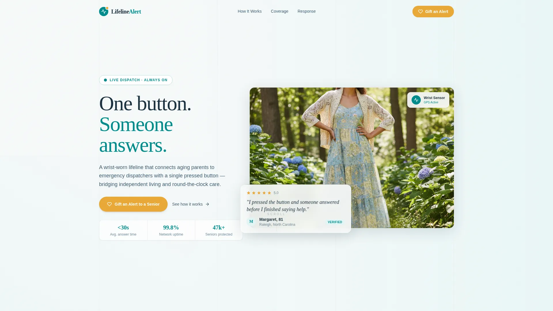
- A hero section with a testimonial card floated over a lifestyle photograph, showing a real quote, first name, age, and star rating
- Three FAQ zigzag sections, each pairing a fear-based question with an illustrated answer and alternating image placement
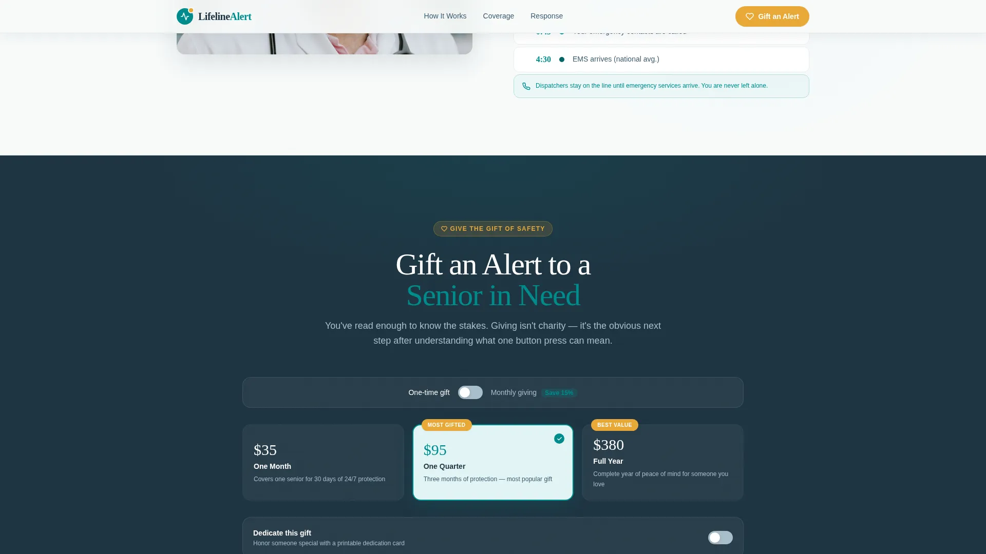
- A donation call-to-action section with a three-tier selector, a name dedication toggle, a monthly subscription path, and an optional email field for a printable dedication card
Feature list
This template is built around specific interactive and visual components that serve the senior care fundraising use case.
Testimonial Hero Card
The hero opens with a softly shadowed card floated over a muted lifestyle photograph of a silver-haired woman gardening. The card displays a serif quote, a first name and age attribution, and a small star rating. The documentary grain of the image signals authenticity, not advertisement polish.
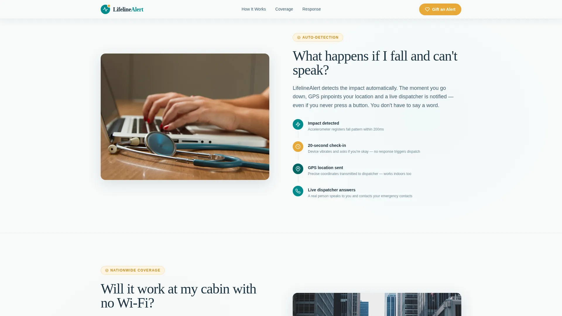
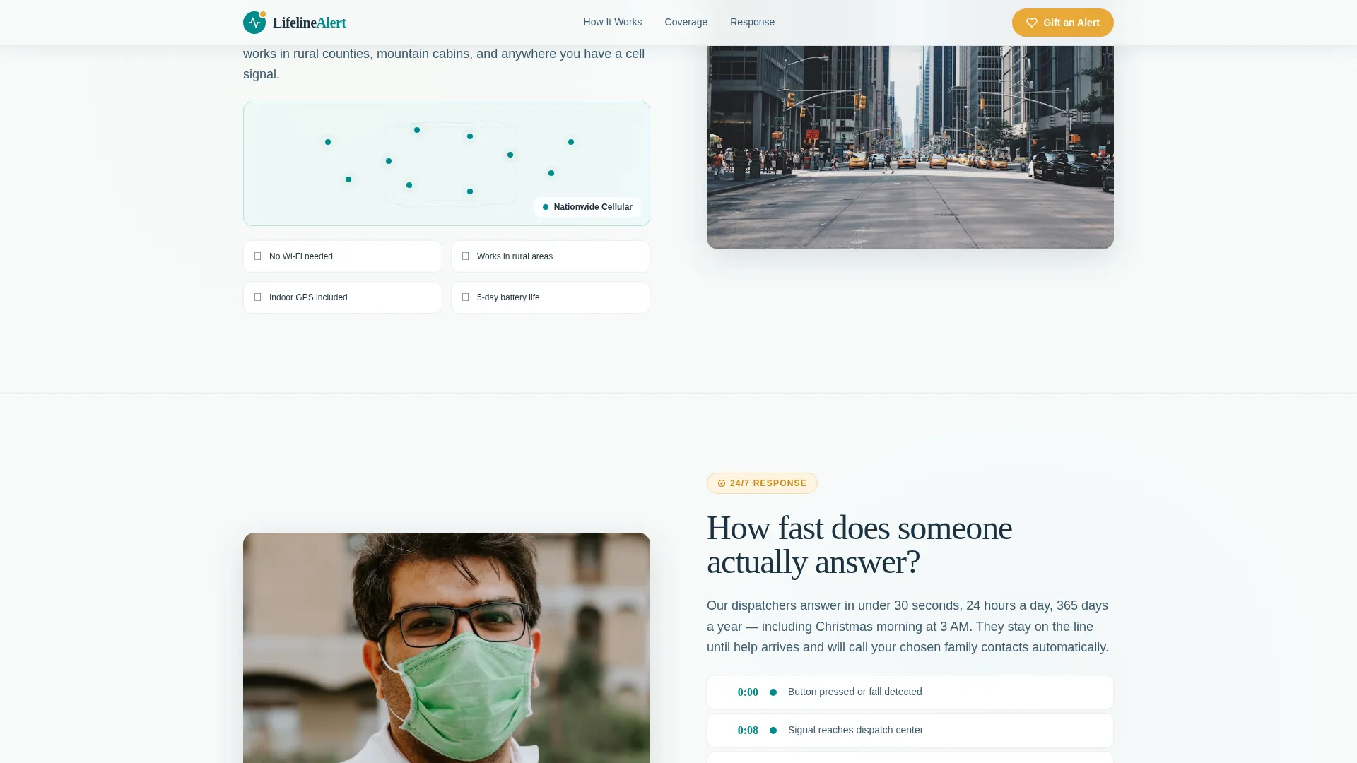
FAQ Zigzag Layout
Each zigzag section frames one real caregiver fear as a plain-language question. The answer sits beside an illustration or map, with image placement alternating left and right across sections. Questions escalate from practical to emotional, ending on the most personal hesitation of all.
Donation Tier Selector
The giving section offers three pre-set tiers: one month of coverage, one quarter, and a full year. Visitors can toggle between one-time and monthly giving, and a secondary path presents a reduced monthly subscription. The selector is built as a client-side interactive component.
Name Dedication Toggle
Donors can dedicate a gift in someone's name directly on the page. An optional email field lets them request a printable dedication card. This feature turns a transaction into a personal gesture.
GSAP Scroll Animations
Sections reveal through ScrollTrigger image animations and Intersection Observer stagger effects. A scroll-linked parallax layer adds depth without distraction. Animation intensity is set to medium, keeping the page feeling alive without overwhelming older visitors.
Single-Row Footer
The footer follows a Pattern 1 linear single-row layout, keeping the page clean and focused. It does not compete with the donation call to action above it.
Page sections overview
| Section | Purpose |
|---|---|
| Hero Testimonial Card | Opens with social proof floated over a lifestyle photo to build immediate trust |
| FAQ Zigzag One | Addresses the fall-and-can't-speak fear with a GPS auto-detection step illustration |
| FAQ Zigzag Two | Answers the rural connectivity question with a cellular coverage map |
| FAQ Zigzag Three | Handles the response speed question with a visual timeline |
| Donation Call to Action | Presents three giving tiers, a name dedication toggle, and a monthly giving path |
| Linear Single-Row Footer | Closes the page cleanly without redirecting attention away from the gift action |
Design & branding system
The visual identity follows an Educational Guide theme. Every color choice and type decision reinforces the feeling of a well-lit, trustworthy space where someone speaks to you slowly and clearly.
- Color system: clinical teal (#008B8B) as primary, pulse-monitor white (#F7FAFA) as background, calm slate (#3D5A6E) for body text, and warm amber (#E8A838) reserved exclusively for buttons and callout badges
- Typography: Fraunces serif for headlines to convey warmth and authority, DM Sans for body text and interface labels for clean readability
- Photography direction: documentary grain and natural light, not stock-photo polish, so the page reads as a real human story rather than a campaign
Mobile & speed optimization
The template is built desktop-first with careful mobile optimization, recognizing that midnight research often happens on a phone. The layout adapts to smaller screens without losing the sequential FAQ logic.
- Zigzag sections restack cleanly for vertical mobile scrolling so the image-text pairing stays readable
- The donation widget is isolated as a client-side component, keeping the static sections light and fast to load
- Server Components handle all static sections, separating rendering responsibility from interactive donation logic
How this template helps you convert
This template earns the donation click by making visitors feel genuinely informed before they ever see a giving option. The conversion path is patient and sequential.
- The testimonial hero card creates immediate emotional credibility with a real quote, a name, an age, and a star rating, giving skeptical visitors a reason to keep reading
- Each FAQ zigzag section dissolves one specific fear before moving to the next, so by the time the donation section appears, the visitor has already mentally committed to the value of the device
- The three-tier donation selector with a monthly toggle and a name dedication option reframes giving as a personal and meaningful act, not a charity transaction
Other information about this template
This template is localized for United States audiences, using United States dollars, English copy, and 12-hour time formatting throughout. It is designed specifically for the medical alert system niche within the elderly care and senior living category.
- The page structure supports social workers and discharge planners who need a shareable, trustworthy resource to include in care packets
- The FAQ creative direction is intentional: questions are written from the visitor's voice, not the brand's voice, so the scroll feels like a conversation rather than a pitch
- The amber call-to-action color (#E8A838) is used only for buttons and badges, preserving its visual weight as a deliberate signal to act
- Animation is set to medium intensity using GSAP ScrollTrigger and Intersection Observer, keeping the experience engaging without causing distraction for older or anxious visitors
Theme
Educational Guide
Creative direction
FAQ-Driven
Color system
Teal Catalyst
Style
Zigzag/Alternating
Direction
Donation/Fundraising
Page Sections
Testimonial Hero with Lifestyle Photo
FAQ Zigzag Sections
Interactive Donation Tier Selector
Name Dedication Toggle
GSAP Scroll Reveal Animations
Related questions
Can I customize the donation tier amounts and labels?
Does the name dedication toggle send an automatic email?
Is this template suitable for both nonprofit and for-profit organizations?
How does the FAQ zigzag layout display on mobile screens?
Can I add more FAQ zigzag sections beyond the three included?


