Chiropractor Appointment Booking Website Template
Chiropractor appointment booking website template with symptom-matching educational panels, animated SVG spine hero, and a sequential 3-field booking form. Built for chiropractors who want to convert pain-aware visitors into booked patients before they pick up the phone. Free to customize with AI in minutes.
by Rocket studio
Quick summary
Align is a chiropractor appointment booking landing page designed to convert pain-aware visitors into booked patients. It opens with a bold typographic hero, moves through symptom-specific educational panels, and closes with a three-field booking form. The Forest Trust color system and single-column layout create a calm, credible space that feels as grounded as the practice itself.
Who this template is for
This template is built for chiropractors who want to attract patients before those patients have made up their minds. It suits practices that treat everyday chronic pain rather than acute injuries, and who want their landing page to do the educational work before the first appointment.
- Chiropractors serving desk workers, weekend athletes, and new parents with recurring musculoskeletal pain
- Practices that want to reduce no-shows by sending pre-qualified, well-informed patients to the treatment room
- Healthcare providers who prefer a content-led approach over a hard-sell booking page
What problem this template solves
Most chiropractic booking pages ask for a commitment before the visitor understands what is actually wrong with their body. Visitors arrive Googling vague symptoms, feel unseen by generic copy, and leave without booking. Align solves this by naming the exact pains your audience carries and explaining the mechanics behind them.
- Vague symptom recognition: visitors see their specific pain described and feel understood before any call to action appears
- High booking friction: the form strips intake to three sequential fields so the path from interest to booked appointment stays short
- Trust deficit: anatomical explainers and real patient outcome snapshots build credibility without requiring a hard sell
What you get with this template
You get a complete, single-column landing page structured around a clear narrative arc. Every section serves a specific conversion role, from hero to booking form, and the design system is consistent throughout.
- A stacked typographic hero with an animated SVG spine, three paired symptom and solution panels, a social proof section, a sequential booking form, and a footer
- A Forest Trust color system with four defined roles across headers, callout boxes, interactive elements, and background
- Scroll-triggered reveals, hover states, and a subtle two-second vertebra alignment animation built into the hero
Feature list
This template includes the following built-in capabilities, each grounded in the project brief.
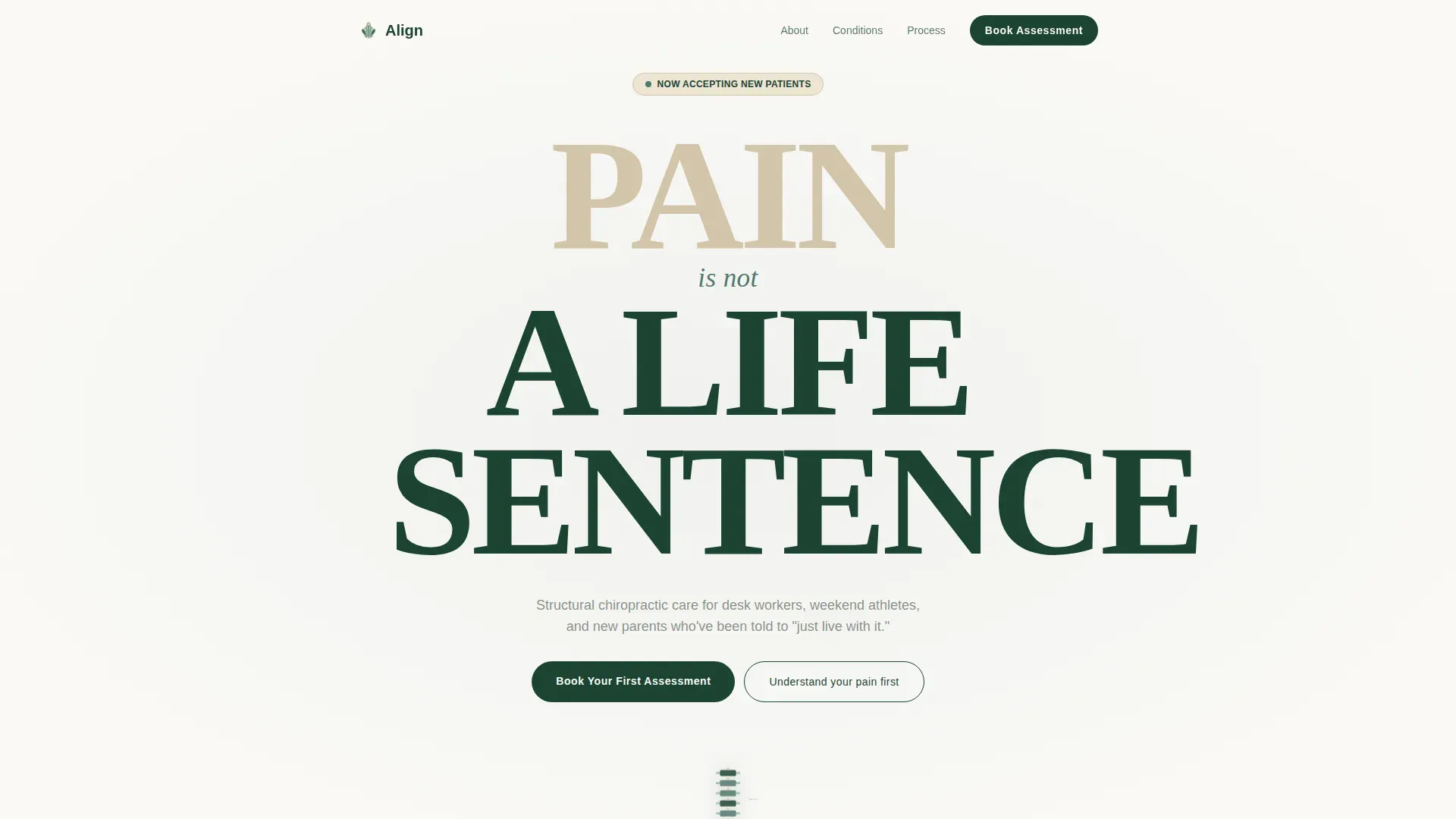
Stacked Type Tower Hero
The hero opens with the words "PAIN / is not / A LIFE SENTENCE" set in large Fraunces serif display type across three lines. Below the type stack, an anatomical line drawing of a spine plays a two-second SVG animation where each vertebra gently shifts into alignment. No competing imagery interrupts the message.
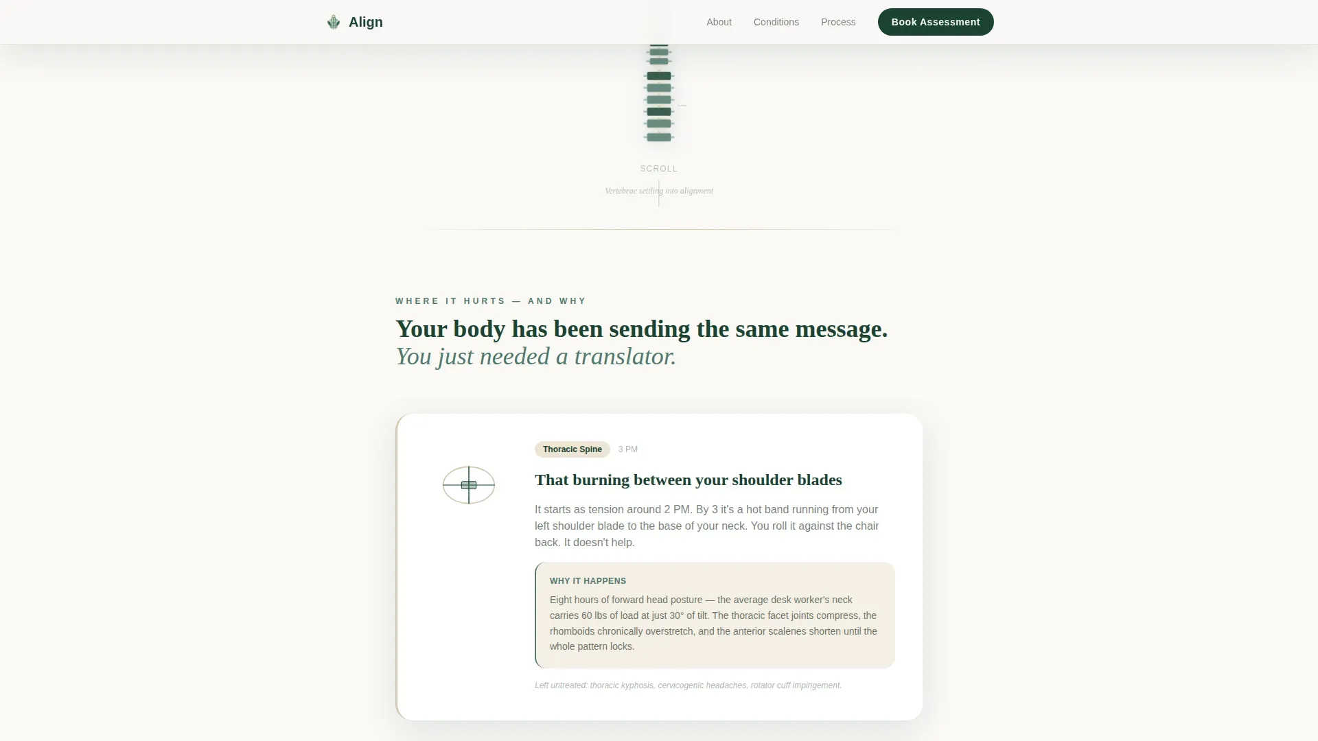
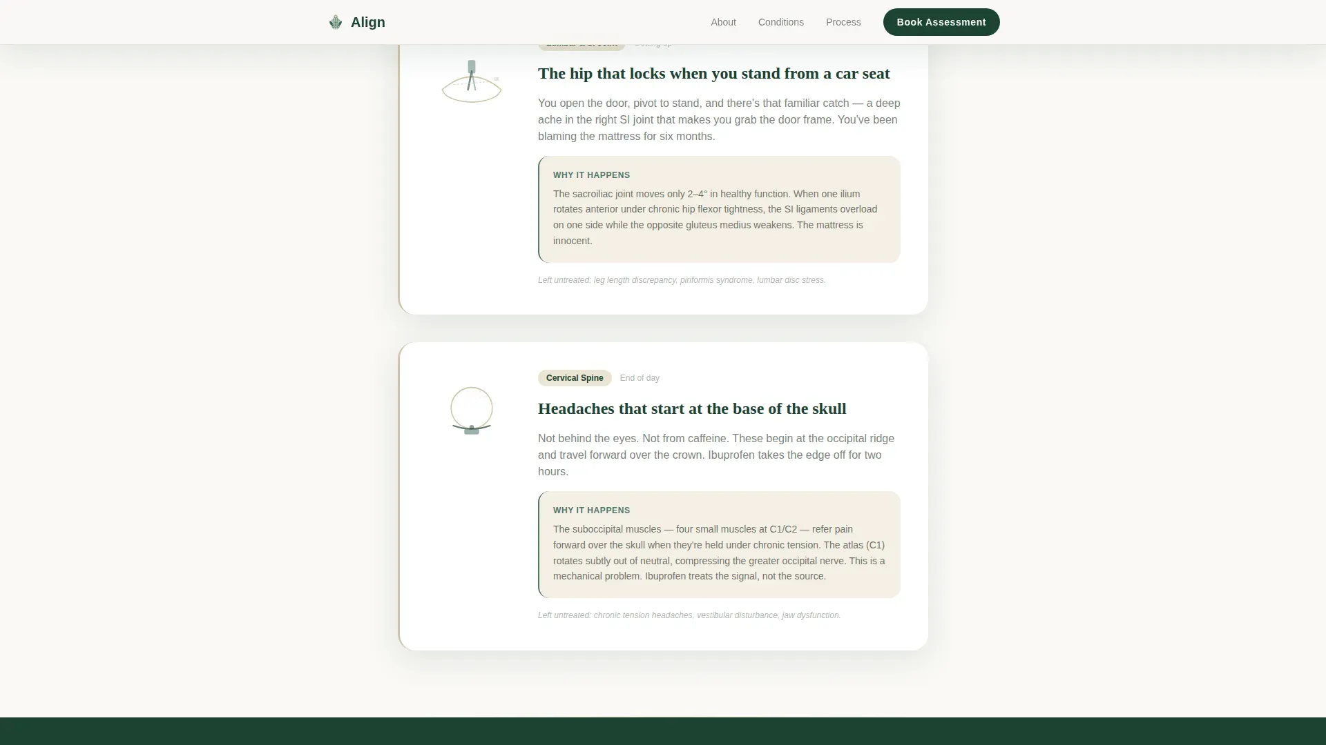
Problem to Solution Arc Panels
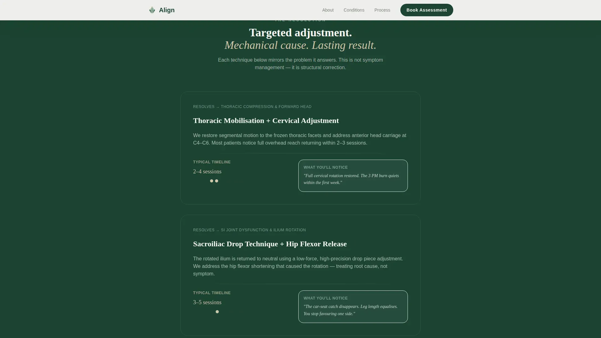
Three symptom panels name specific pains: the burning between the shoulder blades at 3 PM, the hip that locks when standing from a car seat, and headaches that start at the base of the skull. Each panel includes a minimal anatomical illustration explaining the mechanical cause, then mirrors directly into a solution panel showing the adjustment technique and expected timeline.
Sequential Three-Field Booking Form
The primary call to action leads into a low-friction booking form. Visitors select their pain location from a dropdown of body regions, indicate how long the pain has persisted, and choose a preferred appointment window. No insurance fields, no intake paperwork. The form collects only what the chiropractor needs to prepare before the patient arrives.
Email Capture Secondary Path
Visitors who are not yet ready to book can choose a secondary path: downloading a Spine Health Guide in exchange for their email address. This path appears alongside the primary call to action and captures leads at the consideration stage without losing them entirely.
Social Proof with Outcome Snapshots
The social proof section uses overlapping, rotated photo-style testimonial cards set against birch bark warm tones. Three key outcome statistics accompany specific patient quotes, giving prospective patients concrete evidence of results before they commit to booking.
Scroll-Triggered Reveal System
Symptom and solution sections use scroll-triggered reveal animations so content appears as the visitor reads down the page. Interactive elements including the booking form fields and the symptom expand panels include hover states styled in fern green.
Page sections overview
| Section | Purpose |
|---|---|
| Hero type tower | Declares core message and animates spine alignment |
| Problem arc panels | Names specific symptoms with anatomical context |
| Solution arc panels | Mirrors each problem with adjustment and timeline |
| Social proof cards | Builds trust with patient quotes and outcome stats |
| Booking form | Converts ready visitors with three sequential fields |
| Email lead capture | Retains undecided visitors with a downloadable guide |
| Footer | Provides logo, tagline, and essential navigation links |
Design & branding system
The Forest Trust color system uses four colors with defined roles across every section of the page. Typography pairs Fraunces serif display for headlines with DM Sans for body copy, creating an educational tone that feels grounded and credible rather than clinical.
- Evergreen (#1B4332) anchors headers and section dividers; birch bark (#D4C5A9) warms testimonial cards and callout boxes; fern (#52796F) marks buttons and hover states; root white (#FAF9F6) serves as the primary background
- The single-column layout gives every section room to breathe, reinforcing the calm and focused atmosphere the practice brand communicates
- Fraunces serif at large scale carries the emotional weight of the type tower; DM Sans keeps body paragraphs and form labels easy to scan
Mobile & speed optimization
The template is built mobile-first, reflecting the reality that most patients will open the page between desk sessions on their phones. The single-column flow requires no layout reflow between breakpoints, and the sequential booking form works naturally on touch screens.
- Static content sections use server-rendered components while the booking form and animations load as client components, separating heavy interactive logic from fast-loading copy
- Scroll-triggered reveals and the SVG spine animation are scoped to client components so they do not block the initial page render
- The three-field sequential form reduces tap count on mobile, making it faster for a patient to complete a booking from a phone than from a desktop
How this template helps you convert
The page is structured so that every scroll inch earns the call to action rather than asking for commitment before trust is established.
- The Problem to Solution arc moves the visitor from symptom recognition to mechanical understanding before the primary call to action appears, so the ask feels earned rather than premature
- Two conversion paths run in parallel: the booking form captures ready patients and the email lead capture retains visitors still in the research phase, so no session is wasted
- Social proof with specific outcome quotes and three key statistics appears just before the booking form, providing the final reassurance a hesitant visitor needs to act
Other information about this template
This template is designed specifically for the chiropractor appointment booking page niche within the broader Health and Medical category. It is built as a single-column flow landing page, which means every section follows a linear narrative path with no branching navigation to distract the visitor.
- The Educational Guide theme makes this template suitable for practices that want to position themselves as knowledgeable and trustworthy rather than purely transactional
- The template supports English language copy, United States date format, and USD pricing context throughout
- The footer follows a logo and tagline left, essential links right layout pattern, keeping the closing section clean and professional without adding visual weight
- The intersection match between the Health and Medical category, Chiropractor Website subcategory, and Chiropractor Appointment Booking Page niche is reflected in every structural and visual decision in the template
Theme
Educational Guide
Creative direction
Problem→Solution Arc
Color system
Forest Trust
Style
Single Column Flow
Direction
Content/Resource
Page Sections
Stacked Type Tower Hero with Animated Spine
Problem to Solution Arc Panels
Sequential Three-field Booking Form
Email Lead Capture Secondary Path
Rotated Photo Testimonial Cards
Scroll-triggered Reveal Animations
Related questions
Can I use this template without chiropractic-specific copy?
Does the booking form connect to any scheduling software?
How many conversion paths does this landing page include?
Can I customize the color system for my practice brand?
Is this template suitable for a practice with multiple locations?


