Chiropractic FAQ & Patient Resource Landing Page Template
Align is a split-screen chiropractic landing page built around an FAQ and resource format. It pairs large serif questions with short editorial answers and subtle anatomical illustrations. A persistent booking bar and a downloadable spinal health guide give visitors two clear paths forward, making the page effective for both ready-to-book patients and those still researching.
by Rocket studio
Quick summary
Align is a single-page chiropractic FAQ and resource template designed to build authority before asking for a booking. It uses a 50/50 split-screen layout, an editorial magazine visual style, and a two-path lead generation structure. The page guides visitors from credential-heavy first impressions through escalating clinical questions, ending in a confident call to action.
Who this template is for
This template is built for chiropractors who want their online presence to reflect the depth of their clinical knowledge. It works especially well for practices serving patients who research before they book.
- Chiropractors running a solo or small group practice who need a credible, professional landing page
- Clinics serving desk workers, active adults, or prenatal patients who have specific concerns and want informed answers
- Practitioners who want to capture both ready-to-book visitors and early-stage researchers in a single page
What problem this template solves
Most chiropractic pages push a booking button before the visitor feels ready. Patients arrive with real questions about pain, safety, and what to expect, and a generic hero image does not answer them. This template puts the FAQ front and center so the page does the trust-building work first.
- Visitors leave prematurely when their core questions go unanswered before a call to action appears
- A generic layout fails to communicate clinical expertise to skeptical or first-time chiropractic patients
- Practices lose leads from visitors who are curious but not yet convinced, with no secondary path to capture them
What you get with this template
The template delivers a fully structured, single-page layout with every section already in place. You get a clear visual hierarchy, two distinct lead capture paths, and a design system ready to receive your clinic's branding.
- An award badge header section, a scrolling split-screen FAQ body, and a persistent bottom-bar booking form
- A secondary lead capture option offering a downloadable spinal health guide in exchange for an email address
- An editorial color palette and typographic system built for immediate credibility with no extra styling required
Feature list
This section outlines the core built-in components that make Align work as a lead generation landing page for chiropractic practices.
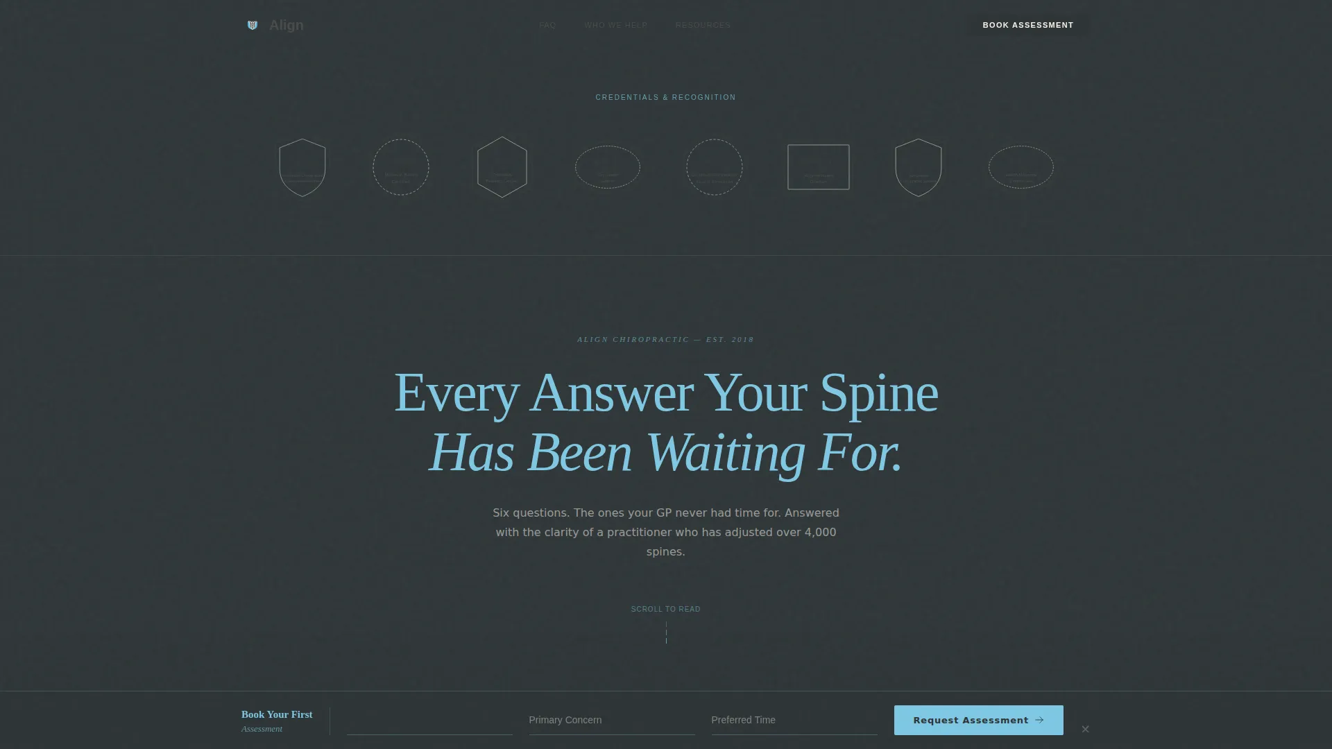
Award Badge Header Band
The header is a full-width horizontal band displaying certification seals, association emblems, and press recognition badges. Each badge is slightly desaturated to feel printed rather than digital. A single serif headline in sky blue anchors the composition below the badge grid, establishing authority before the visitor scrolls.
Split-Screen FAQ Layout
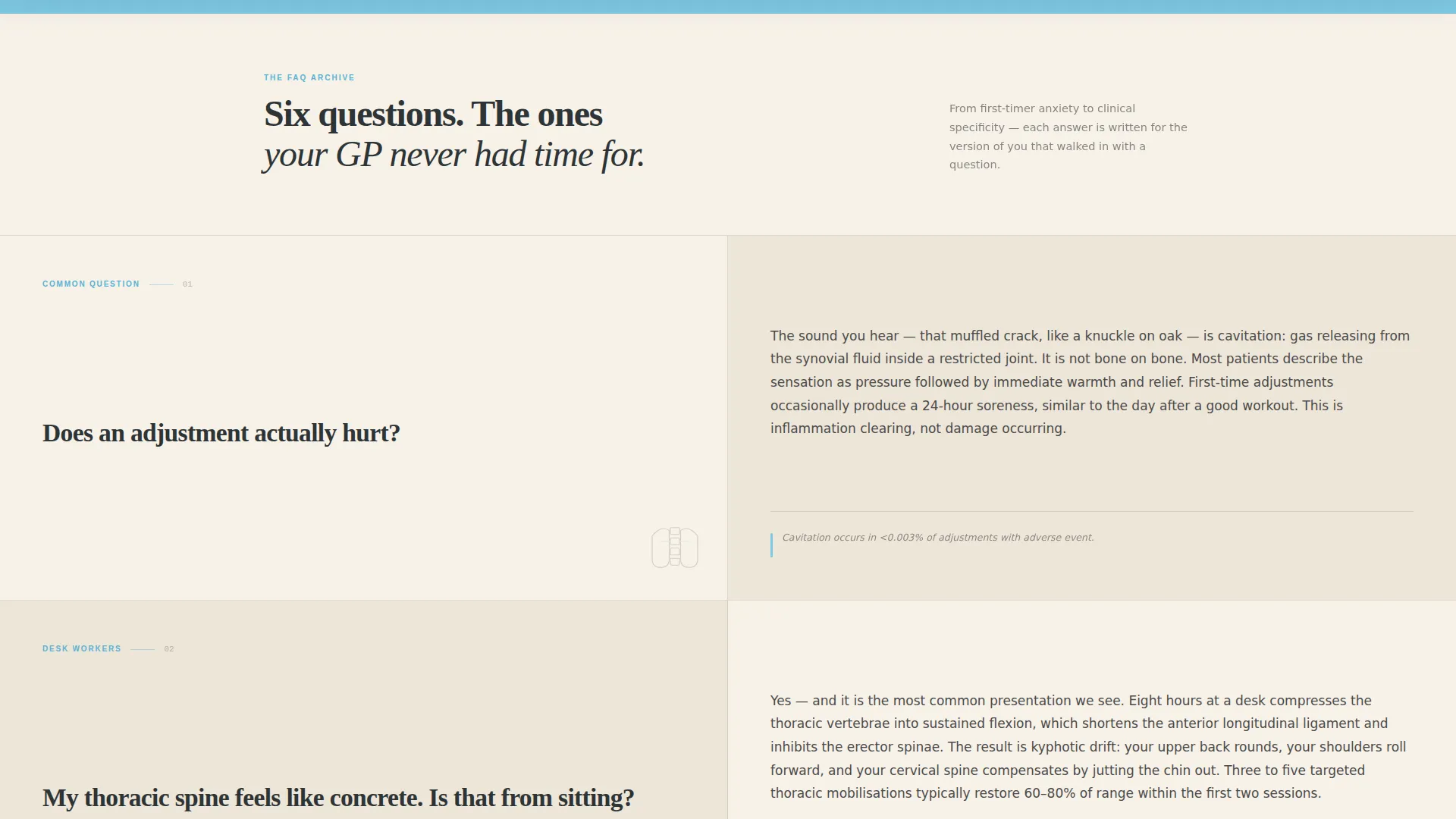
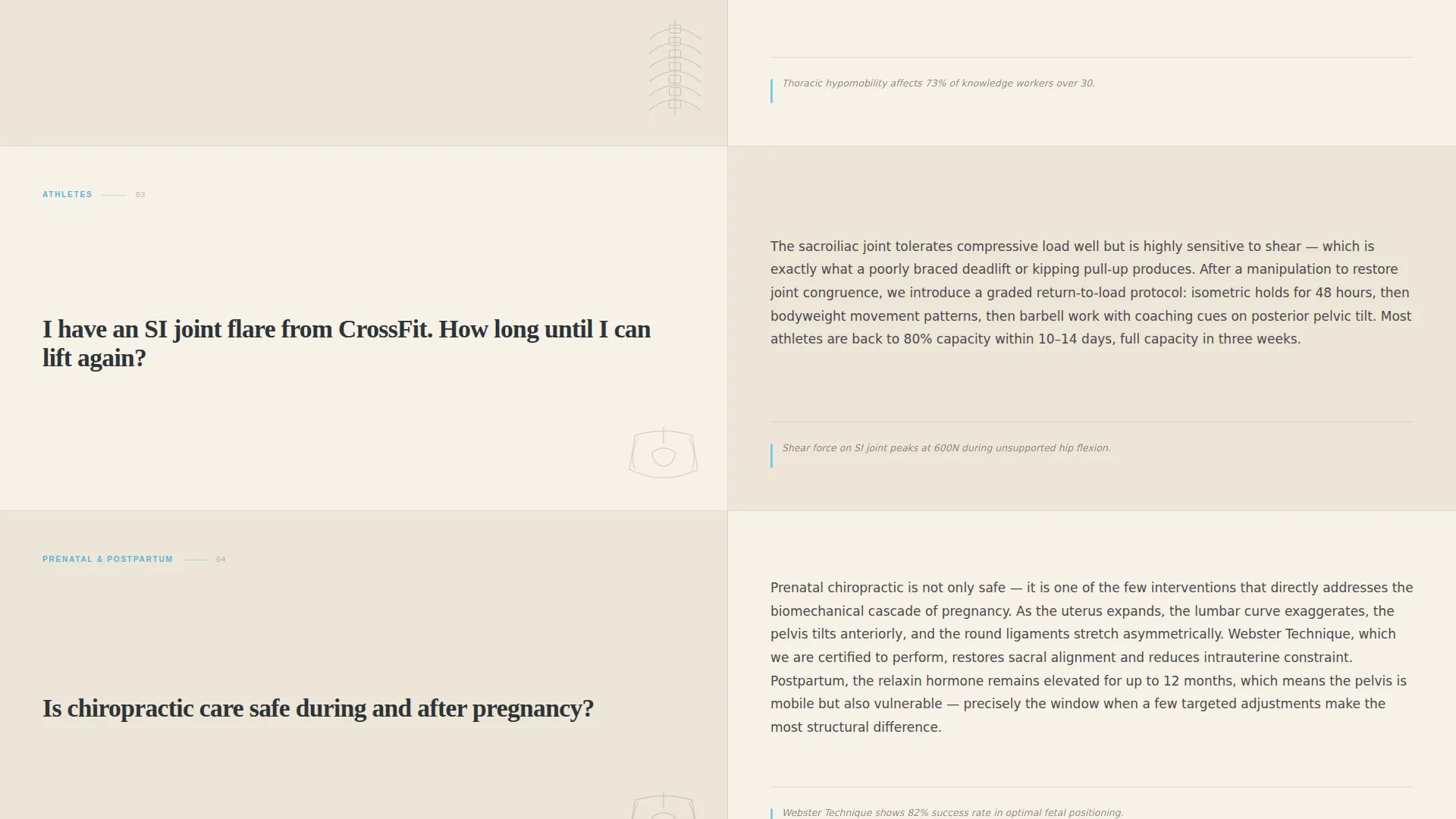
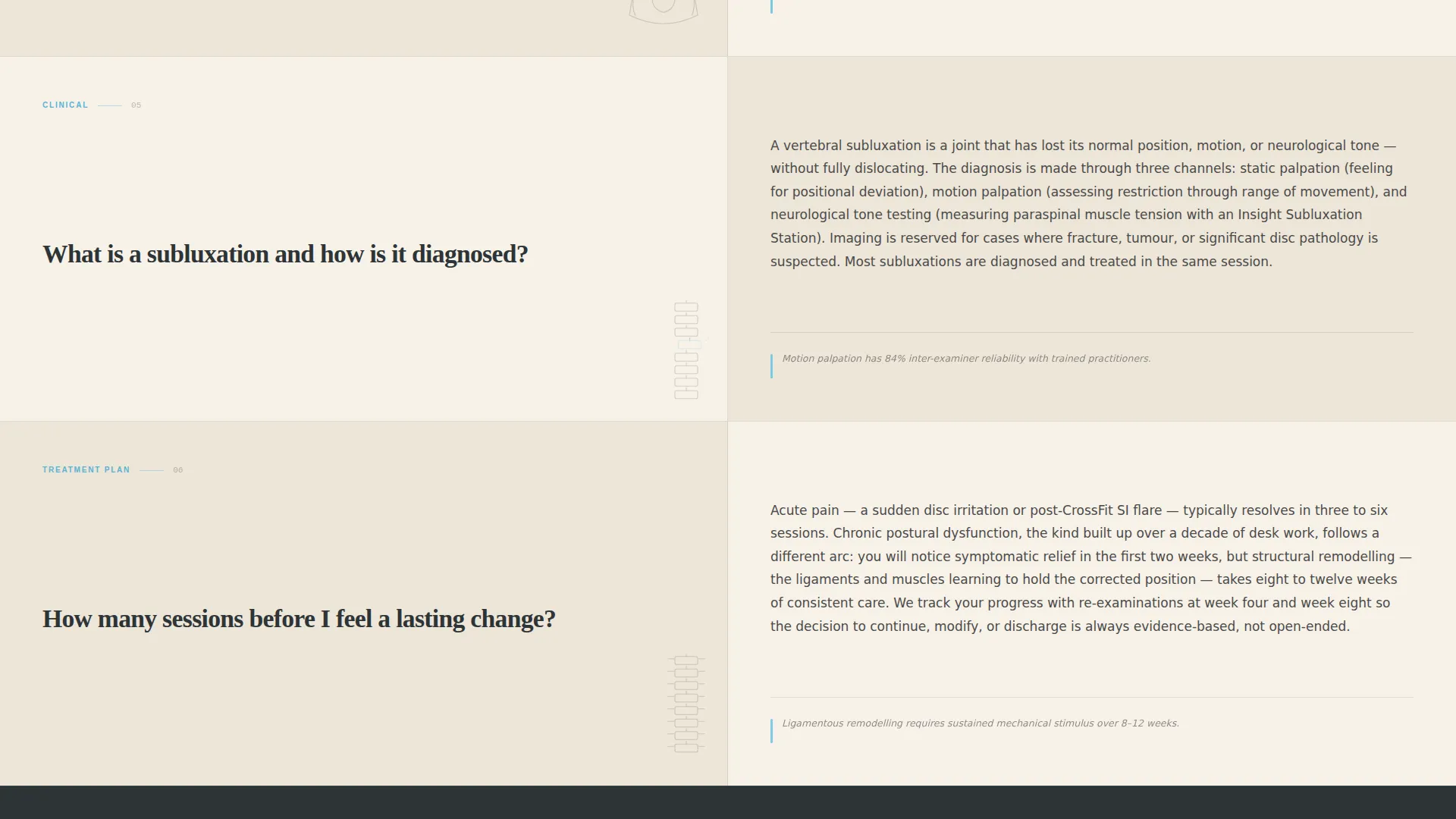
The page body uses a strict 50/50 split screen. The left panel holds each FAQ question in large bold serif type. The right panel carries a short editorial answer paragraph paired with a subtle anatomical illustration. Questions escalate from accessible to clinical, building confidence progressively as the visitor scrolls.
Persistent Booking Bottom Bar
After the third FAQ pair, a bottom bar locks into view and stays visible as the visitor continues reading. It holds the primary call to action, "Book Your First Assessment," and includes fields for first name, a primary concern dropdown, and a preferred appointment window selection. The bar appears only after enough content has been absorbed.
Secondary Lead Capture Path
Visitors who are not ready to book are offered a softer conversion: "Download Our Spinal Health Guide." This option captures a name and email address for follow-up nurture. It gives the page two distinct conversion paths so no visitor leaves without an opportunity to engage.
Editorial Magazine Typography
The template uses large serif typefaces for headlines and FAQ questions, with a quieter body copy weight for answers. The typographic system is designed to feel like a peer-reviewed health publication. It communicates clinical authority without requiring any custom font work from the user.
Slate and Sky Color System
The palette uses deep editorial slate for headlines and dividers, clinical sky blue for accents and hover states, warm parchment as the reading background, and quiet charcoal for body text. The combination feels like a high-quality print publication and supports the credibility-first positioning of the page.
Page sections overview
| Section | Purpose |
|---|---|
| Award Badge Header | Establish credentials and set editorial tone |
| Serif Hero Headline | Anchor visitor attention with a clear value statement |
| Split-Screen FAQ Body | Answer escalating patient questions while building trust |
| Persistent Booking Bar | Capture ready-to-book visitors after trust is built |
| Spinal Guide Download | Offer a softer path for visitors still in research mode |
Design & branding system
The visual identity follows an Editorial Magazine theme. Every design decision supports a calm, authoritative reading experience rather than a high-pressure sales environment.
- Color system: deep editorial slate (#2D3436) for headlines and dividers, clinical sky blue (#7EC8E3) for accents, warm parchment (#F7F1E8) as the page background, and quiet charcoal (#4A4A4A) for body copy
- Typography: large serif fonts for questions and headlines give the page a journal-like weight, while lighter body type keeps answers easy to read at any scroll speed
- Subtle anatomical illustrations pair with each FAQ answer to reinforce clinical context without overwhelming the editorial layout
Mobile & speed optimization
The split-screen layout is designed to reflow cleanly for smaller screens, keeping the FAQ experience readable and the booking bar accessible without extra scrolling.
- The 50/50 split stacks vertically on mobile so each question and answer reads as a full-width pair rather than a compressed side-by-side column
- The persistent booking bottom bar remains fixed and functional on mobile, keeping the primary call to action reachable at any point during the scroll
- Lightweight anatomical illustrations and a restrained animation philosophy keep the page visually clean and fast to render across devices
How this template helps you convert
The page is structured so authority is established before any commitment is requested. Every design and content decision supports a measured, confidence-first conversion path.
- The badge header absorbs the visitor's first seconds of attention and establishes credentials immediately, before a single word of copy is read
- The escalating FAQ sequence moves the visitor from casual curiosity to informed confidence, making the booking decision feel like a natural next step rather than a cold ask
- Two conversion paths, a direct booking form and a guide download, mean the page captures leads at multiple readiness levels rather than losing visitors who are not yet ready to commit
Other information about this template
Align is a strong foundation for any chiropractic practice looking to build an authoritative online presence without a complex multi-page website build.
- The template style is a split-screen (50/50) single-page layout, categorized under Professional Services for Chiropractor Online Presence
- The creative direction follows a Logo Wall Authority approach, using accumulated social proof and credentials to drive scroll engagement
- The lead generation structure supports both immediate appointment booking and longer-term email nurture through the guide download path
- This template is well suited for niches including back pain, neck pain, posture correction, prenatal chiropractic, and sports injury care, matching the concern dropdown built into the booking form
Theme
Editorial Magazine
Creative direction
Logo Wall Authority
Color system
Slate & Sky
Style
Split Screen (50/50)
Direction
Lead Generation
Page Sections
Award Badge Header Band
Split-screen FAQ Layout
Persistent Booking Bottom Bar
Secondary Lead Capture Path
Editorial Magazine Typography
Related questions
Can I update the FAQ questions to match my clinic's most common patient inquiries?
How does the two-path lead capture work in practice?
Does the booking form connect to a scheduling system automatically?
Is this template suitable for a prenatal or sports injury chiropractic focus?
What does the persistent bottom bar look like on mobile?



