Condition-Specific Chiropractic Care Website Template
Align is a hub and spoke chiropractic landing page built for condition-specific care. It guides visitors through five targeted condition libraries, a body-map pain assessment quiz, and a step-by-step treatment path, all designed to convert curious patients into booked consultations before they ever pick up the phone.
by Rocket studio
Quick summary
Align is a single-page chiropractic landing page built around a hub and spoke architecture. It connects a central conditions library to five focused treatment spokes, each walking patients through anatomy, adjustment protocols, and recovery timelines. A built-in pain assessment quiz personalizes the experience and ends with a direct booking call to action.
Who this template is for
This template is built for chiropractors who treat specific conditions and want their website to do the explaining before the first appointment. It works equally well for solo practitioners and multi-provider clinics with a defined patient base.
- Chiropractors treating desk workers, weekend athletes, post-partum mothers, and retirees with chronic pain
- Practices that want to move beyond generic "we do adjustments" messaging and show patients a real path to recovery
- Clinics ready to replace passive contact forms with a guided, quiz-led booking flow
What problem this template solves
Most chiropractic websites list services without answering the question every patient actually has: "Is this going to help me, specifically?" Patients arrive mid-pain-episode, skeptical after being told to "just live with it," and they need reassurance before they will book.
- Visitors leave because nothing on the page speaks to their exact condition or situation
- Generic service pages fail to build the trust needed to convert a hesitant first-time patient
- Contact forms ask for commitment before the patient feels understood
What you get with this template
Align delivers a complete, conversion-focused single-page layout with a layered structure that educates, diagnoses, and guides patients toward booking. Every section is purposeful, and the visual system reinforces clinical credibility with genuine warmth.
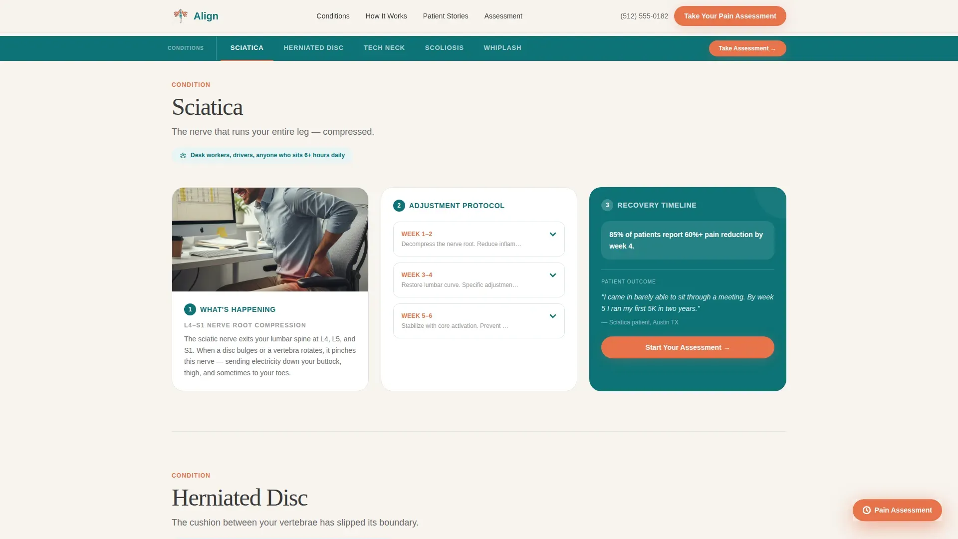
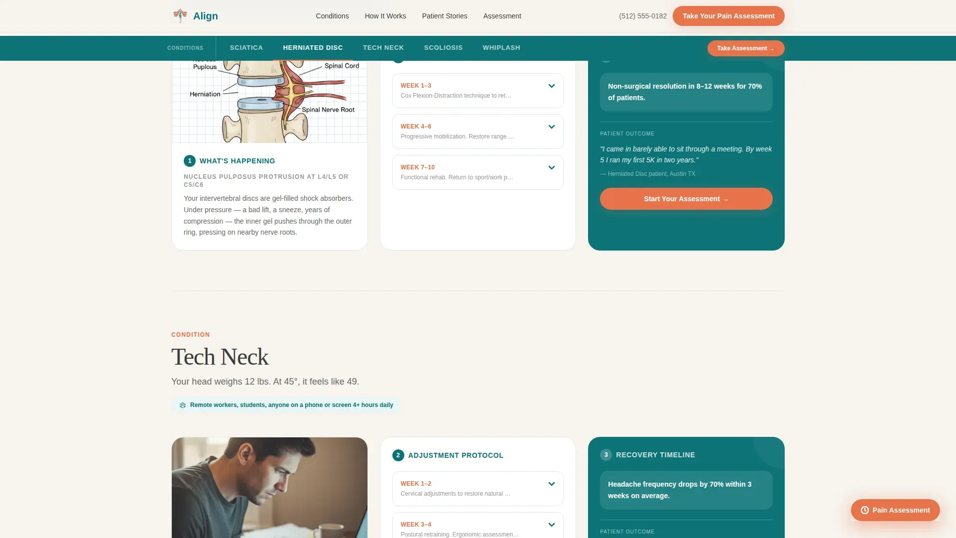
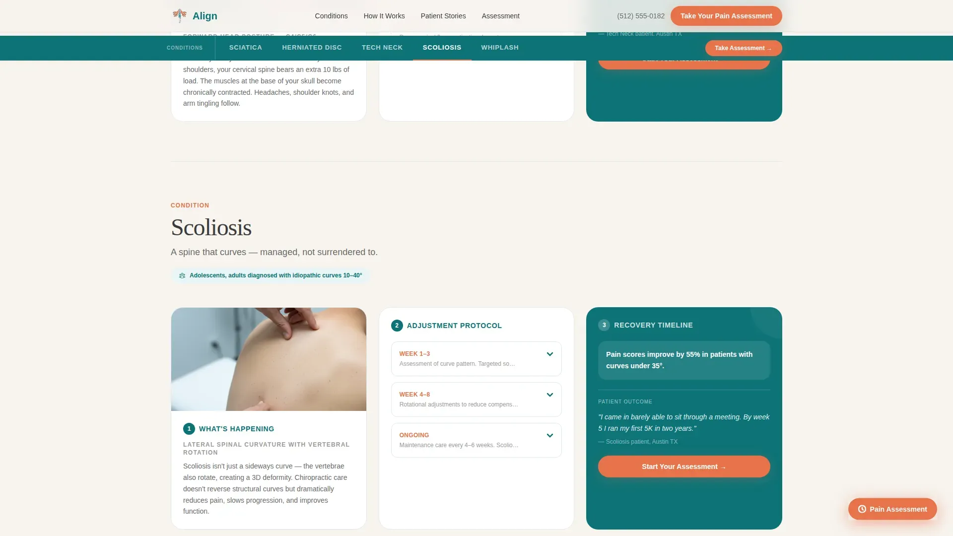
- A conditions hub with anchor navigation linking to five spoke sections: Sciatica, Herniated Disc, Tech Neck, Scoliosis, and Whiplash
- A multi-step pain assessment quiz with a body-map click interface, three progressive questions, and a personalized results screen that ends on a booking call to action
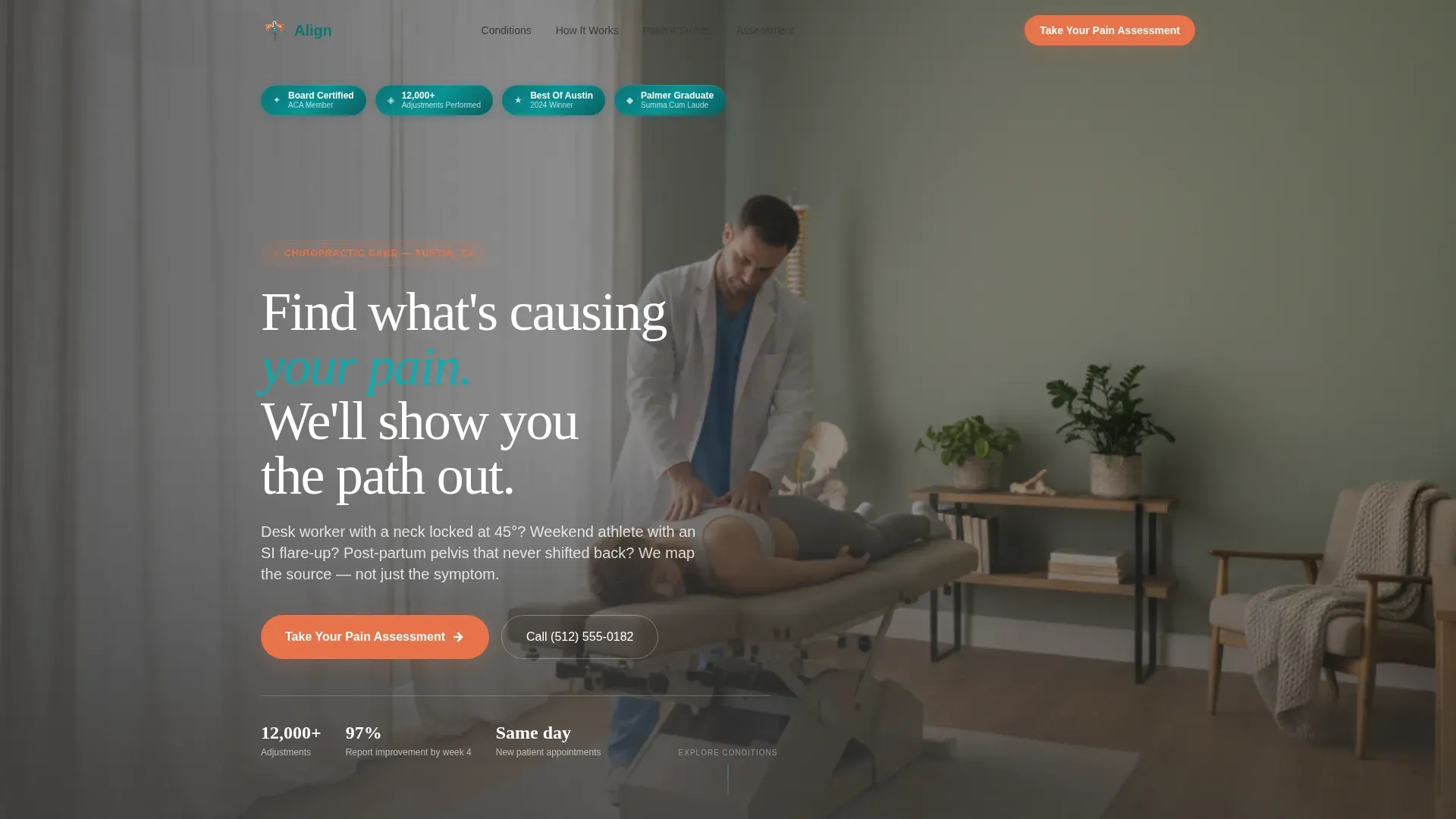
- A hero section with floating award badges, outcome statistics, board certifications, and a regional recognition badge
Feature list
This template is built around five tightly integrated components. Each one earns its place by moving the visitor one step closer to a booked visit.
Hub and Spoke Conditions Library
A central anchor navigation lists all five conditions. Each spoke expands into its own three-part journey: an anatomical diagram showing what is happening in the body, a week-by-week adjustment protocol, and a real patient recovery timeline. The architecture lets visitors self-select their condition and immediately feel seen.
Body-Map Pain Assessment Quiz
The quiz opens with an interactive SVG body-map click. Visitors tap where it hurts, then answer three progressive questions covering pain frequency, duration, and prior treatments tried. Results deliver a personalized condition match and a recommended first-visit plan, ending with a calendar picker and an insurance verification toggle.
Award Badge Hero Section
The header opens with a confident horizontal band of credentials: board certifications, a patient outcome statistic of 12,000 or more adjustments performed, professional association seals, and a regional Best Of badge. They are rendered in teal and white with subtle metallic edges, building trust before the visitor reads a single word of body copy.
Persistent Coral call to action Button
The "Take Your Pain Assessment" call to action appears in the header and again as a floating button that stays visible throughout the entire scroll. It is rendered in catalyst coral so it stands out from the teal and bone-white palette without feeling aggressive.
Patient Stories Section
Condition-tagged testimonials show real outcomes tied to specific diagnoses. Each story is paired with outcome details, giving prospective patients the social proof they need at the moment they are deciding whether to book.
Step-by-Step How It Works Flow
Each condition spoke follows the same three-step consultation-style flow: understand your anatomy, see the adjustment plan, read a recovery timeline. This structure reassures patients that care here is methodical and transparent, not a one-size adjustment.
Page sections overview
| Section | Purpose |
|---|---|
| Hero with Badges | Open with credentials and primary quiz call to action |
| Conditions Anchor Nav | Navigate directly to each condition spoke |
| Sciatica Spoke | Three-step journey for sciatica patients |
| Herniated Disc Spoke | Three-step journey for disc pain patients |
| Tech Neck Spoke | Three-step journey for posture and neck pain |
| Scoliosis Spoke | Three-step journey for scoliosis patients |
| Whiplash Spoke | Three-step journey for whiplash recovery |
| How It Works | Anatomy, protocol, and recovery per condition |
| Patient Stories | Condition-tagged testimonials and outcomes |
| Pain Assessment Quiz | Body map, three questions, personalized results |
| Footer Arc Split | Logo and tagline left, navigation links right |
Design & branding system
The visual identity follows a Healing Space theme. It balances clinical precision with the warmth of a well-lit treatment room, using color and typography to signal trust without feeling sterile.
- Color palette: deep therapeutic teal (#0D7377) as the primary anchor, soft bone white (#F7F4EF) for content backgrounds, warm graphite (#3B3B3B) for body text, and catalyst coral (#E8734A) used exclusively for interactive elements and calls to action
- Typography: Fraunces serif display font for headlines and Dekstop Messaging Sans (DM Sans) for body text, creating a pairing that feels both authoritative and readable
- Motion and interactivity: medium GSAP scroll reveals, condition card hover reveals, and quiz step transitions bring the page to life without slowing it down
Mobile & speed optimization
This template is built mobile-first. Most patients search for pain relief on their phones during or immediately after a pain episode, so every interaction is designed for a small screen first.
- The anchor navigation, condition spoke expansion, and quiz flow are all optimized for thumb-driven mobile interaction
- Images are lazily loaded and CSS-first animations are used to keep the initial page load fast
- The body-map SVG click interface is sized and spaced for touch accuracy on standard mobile screen sizes
How this template helps you convert
Align is structured so that the page earns trust at every scroll depth before asking for anything in return. By the time a visitor reaches the booking step, the template has already acted like their chiropractor.
- The award badge hero section establishes instant credibility with certifications, outcome stats, and recognition seals before the visitor reads a single service claim.
- The condition library and three-step spoke structure guides each visitor through a consultation-style explanation of their specific pain, making the practice feel like it already understands their case.
- The pain assessment quiz delivers real diagnostic value by matching the visitor to a condition and recommended first-visit plan, making the final "Book Your Initial Consultation" step feel like a natural next move rather than a cold ask.
Other information about this template
Align is a strong fit for practitioners who want their online presence to reflect the depth and precision of their in-clinic care. The template is built with USA localization in mind, including US phone format, MM/DD/YYYY date formatting, and USD currency references throughout the quiz and booking flow.
- The footer uses a Pattern 7 Arc Browser Split layout with the logo and tagline on the left and navigation links on the right
- The calendar picker inside the quiz results screen includes an insurance verification toggle, reducing friction at the booking step
- The template title "Align" reflects the core promise of the practice: returning patients to bodies that move in alignment, without negotiation
Theme
Healing Space
Creative direction
Step-by-Step Guide
Color system
Teal Catalyst
Style
Hub & Spoke (Anchor Nav)
Direction
Quiz/Assessment
Page Sections
Hub and Spoke Conditions Library
Body-map Pain Assessment Quiz
Award Badge Hero Section
Persistent Floating Call to Action Button
Condition-tagged Patient Stories
Related questions
Can I change the five conditions listed in the hub?
Does the pain assessment quiz actually score and match conditions?
Is the booking calendar connected to a live scheduling system?
How do the award badges work in the hero section?
Who is this landing page best suited for?


