Orthodontic Treatment Guide & Bite Condition Website Template
Align is a single-page orthodontist condition and treatment library landing page. It maps six common bite conditions to five treatment paths through interactive comparison tables and a five-step guided assessment. Built for parents, adults, and referring dentists, it combines real clinician stats, expandable condition cards, and a coral-accented quiz flow to move anxious visitors toward a confident consultation.
by Rocket studio
Quick summary
Align is a comprehensive orthodontist landing page that turns research anxiety into informed confidence. It presents six bite conditions, each linked to a side-by-side treatment comparison table. A floating "Find My Best Treatment" quiz synthesizes what visitors learn into a personalized provider match. The result is a page that earns trust before it asks for a click.
Who this template is for
This template is built for orthodontic practices that want their website to do real educational work. It suits practices where the front desk often answers the same treatment questions by phone, and where the consulting orthodontist wants patients to arrive already informed.
- Parents researching a teenager's bite problem late at night
- Adults who have been avoiding a smile decision for years
- Referring dentists who need a clear visual reference during chairside conversations
What problem this template solves
Most orthodontic websites show a services list, a phone number, and a gallery of before-and-after photos. That format leaves visitors with the same unanswered questions they arrived with. Align replaces that pattern with a structured information experience.
- Visitors cannot compare treatment options side by side on most practice websites
- Condition-specific detail is usually buried in blog posts or hidden behind a consultation gate
- The gap between "I Googled my overbite" and "I booked an appointment" is rarely bridged by a single page
What you get with this template
Align delivers a fully structured, single-page library experience with every component mapped to a specific stage of the visitor's decision journey. From first impression to final form submission, each section moves the visitor one step forward.
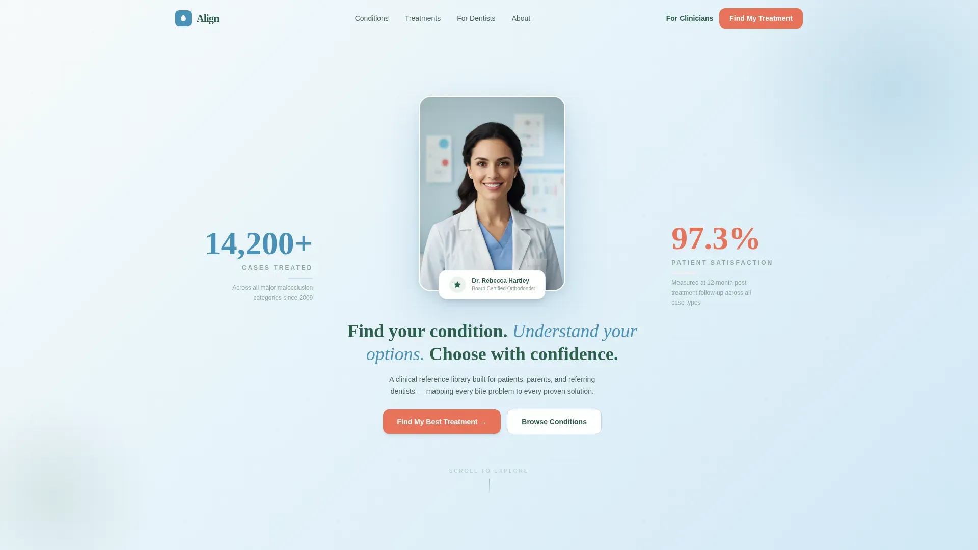
- A portrait-centered hero section with two fade-in credential stats and a clear headline
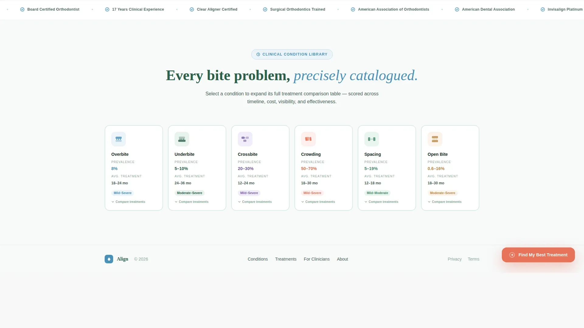
- Six expandable condition cards with prevalence data and average treatment durations
- Per-condition comparison tables scored across five treatment columns with visual progress bars
- A five-step guided assessment modal that captures concern, age, priorities, history, and contact details
- A scrolling trust bar featuring clinical credentials and professional associations
Feature list
A paragraph introducing the feature set: Every feature in Align is designed to close the information gap between a worried visitor and a ready patient. The components below work together to build fluency, establish trust, and guide action.
Portrait-Centered Hero with Credential Stats
The hero section leads with a composed orthodontist portrait shot against a gradient from summit white to glacier blue. Two typographic stats fade in on either side: cases treated on the left and patient satisfaction rate on the right. The headline below reads in evergreen: "Find your condition. Understand your options. Choose with confidence."
Expandable Condition Card Row
Six horizontal cards represent overbite, underbite, crossbite, crowding, spacing, and open bite. Each card surfaces a condition prevalence percentage and an average treatment duration before the visitor interacts. Clicking any card expands a full comparison table for that condition.
Per-Condition Comparison Tables
Each expanded comparison table scores five treatment types across five evaluation rows: average timeline, discomfort level, visibility, cost range, and effectiveness rating. Glacier blue progress bars and coral highlight chips make differences readable at a glance without requiring any clinical background.
Five-Step Guided Assessment Modal
The "Find My Best Treatment" quiz opens as a modal triggered by a floating coral button pinned after the first scroll. The five steps cover primary concern, age range, ranked priorities, orthodontic history, and contact details. The drag-to-rank interaction in step three makes the experience feel responsive rather than generic.
Scrolling Clinical Trust Bar
A marquee-style trust bar runs between the assessment call to action and the footer. It displays clinical credentials and professional association memberships in a continuous horizontal scroll. This section reinforces authority without interrupting the reading flow.
Page sections overview
| Section | Purpose |
|---|---|
| Hero portrait area | Establishes clinician authority with a real photo and two credential stats |
| Condition card row | Surfaces six conditions with prevalence data and duration before click |
| Comparison table view | Scores five treatments across key factors per condition |
| Assessment call to action | Pins a floating quiz button and opens the five-step modal |
| Clinical trust bar | Scrolls credentials and associations to reinforce professional standing |
| Single-row footer | Closes the page with clean linear contact and navigation links |
Design & branding system
The visual identity follows a Medical Clarity approach using the Alpine Fresh color palette. The overall effect is clinical without feeling cold, and structured without feeling corporate. Every color has a defined role so nothing competes for attention.
- Summit white (#F7FAFA) dominates backgrounds to let dental photography carry visual weight
- Glacier blue (#4A90B8) structures headers, table borders, and progress bars throughout the page
- Evergreen (#2D5F4A) anchors body text, condition labels, and all supporting copy
- Coral (#E8735A) is reserved exclusively for calls to action, active states, and highlight chips
- Typography pairs Plus Jakarta Sans for body and interface text with Fraunces as the display serif for headlines
Mobile & speed optimization
The template is built desktop-first to protect the integrity of wide comparison tables, but it collapses gracefully for mobile visitors. Interactive components are handled by client-side rendering while static sections use server components.
- Comparison tables collapse into a scrollable card format on smaller screens
- The floating assessment button remains pinned and accessible on all device sizes
- GSAP ScrollTrigger drives staggered card reveals, progress bar animations, and modal transitions without blocking the initial page load
How this template helps you convert
Align earns the conversion by building visitor fluency before asking for commitment. The page is structured so that every interaction deepens understanding rather than interrupting it.
- Visitors explore condition cards and comparison tables first, arriving at the quiz already informed and more willing to share their contact details
- The floating coral button stays visible throughout the scroll without being intrusive, creating a persistent low-friction entry point to the five-step assessment
- The assessment's final step collects name, email, and zip code to match the visitor with a local provider, turning a research session into a concrete next step
Other information about this template
Align is categorized under Health and Medical, with a specific focus on the Orthodontist Condition and Treatment Library niche. It is built for the United States market, using English copy and United States dollar pricing references throughout.
- The template style is a Comparison Table layout with a Quiz and Assessment conversion direction
- The header concept is Portrait-Centered, featuring a real clinician rather than stock imagery
- The creative direction is Stats-First Impact, surfacing data before explanation at every scroll depth
- Condition prevalence data referenced in the brief is drawn from American Association of Orthodontists sources
- The intersection match score for this template's niche and subcategory alignment is 13, indicating strong category fit


Theme
Medical Clarity
Creative direction
Stats-First Impact
Color system
Alpine Fresh
Style
Comparison Table
Direction
Quiz/Assessment
Page Sections
Portrait-centered Hero with Fade-in Stats
Expandable Condition Card Row
Per-condition Comparison Tables
Five-step Guided Assessment Modal
Scrolling Clinical Trust Bar
Related questions
Who is this landing page template built for?
Can I customize the condition cards for my practice?
Is the comparison table readable on a phone?
Do I need to provide my own orthodontist photo for the hero section?
What happens to the quiz responses after a visitor completes the assessment?


