Chiropractic Patient Education Website for New Patients
Align is a chiropractor patient education landing page built on a split-screen layout. It pairs practitioner video panels with animated anatomical illustrations to transform anxious Googlers into confident first-time patients. The design blends warm editorial calm with clinical authority, guiding desk workers, active parents, and retirees toward a single, well-earned booking moment.
by Rocket studio
Quick summary
Align is a single-page chiropractic patient education hub designed to educate before it ever asks for a commitment. The page uses a 50/50 split-screen structure throughout, pairing human faces with science and patient stories with process clarity. Every section earns the final call to action rather than rushing toward it.
Who this template is for
This template is built for chiropractors and chiropractic practices that want to attract new patients through education rather than a hard sell. It works especially well for practices serving mixed audiences who arrive with anxiety and skepticism rather than readiness to book.
- Chiropractors targeting desk-bound professionals with chronic neck and back tension
- Practices serving active parents, retirees, and patients referred by a general practitioner
- Clinics that want to position themselves as trusted educators, not just appointment takers
What problem this template solves
Many prospective chiropractic patients spend hours searching symptoms online and still arrive at a practice feeling uninformed and nervous. A plain booking page does not bridge that gap. This template replaces vague selling with structured education, so the visitor arrives at the call to action already feeling prepared.
- Patients who distrust chiropractic care due to a lack of clear information
- Visitors who need to understand what a first visit involves before they will commit
- Practices losing curious traffic because their current page offers no educational depth
What you get with this template
This template delivers a fully designed, section-by-section patient education landing page ready to be customized for your practice. It combines visual storytelling, practitioner credibility, and transparent process design into one cohesive scroll experience.
- A 50/50 split-screen layout with a portrait-centered hero and serif headline section
- An alternating Expert Panel that pairs practitioner video clips with animated anatomical illustrations
- A patient testimonial block, a first-visit process walkthrough, and a full-width conversion call to action
Feature list
This template is built around six purposeful components. Each one addresses a specific moment in the visitor's decision journey.
Portrait-Centered Hero Split
The hero divides the screen equally. The left side holds a warmly lit, shoulders-up chiropractor portrait. The right side carries a single generous serif headline. The layout creates immediate human trust before any body copy appears.
Alternating Expert Panel
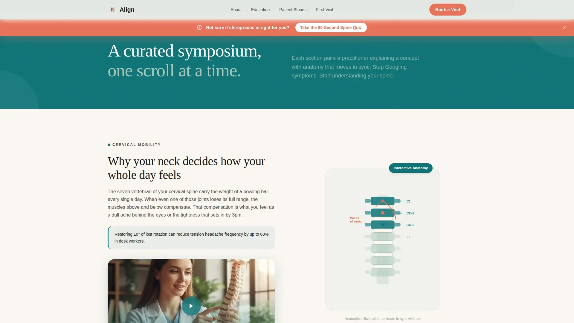
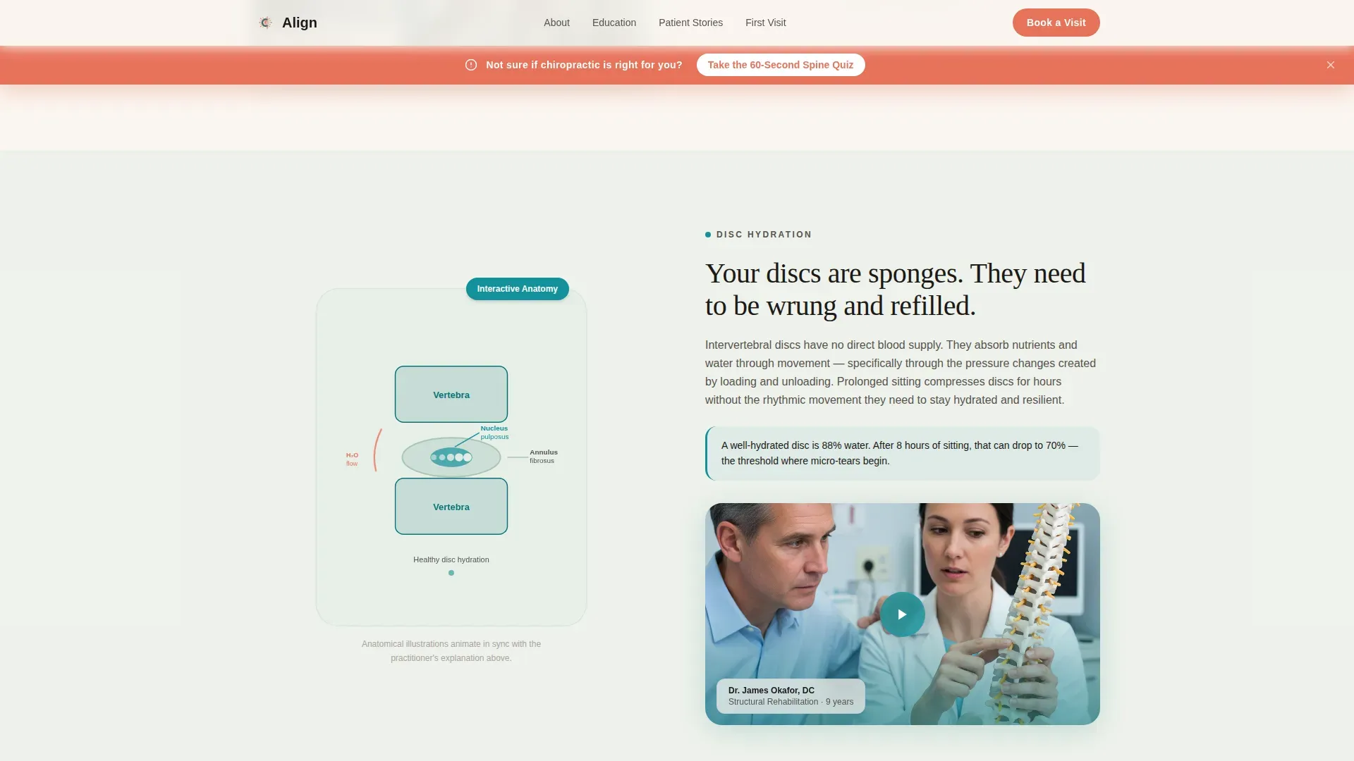
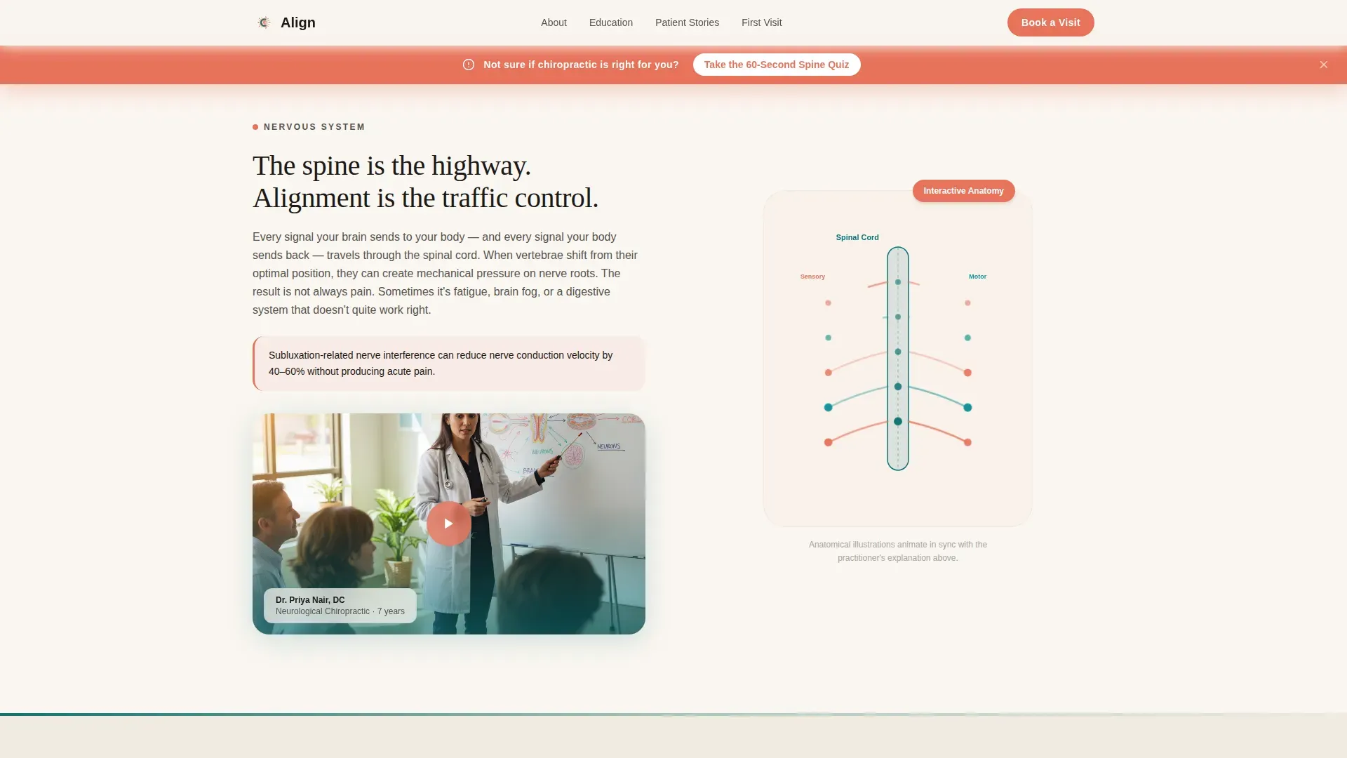
Three split-screen practitioner segments cover cervical mobility, disc hydration, and nervous system regulation. Each segment pairs a short practitioner video clip on one side with a synchronized animated anatomical illustration on the other. The rhythm alternates face, diagram, and patient story to keep authority warm and science approachable.
Animated Anatomical Illustrations
SVG-based anatomy animations move in sync with each practitioner explanation. GSAP ScrollTrigger reveals activate as the visitor scrolls, so the diagrams feel responsive to the reader's pace rather than auto-playing on load.
Patient Testimonial Bento Block
Three named patient stories are arranged in an asymmetric bento layout. Each story ties a specific condition to a specific outcome, avoiding the vague generic quotes that erode trust on most healthcare pages.
First Visit Process Walkthrough
A visual step-by-step section shows exactly what happens during an initial appointment. Removing uncertainty here is the final trust-building act before the primary call to action appears.
Sticky Coral Quiz Bar
A persistent secondary call to action sits in a catalyst coral bar at the top of the viewport throughout the scroll. It carries the prompt "Take the 60-Second Spine Quiz" and captures curious visitors before they are ready to book a full appointment.
Page sections overview
| Section | Purpose |
|---|---|
| Hero Split Screen | Introduce the practitioner and lead headline |
| Sticky Quiz Bar | Capture early interest before commitment |
| Expert Panel Segments | Educate visitors on three spine conditions |
| Patient Testimonial Block | Build trust with specific named outcomes |
| First Visit Walkthrough | Remove uncertainty about the intake process |
| Primary Call to Action | Convert educated visitors to book a visit |
| Footer | Provide minimal navigation and contact context |
Design & branding system
The visual identity follows an Organic Flow theme. The palette is grounded in calm, natural tones with one warm accent that draws the eye immediately to interactive elements.
- Deep therapeutic teal (#0D7377) anchors headers and section backgrounds; living sage (#A8C5B8) softens secondary panels; warm bone white (#FAF6F1) fills open breathing space
- Catalyst coral (#E8735A) is reserved for buttons, the sticky quiz bar, and interactive hotspots to create a single clear visual priority
- Fraunces serif is used for headlines to deliver editorial warmth; DM Sans handles body text and interface elements for clean legibility
Mobile & speed optimization
The template is designed desktop-first to serve its primary audience of desk-bound professionals on laptops. It is fully responsive so the layout adapts cleanly on smaller screens without sacrificing the editorial feel.
- Static sections use server components to keep initial load fast; animated sections are client-rendered to isolate interactivity overhead
- GSAP ScrollTrigger animations and staggered card entrances are scoped to client components, keeping the static shell lightweight
- The split-screen layout reflows to a stacked single-column view on mobile, preserving the face-then-content reading order
How this template helps you convert
The page is structured as a click-through landing page. Every section intentionally builds the visitor's confidence before the primary call to action appears at the bottom.
- The sticky coral quiz bar captures visitors who are curious but not yet ready to book, creating a low-commitment first step that keeps them in the funnel.
- The Expert Panel and first-visit walkthrough replace the visitor's accumulated uncertainty with specific, practitioner-backed knowledge, making the final booking moment feel like a natural next step rather than a leap.
Other information about this template
This template is categorized under Health and Medical and sits within the Chiropractor Website subcategory. It is specifically designed as a Chiropractor Patient Education Hub, making it a strong fit for practices that want to differentiate through depth of communication rather than promotional copy.
- The Teal Catalyst color system and Organic Flow theme are designed to feel warm and clinical at once, referencing editorial wellness aesthetics while maintaining medical credibility
- The landing page direction is Click-Through, meaning the primary call to action "See What Your First Visit Looks Like" links through to a separate detailed booking and intake page
- The template is localized for English-language audiences in the United States and requires no currency or transactional elements on the page itself

Theme
Organic Flow
Creative direction
Expert Panel
Color system
Teal Catalyst
Style
Split Screen (50/50)
Direction
Click-Through
Page Sections
Portrait-centered Hero Split
Alternating Expert Panel Segments
SVG Anatomy Animations
Named Patient Testimonial Bento
First Visit Process Walkthrough
Persistent Sticky Quiz Bar
Related questions
Who is the primary audience for this template?
Can I customize the practitioner portrait and video clips?
What does the sticky quiz bar do?
Does this template include the booking and intake page?
How many patient conditions does the Expert Panel cover?


