Chiropractic Patient Portal Landing Page Template
Align is a sidebar companion landing page built for chiropractic patient portals. It uses a scrolling Problem-to-Solution arc to show patients exactly how the portal replaces front-desk phone calls, forgotten imaging results, and lost exercise sheets. The warm Healing Space design and interactive sidebar demo guide visitors toward one clear action: exploring the guided patient walkthrough.
by Rocket studio
Quick summary
Align is a single-page companion landing page for a chiropractic patient portal. It walks prospective patients through three real frustrations, then pairs each one with a live portal preview in the sidebar. The design is warm and clinical, the copy is specific, and every scroll brings the visitor closer to clicking "Explore the Patient Walkthrough."
Who this template is for
This template is built for chiropractic clinics and health tech teams that need to convert real patients into portal sign-ups. It speaks directly to the people already sitting in the waiting room or recovering between visits.
- Office workers managing ongoing spinal care who are tired of calling the front desk during their lunch break
- Postpartum patients rebuilding stability who want to track their progress without paper handouts
- Weekend athletes treating maintenance adjustments like routine upkeep, who prefer digital records over clipboard forms
What problem this template solves
Most chiropractic clinics still rely on phone calls, printed sheets, and verbal summaries to keep patients informed. Patients forget imaging explanations. Exercise handouts end up in kitchen drawers. Appointment reminders go unanswered because the front desk only picks up during certain hours. This landing page addresses all three pain points directly before asking for anything in return.
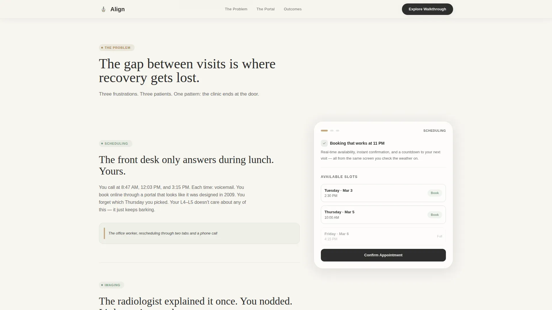
- Scheduling friction: patients miss appointments because booking requires a phone call during narrow office hours
- Lost imaging context: X-ray and spinal scan results are explained once, then inaccessible until the next visit
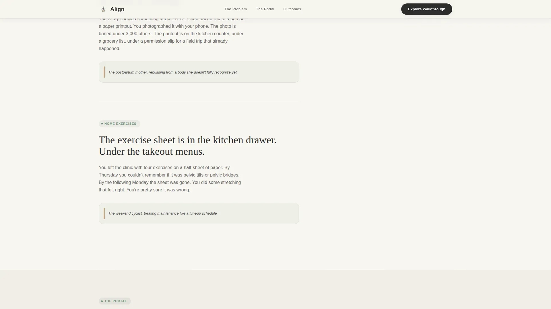
- Forgotten exercise plans: printed rehabilitation sheets get misplaced, and patients lose momentum between sessions
What you get with this template
You get a fully structured, single-page layout with a persistent sidebar that transforms as the visitor scrolls. The page earns trust before it asks for a click, and both conversion paths are built in from the start.
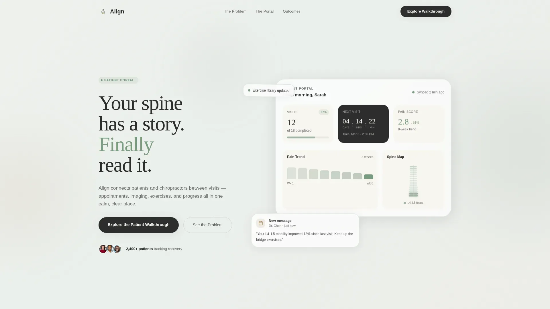
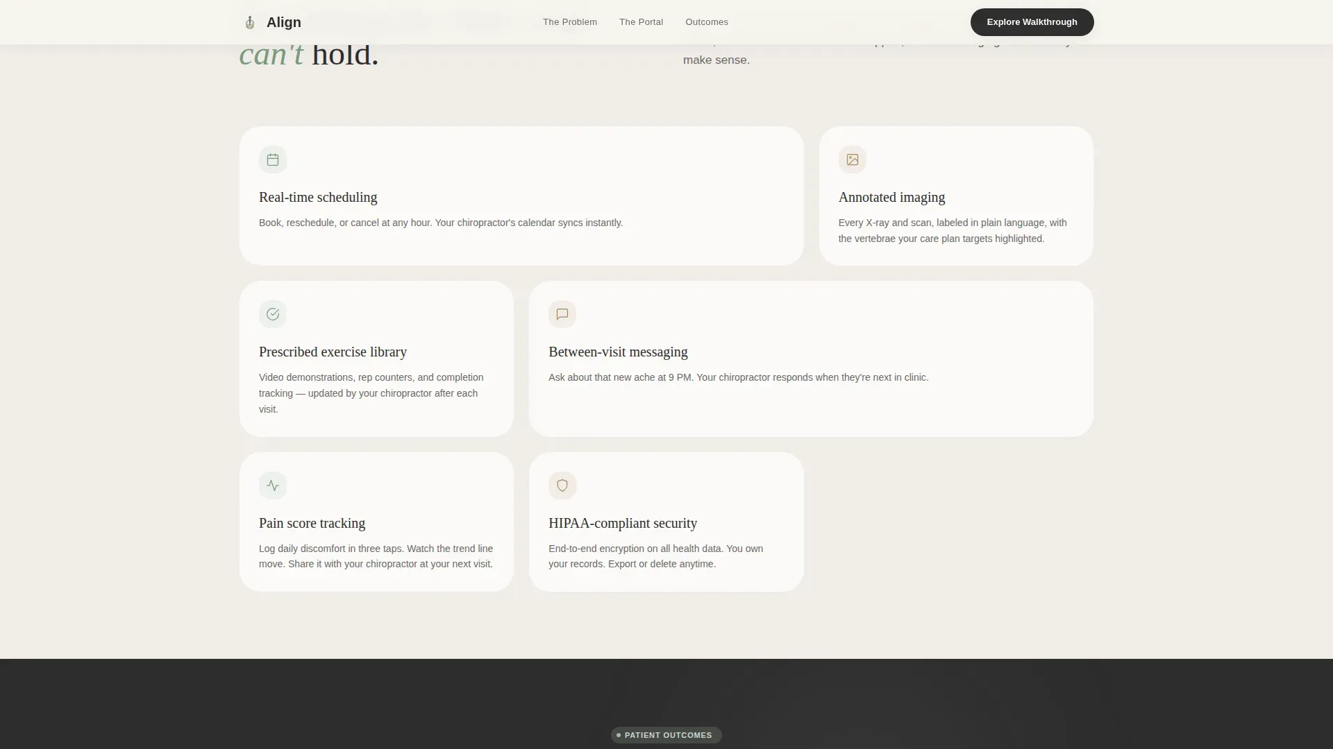
- A hero section with a dashboard freeze-frame showing real recovery data: visits completed, next appointment countdown, a simplified spinal diagram, and a pain score trend across eight weeks
- A scrolling Problem-to-Solution arc with three paired content blocks, each showing a patient frustration alongside the portal feature that resolves it
- A primary call-to-action linking to an interactive portal walkthrough, plus a secondary email-gated PDF download titled "5 Questions to Ask Your Chiropractor About Digital Records"
Feature list
This template is built around a specific set of functional and visual components drawn from the project brief. Each one serves the core goal of helping a prospective patient understand the portal's value before committing.
Stats and Metrics Hero Dashboard
The header opens with a stylized portal screenshot showing a patient's wellness summary at a glance. Large numbers display visits completed (12 of 18), a countdown to the next appointment, a simplified spinal diagram with two highlighted vertebrae, and a downward-trending pain score across eight weeks. The data tells the recovery story without a single paragraph of explanation.
Scrolling Problem-to-Solution Arc
Three frustration blocks scroll in sequence, each paired with a sidebar portal preview. The sidebar shifts from a static navigation menu into a living demo as the visitor moves down the page. Appointment booking appears beside the scheduling complaint, imaging history appears beside the lost-results frustration, and the exercise library appears beside the crumpled handout block.
Persistent Transforming Sidebar
The sidebar is the structural backbone of the page. It stays visible throughout the scroll and updates its content contextually alongside each problem block. This design pattern lets the portal demonstrate its own value in real time, without requiring the visitor to navigate away.
Dual Conversion Path Layout
The primary call-to-action, "Explore the Patient Walkthrough," links to an interactive guided tour of the portal. A secondary path offers a downloadable PDF gated behind a single email field. Both conversion points appear after the problem-solution arc, so the visitor already understands the value before being asked to act.
Social Proof Section
A dedicated section presents patient outcomes through pain score trend data, visit completion statistics, and three patient testimonials written with specificity. This section reinforces the portal's real-world impact using data-first presentation rather than generic praise.
Scroll-Reveal Animation System
The template includes medium-weight animation: scroll-reveal entrance effects, floating dashboard cards, a pain score chart animation, and staggered element entrances. Sidebar transformations and hover micro-interactions are handled through client-side interactivity.
Page sections overview
| Section | Purpose |
|---|---|
| Hero Dashboard Header | Opens with a data-rich portal freeze-frame and the headline "Your spine has a story. Finally read it." |
| Scheduling Problem Block | Depicts front-desk phone-tag frustration alongside a sidebar preview of the appointment booking feature |
| Imaging Problem Block | Shows the lost-results frustration and pairs it with the portal's imaging history view |
| Exercise Problem Block | Addresses the crumpled handout problem and reveals the portal's built-in exercise library |
| Solution Showcase | Consolidates all three sidebar previews into a unified portal feature overview |
| Social Proof Section | Displays pain score trends, visit stats, and three specific patient testimonials |
| Primary Call to Action | Presents "Explore the Patient Walkthrough" as the main conversion button |
| PDF Download Gate | Offers the gated PDF resource behind a single email field as a secondary conversion path |
| Footer Row | Delivers a clean single-row linear footer closing the page |
Design & branding system
The visual identity follows a Healing Space theme built on the Cloud Canvas color system. Every color choice is intentional: the palette is warm enough to slow breathing, neutral enough to lower shoulders, and clinical enough to build trust.
- Linen white (#F7F5F0) covers open content areas, Muted sage (#A3B5A6) marks sidebar navigation and section dividers, Warm clay (#C4A882) activates on hover states and progress indicators, and Deep charcoal (#2D2D2D) carries all body text
- Typography pairs Fraunces (a serif display face) with DM Sans (a clean body face), creating contrast between emotional headings and practical supporting copy
- The overall aesthetic references a clinic waiting room lit by diffused natural light rather than fluorescent tubes: warm, unhurried, and confident without being loud
Mobile & speed optimization
The layout is desktop-first by design, given its sidebar-driven structure, but it is fully responsive for mobile visitors. The sidebar collapses gracefully on smaller screens so the problem-solution arc remains coherent on any device.
- Static sections use server-side rendering to keep initial load light, while the interactive sidebar and animated components are handled client-side
- Scroll-reveal effects, floating dashboard cards, and the pain score chart animation are scoped to avoid layout interference on narrow viewports
- The email-gated PDF form and both call-to-action paths remain accessible and functional across desktop, tablet, and mobile screen sizes
How this template helps you convert
The page is structured as a Content and Resource destination. It builds trust through demonstrated value before making any request. By the time a visitor reaches the call-to-action, they have already seen the portal solve three specific problems that affect them personally.
- The problem-solution arc earns attention by naming frustrations the visitor already feels, making the portal feel like a logical answer rather than a sales pitch
- The "Explore the Patient Walkthrough" call-to-action gives the visitor a low-commitment next step: they explore an interactive tour before committing to anything
- The gated PDF offers a second entry point for visitors who are not yet ready to explore the portal, capturing their email while delivering genuine value in return
Other information about this template
This template is designed for the chiropractic patient portal niche within the broader Health and Medical category. It is optimized as a companion landing page, meaning it works alongside a live portal application rather than replacing it. A few additional details worth noting:
- The footer follows a linear single-row pattern, keeping the page close cleanly without adding extra navigation weight
- Localization is set for North American audiences: English language, USD currency display, and MM/DD/YYYY date formatting
- The template style is classified as a Sidebar Companion, a layout pattern suited to portals and SaaS products where a persistent navigation panel needs to do double duty as a live demo
- The header concept is built around a Stats and Metrics freeze-frame rather than a traditional hero image, prioritizing data storytelling over photography
- The creative direction follows a Problem-to-Solution Arc, a proven structure for health tech conversion pages where trust must be established before a sign-up request appears
Theme
Healing Space
Creative direction
Problem→Solution Arc
Color system
Cloud Canvas
Style
Sidebar Companion
Direction
Content/Resource
Page Sections
Stats and Metrics Hero Dashboard
Scrolling Problem-to-solution Arc
Persistent Transforming Sidebar
Dual Conversion Path Layout
Social Proof Data Section
Scroll-reveal Animation System
Related questions
Who is this landing page template designed for?
What is the primary call-to-action on this page?
Does the sidebar actually change as the visitor scrolls?
What social proof elements are built into the template?
Is this template suitable for a clinic without a live portal yet?


