Physical Therapy Landing Page Template
Align is a single-page physical therapy landing page built for clinics that earn trust through outcomes, not promises. It opens with a compelling patient testimonial, delivers outcome stats before the first scroll, and guides visitors through a comparison table, service area sections, and a low-friction inline scheduling flow, all styled in an editorial slate-and-sky palette.
by Rocket studio
Quick summary
Align is a precision-built physical therapy landing page template. It leads with a patient pull-quote and hard outcome numbers, then walks visitors through a clinic comparison table, neighborhood service area blocks, and a streamlined booking form. The design feels like a quality health journal: authoritative, calm, and immediately credible for clinics that want bookings, not browsers.
Who this template is for
This template suits independent physical therapy clinics and solo practitioners who want a landing page that converts comparison shoppers into scheduled patients. It works especially well when the clinic has real outcome data, strong reviews, and a defined local service area to highlight.
- Physical therapists targeting post-surgical, sports injury, or chronic pain patients
- Clinics serving specific neighborhoods or drive-time zones who want locally written content blocks
- Practitioners ready to replace a generic web presence with something that earns trust on first scroll
What problem this template solves
Most physical therapy pages look identical. They list services, show a stock photo, and hope the visitor calls. That approach loses patients who are actively comparing clinics and need a reason to choose one over another.
- Visitors arrive uncertain and leave without booking because no single page speaks directly to their recovery concern
- Clinics with strong outcomes and reviews have no structured way to surface that proof before asking for a commitment
- Hesitant visitors with questions about fit or insurance abandon the page rather than reaching out
What you get with this template
You get a fully structured, single-page layout with every section pre-built and ready to populate with your clinic's real data. Nothing is generic filler, every block has a defined job in the conversion flow.
- An oversized testimonial card header with outcome stats, a comparison table section, and editorial service area blocks
- A pinned top-bar call to action that appears after the testimonial scrolls away, keeping "Book Your First Visit" always visible
- A dual-path scheduling section with an inline form for ready visitors and a low-commitment phone screen option for those still deciding
Feature list
This template is built around a clear editorial structure with evidence-first design decisions.
Oversized Testimonial Card Header
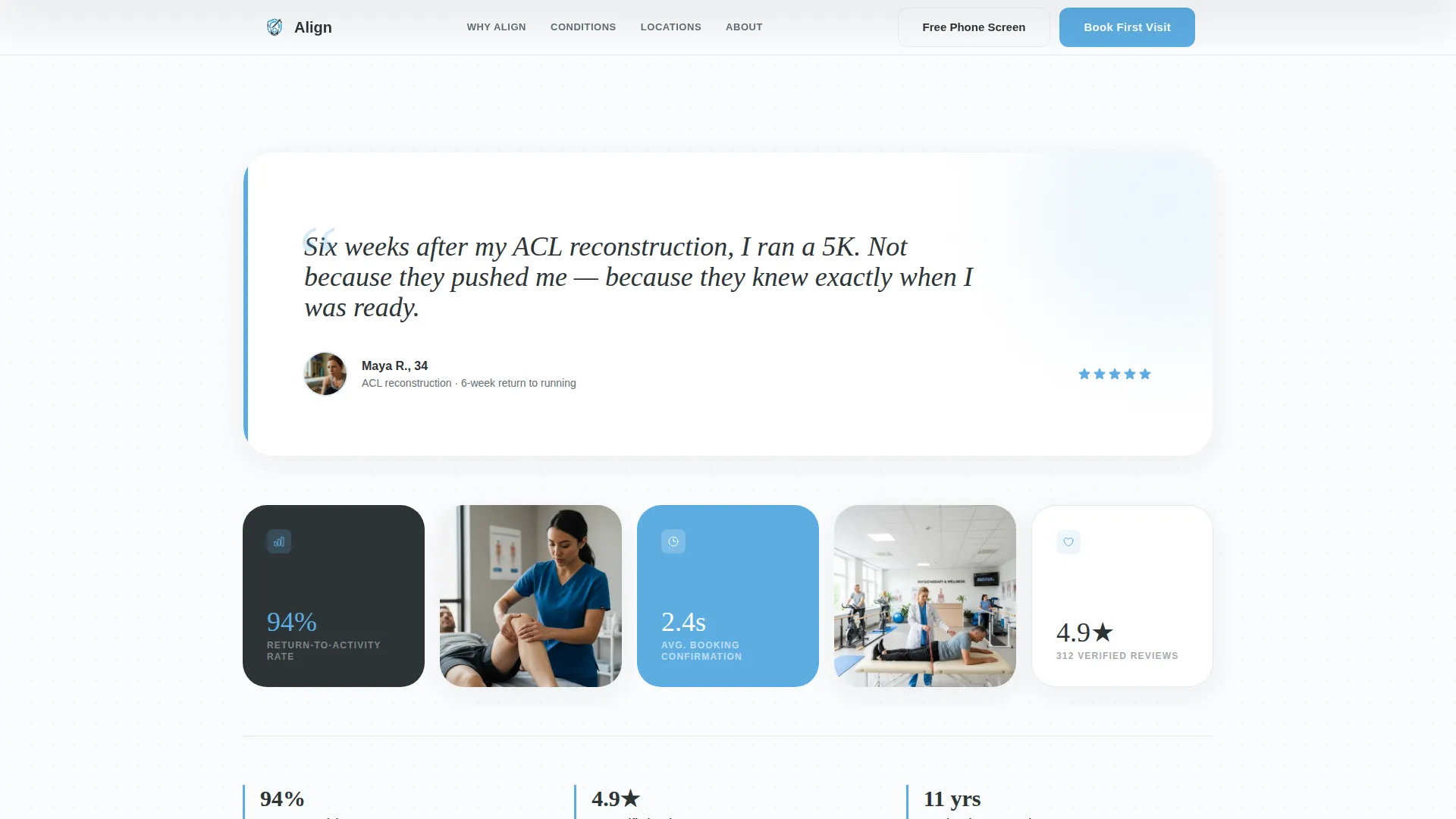
The page opens with a single pull-quote rendered in elegant serif type against generous white space. It is attributed with a first name, age, condition, and weeks to recovery. A small portrait photograph and a row of bold outcome stats sit directly below, visible before the visitor scrolls.
Clinic Comparison Table
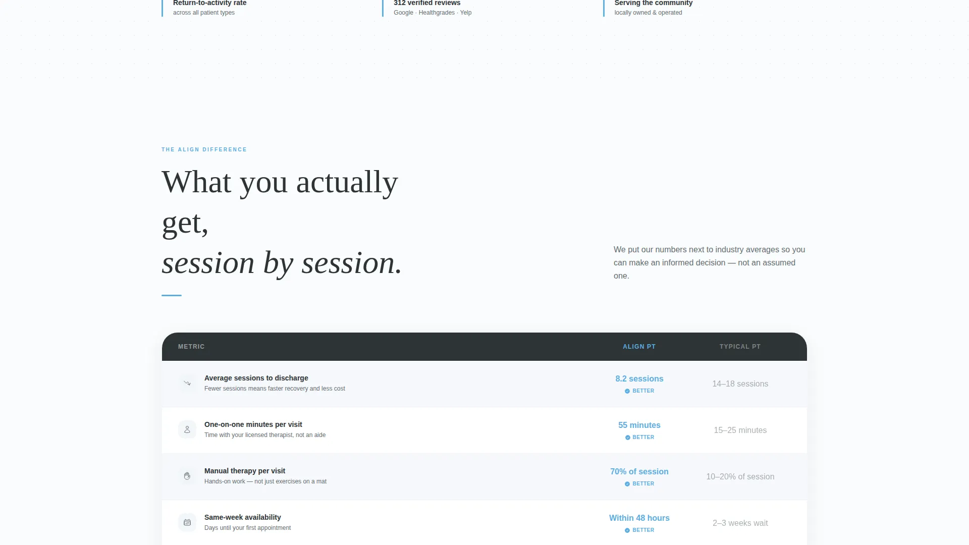
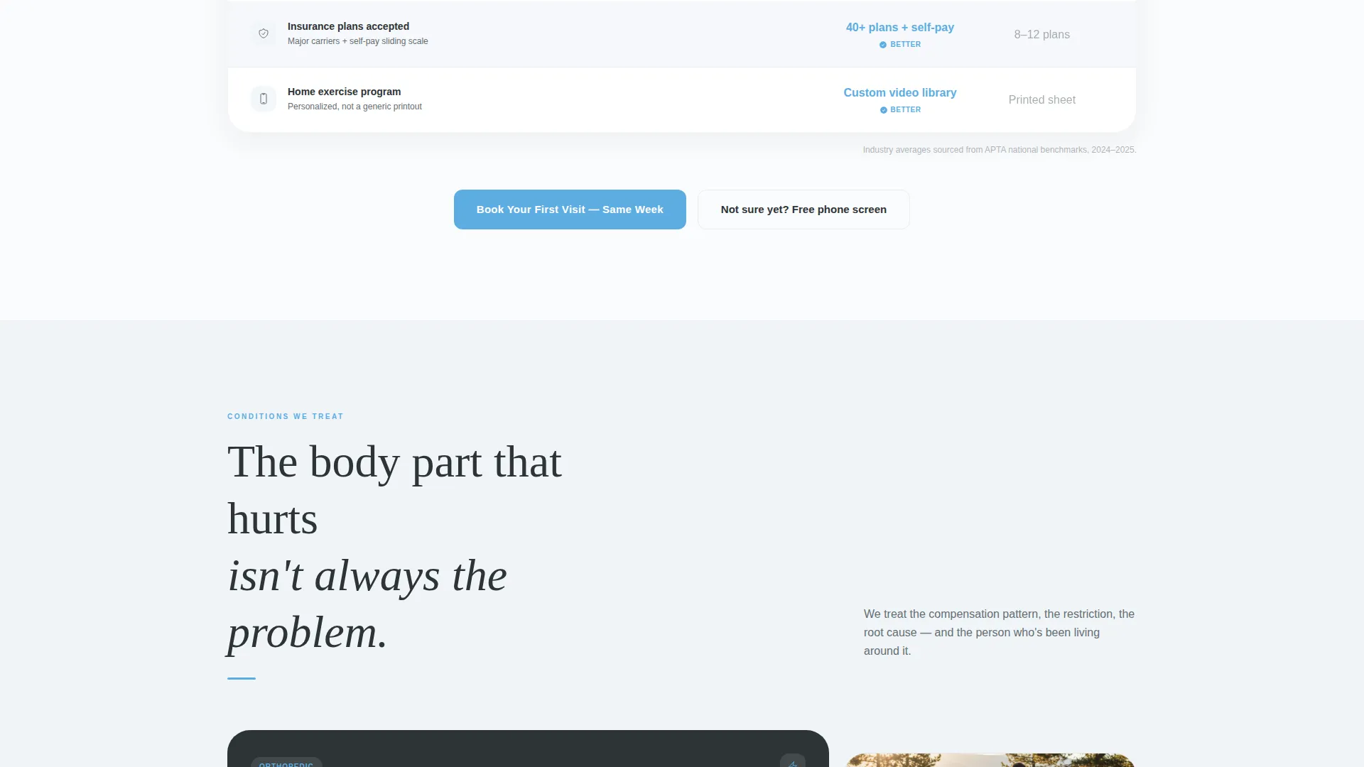
A structured table contrasts this clinic against typical physical therapy experiences. Columns cover average sessions to discharge, one-on-one minutes per visit, manual therapy percentage, and same-week availability. Clinic numbers appear in clinical sky blue; competitor figures use muted gray for instant visual contrast.
Editorial Service Area Blocks
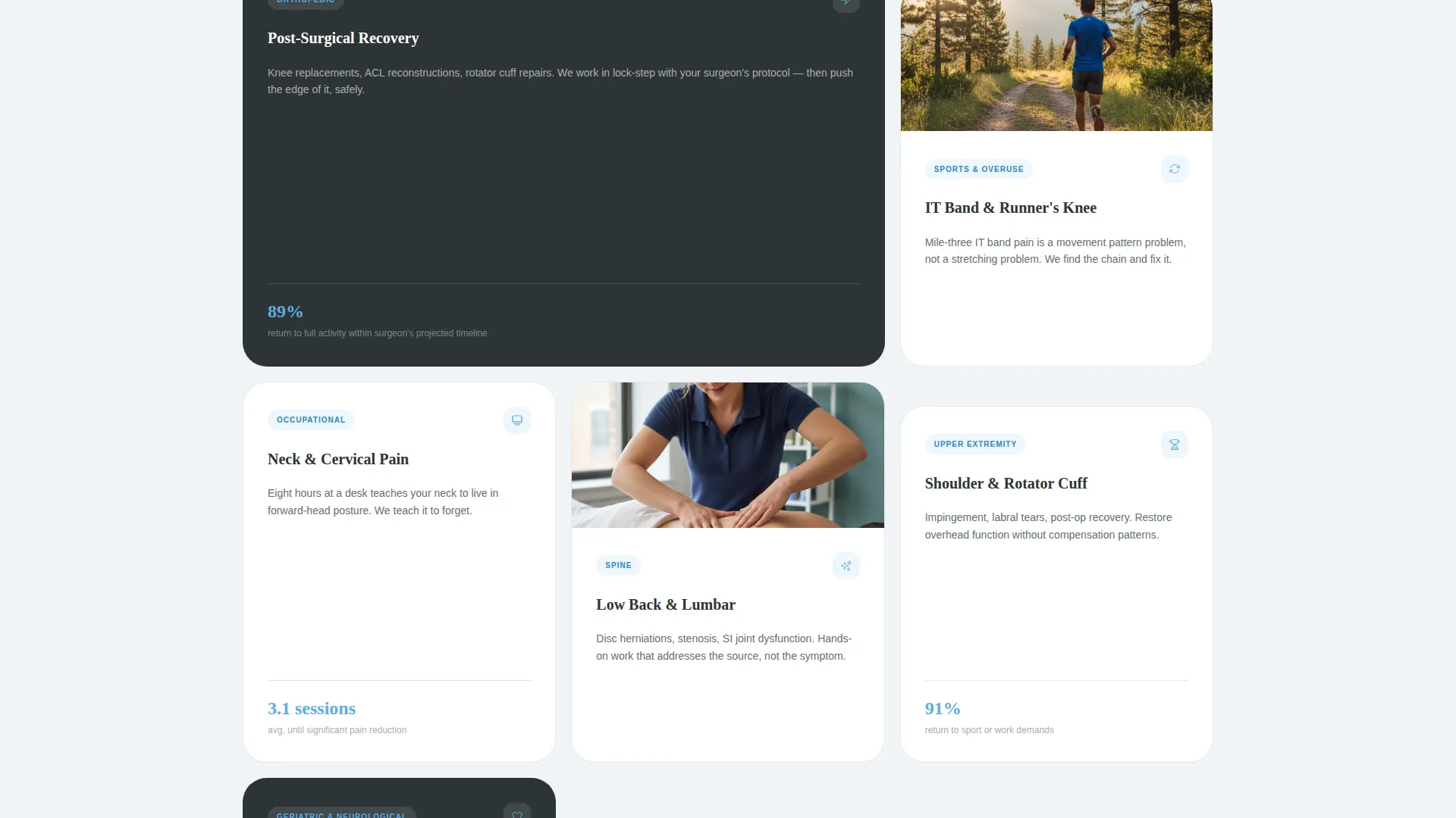
Between table sections, dedicated content blocks name specific neighborhoods, landmarks, and drive times. Each block carries its own local stat, such as a referral rate from a named neighborhood. This makes the page feel written for a real community rather than duplicated from a template.
Dual-Path Booking Section
The inline scheduling form collects injury type or body region first via a dropdown, then preferred location, insurance provider, and a calendar showing real open slots this week. A secondary path captures hesitant visitors with just a name and phone number for a free ten-minute phone screen.
Pinned Booking Call to Action
A slim top bar with a "Book Your First Visit" button pins to the top of the page after the testimonial card scrolls out of view. It stays present throughout the entire page without interrupting the editorial reading experience.
Stats-First Layout Structure
Every scroll reveals a new piece of evidence before asking the visitor to act. The layout is sequenced so that credibility builds progressively, from the opening testimonial through the comparison table to the local referral stats, reducing skepticism at each step.
Page sections overview
| Section | Purpose |
|---|---|
| Testimonial Card Header | Opens with a patient pull-quote, portrait photo, and outcome stats |
| Outcome Stats Row | Displays return-to-activity rate, star rating, and years serving the area |
| Clinic Comparison Table | Contrasts clinic metrics against typical PT experiences |
| Service Area Block One | Names first neighborhood zone with local referral stat |
| Service Area Block Two | Names second neighborhood zone with local referral stat |
| Inline Scheduling Form | Captures ready-to-book visitors with a four-step form |
| Phone Screen Path | Captures hesitant visitors with a minimal name-and-phone entry |
| Pinned Top Bar | Keeps the primary booking call to action visible on scroll |
Design & branding system
The visual identity follows an Editorial Magazine theme that feels like a well-designed health journal left open on a sunlit waiting room table. It is authoritative without sterility and calm without being passive.
- Deep editorial slate (#2D3436) for headline type, clinical sky blue (#5DADE2) for accent bars and interactive highlights, warm cloud white (#FAFBFD) for open backgrounds, and charcoal graphite (#636E72) for body copy
- Elegant serif typography for pull-quotes and display headings, paired with clean sans-serif for data callouts and form labels
- Magazine-style bold data callouts for stats, sky-blue table values for clinic figures, and muted gray for comparison columns
Mobile & speed optimization
The layout is designed to translate cleanly from desktop to smaller screens without losing its editorial character. The comparison table and service area blocks reflow to maintain readability on mobile devices.
- The pinned top bar stays functional on mobile, keeping the booking call to action accessible throughout scroll
- The dual-path booking section keeps form fields minimal and clearly labeled so mobile visitors can complete either path without friction
- Stat callouts and pull-quote typography scale to remain legible and visually impactful on smaller viewports
How this template helps you convert
Every layout decision in Align is oriented toward one outcome: turning a comparison-shopping visitor into a scheduled patient.
- The testimonial card and outcome stats deliver social proof and credibility in the first viewport, so visitors arrive at the comparison table already inclined to trust the clinic rather than still forming an opinion.
- The comparison table gives undecided visitors a concrete, visual reason to choose this clinic over a generic alternative, with the clinic's numbers highlighted in sky blue for instant recognition.
- The dual booking path removes the single biggest barrier to scheduling: commitment friction. Ready visitors book directly; hesitant visitors can request a free phone screen with minimal information, keeping both groups engaged.
Other information about this template
This template is designed as a standalone landing page, not a multi-page website. It is built for clinics in the Professional Services category, specifically for the physical therapist booking page use case where local trust signals matter as much as service descriptions.
- The template style is Editorial Magazine, and the theme is Service Utility, meaning it prioritizes practical proof over decorative design choices
- The creative direction is Testimonial Mosaic, which means multiple forms of social proof work together across the page rather than relying on a single review widget
- The color system is described in the brief as Cloud Canvas, a palette that uses open white space and editorial contrast to create a calm, credible reading environment
- The header concept is a dark full-bleed layout with a glow treatment, giving the testimonial card visual weight and drawing the eye immediately to the pull-quote
- The landing page direction is Click-Through, meaning the layout is built to move visitors from reading to acting in a single session
- This template is suited for clinics ready to populate all data fields, including real stats, named neighborhoods, and actual open booking slots, to get the full benefit of its evidence-first structure
Theme
Service Utility
Creative direction
Testimonial Mosaic
Color system
Cloud Canvas
Style
Editorial/Magazine
Direction
Click-Through
Page Sections
Oversized Testimonial Card Header
Clinic Comparison Table
Editorial Service Area Blocks
Dual-path Booking Section
Pinned Booking Call to Action
Stats-first Page Architecture
Related questions
Can I use this template without real outcome stats?
Does the comparison table work for any physical therapy speciality?
How does the dual booking path reduce friction for hesitant visitors?
Is this template suitable for a multi-location clinic?
Can the service area content be customized for my city or neighborhood?



