Orthodontist Virtual Consultation Landing Page Template
Align is a sidebar companion landing page template built for orthodontic practices offering virtual consultations. It guides visitors from first-time curiosity to a confident click through a warm, spa-meets-clinical design, a scrolling problem-to-solution narrative, trust badge display, and a fixed sidebar that tracks progress and keeps the primary call to action always within reach.
by Rocket studio
Quick summary
Align is a single-page template designed for orthodontic practices running virtual consultations. It opens with a trust badge constellation, moves through a personal problem arc, and closes with a clear call to action. The sidebar companion column stays fixed throughout, quietly guiding visitors step by step until they are ready to upload their smile.
Who this template is for
This template is built for orthodontic practices that want to convert online visitors into virtual consultation bookings. It works especially well for practices that already offer a selfie-based intake process or a digital treatment preview.
- Orthodontists offering remote or virtual smile assessments
- Practices targeting cost-conscious adults, parents researching options for teens, and younger adults exploring teeth-straightening treatments
- Clinics that want a polished landing page without a complicated multi-page build
What problem this template solves
Most orthodontic websites ask visitors to call, fill out a long form, or come in before they know anything about cost or treatment. That friction loses the cautious visitor before a conversation even starts.
- Visitors who are self-conscious or unsure feel overwhelmed before they act
- Cost and timeline uncertainty stops people from booking even when they are genuinely interested
- There is no guided path from "I'm curious" to "I'm ready" on a typical practice website
What you get with this template
You get a complete, ready-to-customize landing page that walks visitors through the full journey from anxiety to action. Every section is purpose-built and sequenced to reduce hesitation and build trust before the click.
- A fixed sidebar column with a three-step progress indicator that updates as the visitor scrolls
- A problem-to-solution narrative arc with an anxiety carousel, treatment flow explanation, and three-panel patient journey strips
- Three strategically placed calls to action and one secondary pricing path, all pointing toward the consultation upload flow
Feature list
A single paragraph introduces the feature set. Each section of this template carries a specific conversion job. Together they form a layout that feels calm, trustworthy, and purposeful from the first scroll to the last.
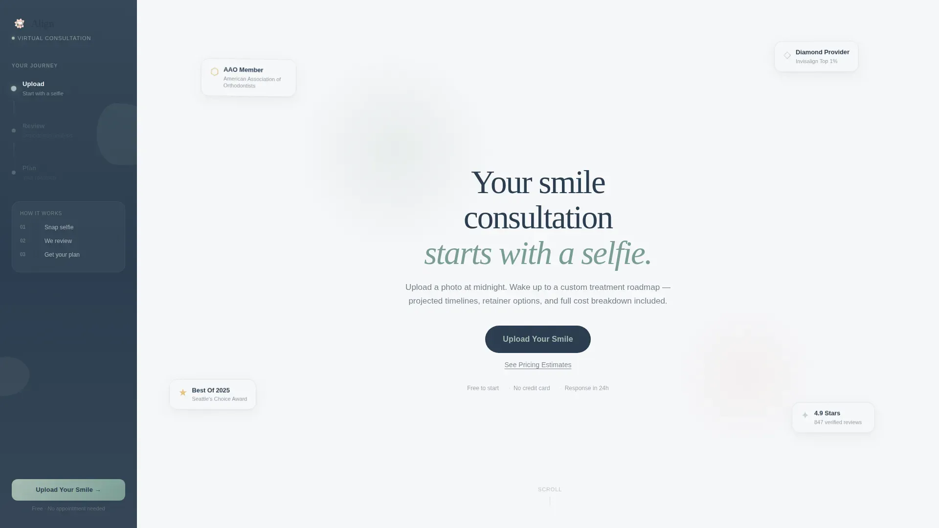
Trust Badge Constellation Header
The header arranges credential badges in an organic cluster against a fog white background. Award recognitions and provider status seals are rendered in muted brushed gold and soft silver, avoiding the hard-sell feel of a rigid badge row. A single serif headline sits beneath them in deep enamel.
Scroll-Linked Sidebar Companion
A fixed sidebar column in deep enamel stays visible throughout the entire page scroll. It displays a miniature three-step visual showing Upload, Review, and Plan, and updates its active step indicator as the visitor moves through the narrative. Past the midpoint, it also shows the persistent primary call to action button.
First-Person Anxiety Carousel
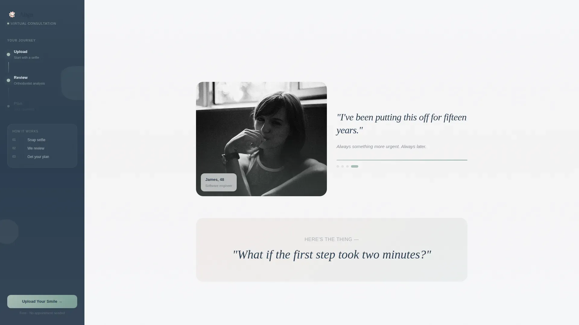
An interactive carousel opens the problem section with real, relatable anxieties written in first person. Each slide pairs a short personal statement with a soft-focus photo of someone mid-hesitation. A single pivot line follows the carousel to bridge the emotional problem with the practical solution.
Annotated Treatment Preview
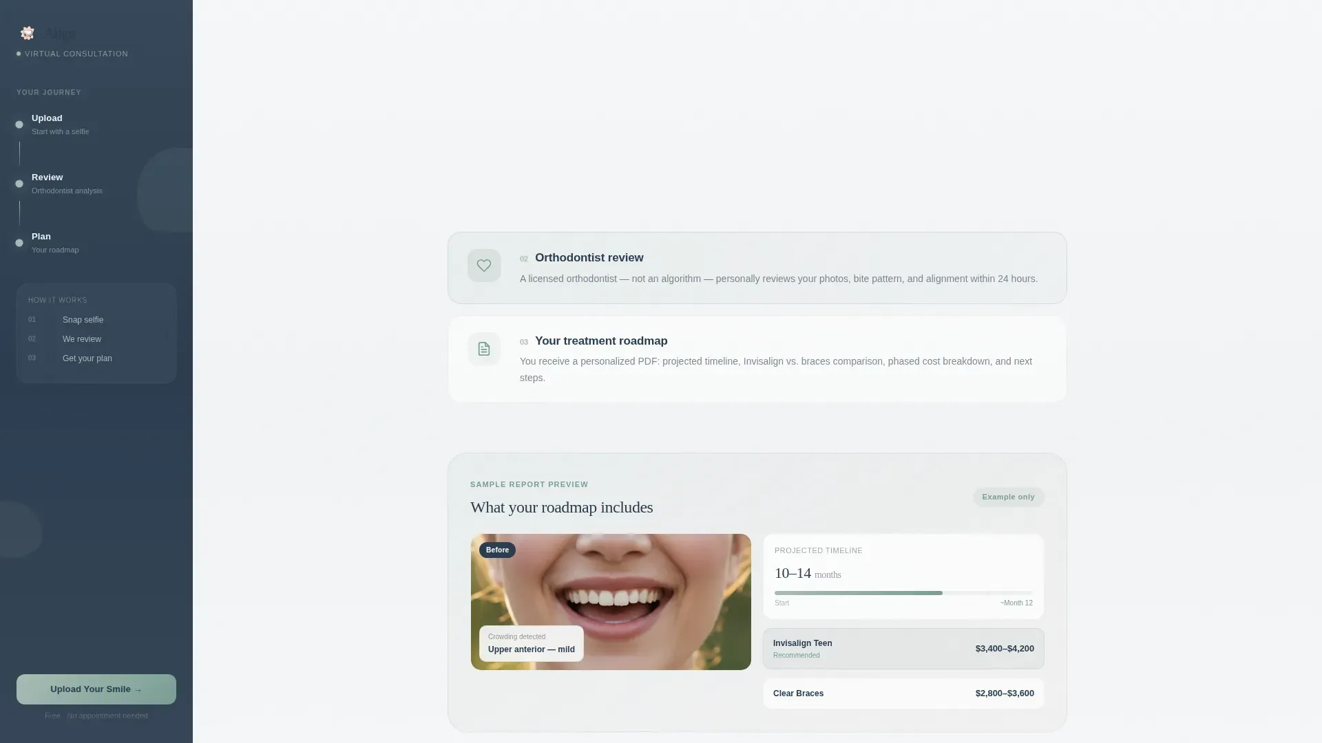
The solution flow section includes a sample treatment preview with an annotated smile simulation. This shows visitors what a real consultation output looks like before they commit to starting. It reduces the unknown and builds confidence that the process delivers something tangible.
Three-Panel Patient Journey Strips
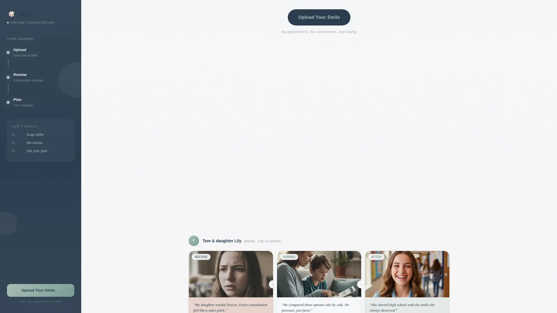
Patient stories are told in a three-panel comic strip format moving from worry to process to result. This format keeps social proof readable and emotionally resonant without requiring long written testimonials. The format works across desktop and mobile column layouts.
Dual Call to Action Path
The primary call to action, "Upload Your Smile," appears three times across the page. A secondary text link, "See Pricing Estimates," gives cost-conscious visitors a lower-commitment path. Neither path requires a form on this page; both lead to a dedicated next step.
Page sections overview
| Section | Purpose |
|---|---|
| Hero Trust Header | Display credential badges, headline, and first call to action |
| Fixed Sidebar Column | Show three-step progress and persistent call to action |
| Problem Arc Carousel | Surface visitor anxieties in first-person slides with photos |
| Solution Flow | Explain the virtual consultation process with annotated preview |
| Patient Journey Strips | Tell three patient stories in comic strip format |
| Final Call to Action | Reinforce primary and secondary actions before footer |
| Linear Single-Row Footer | Close the page with minimal, organized footer links |
Design & branding system
The visual identity follows an Organic Flow theme built around the Soft Mist color system. The palette feels warm and clinical at the same time, like a well-lit room with good ventilation and soft natural light. Typography pairs DM Sans for body text with Fraunces as the serif display face for headings.
- Colors: morning fog white (#F7F8FA) for the main background, eucalyptus stem (#A8BDB5) for accents and interactive elements, warm breath pink (#E8D5CE) for hover states and before-and-after image warmth, and deep enamel (#2C3E50) for text, the sidebar, and buttons
- Typography: DM Sans handles all body copy for clean readability; Fraunces brings expressive warmth to display headings
- Animation style: medium-intensity scroll-linked reveals, fade-up section transitions, gentle parallax blobs, and a live-updating sidebar step indicator
Mobile & speed optimization
The template is designed desktop-first around the sidebar companion layout. On smaller screens, the sidebar collapses gracefully so the core narrative and calls to action remain fully accessible.
- The sidebar fixed column collapses on mobile to avoid obscuring content
- Interactive elements including the anxiety carousel and scroll tracking are built as client components, while static sections use server component rendering for leaner page loads
- Fade-up reveals and parallax effects are designed to complement the reading experience without adding visual noise on smaller displays
How this template helps you convert
This template earns the click by removing every unnecessary barrier between curiosity and action. The layout is engineered so that by the time a visitor reaches the second call to action, they have already understood the process, seen a sample output, and read a real patient story.
- The problem arc opens with the visitor's own words, making them feel seen before anything is asked of them, which keeps them reading rather than bouncing
- The solution flow and annotated preview answer the two biggest questions, what happens and what it costs to try, before the call to action ever reappears
- The persistent sidebar call to action removes the need to scroll back up; when a visitor is ready, the action is already in front of them
Other information about this template
This template is part of the Health and Medical category under the Orthodontist Website subcategory, built specifically for the virtual consultation niche. It is a single landing page with a sidebar companion layout and a click-through conversion goal.
- The template style is Sidebar Companion with a Problem-to-Solution Arc creative direction
- The lp direction is Click-Through, meaning no form fields appear on this page; the call to action leads to a separate upload flow
- The footer follows a Linear Single-Row pattern to keep the page close cleanly without distraction
- This template is built for English-language, US-based practices using USD pricing and MM/DD/YYYY date formatting
- The intersection match score for this template is 13, indicating a strong alignment between category, subcategory, and niche intent
Theme
Organic Flow
Creative direction
Problem→Solution Arc
Color system
Soft Mist
Style
Sidebar Companion
Direction
Click-Through
Page Sections
Trust Badge Constellation Header
Scroll-linked Sidebar Companion
First-person Anxiety Carousel
Annotated Treatment Preview
Three-panel Patient Journey Strips
Dual Call to Action Path
Related questions
Does this template include a consultation booking form?
Can I update the trust badge section with my own credentials?
Is the sidebar fixed or does it scroll with the page?
Can I change the colors to match my practice branding?
Does this template work for practices that do not yet offer virtual consultations?



