Chiropractic Patient Reviews & Testimonials Website Template
The Align chiropractic landing page is a comparison-table-driven testimonial and review page built to convert skeptical patients through clinical evidence. It leads with an oversized patient quote, animated outcome statistics, and a condition-based comparison table before presenting a masonry testimonial grid and a streamlined three-step booking form, earning trust before asking for commitment.
by Rocket studio
Quick summary
Align is a single-page chiropractic testimonial and review landing page designed around a Stats-First Impact approach. It opens with a cinematic testimonial card, moves into a clinical comparison table, and builds toward a booking form, all within a Corporate Precision visual identity. The page is built to convert data-driven patients who need evidence before they schedule.
Who this template is for
This template is built for chiropractic clinics that attract analytically minded patients. It works especially well for practices treating specific, recurring conditions with measurable outcomes.
- Chiropractors serving desk-bound professionals, athletes, and post-partum patients who want proof before they book
- Practices that track recovery timelines and patient satisfaction data and want to show that data clearly
- Clinics ready to replace generic "we care about you" copy with specific, outcome-led social proof
What problem this template solves
Most chiropractic websites lead with a friendly photo and a booking button. That approach fails the skeptical patient who has already tried physical therapy, seen a general practitioner, and walked away without lasting relief. They need to see numbers, not warmth, before they trust a new provider.
- Patients with chronic conditions like sciatica, postural kyphosis, or herniated disc need condition-specific proof, not generic praise
- Visitors arriving during a pain flare on a desktop research session need fast, scannable answers about real outcomes
- Clinics lose conversions when they ask for commitment before establishing credibility
What you get with this template
This template delivers a fully structured, section-led landing page with every component specified and purposefully ordered. Each section earns the next by adding a new layer of evidence.
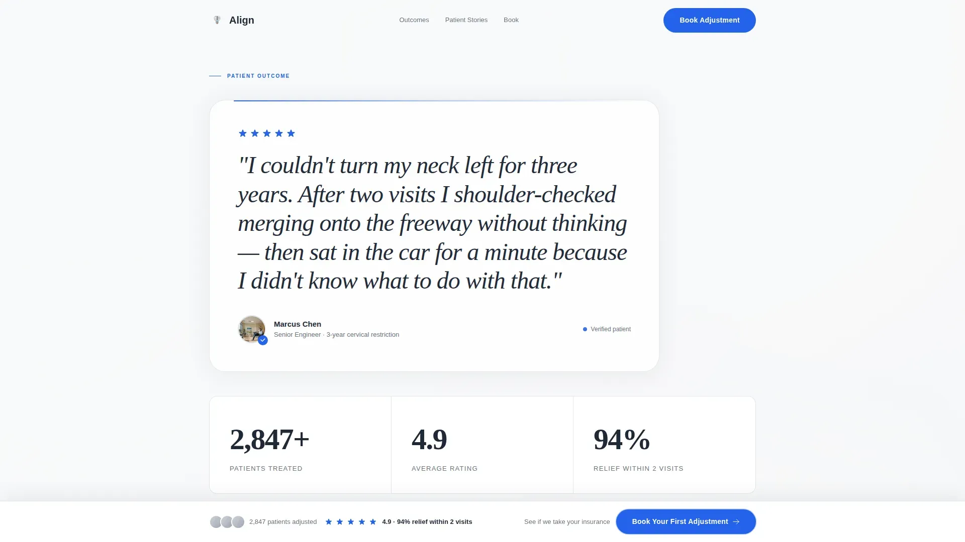
- A hero section with a floating 48-pixel serif testimonial card, animated patient count, average rating, and relief-rate statistics
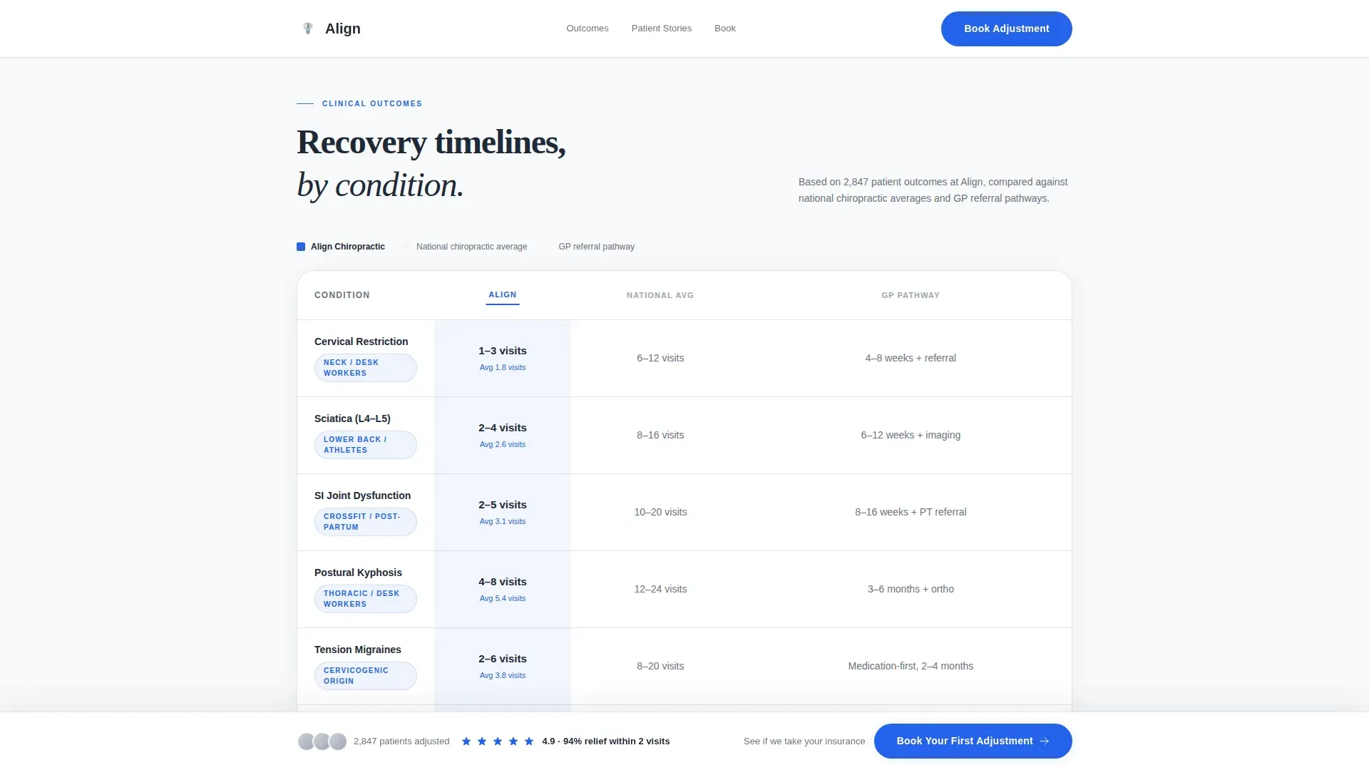
- A clinical comparison table contrasting recovery timelines across sciatica, migraines, herniated disc, and postural kyphosis against national chiropractic averages and general practitioner referral pathways
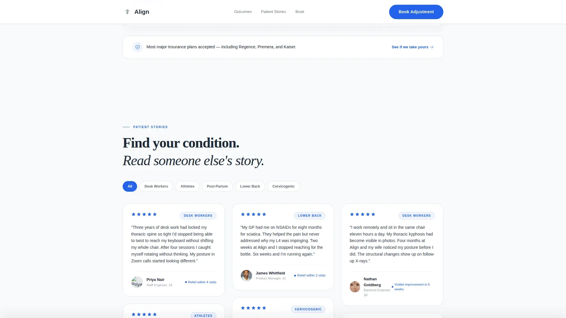
- A condition-tagged masonry testimonial grid, a three-step sequential booking form, an insurance lookup field, and a floating booking bar that appears after the visitor scrolls past the comparison table
Feature list
This template is built around a specific sequence of trust-building components. Each feature below is intentional and sourced directly from the template design brief.
Cinematic Hero Testimonial Card
The hero opens with a single oversized patient quote typeset at 48 pixels in Fraunces serif. A real name, photo thumbnail, and five-star rating rendered in accent blue anchor the card on white space. The quote is specific and physical, describing a real outcome rather than a general feeling.
Animated Statistics Row
Three key numbers sit directly below the hero card: total patient count, average star rating, and the percentage of patients who report relief within two visits. Each number counts up from zero on page load, drawing the eye and reinforcing clinical credibility immediately.
Condition-Based Comparison Table
The comparison table lists common conditions in rows and compares recovery timelines across three columns: this clinic, national chiropractic averages, and general practitioner referral pathways. The clinic column carries a subtle blue wash to distinguish it visually. Conditions covered include sciatica, migraines, herniated disc, and postural kyphosis.
Condition-Tagged Masonry Testimonial Grid
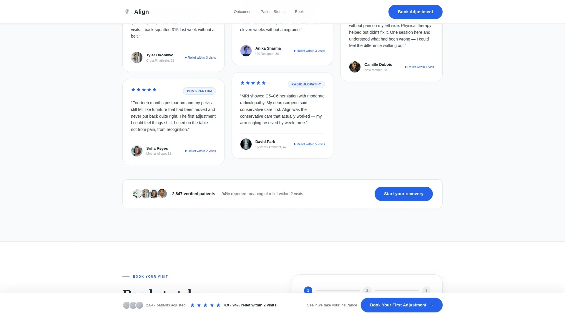
Below the comparison table, testimonial cards stack in a masonry grid layout. Each card is tagged by condition so visitors can find reviews from patients with their specific problem. Cards grow more specific as the visitor scrolls, building a cumulative case through individual stories.
Three-Step Sequential Booking Form
The booking section presents three inputs in sequence: a dropdown for condition or pain area, a horizontal toggle for preferred day of the week, and a phone number field for confirmation. The form is purposefully minimal to reduce friction and keep the path to booking clear.
Floating Booking Bar with Insurance Lookup
A "Book Your First Adjustment" call-to-action bar floats into view after the visitor scrolls past the comparison table. A secondary option below the testimonial grid links to a quick insurance provider lookup, giving visitors who are unsure about coverage a low-commitment next step.
Page sections overview
| Section | Purpose |
|---|---|
| Hero Testimonial Card | Opens with a specific patient quote, photo, and five-star rating to establish immediate credibility |
| Animated Stats Row | Displays patient count, average rating, and two-visit relief rate with count-up animation |
| Condition Comparison Table | Compares recovery timelines at the clinic versus national chiropractic and general practitioner benchmarks |
| Masonry Testimonial Grid | Stacks condition-tagged patient stories in order of increasing specificity |
| Sequential Booking Form | Collects condition, preferred day, and phone number across three focused steps |
| Insurance Lookup Field | Lets visitors check coverage by provider name before committing to a booking |
| Floating Booking Bar | Appears after the comparison table scroll point and pins the primary call to action on screen |
| Single-Row Footer | Closes the page with a clean, minimal linear footer layout |
Design & branding system
The visual identity follows a Corporate Precision theme using an Arctic White color system. The aesthetic is intentionally clinical: white canvas, stainless steel accents, and a single active color reserved for interactive moments.
- Color palette: clinical white (#F8F9FA) dominates at roughly 80 percent of the canvas, deep spinal charcoal (#1F2937) carries all body text, instrument-grade silver (#D1D5DB) draws table borders and dividers, and adjustment blue (#2563EB) appears only on star ratings, interactive elements, and call-to-action pulses
- Typography: Fraunces serif for headlines and patient quotes to convey warmth and authority, DM Sans for body copy and interface elements to maintain clinical readability
- Scroll-triggered section reveals and a medium-weight animation approach keep the page feeling precise rather than playful
Mobile & speed optimization
The template is designed desktop-first, reflecting the target audience of desk-based professionals researching during a pain episode at their workstation. It is responsive and adapts to mobile viewports.
- Static content uses server components to reduce unnecessary JavaScript overhead, while count-up animations and scroll-triggered reveals use minimal scripting
- The floating booking bar, masonry grid, and comparison table all reflow cleanly for smaller screens without losing their structural logic
How this template helps you convert
The page is architected as a deliberate evidence ladder. Each section hands the visitor one more reason to act before the call to action appears.
- The hero testimonial card and animated stats establish credibility instantly, so visitors with chronic pain recognize a serious clinical practice within the first viewport rather than a generic wellness site
- The comparison table delivers condition-specific data before the visitor has been asked to do anything, making the floating booking bar feel like a natural conclusion rather than an interruption
- The condition-tagged testimonial grid personalizes the case for each visitor type, whether they have sciatica, migraines, a herniated disc, or pelvic misalignment after pregnancy, so by the time they reach the booking form, the decision feels already made
Other information about this template
This template is localized for an English-language United States audience and reflects a Seattle, Washington clinical context. It can serve as the primary patient acquisition page for a chiropractic practice or as a standalone review and testimonial hub linked from a broader practice website.
- The FAQ accordion included in the booking section supports common pre-visit questions, helping visitors resolve hesitations without leaving the page
- The template covers four core conditions in the comparison table: sciatica, migraines, herniated disc, and postural kyphosis, and the booking dropdown mirrors these same condition labels for consistency
- The insurance lookup field is a secondary conversion path for visitors who are unsure whether chiropractic care is covered under their plan, reducing a common barrier to booking
Theme
Corporate Precision
Creative direction
Stats-First Impact
Color system
Arctic White
Style
Comparison Table
Direction
Booking/Scheduling
Page Sections
Cinematic Hero Testimonial Card
Animated Statistics Row
Condition-based Comparison Table
Condition-tagged Masonry Grid
Three-step Sequential Booking Form
Scroll-triggered Floating Booking Bar
Related questions
What types of patients is this landing page template designed for?
Can I customize the conditions listed in the comparison table?
Does the template include a way to handle insurance questions?
When does the floating booking bar appear on the page?
What typography and color choices does this template use?



