Wellness Modalities Booking Website Template
Align is a scroll-reveal landing page built for Rolfing and structural integration practitioners. It opens with an interactive posture quiz, then guides each visitor through a progressive testimonial mosaic before presenting a streamlined booking form. The result is a focused, atmospheric landing page that earns trust early and converts curious visitors into confirmed assessment bookings.
by Rocket studio
Quick summary
Align is a single-page, scroll-reveal landing page template designed specifically for structural integration and Rolfing practitioners. It replaces a standard hero image with an interactive posture quiz, builds trust through progressively revealed client narrative arcs, and closes with a focused booking form. Every element serves just one conversion goal: getting qualified visitors to reserve their ninety-minute initial assessment.
Who this template is for
This landing page was built for solo practitioners and small bodywork practices that work with clients experiencing chronic postural pain. It is the right starting point if you offer structural integration, Rolfing sessions, or related manual therapy that addresses root-cause patterns rather than isolated symptoms.
- Rolfing and structural integration practitioners looking to launch a new landing page without starting from scratch
- Wellness and bodywork professionals whose target audience includes marathon runners, desk workers, and yoga teachers with long-standing postural compensations
- Practitioners who want professional landing pages that reflect a calm, credible brand identity rather than a generic clinic aesthetic
What problem this template solves
Most bodywork practitioners rely on referrals or generic appointment pages that fail to communicate what makes structural integration different. Prospective customers land on a page that looks like every other massage or physical-therapy site and feel no reason to commit. The result is low conversion rates, abandoned forms, and potential customers who drift away without booking.
- Visitors arrive skeptical and leave without engaging because the landing page design does not demonstrate practitioner knowledge before asking for a booking
- Generic booking pages overwhelm visitors with navigation menus, multiple links to other website pages, and no clear value proposition
- Without social proof or specific client outcomes, the landing page fails to encourage visitors to take the desired action
What you get with this template
This template delivers a complete, ready-to-customize landing page structure for a structural integration practice. From the opening quiz to the closing booking form, every section is purposefully sequenced. The landing page design is atmospheric and unhurried, using Japanese Zen minimalism to hold the visitor's attention without distraction.
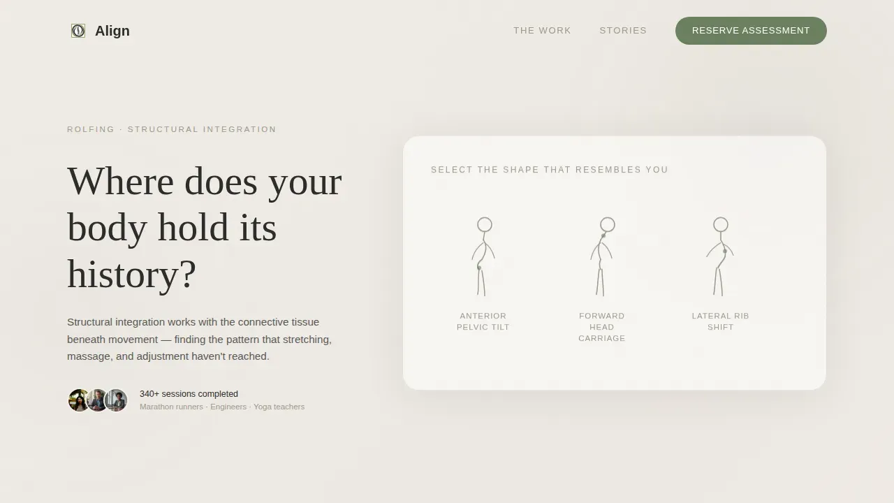
- An interactive posture quiz header that replaces a traditional hero image and immediately demonstrates practitioner fluency to prospective customers
- A progressive testimonial mosaic with asymmetric scroll-reveal blocks, including narrative arcs, handwritten-style pull quotes, and silent video testimonials
- A multi-step booking form pre-filled from the quiz result, a floating moss-green call to action button, and a secondary email capture path for visitors still researching
Feature list
This landing page template ships with a tightly defined set of interactive elements and layout components. Each one is grounded in what a high converting landing page for a bodywork practitioner actually needs: clear intent, strong social proof, and a smooth path to booking.
Interactive Posture Quiz Header
The landing page opens with a single engaging headline on a pale gradient field: "Where does your body hold its history?" Three minimal illustrated silhouettes represent common postural patterns. Visitors tap the one that matches their body, and the page responds instantly with a short anatomical insight. This user interaction replaces a conventional hero image and proves practitioner expertise before the scroll begins. Interactive elements like this quiz can significantly boost user engagement and lead generation by making the visitor feel understood from the first second.
Scroll-Reveal Testimonial Mosaic
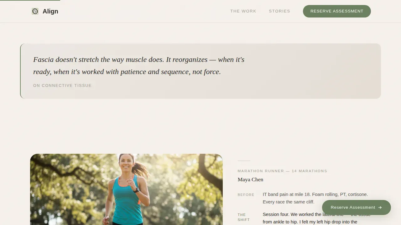
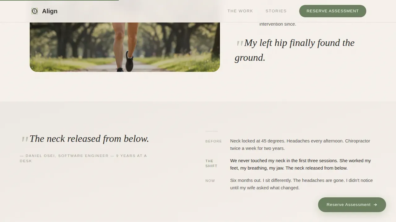
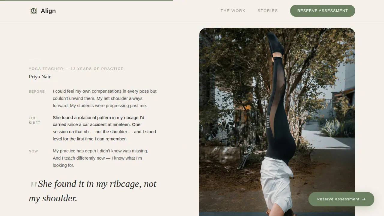
Below the fold, client stories surface one by one as the visitor scrolls. Each story follows a brief narrative arc: what the client came in with, what shifted, and what their body feels like now. The mosaic layout never repeats itself. Some blocks include before-and-after posture photographs. Some are text-only with a handwritten-style pull quote. Some feature a ten-second silent video. Video testimonials and image-based social proof alternate with text blocks to create rhythm. Engaging visuals keep the page feeling discovered rather than listed, and every reveal adds another layer of trust.
Anatomical Insight Strip
Between testimonial blocks, single-sentence anatomical truths fade in as the visitor scrolls. Lines like "The Ten-Series works from surface to core, session by session" give the scroll a dual rhythm of feeling and knowing. These insight strips reinforce the practitioner's value proposition without adding bulk. They act as micro-moments of credibility that keep the visitor's attention moving forward toward the booking form.
Pre-Filled Multi-Step Booking Form
The booking section asks three things in sequence: the visitor's name, the postural pattern they selected in the quiz (pre-filled automatically), and their preferred date from a short list of available ninety-minute sessions. Multi-step forms like this keep the signup process simple, reduce drop-offs, and avoid overwhelming visitors with too many fields at once. Simplifying form fields is one of the clearest ways to improve conversion rates on an appointment booking landing page. The form is designed as the page's primary call to action, and booking appointments online through it is fast and intuitive.
Floating Call to Action Button
The primary call to action, "Reserve Your Assessment," appears in moss green immediately after the quiz result. It then floats gently at the bottom of the viewport as the visitor continues scrolling. This strategic placement of the call to action ensures the desired action is always within reach without interrupting the narrative. A visually prominent call to action call to action that uses action-oriented language is one of the key elements of a high converting landing page, and this floating button delivers exactly that.
Secondary Email Capture Path
Not every visitor is ready to book. The secondary path, "Not ready? Download the Fascia Guide," captures an email address for visitors still in the research phase. This sign up form expands the landing page's lead generation reach beyond immediate bookers. Generating leads at two levels, booked sessions and email subscribers, lowers the cost per qualified lead over time and builds a warm audience for future outreach.
Page sections overview
| Section | Purpose |
|---|---|
| Quiz Header | Posture silhouette selector with instant personalised insight |
| Quiz Result Card | Floating anatomical response that pre-fills the booking form |
| Testimonial Mosaic One | Marathon runner narrative arc in asymmetric scroll-reveal layout |
| Anatomical Insight Strip | Single-sentence fade-in truth between testimonial blocks |
| Testimonial Mosaic Two | Software engineer narrative with text-only layout and pull quote |
| Session Structure Block | Ten-Series explanation leading into the booking call to action |
| Booking Reserve Form | Three-field multi-step form with pre-filled posture pattern |
| Secondary Capture Path | Email opt-in for the downloadable Fascia Guide |
| Minimal Footer | Superhuman-style minimal footer with essential links only |
Design & branding system
The landing page design follows a Japanese Zen color system that communicates calm authority. Every color choice, spacing decision, and typographic pairing reinforces the practitioner's brand identity without a single word of explanation. The overall effect is a visual treat for visitors accustomed to cluttered wellness pages.
- Color palette: shōji screen white (#F5F0EB) for backgrounds, bamboo charcoal (#2C2C2A) for body text, stone garden gray (#9B9B8E) for accents, and moss green (#6B7F5E) reserved exclusively for the call to action button and progress indicators
- Typography: Fraunces (a warm serif display face) for headings paired with DM Sans for body text, creating a balance between atmospheric visual appeal and high readability
- White space, soft gradient backgrounds, and the deliberate absence of stock photos or decorative clutter keep the layout clean, skimmable, and consistent with a credible wellness brand identity
Mobile & speed optimization
A mobile friendly landing page is non-negotiable for a wellness practice. Mobile users now represent a large share of people researching health services, and many users book appointments on their smartphones. This template is built desktop-first with full mobile responsiveness so the experience holds across all screen sizes.
- The interactive quiz, floating call to action, scroll-reveal testimonial blocks, and multi-step booking form are all designed to function cleanly on mobile devices
- The layout uses server-side components for static sections and client-side components only for the quiz and booking form, which keeps page speed manageable and the signup form snappy for mobile users
- Generous white space, large tap targets, and a single-column flow on smaller screens ensure that the landing page does not overwhelm visitors on any device
How this template helps you convert
A good landing page should take every visitor on a deliberate journey from curiosity to commitment. Align is built around a focused sequence: the quiz earns trust, the testimonial mosaic deepens it, and the booking form closes with minimal friction. This is the ideal landing page structure for a practitioner service where trust must be established before money changes hands.
- The posture quiz acts as the engaging headline and the opening interactive element simultaneously. It captures the visitor's attention, personalises their experience, and delivers immediate value. By the time the first scroll-reveal testimonial appears, the visitor already feels seen. This is what separates a great landing page from a generic one: it tells the visitor something true about themselves before asking anything in return.
- The progressive testimonial mosaic builds social proof across the entire scroll journey. Customer testimonials in narrative form are more persuasive than quote cards because they show transformation, not just satisfaction. Satisfied customers become the practitioner's most credible voice, and the asymmetric layout ensures each success story lands with fresh impact. Incorporating social proof this thoroughly is one of the clearest ways to encourage visitors to take the final push toward booking.
- The floating call to action and pre-filled booking form reduce every remaining barrier at the conversion point. The multi-step form asks only what is necessary. The quiz result pre-fills the postural pattern field, so the visitor's answer travels with them. This converts visitors who might otherwise abandon the page at the form stage. A well-designed appointment booking landing page motivates visitors to schedule appointments with clear calls to action and a smooth, intuitive booking experience.
Other information about this template
This section covers additional practical details for practitioners evaluating whether Align fits their marketing strategy and workflow. The template is designed to work as a standalone landing page, separate from other website pages, so it focuses entirely on just one conversion goal.
- The landing page structure avoids navigation menus and multiple links to ensure every scroll moves the visitor toward booking or email capture, never away from the page's purpose
- The template supports a dual lead generation path: primary conversion through the "Reserve Your Assessment" booking form and secondary conversion through the "Download the Fascia Guide" signup form, giving practitioners two routes to grow their list of qualified leads
- Because the landing page carries no hero image in the traditional sense, practitioners do not need high quality images of their studio upfront; the quiz silhouettes and testimonial photographs carry the visual weight
- Practitioners can use this landing page as part of a broader marketing strategy that drives traffic from search engines, social media, or email campaigns to a single, focused conversion page
- Built-in analytics tracking can be connected to the template to collect data on quiz selections, form completions, and scroll depth, providing valuable insights into how prospective customers interact with each section
- The template uses relevant keywords in its section copy and heading structure, which supports discoverability through search engines when paired with a thoughtful content approach
- Lead management tools and marketing tools such as email service providers can be connected to the secondary capture form to automate follow-up for visitors who download the Fascia Guide
- The floating call to action call to action and the pre-filled booking form work together to lower lead costs by reducing the friction that causes potential customers to abandon the page before completing the signup process
- Smart search and direct-traffic visitors alike benefit from the landing page's clear value proposition: structural integration that addresses root postural patterns, not surface-level symptoms
- Practitioners who want to understand how many users reach the booking form versus the quiz result can connect built in analytics tools to track conversion rates at each stage of the page
- The Align structural integration booking landing page template is one of the most niche-specific wellness landing page options available on the platform, built to reflect the unique value proposition of Rolfing rather than generic massage or physiotherapy services
- Because the landing page eliminates distractions and avoids links to other website pages, every element on the page works together to create a clear, focused message that guides visitors toward the desired action
Theme
Soft Gradient
Creative direction
Testimonial Mosaic
Color system
Japanese Zen
Style
Scroll Reveal (Progressive)
Direction
Event Registration
Page Sections
Interactive Posture Quiz Header
Scroll-reveal Testimonial Mosaic
Pre-filled Multi-step Booking Form
Floating Moss-green Call to Action
Secondary Email Capture Path
Anatomical Insight Fade-in Strips
Related questions
Do I need design experience to customize this template?
Can I add my own client testimonials and photographs?
How does the quiz result pre-fill the booking form?
Can I connect the email capture form to my email marketing tool?
Is this landing page suitable if I offer single sessions rather than the full Ten-Series?


