Orthodontist Before & After Smile Transformation Website Template
Align is a split-screen orthodontist landing page template built for testimonial-driven lead generation. It pairs a dramatic before-and-after typography hero with a scroll-linked diagnostic checklist and real patient reviews. A guided three-step micro-audit form closes the loop, turning curious visitors into booked consultations for orthodontic practices.
by Rocket studio
Quick summary
Align is a single-page orthodontist template designed to convert visitors through real patient proof. The left panel diagnoses common concerns with animated checkboxes, while the right panel answers each one with a matching testimonial, star rating, and before-and-after thumbnail. A floating "Check My Smile" call to action and a guided form complete the lead-capture flow.
Who this template is for
This template is built for orthodontic practices that want their website to do more than list services. It works best when the practice has real patient stories to share and wants to turn website visitors into booked consultations.
- Orthodontists targeting adults who have lived with alignment issues and are finally ready to act
- Practices seeking consultations from parents of teenagers or brides-to-be with firm timelines
- Clinics that rely on social proof and visible transformation to build trust before the first call
What problem this template solves
Most orthodontic practice pages lead with credentials and service lists. Visitors arrive with a specific concern, find no mirror for their situation, and leave without booking. Align fixes that by matching each common problem to a patient who had the same issue and solved it.
- Visitors feel unseen when a page does not reflect their specific concern, whether crowding, gaps, overbite, or jaw pain
- Generic before-and-after galleries lack the context that makes transformations feel relevant and believable
- Practices lose hesitant visitors because there is no secondary path for people who are not yet ready to call
What you get with this template
You get a fully designed, single-page layout built around the split-screen format. Every section has a clear job, and the overall flow moves a visitor from recognition to trust to action without friction.
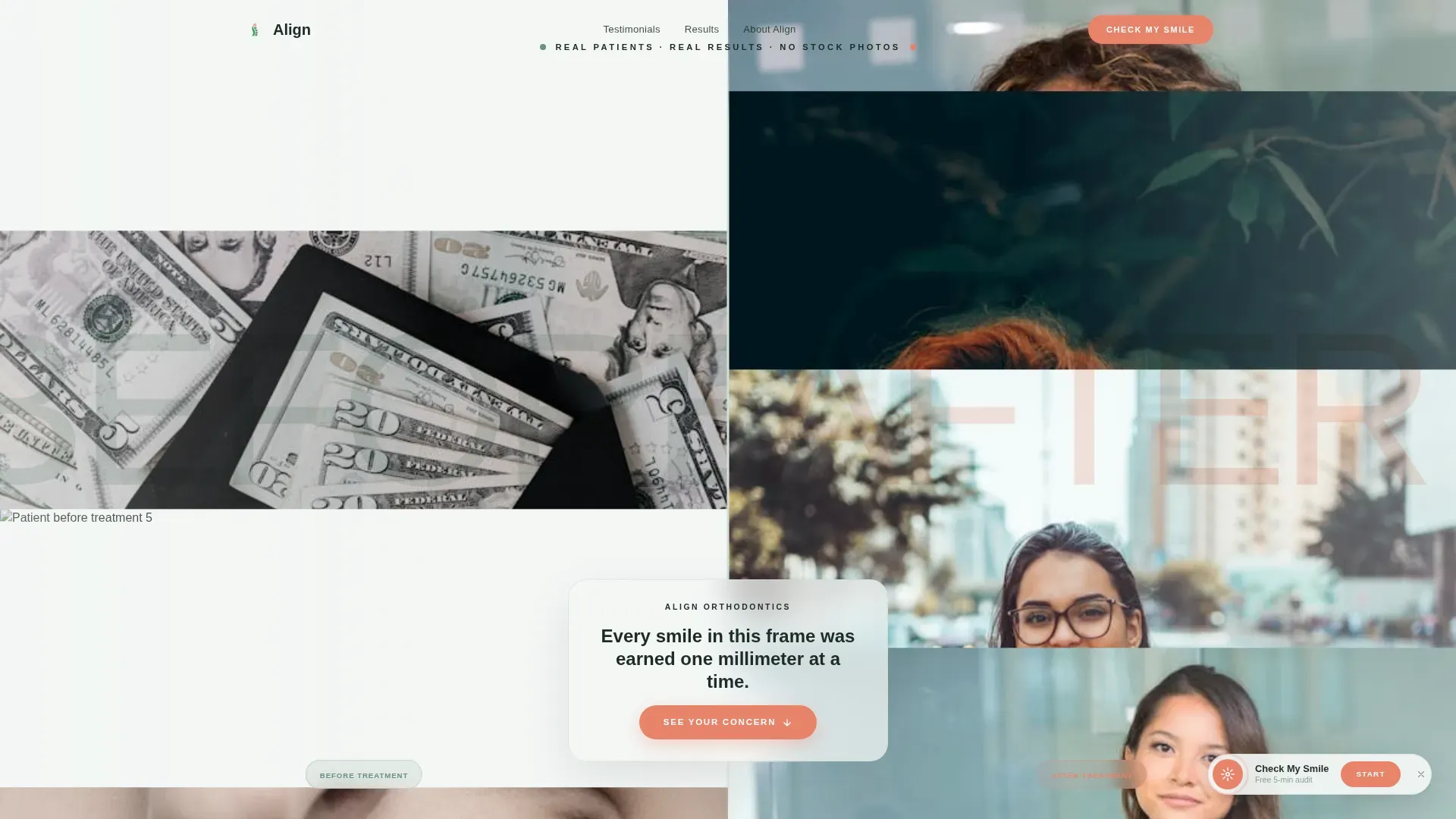
- A BEFORE and AFTER typography hero with a vertical seam revealing a scrolling smile montage
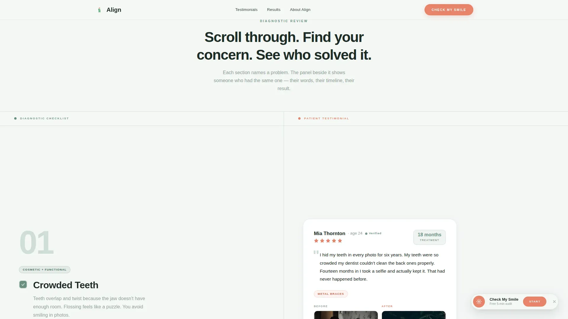
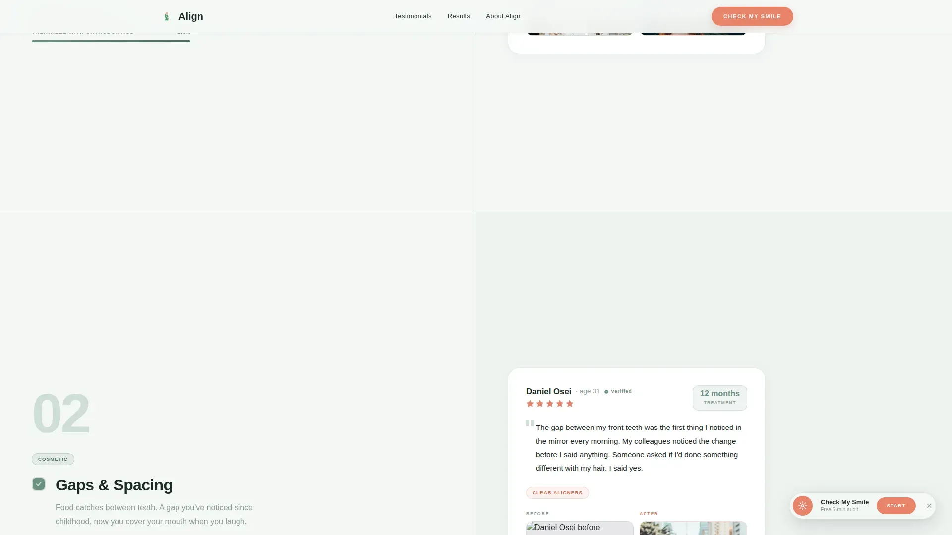
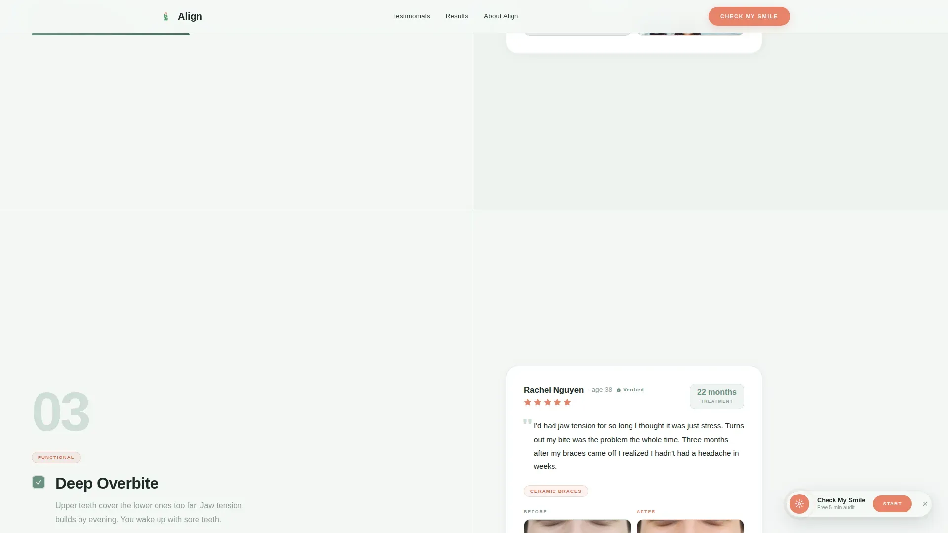
- Five scroll-linked testimonial pairs, each tied to a specific orthodontic concern, with star ratings, treatment duration badges, and before-and-after thumbnails
- A three-step micro-audit form and a secondary "Read 50+ More Reviews" path for visitors who need more time
Feature list
This section covers the key functional and design components built into the Align template.
Split-Screen Scroll Architecture
The page uses a strict 50/50 split throughout. The left panel runs a diagnostic checklist, and the right panel delivers matching patient proof. Each scroll step advances both panels in sync, creating a rhythm that feels intentional rather than arbitrary.
Stacked Type Tower Hero
The hero section fills the full viewport height with the words "BEFORE" and "AFTER" in large, thin-weight type. Between the two words, a narrow vertical seam plays a slow-scrolling montage of real patient smile close-ups, pre-treatment on the left and post-treatment on the right.
Animated Diagnostic Checklist
As the visitor scrolls, soft checkbox animations tick through a list of real orthodontic concerns: crowding, gaps, overbite, crossbite, and jaw pain. Each tick is triggered by an Intersection Observer as that section enters the viewport, making the experience feel responsive and personal.
Floating and Anchored Call to Action
The primary "Check My Smile" button first appears as a floating element after the third testimonial pair. It then anchors into a full-width final section, ensuring the call to action is always visible at the moment a visitor is most persuaded.
Guided Three-Step Micro-Audit Form
The lead capture form opens as a short wizard. Step one asks the visitor to select their primary concern from illustrated icons. Step two asks for age range. Step three collects name, phone number, and preferred contact time. The stepped format reduces friction and keeps completion rates high.
Trust Bar with Practice Statistics
A dedicated trust bar section displays treatment statistics, total patient count, and average star rating. These figures reinforce credibility between the testimonial scroll and the final call to action.
Page sections overview
| Section | Purpose |
|---|---|
| BEFORE/AFTER Hero | Establishes the transformation promise with full-viewport split typography and a scrolling smile montage |
| Diagnostic Checklist Scroll | Pairs animated concern checkboxes on the left with matching patient testimonials on the right |
| Floating call to action Button | Introduces the primary "Check My Smile" action after sufficient proof has been shown |
| Trust Bar | Displays patient count, treatment stats, and average rating to reinforce practice credibility |
| Final call to action Section | Anchors the three-step micro-audit form and the secondary review gallery link in a full-width close |
| Footer | Closes the page with a horizontal flow layout for practice contact and navigation details |
Design & branding system
The visual identity follows a Healing Space theme built around the Alpine Fresh color system. The overall feeling is warm clinical minimalism, the kind of calm that makes a medical environment feel approachable rather than sterile.
- Colors: glacier white (#F4F7F5) for backgrounds, soft pine green (#6B9080) for primary type and headings, morning frost (#D0DDD7) for surface dividers, and living coral (#E8836B) reserved for calls to action, star ratings, and hover states
- Typography: Manrope for all headings and display text, DM Sans for body copy and form labels, both weights chosen for their clean geometric character that suits the alpine freshness theme
- Interactivity: hover states on testimonial cards, scroll-linked panel reveals, floating button entrance animation, and a multi-step form wizard with illustrated concern icons
Mobile & speed optimization
The template is designed desktop-first to support the split-screen layout, with responsive stacking built in for smaller screens. On mobile, the two panels reflow into a single vertical column so the checklist and testimonial pairs remain readable and in sequence.
- Images are lazy-loaded throughout, including the scrolling smile montage and all before-and-after thumbnails
- The static-first build approach keeps the initial page load lean before interactive animations are initialized
- The three-step form wizard stacks cleanly on mobile, preserving the guided experience without layout breakage
How this template helps you convert
The conversion strategy in Align is built on identification before invitation. A visitor must see their own problem reflected before they will trust a solution enough to hand over their contact details.
- The diagnostic checklist names specific concerns that many visitors have quietly carried for years, making the page feel like it was written for them personally, which keeps them scrolling
- Each testimonial pair delivers immediate proof for the concern just identified, pairing a real star rating and treatment duration with a before-and-after thumbnail that shows the outcome is real and achievable
- The three-step micro-audit form and the secondary "Read 50+ More Reviews" path serve two different visitor readiness levels, capturing leads from both the ready-to-book visitor and the one who still needs a little more convincing
Other information about this template
Align is built specifically for the orthodontic testimonial and review page use case within the Health and Medical category. It is a strong fit for practices that already have a library of patient stories and want a structured, persuasive way to present them.
- The template style is Split Screen (50/50), making it distinct from standard single-column practice pages
- The creative direction follows a Checklist and Audit structure, which is well suited to any health niche where visitors self-identify with a symptom or concern before seeking a provider
- The header concept, the Stacked Type Tower, is designed to work as both a visual statement and a functional reveal, with the vertical seam acting as a natural focal point that draws the eye downward into the scroll experience
- The landing page direction is Lead Generation, and every design decision, from the floating button timing to the stepped form, serves that goal directly
Theme
Healing Space
Creative direction
Checklist & Audit
Color system
Alpine Fresh
Style
Split Screen (50/50)
Direction
Lead Generation
Page Sections
Split-screen Scroll Architecture
Stacked Type Tower Hero
Animated Diagnostic Checklist
Floating and Anchored Call to Action
Guided Three-step Micro-audit Form
Trust Bar with Practice Statistics
Related questions
Can I use this template without a large patient photo library?
Is the three-step form connected to any booking system?
Can I edit the orthodontic concerns in the checklist?
Does the split-screen layout work on mobile devices?
Can I add more testimonial pairs to extend the page?



