Orthodontic Treatment Journey & Process Transparency Website
Align is a hub-and-spoke anchor-nav landing page built for orthodontic practices. It walks prospective patients through every step of their smile journey, from first consultation to final reveal, using transparent process storytelling. The design blends organic warmth with clinical confidence, turning anxious scrollers into informed, ready-to-book visitors without a single form to fill out.
by Rocket studio
Quick summary
Align is a single-page orthodontist patient education hub. It uses a hub-and-spoke layout with a sticky anchor navigation bar to guide visitors through five spoke sections: Consultation, Scanning, Planning, Treatment, and Reveal. Each section answers real patient fears honestly. By the final section, visitors are ready to book, not just browse.
Who this template is for
This template is built for orthodontic practices that want to educate patients before the first appointment. It suits practices serving a mixed-age patient base, from teenagers to adults in their thirties and forties.
- Orthodontists who want to reduce no-shows and pre-visit anxiety
- Practices targeting adults who have been putting off treatment for years
- Clinics whose front desk is tired of answering the same five questions by phone
What problem this template solves
Most orthodontic websites describe services in vague clinical language. They list treatment options but never answer the questions patients are actually too embarrassed to ask out loud. Align fixes this directly.
- Patients arrive anxious because the process feels opaque and unfamiliar
- Parents need cost and timeline clarity before they can commit to a consultation
- Teenagers need social reassurance, not bullet points about bracket materials
What you get with this template
You get a fully structured, single-page patient education hub with six content sections, a sticky anchor navigation bar, and a progressive call-to-action system that builds specificity as the visitor scrolls deeper into the page.
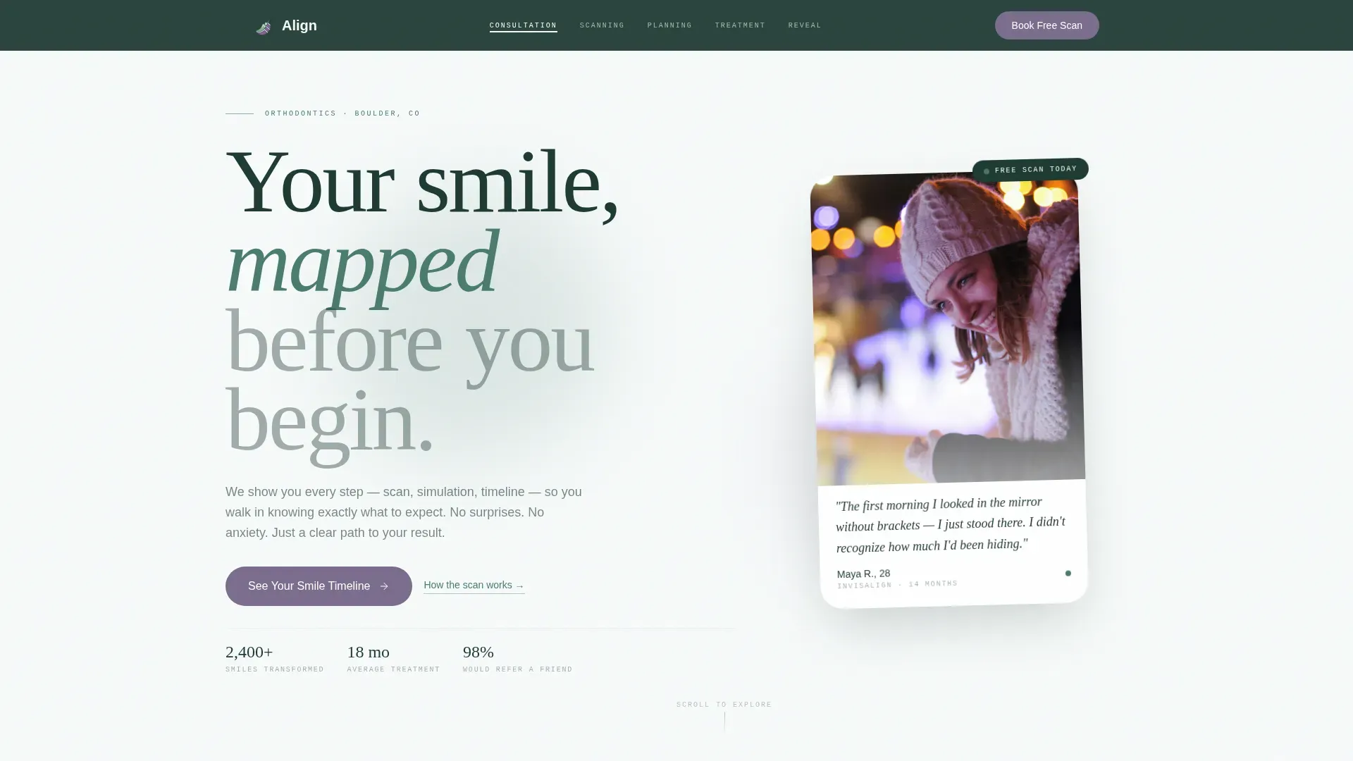
- A hero section with a floating testimonial card, serif headline, and anchor navigation
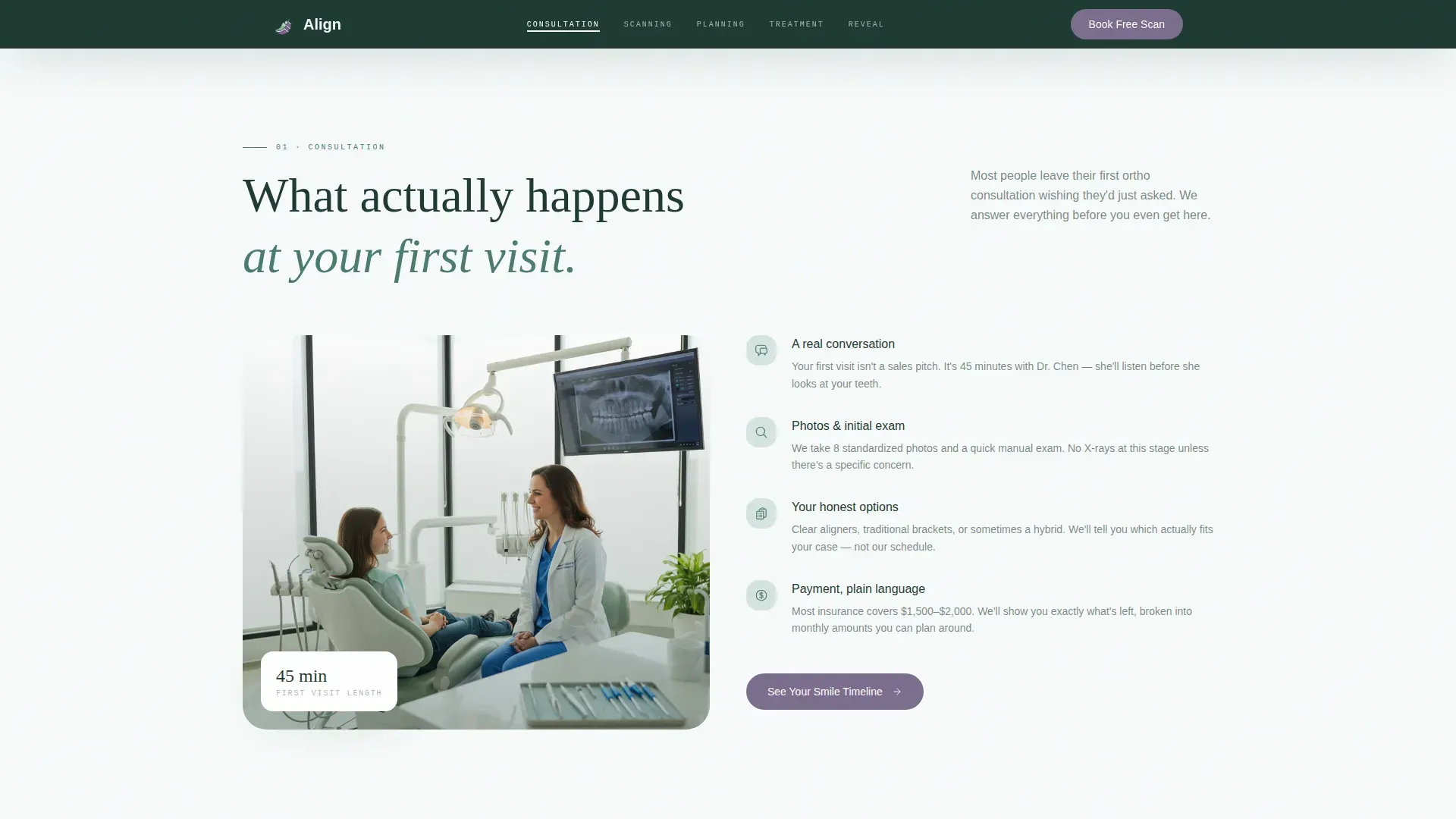
- Five spoke sections covering Consultation, Scanning, Planning, Treatment, and Reveal
- A split-layout footer with logo and tagline on the left and navigation links on the right
Feature list
Sticky Anchor Navigation Bar
The anchor nav pins to the top of the viewport after the hero scrolls past. It displays five trail-marker labels: Consultation, Scanning, Planning, Treatment, and Reveal. Scroll-linked active states highlight the current section automatically as the visitor moves down the page.
Floating Hero Testimonial Card
The header opens with a candid patient portrait printed on a floating card with rounded corners and a soft fog-toned shadow. The patient quote appears beneath the image in handwritten-style typography. The card is styled to feel personal and unposed, shot in natural golden-hour light rather than a clinical setting.
Progressive Call-to-Action System
Each spoke section ends with a primary call-to-action button labeled "See Your Smile Timeline." The button grows more contextually specific as the visitor accumulates information. After the Reveal section, the call to action shifts to "Book Your Free Scan" with a single-click pass-through to the scheduling page. No form appears anywhere on the page.
3D Scan and Simulation Sections
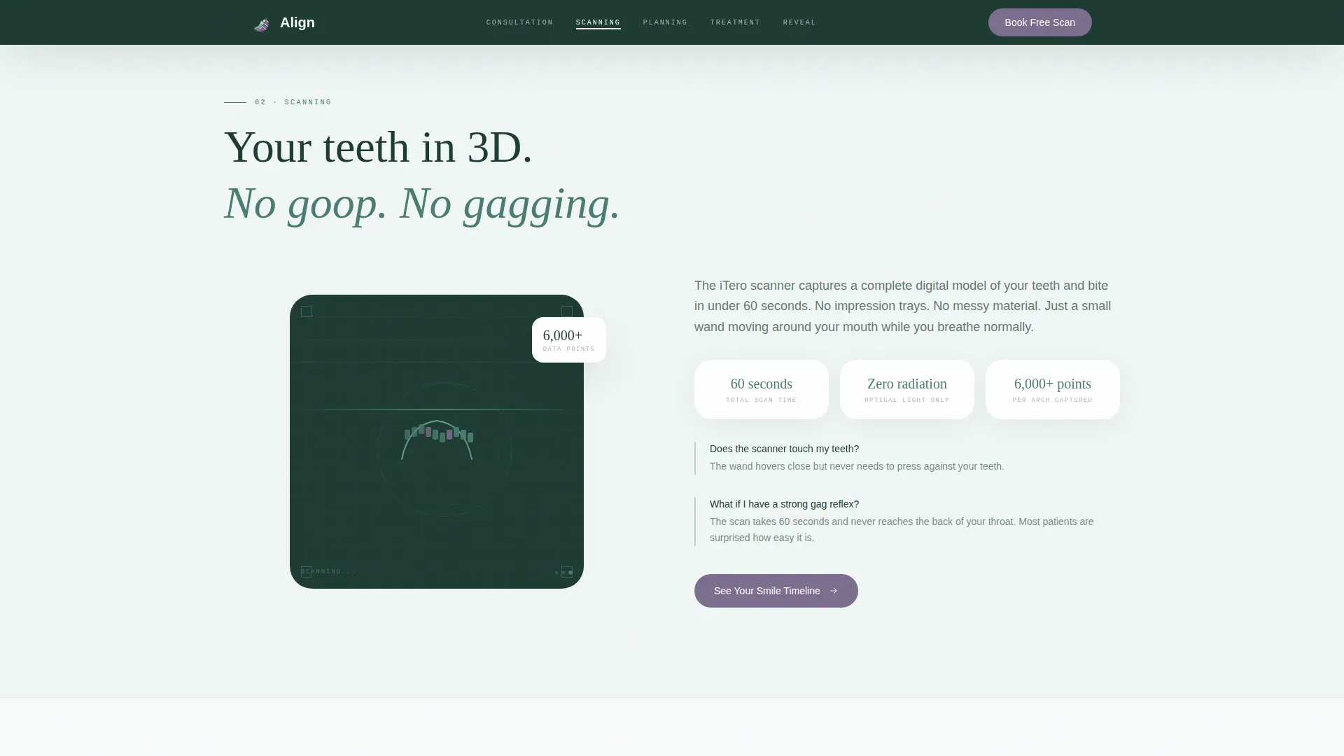
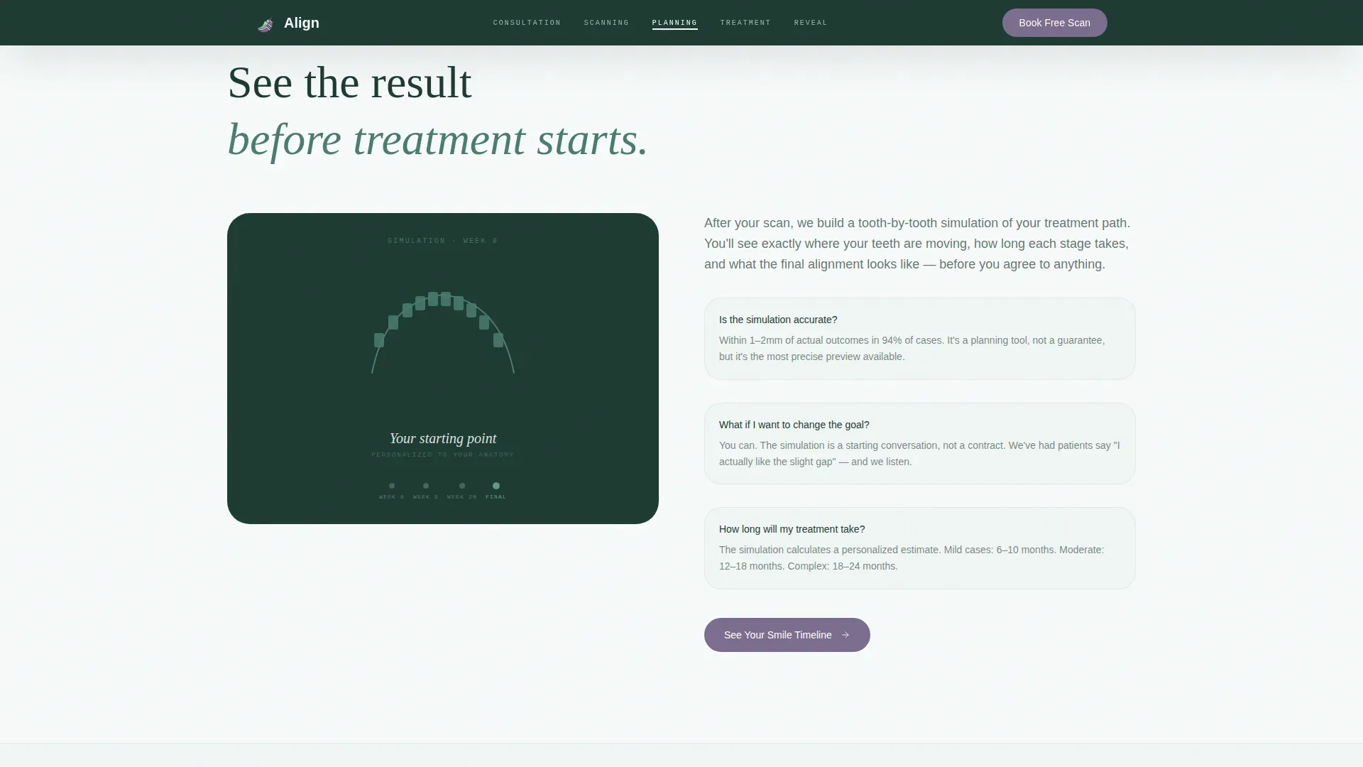
The Scanning section features a 3D digital scan animation showcasing the technology. The Planning section overlays a tooth-by-tooth treatment simulation, showing the personalized path toward the final smile. Both sections are built to answer process questions before patients need to ask them.
Flowing SVG Path Timeline
The Treatment section presents the orthodontic journey as a gentle flowing path rather than a rigid chart. GSAP scroll triggers and IntersectionObserver reveals animate the path as the visitor scrolls. The section includes an inline question-and-answer block covering duration, discomfort, and lifestyle adjustments.
Reveal Gallery with Hover Effect
The Reveal section contains a social proof gallery where patient images display in grayscale by default and shift to full color on hover. An inline testimonial quote accompanies the gallery. The section closes with the final "Book Your Free Scan" call to action.
Page sections overview
| Section | Purpose |
|---|---|
| Hero with Anchor Nav | Introduces the practice and orients the visitor with a sticky navigation trail |
| Consultation Spoke | Explains first-visit expectations with no surprises |
| Scanning Spoke | Showcases 3D digital scan technology and process |
| Planning Spoke | Presents tooth-by-tooth simulation for a personalized path |
| Treatment Spoke | Flowing timeline and life-with-aligners question-and-answer block |
| Reveal Spoke | Social proof gallery and final booking call to action |
| Arc Split Footer | Logo and tagline left, navigation links right |
Design & branding system
The visual identity follows an Organic Flow theme. The palette draws from an Alpine Fresh color system that feels like a high-elevation meadow: cool and fresh without reading as sterile or corporate.
- Colors: glacier white (#F7FAFA) and morning fog (#D6E4E0) for backgrounds, soft pine (#4A7C6F) for the navigation bar and primary elements, deep spruce (#1E3A32) for body text, and wildflower violet (#7B6D8E) reserved for call-to-action buttons and interactive highlights
- Typography: Fraunces (serif display headings), DM Sans (body copy), and JetBrains Mono (labels and numerical data)
- Visual style: rounded card corners, soft fog shadows, organic flowing shapes, and candid golden-hour photography rather than clinical stock imagery
Mobile & speed optimization
The template is built mobile-first, reflecting the reality that its core audiences, teenagers in waiting rooms and parents at kitchen tables, are primarily on phones. Section layouts reflow cleanly at small screen sizes.
- GSAP scroll triggers and IntersectionObserver reveals are handled through Client Components, keeping interactive animations scoped and efficient
- Static spoke sections use Server Components to reduce unnecessary client-side load
- Staggered word animations and flowing SVG path reveals are designed to perform smoothly during scroll without layout shift
How this template helps you convert
Align replaces form friction with education friction. The page does not ask for any visitor information until they are already convinced. By the time the final call to action appears, the visitor has answered their own objections through the content itself.
- The progressive call-to-action system escalates commitment gradually, starting with "See Your Smile Timeline" and ending with "Book Your Free Scan," so each click feels like a natural next step rather than a sales push
- The inline question-and-answer block in the Treatment section addresses the most common objections, pain, duration, lifestyle impact, before visitors need to search elsewhere for answers
- The single-click pass-through to the scheduling page at the end removes all remaining friction, leaving only the question of which appointment slot works
Other information about this template
Align is built specifically for the orthodontist patient education hub use case within the Health and Medical category. It is categorized under orthodontist website templates and is suited for practices that want their digital presence to reflect the same care and transparency they provide in the chair.
- Template style: Hub and Spoke with Anchor Navigation
- Creative direction: Transparent Process
- Header concept: Testimonial Card
- Landing-page direction: Click-Through
- Color system: Alpine Fresh
- Theme: Organic Flow
- Localization: English language, United States dollar pricing, US date format
- Animation stack: GSAP scroll triggers, IntersectionObserver reveals, staggered word animations, flowing SVG path timeline
- Footer pattern: Arc Browser Split layout with logo and tagline left, navigation links right
Theme
Organic Flow
Creative direction
Transparent Process
Color system
Alpine Fresh
Style
Hub & Spoke (Anchor Nav)
Direction
Click-Through
Page Sections
Sticky Anchor Navigation Bar
Floating Hero Testimonial Card
Progressive Call-to-action System
3D Scan and Simulation Sections
Flowing SVG Path Timeline
Reveal Gallery with Grayscale Hover
Related questions
Does this template include a contact form?
Can I update the patient testimonial and reveal gallery images?
Is this template suitable for a practice offering both braces and clear aligners?
How does the progressive call-to-action system work?
Who is the primary audience this template is designed for?



