Physical Therapy New Patient Landing Page Template
Align is a split-screen physical therapy landing page template built to turn anxious first-timers into booked patients. A three-step intake form guides visitors from body-region selection through insurance and scheduling, while photography and plain-language copy resolve common concerns at every scroll. Clean, clinical design keeps the experience warm and trustworthy from first click to confirmed appointment.
by Rocket studio
Quick summary
Align is a single-page physical therapy intake template designed for new patient acquisition. It pairs a guided multi-step form with split-screen photography to walk visitors through body-region selection, insurance, and scheduling. Each section mirrors a real step in the patient journey, so the visit feels familiar before anyone walks through the door.
Who this template is for
This template suits physical therapy clinics and solo practitioners who need a focused new patient intake page. It works especially well for practices that want to reduce phone-tag intake and move prospective patients from curiosity to a confirmed appointment online.
- Physical therapy clinics launching a new patient welcome page
- Solo practitioners replacing a generic contact form with a guided intake flow
- Practice managers seeking a low-friction scheduling path for post-surgical, chronic pain, or sports injury patients
What problem this template solves
Most clinic websites drop visitors onto a contact form with no guidance. That blank page creates anxiety, not bookings. Prospective patients arrive with real concerns: Will this be covered by my insurance? How long is the first visit? Will it hurt? Align answers those questions in sequence, at the exact moment the visitor is asking them.
- Removes the friction of a long, single-page intake form by breaking it into three low-effort steps
- Eases insurance and scheduling uncertainty by addressing both mid-scroll, before the visitor abandons
- Captures undecided visitors with a secondary email path so no lead is lost to hesitation
What you get with this template
Align includes a fully structured, single-page layout with five distinct content sections and a footer. Every section is built around a 50/50 split-screen composition that pairs real clinical photography with interactive or explanatory content. The page is designed desktop-first with fully responsive stacking for mobile screens.
- A three-step intake form covering body region, insurance provider, and preferred appointment day
- A persistent bottom call-to-action bar that stays visible after the visitor scrolls past the header
- A real-time confirmation card that assembles the visitor's selections into a summary before the final click
Feature list
A brief overview of the core capabilities built into this template.
Three-Step Guided Intake Form
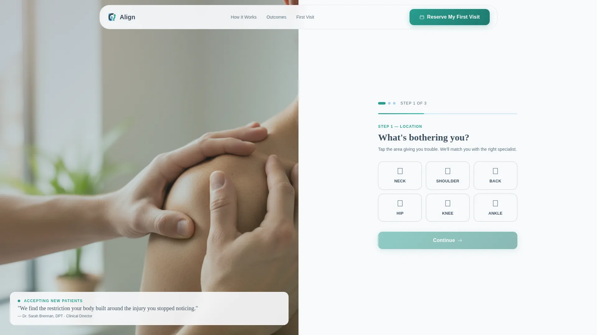
The header section opens with a multi-step form split into three low-friction steps. Step one asks "What's bothering you?" and presents six illustrated body-region buttons: neck, shoulder, back, hip, knee, and ankle. A warm teal progress bar at 33% signals forward motion from the first tap. Each step transitions smoothly to the next, keeping the visitor engaged without overwhelming them.
Real-Time Confirmation Card
As the visitor completes each form step, a confirmation card builds their selections in real time on screen. By step three they can see their body region, insurance provider, and preferred day-of-week summarized before committing. This transparency reduces abandonment and builds trust at the critical decision moment.
Persistent Bottom Call-to-Action Bar
After the visitor scrolls past the header, a fixed bottom bar with the primary call to action "Reserve My First Visit" stays on screen throughout the page. It remains available at every section so the visitor can convert at any point without scrolling back to the top.
Secondary Email Capture Path
A secondary call to action invites undecided visitors to download a First Visit Checklist. This path captures an email address from visitors who are not yet ready to book, offering them a printable PDF that answers the questions they would otherwise ask the front desk.
Split-Screen Photography Layout
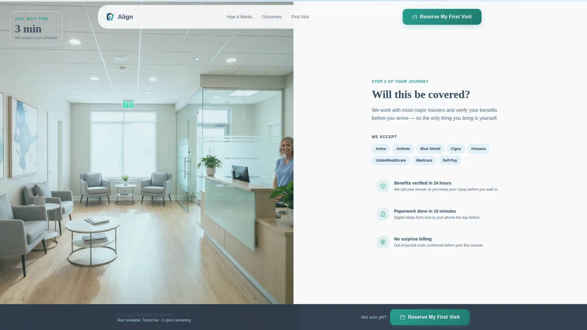
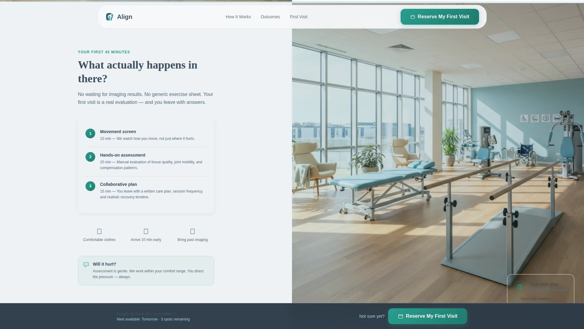
Every section pairs a full-height clinical photograph on the left with interactive or informational content on the right. Photography subjects follow the actual patient journey: therapist hands performing a shoulder assessment, the waiting room, and the evaluation room. This visual progression makes the visit feel familiar before it happens.
Scroll-Triggered Step-by-Step Flow
The page is structured as a step-by-step guide that mirrors the real patient experience. Each scroll section resolves a specific anxiety in sequence: arrival, intake, assessment, and plan. Scroll-triggered reveals and form step transitions give the page a sense of guided motion rather than a static brochure.
Page sections overview
| Section | Purpose |
|---|---|
| Hero Intake Form | Opens the three-step new patient intake with body-region selection and a teal progress bar |
| Journey & Insurance | Pairs waiting room photography with insurance provider and appointment day selection |
| Evaluation & Protocol | Shows the treatment room and explains the first-visit protocol with a live confirmation card |
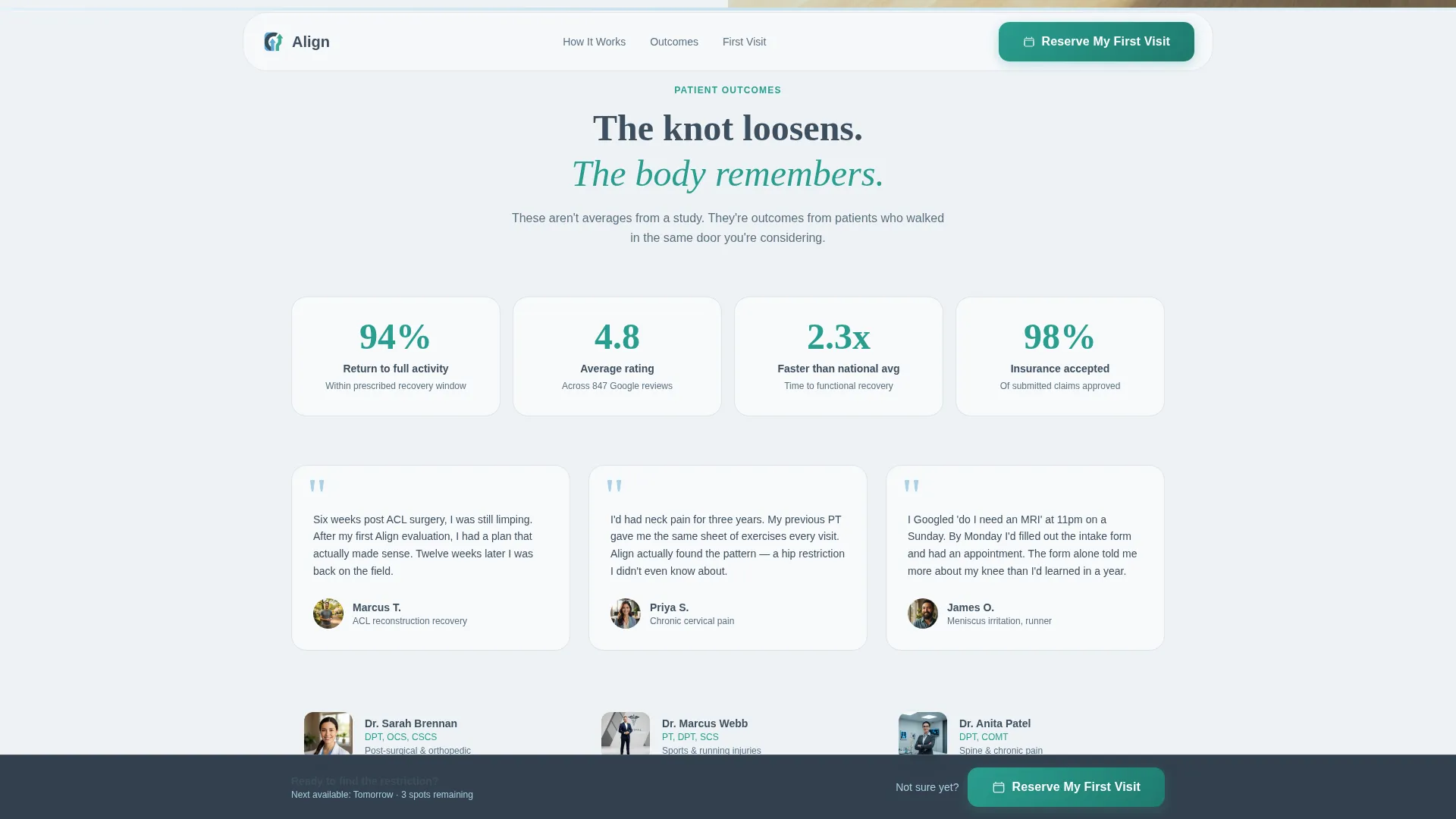
| Trust & Outcomes | Presents patient outcome data, therapist credentials, and recovery timeline testimonials |
| Call to Action | Delivers the persistent booking bar and the secondary checklist email capture path |
| Footer | Single-row linear footer with clinic contact and navigation links |
Design & branding system
The template uses a Medical Clarity visual theme built around a Slate and Sky color system. The palette is designed to feel trustworthy and warm without veering into the cold sterility that makes patients nervous. Typography pairs DM Sans for body text with Fraunces for display headings, creating a tone that feels both clinical and approachable.
- Clinical slate (#3D4F5F) anchors primary text and section backgrounds; soft sky (#A8D0E6) marks progress indicators and section dividers; sterile white (#F7F9FB) keeps open areas light and breathable
- Warm teal (#2A9D8F) appears on every interactive element: buttons, links, form field focus states, and the progress bar
- Display headings use Fraunces for warmth and character; body copy uses DM Sans for clean readability at all sizes
Mobile & speed optimization
The template is built desktop-first with full mobile responsiveness. Split-screen sections stack vertically on smaller screens so photography and content remain readable without horizontal scrolling. Static sections use server-side rendering while form logic runs as client components, keeping interactive elements snappy without loading unnecessary scripts up front.
- Split-screen columns stack cleanly on mobile so no content is clipped or hidden
- Form step transitions and scroll-triggered reveals are medium-weight animations, balanced for smooth motion without slowing the page
- Client components are scoped only to the interactive form, keeping the rest of the page lightweight
How this template helps you convert
Align is designed around a single conversion goal: a booked first appointment. Every layout decision reduces the distance between a visitor's first click and a confirmed reservation.
- The three-step form breaks a traditionally long intake process into one question per screen, so the cognitive load stays low and forward momentum builds naturally from step one.
- The persistent bottom call-to-action bar keeps "Reserve My First Visit" visible throughout the entire scroll, so a visitor who becomes ready to book mid-page can act immediately.
- The secondary checklist path means undecided visitors still enter a follow-up sequence rather than bouncing, giving the clinic a second opportunity to convert them after they leave the page.
Other information about this template
This template is a strong fit for physical therapy practices that rely on direct-to-patient marketing and need a dedicated new patient welcome page separate from their main clinic website. It is built in a US English format with USD and US date conventions, making it ready for North American practices without localization edits.
- The footer follows a linear single-row pattern, keeping the bottom of the page clean and uncluttered
- Fraunces display headings and DM Sans body text are both Google Fonts, making them straightforward to customize or replace within the template
- The template is well-suited for use alongside paid search or social campaigns targeting searches like "physical therapy near me" or "do I need PT," since the page resolves the exact questions those visitors carry
Theme
Medical Clarity
Creative direction
Step-by-Step Guide
Color system
Slate & Sky
Style
Split Screen (50/50)
Direction
Click-Through
Page Sections
Three-step Guided Intake Form
Real-time Confirmation Card
Persistent Booking Call to Action
Secondary Email Capture Path
Split-screen Photography Sections
Scroll-triggered Step-by-step Layout
Related questions
Can I customize the body-region buttons in the intake form?
Does the form connect to a scheduling platform?
What happens after a visitor requests the First Visit Checklist?
Is this template suitable for a multi-location practice?
Can I replace the placeholder photography with my own clinic images?



