Chiropractor Virtual Consultation Website Template
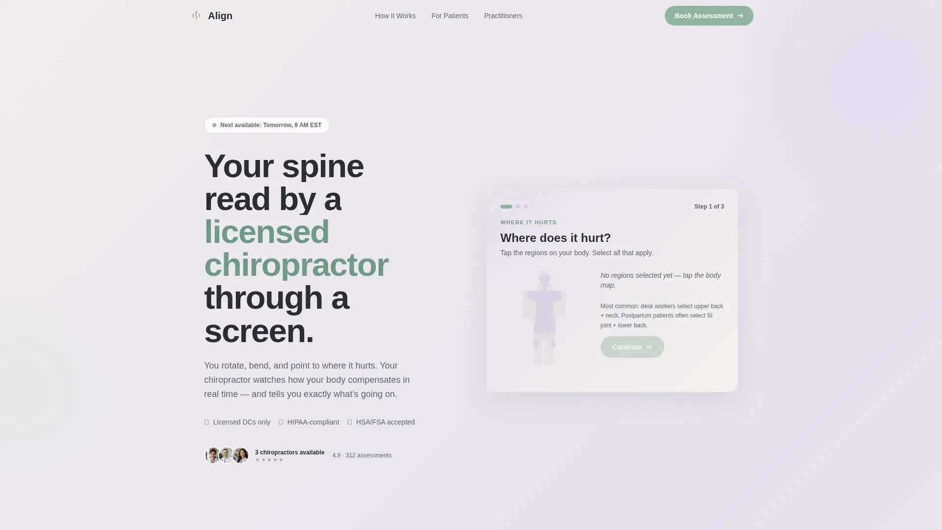
Align is a zigzag landing page built for chiropractors offering virtual consultations. It opens with a three-step interactive form, body map, pain duration, and booking window, then works through real patient objections in alternating FAQ-driven sections. The warm Cloud Canvas palette and sage accents create a calm, clinical-free environment that turns skeptical visitors into booked assessments.
by Rocket studio
Quick summary
Align is a single-page virtual chiropractic consultation landing page. It leads with a multi-step diagnostic form that makes visitors feel the session has already started. Alternating FAQ sections then dismantle every booking hesitation, one honest question at a time. The result is a page that earns trust before asking for a click.
Who this template is for
This template is built for licensed chiropractors who offer virtual or telehealth assessments. It speaks directly to patients who are skeptical, time-poor, or unsure whether remote care can actually help them.
- Chiropractors launching or scaling a virtual consultation practice
- Practitioners targeting desk-bound professionals, postpartum mothers, or weekend athletes
- Clinics that want to capture leads with a home mobility guide before a patient books
What problem this template solves
Most chiropractic websites ask visitors to trust them before explaining anything. Patients searching in pain on a phone need fast clarity, not a wall of credentials. This template solves the credibility gap by doing something different: it starts the diagnostic process immediately, so the consultation feels earned rather than sold.
- Skeptics who wonder whether a chiropractor can do anything useful through a screen
- Patients unsure about insurance coverage, Health Savings Account eligibility, or superbill paperwork
- People who worry they may need in-person care and do not know what happens next
What you get with this template
You get a fully structured, single-page layout with a clear conversion path and a secondary lead-capture route for visitors who are not ready to book yet.
- A three-step header form: interactive body map, pain duration tiles, and a name and appointment window field
- Five content sections in a zigzag alternating layout, each answering one real patient objection
- A secondary email capture offering a downloadable Home Mobility Guide for undecided visitors
Feature list
This template ships with a focused set of interactive and visual components, all grounded in the source brief.
Interactive Body Map Form
The header opens with an illustrated body map the visitor taps to select their pain region. Two further steps follow: how long the pain has lasted, and when they want to be seen. The multi-step flow mirrors the first three questions a chiropractor asks in person.
Gradient Progress Feedback
As visitors move through the form steps, the background gradient shifts softly from lavender to warm white. Each completed step feels like a small step toward relief, reinforcing progress without a progress bar.
FAQ-Driven Zigzag Sections
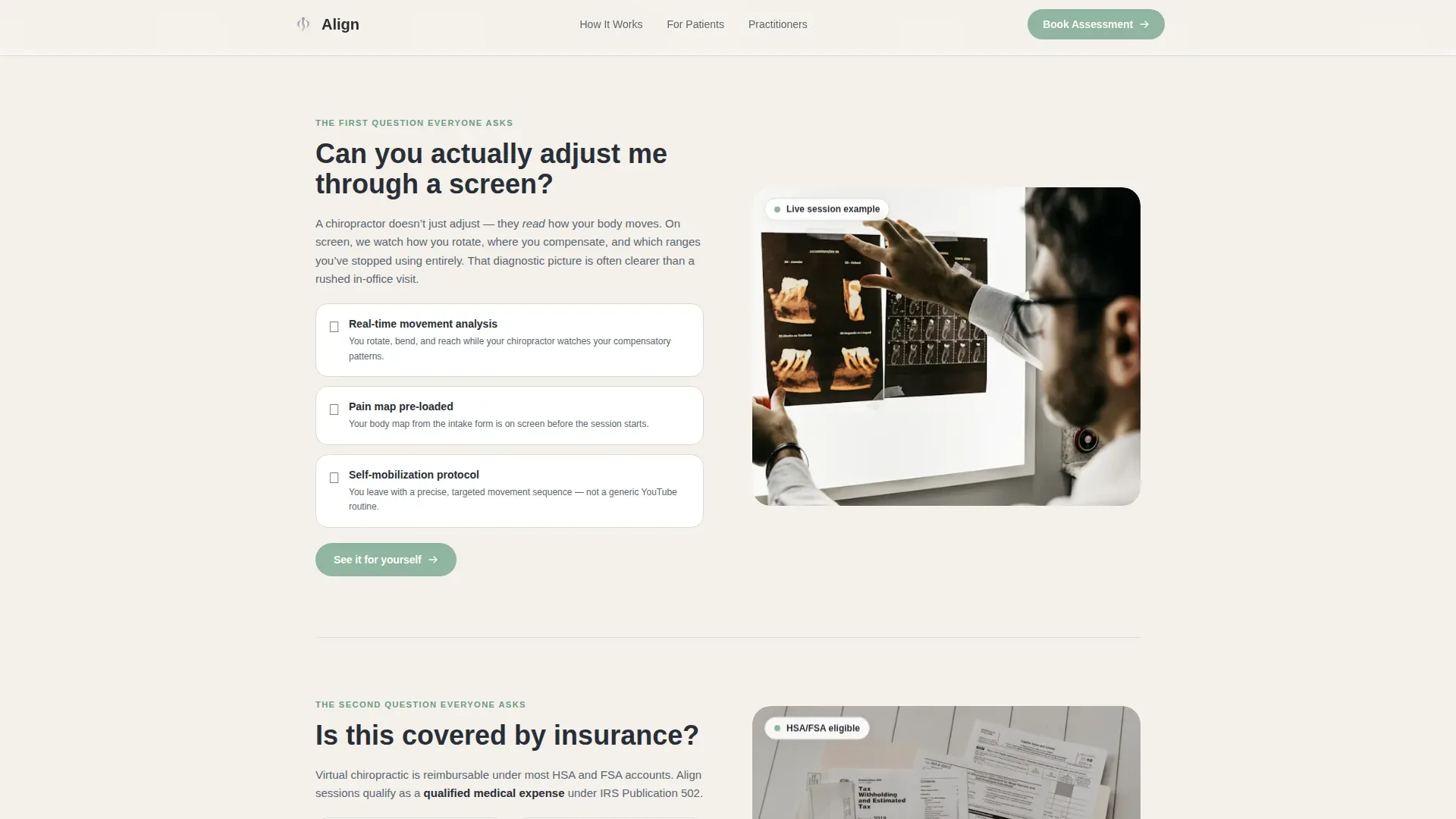
Each alternating section answers one real objection. Questions like "Can you actually adjust me through a screen?" or "What if I need in-person care?" are paired with a visual on the opposite side. The scroll path is designed to build trust incrementally, not all at once.
Repeating Primary Call to Action
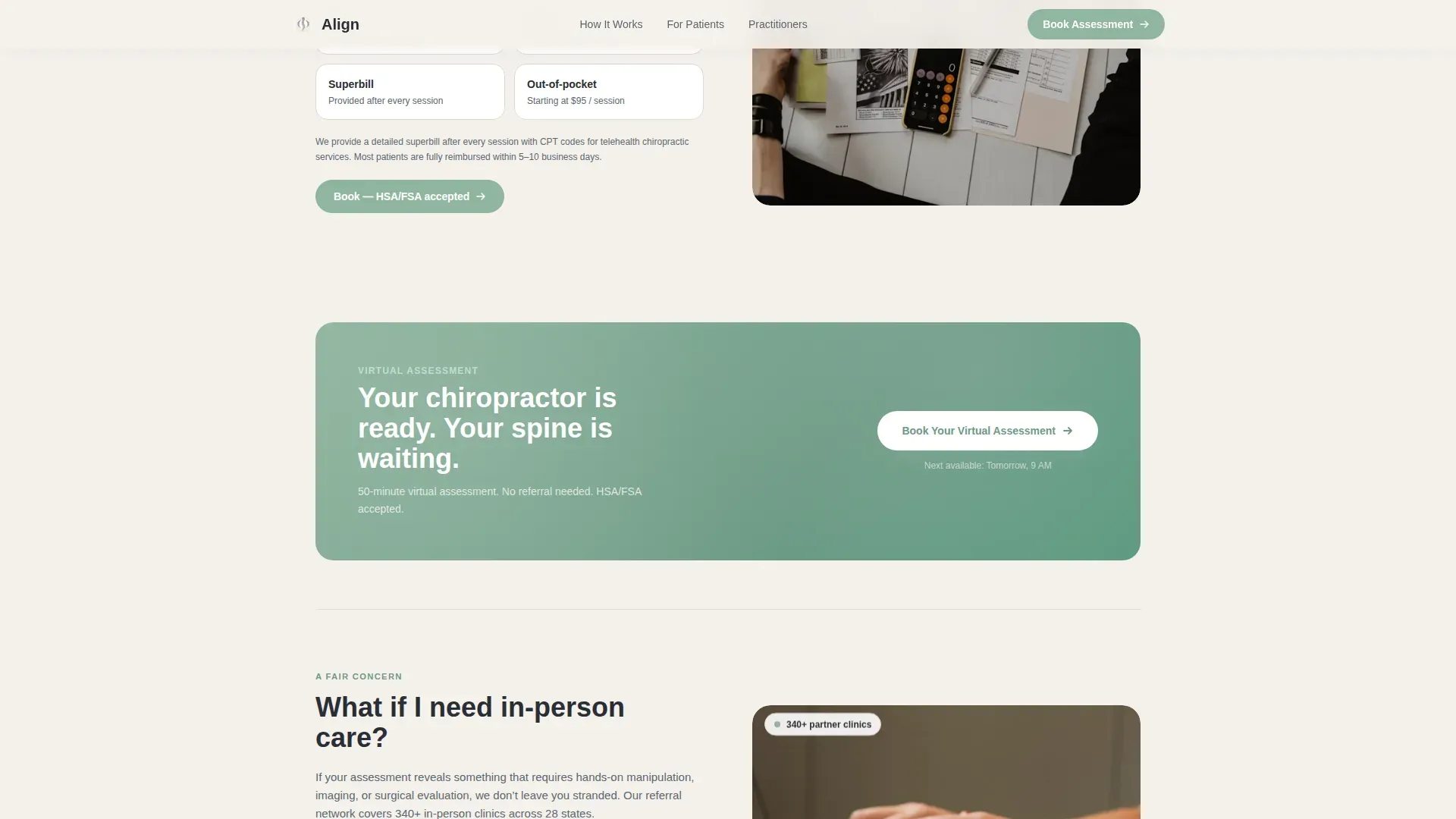
"Book Your Virtual Assessment" appears after every third FAQ section. The call to action anchors back to the body-map data already entered, making the consultation feel half-started before the visitor clicks.
Secondary Lead Capture
A single email field offers a downloadable Home Mobility Guide. This gives undecided visitors a low-commitment reason to stay in your pipeline without feeling pressured to book.
Testimonials and Social Proof Block
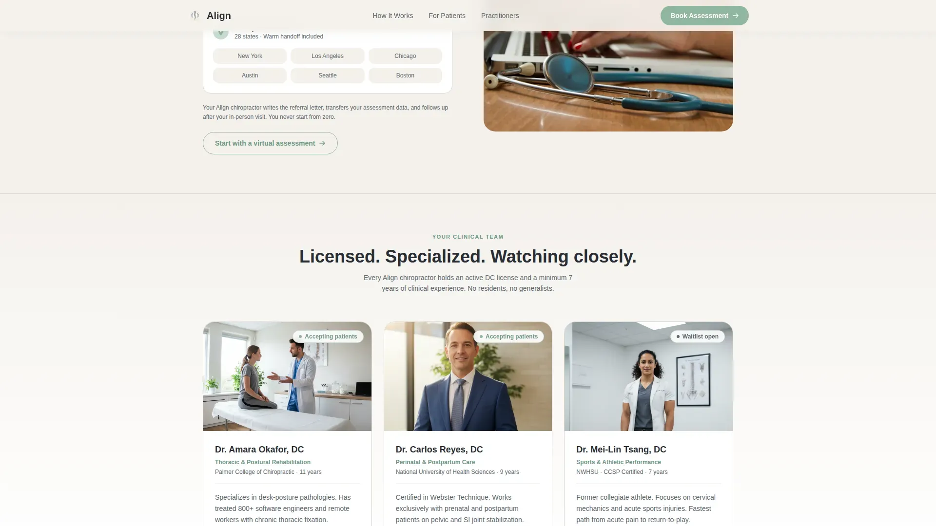
Patient testimonials with names and conditions, alongside practitioner credentials, are built into the page before the final call to action. Real stories from people with similar pain profiles accelerate trust at the bottom of the scroll.
Page sections overview
| Section | Purpose |
|---|---|
| Hero multi-step form | Starts the diagnostic conversation immediately |
| Screen adjustment FAQ | Answers the core virtual-care skepticism objection |
| Insurance coverage FAQ | Covers HSA, FSA eligibility and superbill language |
| In-person referral FAQ | Reassures patients who may need hands-on care |
| Testimonials and lead capture | Builds social proof and captures undecided email leads |
| Footer single-row | Provides practice links in a clean linear layout |
Design & branding system
The visual identity uses the Cloud Canvas color system, a palette that reads as warm and clinical-free. Typography pairs DM Sans for headings with Manrope for body text, keeping the page readable without feeling sterile.
- Base warm mist white (#F4F1EC) flowing into pale lavender (#E8E0F0), grounded by calm slate (#5B6770)
- Healing sage (#8FB59E) used on buttons, progress indicators, and accent details throughout
- Medium animation package: masked text reveals, staggered scroll reveals, form step transitions, and subtle parallax on background gradients
Mobile & speed optimization
The template is built mobile-first. Patients searching for relief on a phone are the primary audience, and the layout reflects that priority throughout.
- The interactive body map and multi-step form are touch-optimized for small screens
- Static content sections use server-rendered components; the interactive form runs as a client component to keep the page responsive
- Staggered scroll reveals and parallax effects are calibrated to run smoothly without blocking the main thread
How this template helps you convert
The page is structured to move a hesitant visitor through three psychological stages: curiosity, trust, and action.
- The interactive body map front-loads the diagnostic interaction. By the time a visitor reaches the first below-the-fold call to action, they have already told the page where it hurts, making the booking feel like a natural next step rather than a cold ask.
- The FAQ-driven zigzag layout removes friction objection by objection. Insurance questions, referral concerns, and screen-care skepticism are each answered in plain language before they can become reasons to leave.
- The secondary Home Mobility Guide capture gives hesitant visitors a low-stakes alternative. It keeps them in the practice's reach without abandoning the primary conversion goal.
Other information about this template
This template is part of the Health and Medical category, sitting specifically within the chiropractor website and virtual consultation niche. A few additional details worth knowing before you build with it.
- The footer follows a linear single-row pattern, keeping the bottom of the page clean and uncluttered
- The page is localized for English-language audiences in the United States, using USD pricing references and US date formats
- Animation intensity is set to medium, meaning motion is present and purposeful but never distracting for patients who may already be in discomfort
- The template ID for this build is 699fb03f60b9b40014601ff3, listed under the project name Align
Theme
Soft Gradient
Creative direction
FAQ-Driven
Color system
Cloud Canvas
Style
Zigzag/Alternating
Direction
Lead Generation
Page Sections
Interactive Three-step Header Form
Gradient Progress Feedback System
Faq-driven Zigzag Layout
Repeating Anchored Call to Action
Secondary Email Lead Capture
Testimonials and Credentials Block
Related questions
Can this template work for an in-person chiropractic clinic too?
What happens to the body-map data a visitor enters in the form?
Is the Home Mobility Guide document included in the template?
Can I customize the FAQ sections to match my own practice?
What audience is this landing page best suited for?



