Consumer Brand Landing Page Template
This hub-and-spoke landing page template is built for allergy-free consumer brands that need to earn deep trust before the click. It guides label-reading parents, post-anaphylaxis adults, and school nurses through a structured visual allergen audit, facility-segregation diagrams, third-party certification seals, and named testimonials, all before a single "Shop Allergen-Free" button is pressed.
by Rocket studio
Quick summary
A single-page hub-and-spoke template purpose-built for allergy-free consumer goods brands. It moves visitors through a clinical audit experience, eight allergens struck through, three certifications verified, and full supply-chain transparency displayed, before presenting the primary call to action. Every section earns the click through accumulated proof, not assertion.
Who this template is for
This template is designed for direct-to-consumer brands selling allergy-free snacks, skincare, or household products. It speaks directly to buyers who cannot afford uncertainty at the ingredient level.
- Parents of allergic children who read every label before purchasing
- Adults recently diagnosed with food allergies, skeptical of "may contain" disclaimers
- School nurses and institutional buyers who need documented proof, not packaging claims
What problem this template solves
Generic product pages ask high-stakes buyers to take claims on faith. That is not enough when one wrong ingredient triggers an EpiPen. This template replaces vague marketing language with a structured, audit-style presentation that preempts every doubt before the visitor forms it.
- Buyers arrive anxious and leave with visual confirmation that all eight major allergens are absent
- The page surfaces lab-test dates, facility-segregation diagrams, and third-party certification seals before the call to action
- Each spoke section anticipates the next logical question and answers it in sequence, so trust compounds as the visitor scrolls
What you get with this template
You get a complete, ready-to-customize landing page structured around a central allergen audit hub with three product-category spokes. The layout is designed to move high-skepticism visitors toward a confident purchase decision.
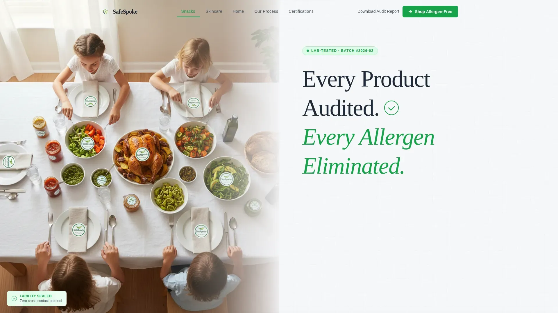
- A hero section with a half-page photo-and-text split, animated green checkmark, and sticky anchor navigation
- Three spoke sections covering Snacks, Skincare, and Home, each with per-product allergen audit cards and sourcing maps
- A Certifications section displaying three third-party seal blocks with verification timelines, plus a Testimonials section with named, role-contextualized quotes
Feature list
This template is built around a specific set of functional and visual components drawn from the design brief. Every element is included to serve a trust-building purpose.
Visual Allergen Audit Hub
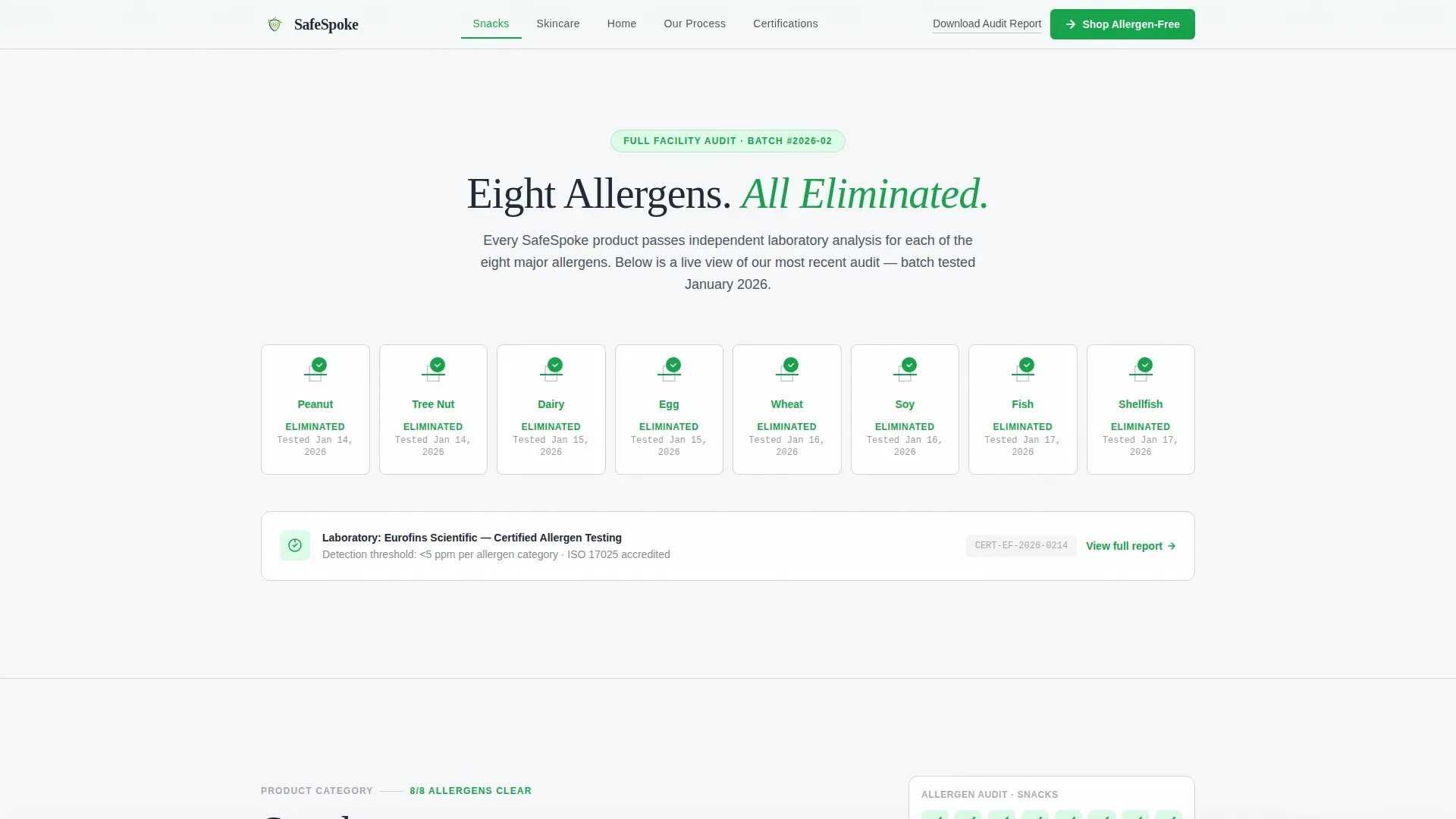
The central hub displays eight allergen icons, peanut, tree nut, dairy, egg, wheat, soy, fish, and shellfish, each struck through in verification green with the lab-test date printed beneath. A staggered animation draws each strike-through on scroll, making the clearance feel earned and verifiable.
Hub-and-Spoke Anchor Navigation
A sticky anchor navigation bar pins to the top of the page after the hero loads. It links directly to Snacks, Skincare, Home, Our Process, and Certifications. Smooth scroll and spoke expand-and-collapse interactivity let visitors jump to the category that matters most to them without losing context.
Per-Product Audit Cards
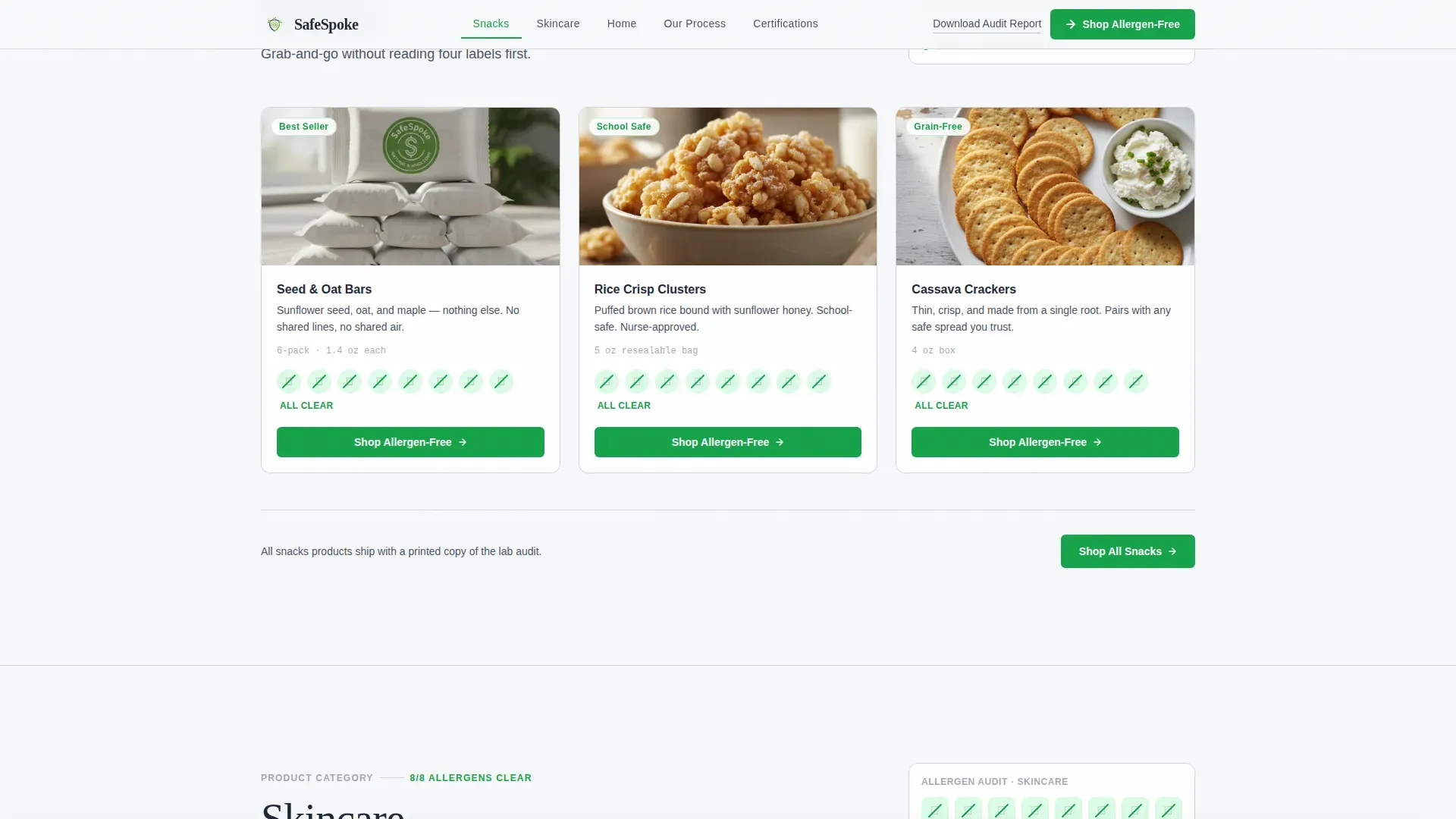
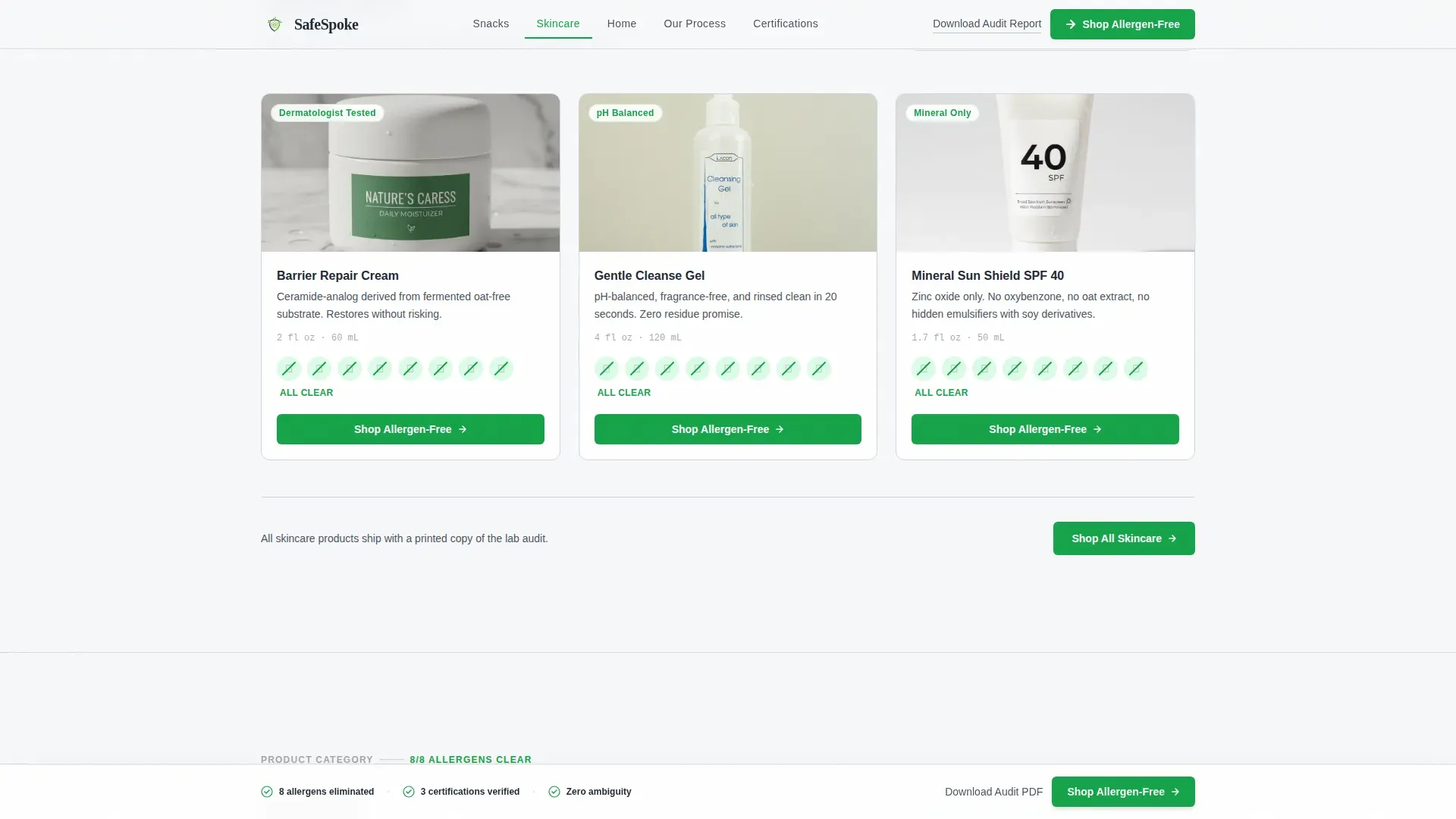
Each spoke section opens with a product category card followed by individual product audit cards. Cards display the full allergen clearance grid alongside ingredient sourcing information, making product-level transparency immediate and scannable.
Facility and Supply-Chain Transparency Section
The Our Process spoke includes a facility-segregation diagram and an ingredient sourcing map. These components address institutional-level doubt by showing how allergen exclusion is maintained from raw material through finished product.
Floating Call-to-Action Bar
After the second scroll depth, a floating bottom bar locks into place carrying the primary "Shop Allergen-Free" call to action. This keeps the conversion path visible without interrupting the audit experience. A secondary path, "Download Our Full Audit Report," captures higher-intent visitors who want documentation before purchasing.
Named Testimonial Section
A dedicated section presents testimonials from parents, adults post-diagnosis, and a school nurse. Each quote includes the speaker's name and role for credibility. Social proof is contextualized, not generic.
Page sections overview
| Section | Purpose |
|---|---|
| Hero split layout | Establishes brand authority and surfaces primary call to action |
| Anchor navigation bar | Lets visitors jump directly to the relevant product category |
| Allergen Audit Hub | Displays all eight allergen clearances with lab-test dates |
| Snacks spoke | Shows per-product audit cards for the snacks category |
| Skincare spoke | Shows per-product audit cards for the skincare category |
| Home spoke | Shows per-product audit cards for household staples |
| Our Process spoke | Presents facility diagrams and ingredient sourcing maps |
| Certifications section | Displays three third-party seals with verification timelines |
| Testimonials section | Provides named, role-contextualized social proof |
| Footer row | Delivers a clean single-row footer with secondary links |
Design & branding system
The visual identity follows a Corporate Precision theme. Every color and typographic choice is functional, not decorative. The palette is described as feeling like a freshly printed lab report held under fluorescent light, immaculate and nothing wasted.
- Background is soft cumulus white (#F7F8FA), dividers and secondary surfaces use clinical dove gray (#D1D5DB), and body text is set in assured slate (#4B5563)
- Verification green (#16A34A) is reserved for checkmarks, trust badges, allergen strike-throughs, and call-to-action buttons to reinforce clearance at every visual touchpoint
- Typography pairs Fraunces for display headings with DM Sans for body text and interface elements, keeping the page readable and clinically crisp
Mobile & speed optimization
The template is built mobile-first, recognizing that the primary audience, parents reading labels at 11 p.m., is most often on a phone. The design scales cleanly from small screens upward without sacrificing the audit card layout or floating call-to-action bar.
- Scroll-reveal animations, checkmark draw sequences, and allergen strike-through staggers are implemented at a medium intensity to remain smooth on mobile devices
- Server Components handle static content sections, keeping client-side JavaScript minimal so the page remains responsive even on slower connections
- The floating call-to-action bar and anchor navigation are optimized for thumb reach on mobile viewports
How this template helps you convert
Conversion is built into the scroll experience rather than forced at the end. By the time a visitor reaches the final call to action, the page has already resolved the doubts that typically prevent purchase.
- The hero places "Shop Allergen-Free" before any product information appears, capturing visitors who are already decided, while the anchor nav keeps undecided visitors moving deeper into proof.
- Each spoke section closes with a repeated primary call to action so the conversion opportunity is present at every natural resting point, not just at page end.
- The "Download Our Full Audit Report" secondary path captures institutional buyers and high-intent researchers who want documentation before committing, widening the conversion funnel without diluting the main message.
Other information about this template
This template is categorized under Health and Medical, specifically within the Allergy and Immunology subcategory. It is designed for the allergy-free product brand niche and carries a high intersection match score, reflecting strong alignment between the template structure and the target use case.
- The template style is Hub and Spoke with Anchor Navigation, the creative direction is Checklist and Audit, and the landing page direction is Click-Through
- The header concept is a Half-Page Photo and Text split, and the color system is Cloud Canvas
- The footer uses a linear single-row pattern, keeping the close of the page as clean and uncluttered as the rest of the experience
Theme
Corporate Precision
Creative direction
Checklist & Audit
Color system
Cloud Canvas
Style
Hub & Spoke (Anchor Nav)
Direction
Click-Through
Page Sections
Visual Allergen Audit Hub
Hub-and-spoke Anchor Navigation
Per-product Audit Cards
Facility and Supply-chain Transparency
Floating Call-to-action Bar
Named Testimonial Section
Related questions
Who is this landing page template designed for?
What product categories does the template cover?
How does the allergen audit work within the template?
Can the template support both individual buyers and institutional buyers like school nurses?
What interactive elements does the template include?



