Retirement Planning Specialist Website Template with Case Studies
Allocate is a scroll-reveal landing page template built for financial advisors who specialize in retirement planning. It pairs a fictional portfolio dashboard header with a progressive case study matrix, guiding visitors from problem awareness to proof of results before the first call to action appears. The layout is designed to build trust before asking for anything.
by Rocket studio
Quick summary
Allocate is a single-page, scroll-reveal landing page template for retirement-focused financial advisors. It opens with a blurred portfolio dashboard that sharpens as visitors scroll, then walks them through before-and-after planning case studies across tax efficiency, estate structure, risk allocation, and income sequencing. Every section builds the case before a single form field appears.
Who this template is for
This template is built for financial advisors whose clients are not beginners. It suits practices where the conversation starts with complexity and ends with a clear plan.
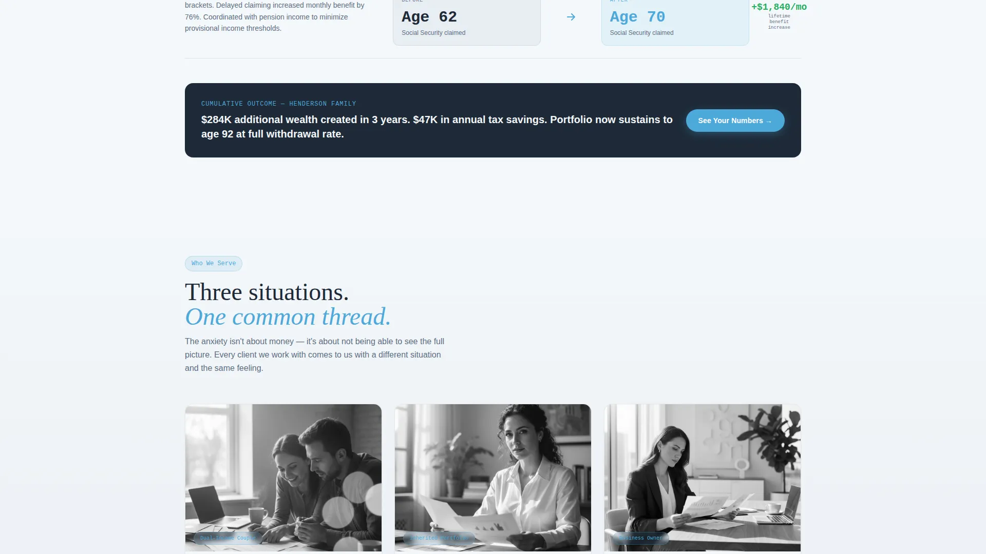
- Retirement planning advisors working with dual-income couples five years from their target retirement date
- Advisors serving recently widowed professionals who have inherited portfolios they have never managed before
- Fee-only planners whose small business owner clients hold most of their wealth inside an LLC or similar entity
What problem this template solves
Most advisor websites describe services in abstract terms. Visitors leave without understanding what working with the advisor actually looks like. This template solves that gap by showing the work in motion.
- Visitors arrive anxious and uncertain; the progressive dashboard reveal gives them an immediate sense of clarity and structure
- Generic service pages fail to differentiate holistic planning from broker-dealer or robo-advisor alternatives; the sticky comparison strip addresses this directly
- Prospects who are not yet ready to call still need a reason to stay connected; the secondary PDF download path keeps them in the funnel without pressure
What you get with this template
The template delivers a complete, single-page layout that builds its argument section by section. Every component is designed around the specific emotional state of a retirement planning prospect.
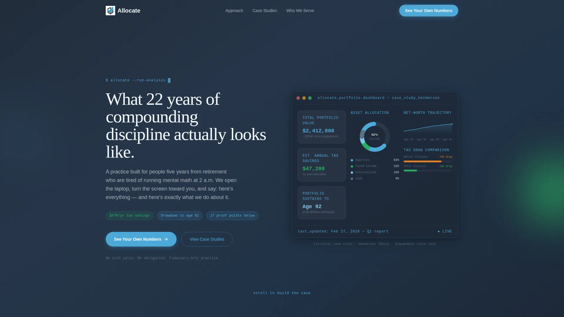
- A pixel-perfect fictional portfolio dashboard in the header, showing an asset allocation donut chart, a projected drawdown curve through age 92, a tax drag comparison bar, and a net-worth trajectory line
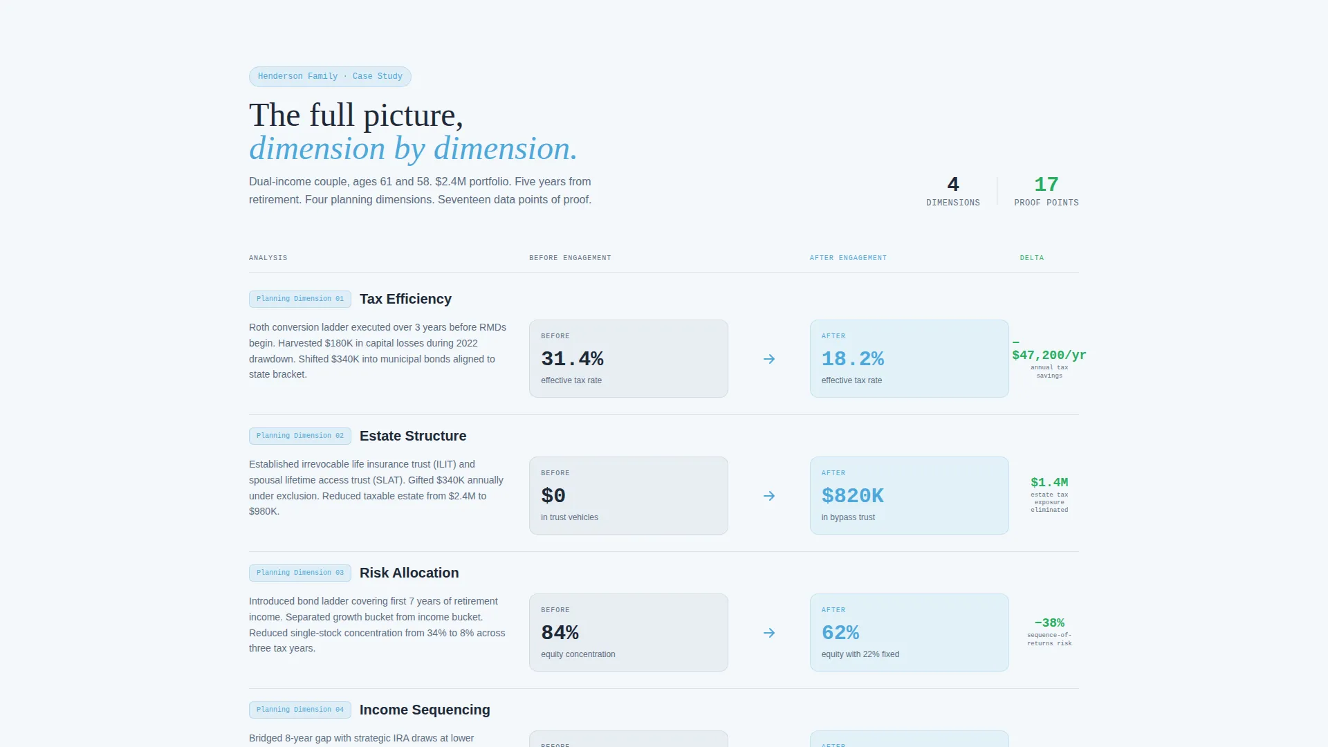
- A scroll-triggered feature matrix comparing client situations before and after engagement across four planning dimensions, with color-coded columns for problem metrics, solved metrics, and the delta
- A two-path conversion zone with a progressive multi-step form and a secondary downloadable PDF option for visitors who are not ready to engage immediately
Feature list
This template is built around deliberate sequencing. Each feature below serves a specific role in moving a skeptical visitor toward confidence.
Scroll-Triggered Dashboard Header
The header opens with a fictional client portfolio mid-analysis. Key data points including a $2.4M portfolio value, 62% equity allocation, and an estimated $47,000 per year in tax savings are visible but slightly blurred. As the visitor scrolls, the first data point snaps into sharp focus. The effect creates immediate curiosity without overwhelming anyone on arrival.
Progressive Case Study Matrix
Four planning dimensions each get their own scroll-triggered reveal: tax efficiency, estate structure, risk allocation, and income sequencing. Each row shows a before state in deep charcoal, a solved state in sky blue, and the improvement delta highlighted in a subtle green. The matrix builds a cumulative argument rather than presenting all evidence at once.
Sticky Comparison Strip
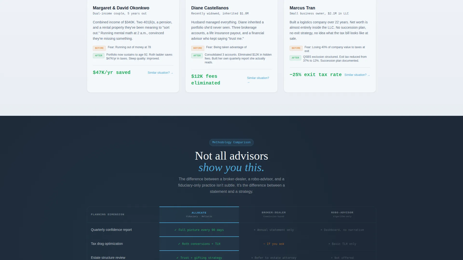
After the third case study row loads, a sticky strip anchors at the top of the viewport. It positions the advisor's holistic methodology directly against typical broker-dealer advice and robo-advisor outputs. The strip stays visible as the visitor continues scrolling, reinforcing the differentiation without interrupting the reading flow.
Multi-Step Progressive Form
The primary call to action, labeled "See Your Own Numbers," opens a short form that reveals fields in stages. First name and email come first, then a portfolio range selector with three tiers, then a single dropdown asking what keeps the visitor up at night. Options include drawdown risk, tax drag, estate complexity, and an honest "I don't know yet" choice. The form qualifies prospects without intimidating them.
Secondary PDF Download Path
Visitors who are not ready to fill out a form can download the full fictional case study as a PDF. This gives the advisor a second conversion touchpoint and gives hesitant visitors a low-commitment reason to engage with the practice's methodology before booking a call.
Page sections overview
| Section | Purpose |
|---|---|
| Dashboard header reveal | Opens with a blurred fictional portfolio that sharpens on scroll to create immediate curiosity |
| Self-typing headline | Animates like a terminal command to set an institutional yet approachable tone |
| Tax efficiency row | First case study comparison showing before and after tax drag metrics |
| Estate structure row | Second case study row covering estate vehicle setup and outcomes |
| Risk allocation row | Third case study row displaying portfolio risk profile changes |
| Income sequencing row | Fourth case study row detailing drawdown schedule improvements |
| Sticky comparison strip | Anchors advisor differentiation against broker-dealer and robo-advisor alternatives |
| Progressive signup form | Qualifies and converts ready prospects through a staged question sequence |
| PDF download path | Offers a no-pressure secondary conversion for visitors not yet ready to call |
Design & branding system
The visual identity uses a palette called Slate and Sky. It is described in the brief as feeling like a Bloomberg terminal that learned to breathe, which captures the balance well. The design is institutional enough for seven-figure conversations and open enough to read without tension.
- Core colors are deep charcoal slate at hex #1E2A38, mid-tone graphite at hex #3B4A5C, open-sky blue at hex #4DA8DA for active states and data highlights, and cloud white at hex #F4F7FA for card surfaces and backgrounds
- Improvement deltas in the case study matrix use a subtle green at hex #27AE60, creating a clear and readable visual signal without feeling promotional
- The Dashboard Pro theme drives the overall layout, using card surfaces, data-style typography, and structured grid spacing that mirrors the feel of a professional portfolio reporting interface
Mobile & speed optimization
The template is designed so its scroll-triggered reveals and progressive form work across screen sizes. The layered visual structure adapts to narrower viewports without losing the sequential storytelling logic.
- The dashboard header and case study matrix are structured to reflow gracefully on smaller screens, preserving the before-and-after column layout in a readable single-column stack where needed
- The sticky comparison strip is positioned to remain functional on mobile without obscuring the primary reading area
- The multi-step form is broken into short stages, which reduces cognitive load on any device and keeps the interaction feeling manageable rather than lengthy
How this template helps you convert
The conversion strategy in this template is built on earned trust. The page accumulates proof across multiple sections before presenting any request to act.
- The scroll-triggered dashboard reveal and self-typing headline create engagement in the first few seconds, giving visitors a reason to keep reading before they have read a single paragraph of copy.
- The four-row case study matrix layers evidence progressively, so by the time the primary call to action appears, the visitor has absorbed a structured argument across tax, estate, risk, and income dimensions rather than a single claim.
- The two-path conversion zone reduces drop-off by offering both a form for engaged prospects and a PDF download for visitors who need more time, capturing interest at two different readiness levels.
Other information about this template
This template sits within the financial advisor website templates subcategory and is specifically scoped to the financial advisor case study page niche. It is a strong fit for practices that want their website to function more like a client meeting than a brochure.
- The template style is Scroll Reveal (Progressive), meaning sections animate into view as the visitor scrolls rather than loading all at once
- The creative direction follows a Feature Matrix approach, adapted here so the matrix cells contain planning outcomes rather than product features
- The header concept is Dashboard Preview, using a fictional but realistic-looking portfolio report to establish credibility before any copy is read
- The landing page direction is Comparison/Versus, meaning the page is structured to contrast one approach against another, building the advisor's case through side-by-side logic
- The theme is Dashboard Pro, which informs the card-based layout, data-style typography, and the overall institutional visual register of the page
Theme
Dashboard Pro
Creative direction
Feature Matrix
Color system
Slate & Sky
Style
Scroll Reveal (Progressive)
Direction
Comparison/Versus
Page Sections
Scroll-triggered Dashboard Header
Progressive Case Study Matrix
Sticky Advisor Comparison Strip
Multi-step Progressive Form
Secondary PDF Download Path
Related questions
Can I replace the fictional case study numbers with my own client data?
What does the "See Your Own Numbers" form actually collect?
Is the PDF download path included in the template?
Who is this landing page best suited for?
Does the dashboard header require real portfolio data to display?



