Wealth Management & Advisory FAQ Website Template
Allocate is a robo-advisor landing page template built for automated wealth management platforms. It features a zigzag FAQ-driven layout, award badge header, animated drawdown chart, fee comparison table, and a sticky "See Your Portfolio" call to action. The design uses a Data Command visual style with a Cloud Canvas color system to project calm, institutional confidence.
by Rocket studio
Quick summary
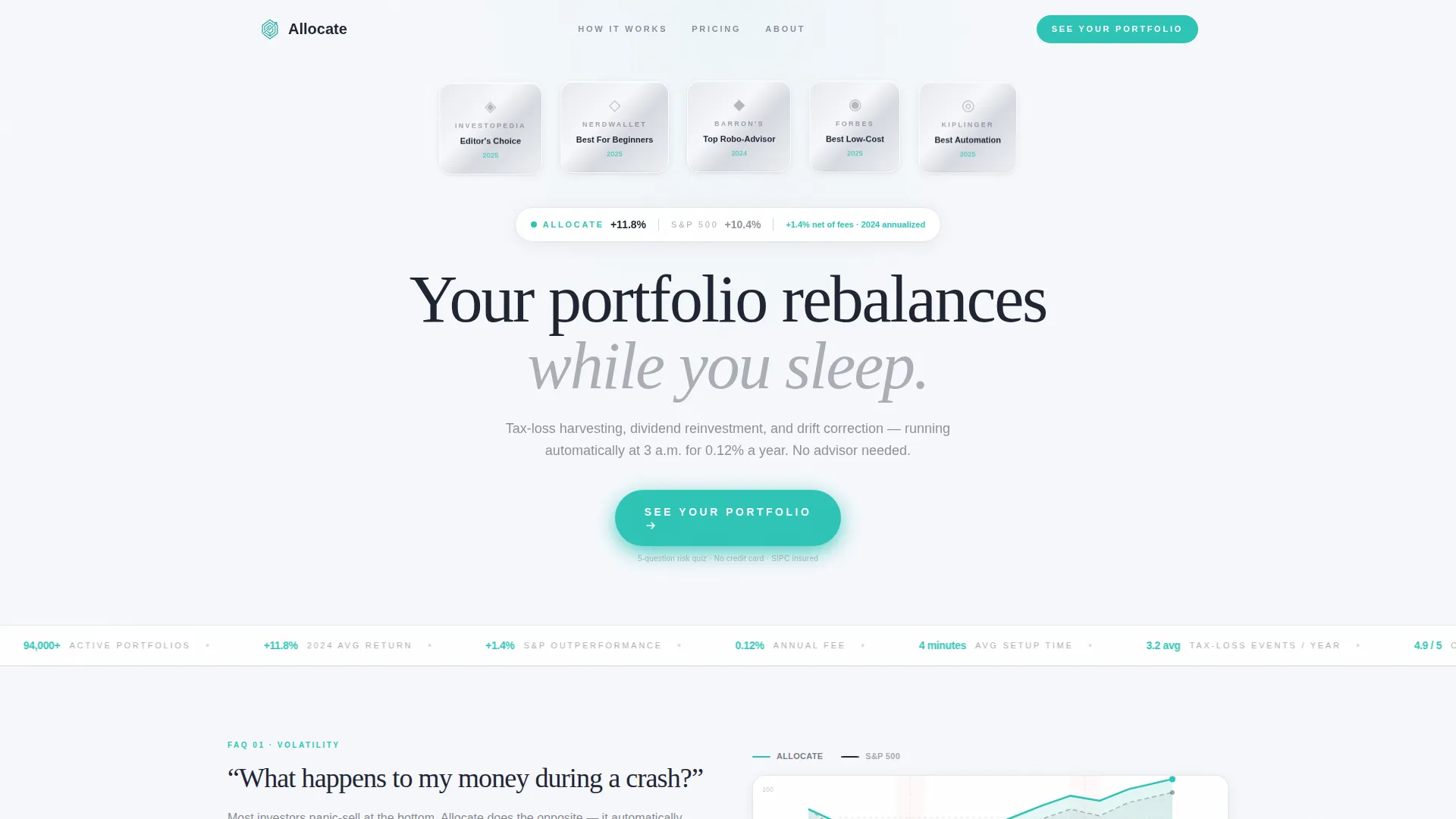
Allocate is a single-page landing page template for robo-advisor platforms. It opens with a row of award badges and a live performance line, then walks visitors through four FAQ-anchored zigzag sections that dissolve doubt before asking for anything. Every element pushes toward one goal: getting the visitor to click "See Your Portfolio" and start a five-question risk tolerance quiz.
Who this template is for
This template is built for FinTech founders and product teams launching or repositioning an automated portfolio management platform. It speaks directly to the audiences that robo-advisor products serve, and it speaks in the language those audiences already trust.
- First-generation investors in their mid-to-late twenties who have maxed a Roth IRA but do not trust themselves to pick individual stocks
- Dual-income couples who need to consolidate old 401(k) accounts into a coherent, low-cost strategy
- Semi-retired professionals who want institutional-grade allocation without paying a traditional one-percent advisory fee
What problem this template solves
Most wealth management landing pages either overwhelm visitors with jargon or undersell the product with generic stock-photo platitudes. Neither approach converts the skeptical, self-directed investor. Allocate solves that problem by structuring the page as a conversation, not a brochure.
- Visitors arrive with specific anxieties: crash behavior, hidden fees, and whether automation is actually trustworthy
- Each FAQ section answers one of those anxieties directly with a data visual, leaving no doubt unanswered before the call to action appears
- The no-form-on-page design removes friction entirely, so the only ask is a single click
What you get with this template
Allocate delivers a complete, production-ready landing page structure with every section already planned and populated with realistic placeholder content. You get a coherent visual system and a conversion-focused page flow out of the box.
- A five-section page covering hero credentials, drawdown behavior, fee comparison, automation activity, and social proof
- A sticky call-to-action bar that resurfaces after every third FAQ section so the conversion opportunity never disappears from view
- A Data Command design system with Cloud Canvas colors, DM Sans body type, and Fraunces serif display headings applied consistently across every section
Feature list
A paragraph introduction to the features: every component in this template was chosen because it serves a specific conversion job for a robo-advisor audience. Nothing is decorative without purpose.
Award Badge Hero Header
The header holds five metallic award badge emblems arranged in a horizontal row above a single-line annualized performance comparison against the S&P benchmark. There is no hero image or illustration. The credibility display is the visual, and it earns attention before a single word of copy is read.
FAQ-Driven Zigzag Layout
Each content section is anchored by a real question investors are already searching for. The layout alternates image-left and image-right so the eye never settles into a passive reading rhythm. Stakes build progressively from curiosity through objection-handling to final proof.
Animated Drawdown Chart
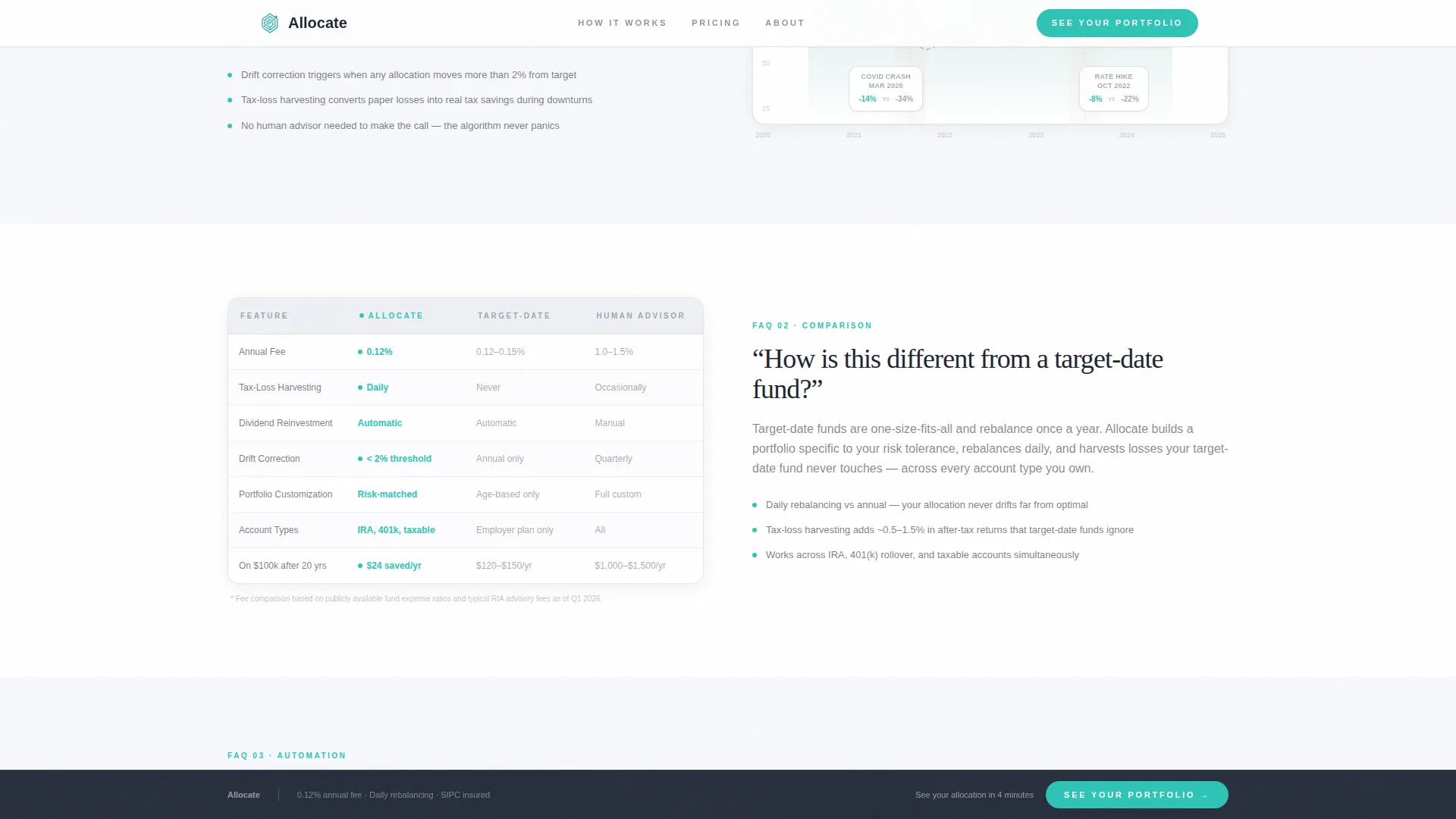
The second section pairs the question "What happens to my money during a crash?" with an interactive drawdown chart. The animation is built with CSS and GSAP scroll reveals, giving visitors a tangible sense of how the platform behaves during market stress without requiring any explanation.
Fee Comparison Table
The third section answers "How is this different from a target-date fund?" with a side-by-side fee comparison table. The table is designed for fast scanning and makes the twelve-basis-point value proposition immediately legible against typical alternatives.
Automation Activity Feed
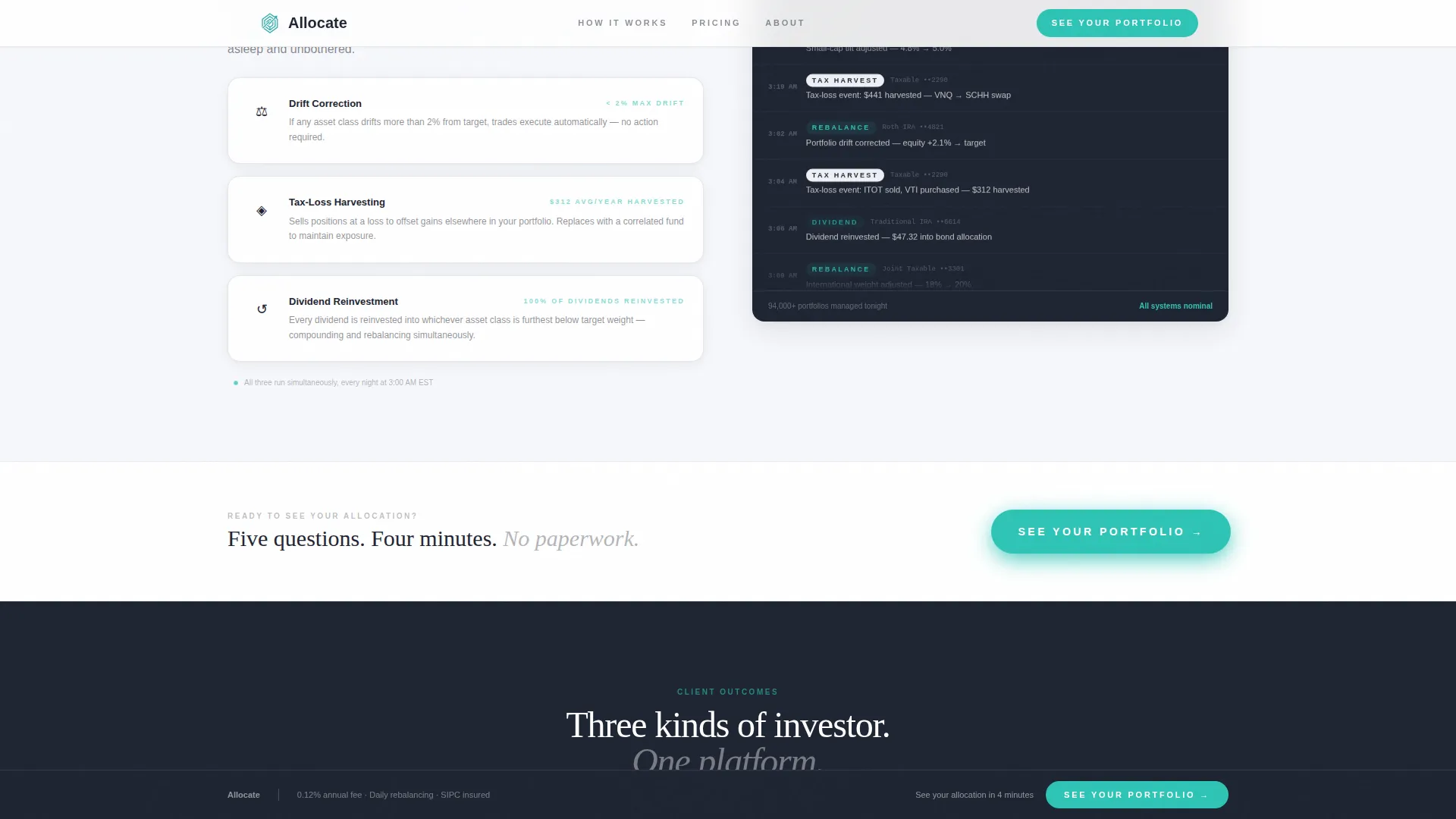
The fourth section answers "What actually runs while I sleep?" with a live-style activity feed showing tax-loss harvesting, dividend reinvestment, and drift correction events. The feed reinforces that the platform is working continuously, not just passively holding assets.
Sticky Call-to-Action Bar
A persistent bottom bar carrying the "See Your Portfolio" call to action reappears after every third FAQ section. It uses signal teal as its background color and magnetic hover behavior to stay visible without interrupting the reading flow.
Page sections overview
| Section | Purpose |
|---|---|
| Hero Award Badges | Establish credibility with award emblems and performance data before any copy |
| Drawdown FAQ Section | Answer crash anxiety with an animated drawdown chart |
| Fee Comparison Section | Differentiate from target-date funds using a scannable fee table |
| Automation Activity Section | Show continuous background activity with a live-style feed |
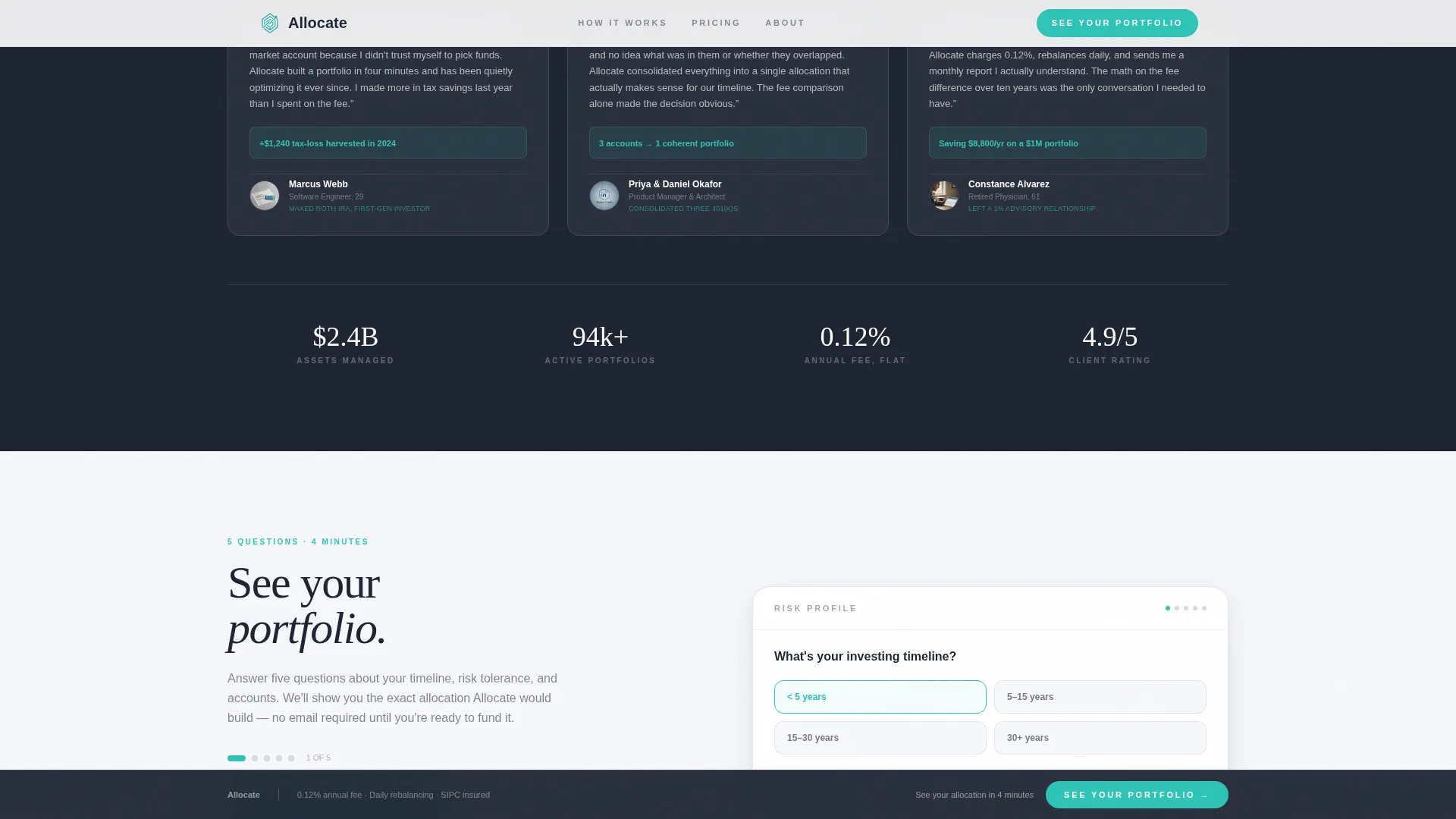
| Social Proof Section | Reinforce trust with three audience-matched testimonials and platform stats |
| Footer Linear Row | Close the page cleanly with a single-row linear footer pattern |
Design & branding system
The template uses a Data Command visual theme that combines clinical precision with quiet confidence. The Cloud Canvas color system keeps the page feeling open and organized, like a well-maintained financial dashboard rather than a marketing site.
- Core palette: soft cumulus white (#F7F8FC) background, mist gray (#D6DAE0) for dividers and secondary surfaces, deep graphite (#1E2432) for all headings and body text, and signal teal (#2EC4B6) for every interactive element, progress bar, and data highlight
- Typography: DM Sans handles all body and user interface text for clean legibility at small sizes; Fraunces serif handles display headings to add institutional weight without stiffness
- Animation layer: GSAP scroll reveals, CSS-animated charts, a marquee ticker, and magnetic call-to-action hover states bring the page to life without sacrificing load performance
Mobile & speed optimization
The template is built desktop-first to honor the financial dashboard aesthetic, but every section is fully responsive and tested at mobile breakpoints. Performance decisions were made deliberately to keep the experience fast on lower-bandwidth connections.
- Server Components handle all static sections to reduce the client-side JavaScript footprint
- Animated elements use CSS-first approaches where possible, with GSAP reserved for scroll-triggered reveals that add genuine engagement value
- The sticky call-to-action bar adapts cleanly to mobile viewports so the conversion path is never buried below the fold on any device
How this template helps you convert
Allocate is structured around a single conversion event: the click to the risk tolerance questionnaire. Every design and copy decision on the page supports that one goal.
- The page earns the click before asking for it. Each FAQ section removes a specific objection and replaces it with a data point, so by the final call to action the visitor's only remaining question is what their personal allocation looks like.
- The sticky call-to-action bar keeps "See Your Portfolio" visible throughout the scroll without interrupting reading, surfacing the conversion opportunity at the exact moments when trust is highest.
- No form fields appear on the landing page itself. The only ask is a single click, which leads to a five-question risk tolerance quiz that feels like progress rather than paperwork.
Other information about this template
Allocate sits at the intersection of the Finance and Insurance category, the Wealth Management and Advisory subcategory, and the Robo-Advisor Platform niche. It is well-suited for teams building automated investment products for self-directed retail investors in the United States market.
- The template is localized for English copy, United States dollar formatting, and United States date conventions
- The social proof section is designed to hold three testimonials mapped to the three core audience profiles, alongside platform statistics such as assets under management, user count, and average return versus benchmark
- The footer follows a Pattern 1 linear single-row layout, keeping the close of the page clean and uncluttered
- The intersection match score for this template across its category, subcategory, and niche is 13, indicating strong alignment between the design system and the robo-advisor use case
Theme
Data Command
Creative direction
FAQ-Driven
Color system
Cloud Canvas
Style
Zigzag/Alternating
Direction
Click-Through
Page Sections
Award Badge Credibility Header
Faq-driven Zigzag Sections
Animated Drawdown Chart
Side-by-side Fee Comparison Table
Automation Activity Feed
Sticky Conversion Bar
Related questions
Can I customize the award badges in the header?
Does this template include the risk tolerance quiz?
What animation tools does this template use?
Can I update the fee figures in the comparison table?
Is this template responsive on mobile devices?



