Teen & Tween Reviews Website Template
Allowance is a teen financial literacy app landing page template built as a modular card grid. It features an interactive dashboard preview, a community gallery of real teen stories, and a single frictionless call to action. The warm Citrus Burst color system and social-feed layout make money feel approachable for teens, parents, and classroom teachers alike.
by Rocket studio
Quick summary
Allowance is a single-page landing page template designed for a teen financial literacy app. It opens with a full-viewport interactive dashboard, flows through a community story gallery, and closes with a live signup counter. Every section points toward one tangerine button. The layout is modular, mobile-first, and built to feel like a social feed rather than a finance brochure.
Who this template is for
This template is built for anyone launching or promoting a teen-focused money app. It speaks equally well to direct-to-consumer app teams and educators or parents who champion financial literacy tools.
- App founders and product teams building a consumer financial literacy product for teens aged 13 to 18
- Parents looking for a structured, engaging way to teach their kids about saving and compound interest
- High-school teachers who run classroom budgeting challenges and need a compelling tool to present to students
What problem this template solves
Most finance app landing pages feel sterile and corporate. They speak to adults who already understand money. This template flips that script. It leads with the product experience itself, not a pitch deck, so the visitor builds trust by playing before they ever read a headline.
- Teens ignore pages that lecture; this template earns attention through real peer stories and an interactive preview they can actually explore
- Parents need reassurance, not jargon; the template balances youthful energy with warm, grounded copy that speaks to both generations
- Teachers need a clear classroom use case; the dedicated Classroom and Family section makes the educational angle immediately visible
What you get with this template
You get a fully structured, section-led landing page ready to customize with your app's real content. Every section has a clear job, and nothing is left vague or placeholder-thin.
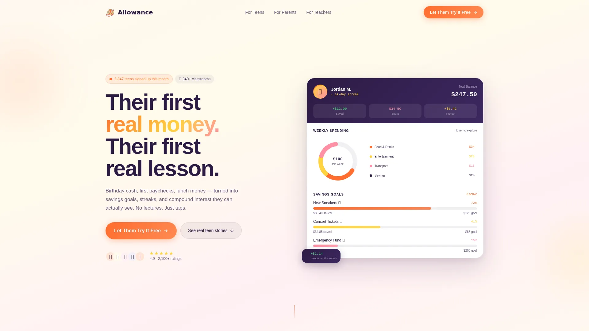
- A full-viewport interactive dashboard hero showing a teen avatar, a live balance, three savings goals with animated progress rings, a hoverable spending ring chart, and a toast notification
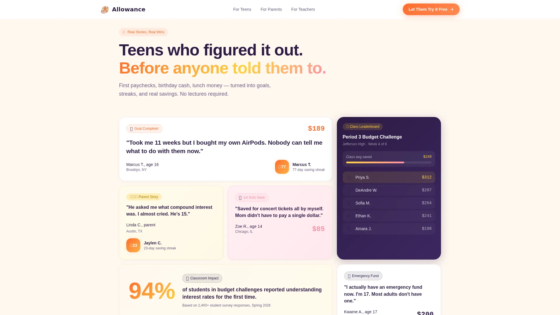
- An asymmetric bento card grid community gallery mixing teen pull-quotes, classroom leaderboard screenshots, parent testimonials, and achievement badges
- A How It Works panel, a Classroom and Family split section, a closing section with a live signup counter, and a footer in horizontal flow pattern
Feature list
This template ships with a set of purpose-built components that match the energy and intent of a teen financial literacy product.
Interactive Dashboard Hero
The hero section renders a functioning app mock-up at full viewport scale. It shows Jordan's $247.50 balance, three savings goals at varying completion percentages, and a weekly spending ring chart the visitor can hover to explore. Numbers animate upward on page load, and a toast notification slides in reading "You saved $12 this week." The product is the hero, replacing any need for stock photography.
Modular Community Gallery
The community gallery is an asymmetric bento card grid that feels like a social feed. Cards vary in size and shape, mixing screenshots of completed savings goals, pull-quote cards with unpolished teen voices, a classroom leaderboard, and parent testimonials paired with streak counters. As the visitor scrolls, the story arc shifts from personal wins to classroom impact to family conversations about money.
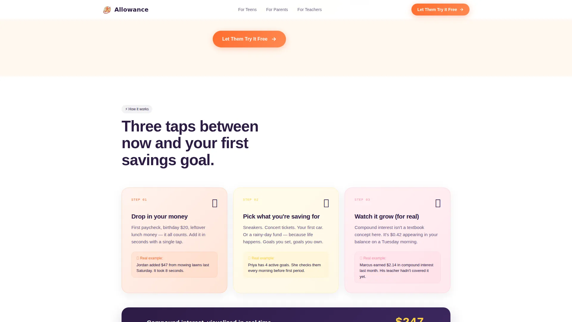
Save, Track, Grow Flow Panel
A three-panel asymmetric split section walks visitors through the core app loop. Each panel covers one stage: Save, Track, and Grow. Animated progress visuals reinforce the idea that money moves forward with every tap, making the value proposition concrete and visual rather than abstract.
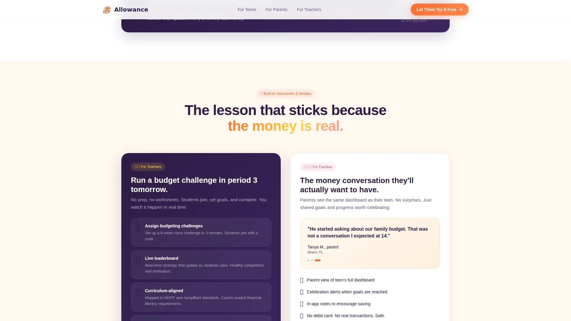
Classroom and Family Split Section
A dedicated two-column section addresses both major secondary audiences in one view. The left side presents the teacher use case with classroom challenge context. The right side shows a parent-and-kid conversation framing. This section makes the template equally useful for school-facing and family-facing marketing.
Floating Single Call to Action
The tangerine "Let Them Try It Free" button appears three times: inside the interactive header, floating at the bottom of the card grid, and anchored in the closing section. There are no forms and no fields. The entire conversion path is a single tap, reducing friction to near zero.
Live Signup Counter Closing Section
The closing section displays a real-time count of how many teens signed up this month. This social proof element reinforces momentum and urgency without resorting to artificial scarcity tactics. It pairs with the final tangerine button to create a natural, confident page ending.
Page sections overview
| Section | Purpose |
|---|---|
| Interactive Dashboard Hero | Shows live app preview with Jordan's balance, savings goals, spending ring, and animated toast |
| Community Story Gallery | Asymmetric bento grid of teen stories, leaderboards, testimonials, and achievement badges |
| How It Works | Three-panel Save, Track, Grow flow with animated progress visuals |
| Classroom and Family | Split section addressing teacher use case left and parent-kid conversation right |
| Closing Call to Action | Live signup counter paired with the final tangerine button |
| Footer | Horizontal flow footer pattern |
Design & branding system
The visual identity follows a Nurture and Care theme expressed through a Citrus Burst color system. The palette is bright enough to feel exciting for teens and warm enough to feel safe for parents, never sterile or corporate.
- Tangerine (#FF6D2E) drives buttons and progress indicators; lemon (#FFD23F) washes behind cards and callouts; soft grapefruit pink (#FF8FA4) accents badges and achievement pings; deep grape (#2D1B44) anchors all body text and navigation so the palette stays grounded
- Typography uses Plus Jakarta Sans for bold headings, DM Sans for body copy, and JetBrains Mono for all numeric displays including balances and counters
- The overall visual style is social-feed energy with staggered card reveals, scroll-linked blur transitions, count-up number animations, animated progress rings, and hover interactions on the dashboard
Mobile & speed optimization
This template is built mobile-first because its primary audience, teens aged 13 to 18, almost exclusively uses phones. Desktop layout is also considered for teachers and parents who browse on larger screens.
- Interactive components such as the dashboard and card grid use Client Components to keep animations and hover states responsive, while static sections use Server Components to reduce unnecessary rendering work
- The floating call-to-action button and staggered card reveal animations are tuned to feel smooth on mobile viewports without requiring excessive scroll distance
How this template helps you convert
The entire page is designed as a single-path funnel. Every element earns trust first and asks for a tap second. There are no barriers between a curious visitor and the download.
- The interactive dashboard preview lets visitors experience the product before reading a single line of marketing copy, building confidence through direct engagement rather than claims
- The community gallery fills the scroll journey with real teen voices, classroom proof, and parent reassurance, so by the time visitors reach the closing section, trust is already established
- The frictionless single-button conversion path, no form, no fields, just one tangerine tap, removes every reason to hesitate and makes the decision feel low-stakes and immediate
Other information about this template
This template is a strong fit for the intersection of consumer financial technology and educational technology, a space often called FinTech or EdTech. It targets the business-to-consumer and business-to-business-to-consumer models simultaneously, reaching teens directly while also speaking to the parents and teachers who influence their choices.
- The template is categorized under Kids and Family, specifically the Teen and Tween subcategory, making it a natural fit for app stores, school program pages, or family finance platforms
- The Citrus Burst color system and Community Gallery creative direction give the page a distinctly warm, social tone that stands apart from typical financial product pages
- The Card Grid modular template style means individual story cards, leaderboard blocks, and testimonial panels can be updated independently as new community content becomes available
Theme
Nurture & Care
Creative direction
Community Gallery
Color system
Citrus Burst
Style
Card Grid (Modular)
Direction
Click-Through
Page Sections
Interactive Dashboard Hero Section
Asymmetric Bento Community Gallery
Save, Track, Grow Three-panel Flow
Classroom and Family Split Section
Frictionless Single-button Conversion
Live Signup Counter Closing Section
Related questions
Who is the main audience for this landing page template?
Does the template include the interactive dashboard component?
Is there a sign-up form on this landing page?
Can teachers use this template to promote a classroom budgeting program?
How many times does the call-to-action button appear on the page?


