Bold Black-Owned Agency Landing Page Template
Amplify is a bold, scroll-reveal landing page template built for Black-owned marketing agencies ready to show, not just tell, what transformation looks like. With a Before/After Slider header, progressive section reveals, a sticky upgrade call-to-action bar, and a warm Citrus Burst color system, this template turns every scroll into a compelling case for leveling up.
by Rocket studio
Quick summary
Amplify is a scroll-reveal landing page template designed for a Black-owned creative marketing agency. It leads with a dramatic Before/After Slider, then guides visitors through a layered Comparison Journey across visual identity, messaging, campaign performance, and revenue impact. The warm Citrus Burst palette and progressive reveal structure make every section feel like a brand transformation unfolding in real time.
Who this template is for
This template is built for Black-owned marketing agencies and creative studios that serve founders, small business owners, and established brands. It speaks directly to clients who have outgrown basic design tools and are ready for strategy rooted in cultural fluency and real business results.
- Marketing agencies led by Black creatives targeting founder-stage and scaling clients
- Brand strategists who need a high-impact upsell page for existing clients on starter packages
- Creative studios showcasing before-and-after transformation work to attract premium-tier clients
What problem this template solves
Most agency landing pages describe their services in abstract terms. Visitors read bullet points about "brand strategy" and leave without feeling anything. Amplify fixes that by replacing passive descriptions with an active, visual proof structure that lets prospects see transformation happen as they scroll.
- Founders cannot picture what an agency will actually do for their brand without concrete before-and-after evidence
- Existing clients on entry-level packages need a clear, low-friction path to upgrade their investment
- Agencies lose warm leads because their pages ask for too much too soon, before the visitor is convinced
What you get with this template
This template delivers a fully structured, single-page layout built around progressive scroll reveals and a Comparison Journey framework. Every section is purposeful, sequenced to build trust and desire before the call-to-action ever appears.
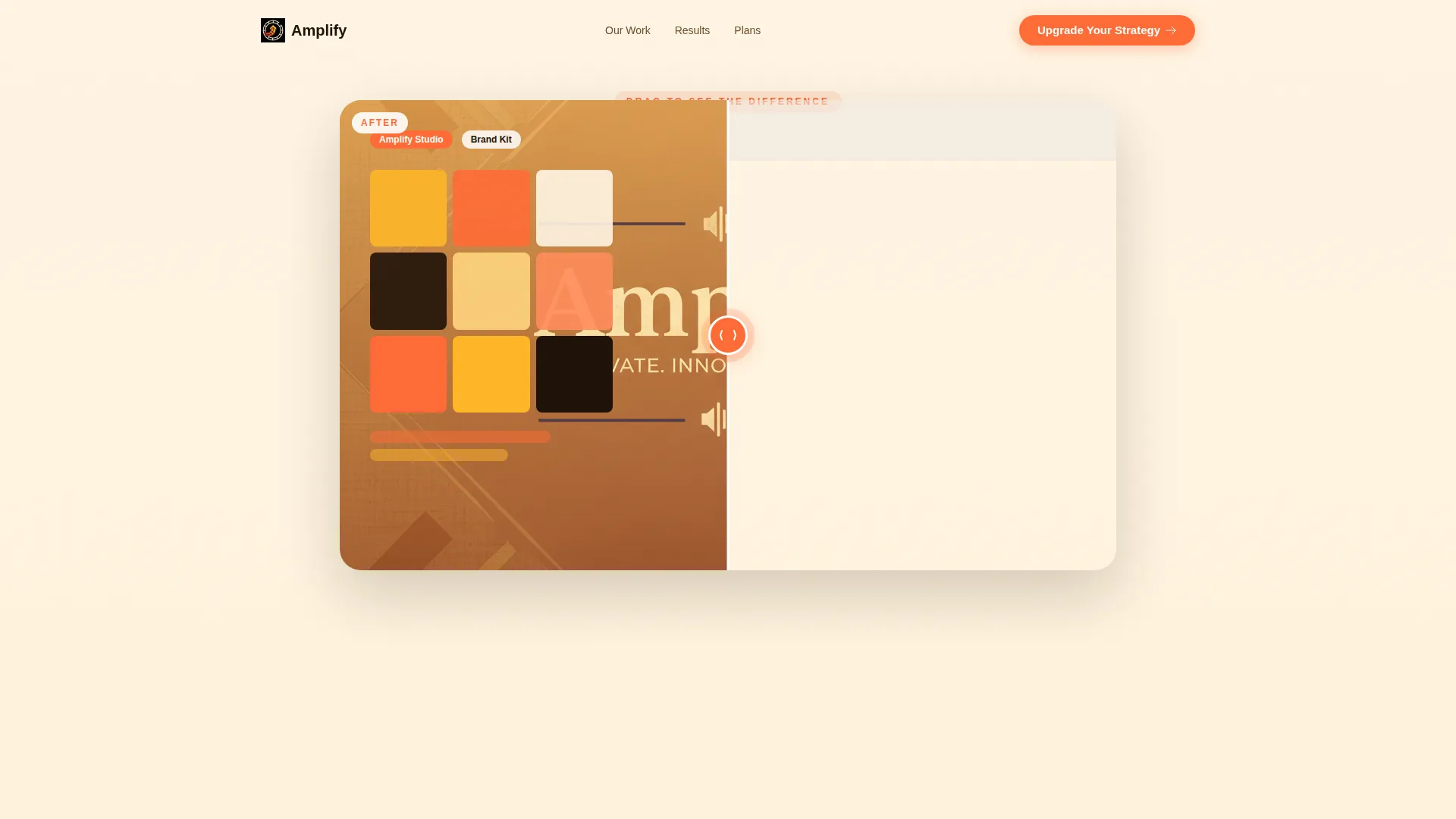
- An interactive Before/After Slider header with a pulse-animated tangerine handle and a headline that fades in only after the visitor engages
- A sticky bottom bar with the primary "Upgrade Your Strategy" call-to-action that appears after the third section reveal
- A tiered comparison card that progressively unlocks as the visitor scrolls, highlighting plan differences in tangerine accents
- A secondary "Book a Growth Call" call-to-action paired with a short founder testimonial video
- A featherlight contact form collecting only name, current package, and biggest growth goal
Feature list
This template is packed with purposeful components, each designed to reduce friction and build conviction from the first interaction to the final form submission.
Interactive Before/After Slider Header
The page opens with a side-by-side slider showing a cluttered, underwhelming brand presence on the left and a polished, cohesive brand identity on the right. The tangerine circle handle pulses gently, inviting interaction. The headline "Same brand. New gravity." fades in only after the visitor drags the slider, making the first moment on the page feel earned rather than given.
Progressive Scroll Reveal Structure
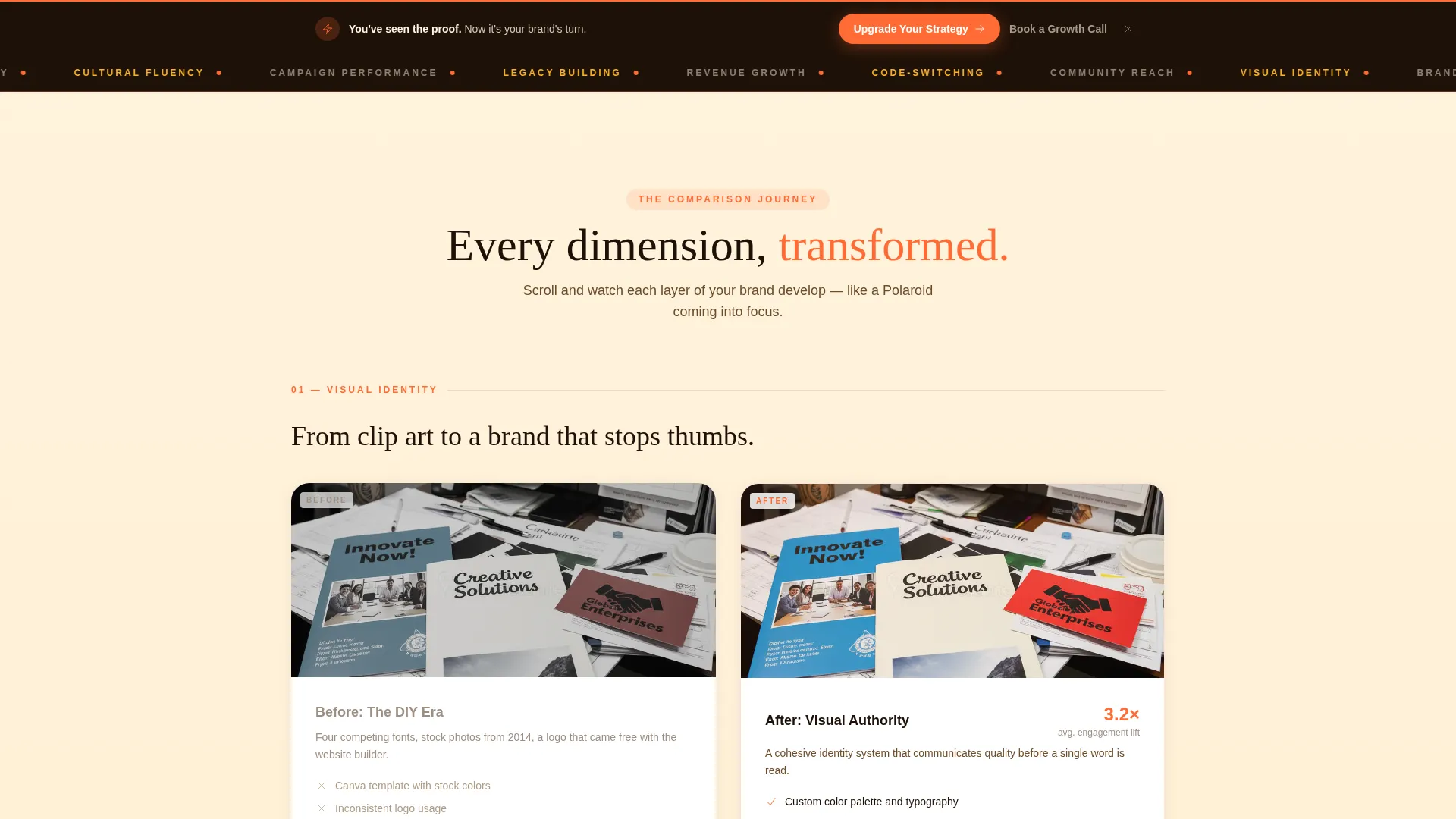
Each section of the page reveals itself as the visitor scrolls, following the rhythm of a Polaroid developing in real time. The sequence moves from visual identity to messaging to campaign performance to revenue impact, building a layered case for transformation that grows stronger with every viewport crossed.
Sticky Upgrade Call-to-Action Bar
After the third section reveal, a sticky bar locks to the bottom of the screen with the primary call-to-action: "Upgrade Your Strategy." It stays visible without interrupting the scroll experience, keeping the next step accessible at exactly the moment conviction is highest.
Progressive Tiered Comparison Card
A comparison card unlocks section by section as the visitor scrolls, revealing the difference between their current plan and the next tier. Key deliverable differences are highlighted in tangerine, making the upgrade value immediately visible and specific rather than vague.
Founder Testimonial Video Placement
A short video testimonial from a founder who upgraded appears alongside the secondary "Book a Growth Call" call-to-action. The placement pairs social proof with a low-commitment next step, giving hesitant visitors a human voice to trust before they fill out any form.
Featherlight Lead Capture Form
The contact form asks for only three fields: name, current package, and biggest growth goal. The minimal friction design works because the page has already done the persuasion work through every before-and-after section the visitor just experienced.
Page sections overview
| Section | Purpose |
|---|---|
| Before/After Slider Header | Opens with interactive brand transformation visual and delayed headline reveal |
| Visual Identity Reveal | First Comparison Journey section contrasting cluttered versus cohesive brand design |
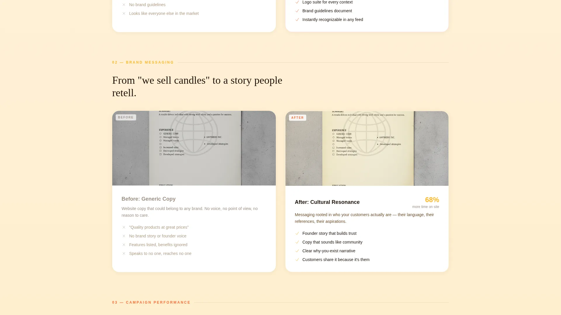
| Messaging Transformation | Shows the shift from generic copy to culturally resonant brand voice |
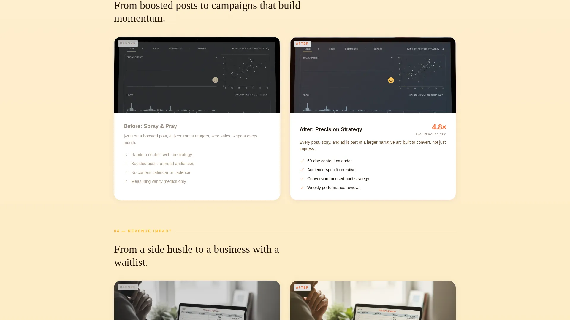
| Campaign Performance View | Demonstrates the difference between low-reach content and high-impact campaign results |
| Revenue Impact Section | Connects brand transformation to tangible business outcomes and growth proof |
| Tiered Comparison Card | Progressively unlocks plan differences with tangerine-highlighted deliverable upgrades |
| Testimonial Video Block | Pairs a founder video with the secondary "Book a Growth Call" call-to-action |
| Lead Capture Form | Collects name, current package, and growth goal with minimal form friction |
| Sticky Upgrade Bar | Persists after third section scroll to keep the primary call-to-action always reachable |
Design & branding system
The visual identity follows a Soft Gradient theme built on the Citrus Burst color system. Backgrounds shift through soft gradients from warm cream to pale mango as the visitor scrolls, giving the page a sense of warmth and forward motion without ever feeling loud or overdesigned.
- Core palette: sun-ripened tangerine (#FF6B35) for buttons and interactive accents, ripe mango (#FFB627) for gradient transitions, warm cream (#FFF5E4) for backgrounds, and deep espresso (#1E1108) for all headlines and body text
- Tangerine is reserved exclusively for interactive elements, keeping it visually meaningful every time it appears
- Deep espresso grounds all text blocks so that the brightness of the palette never sacrifices readability
Mobile & speed optimization
The scroll-reveal and slider interactions are built to perform cleanly across screen sizes. Progressive reveal animations are structured to feel smooth on both desktop and mobile viewports without requiring heavy asset loads upfront.
- The Before/After Slider is touch-friendly, allowing mobile visitors to drag the handle as naturally as desktop users
- Soft gradient backgrounds use CSS-based transitions rather than image-heavy assets, supporting faster paint times on smaller devices
- The sticky call-to-action bar is sized and positioned to remain usable on mobile screens without blocking content
How this template helps you convert
Every design and copy decision in this template is sequenced to reduce doubt and build desire before the visitor reaches any form or button.
- The interactive slider creates an immediate emotional payoff. Visitors experience transformation firsthand before reading a single word of body copy, priming them to believe the agency's results are real and achievable for their own brand.
- The progressive Comparison Journey structures the scroll as a trust-building sequence. By the time the tiered comparison card and sticky call-to-action bar appear, the visitor has already witnessed four dimensions of transformation and is mentally comparing their current brand to the "after" state they just saw.
- The three-field form removes the last barrier to action. Asking only for name, current package, and biggest growth goal signals respect for the visitor's time and keeps the path from interest to inquiry as short as possible.
Other information about this template
This template is categorized under Retail and E-Commerce with a Black-Owned Business subcategory focus, making it relevant for agencies and studios serving founders in product-based and service-based sectors alike. The Comparison Journey creative direction and Soft Gradient theme are matched from the intersection context of Black-owned business templates, ensuring the visual and structural approach fits the niche authentically.
- The template is designed as a single scroll-reveal landing page, not a multi-page website, so all content lives in one sequenced flow
- The upsell and upgrade positioning makes this template particularly effective for agencies running tiered service packages or free brand audit lead magnets
- The Citrus Burst color system is fully described in the brief and can be applied consistently across any additional brand assets created alongside this page
- The page structure supports a direct sales landing-page direction, meaning it is built to move warm visitors toward a specific conversion action rather than to inform or explore broadly
Theme
Soft Gradient
Creative direction
Comparison Journey
Color system
Cloud Canvas
Style
Masonry/Pinterest
Direction
Direct Sales
Page Sections
Interactive Before/after Slider Header
Progressive Scroll Reveal Sections
Sticky Upgrade Call-to-action Bar
Progressive Tiered Comparison Card
Founder Testimonial Video Block
Featherlight Three-field Lead Form
Related questions
Is this template suitable for a brand new agency without existing clients?
Can I change the color palette to match my own agency branding?
How does the Before/After Slider work on mobile devices?
What does the lead capture form actually collect?
Does the headline appear immediately when the page loads?



