Energy Marketing Agency Website Template
Amplify is a bold brutalist landing page template built for energy influencer marketing agencies. It features a collage-style header, a masonry creator spotlight grid, and a scarcity-driven waitlist flow. The Void and Violet color system makes every scroll feel electric. Designed for clean energy brands ready to ditch trade show budgets and go viral instead.
by Rocket studio
Quick summary
Amplify is a single-page waitlist landing page for energy influencer marketing agencies. It pairs a raw collage header with a Pinterest-style creator grid and a fixed bottom call-to-action button. The Bold Brutalist design speaks directly to Series B clean energy CMOs who need creator rosters, not conference booths.
Who this template is for
This template is built for agencies and founders operating at the intersection of clean energy and creator culture. If you match the grid to the right brands, this page does the heavy lifting before you even take a call.
- Energy influencer marketing agencies pitching solar, electric vehicle charging, or battery storage brands
- Clean energy startups launching a creator program and collecting early waitlist signups
- Agency founders who want a high-impact page that filters serious clients from browsers
What problem this template solves
Most agency landing pages look like every other B2B service site. They explain what they do in three bullet points, drop a contact form, and wait. That approach fails when your actual differentiator is taste, energy, and cultural reach. Amplify solves the credibility-and-vibe problem in one scroll.
- Clean energy brands struggle to find agencies that understand both creator platforms and technical niches like grid storage or inverter hardware
- Generic agency templates signal generic thinking, which is the opposite of what a creator-first shop needs to communicate
- Waitlist mechanics get buried or skipped when a page fails to build tension early enough to matter
What you get with this template
You get a fully designed single-page layout built around three core ideas: create tension with the header, prove depth with the creator grid, and convert with scarcity. Every section is purpose-built for the waitlist moment.
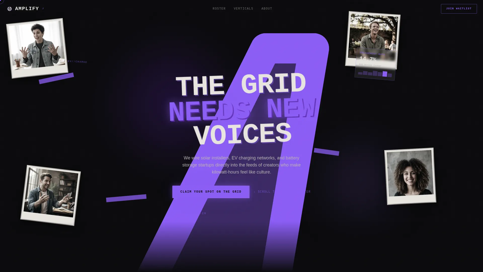
- A full-viewport collage header with overlapping creator portraits, ripped brand logos, hand-drawn lightning bolts, and subtle cursor-driven parallax
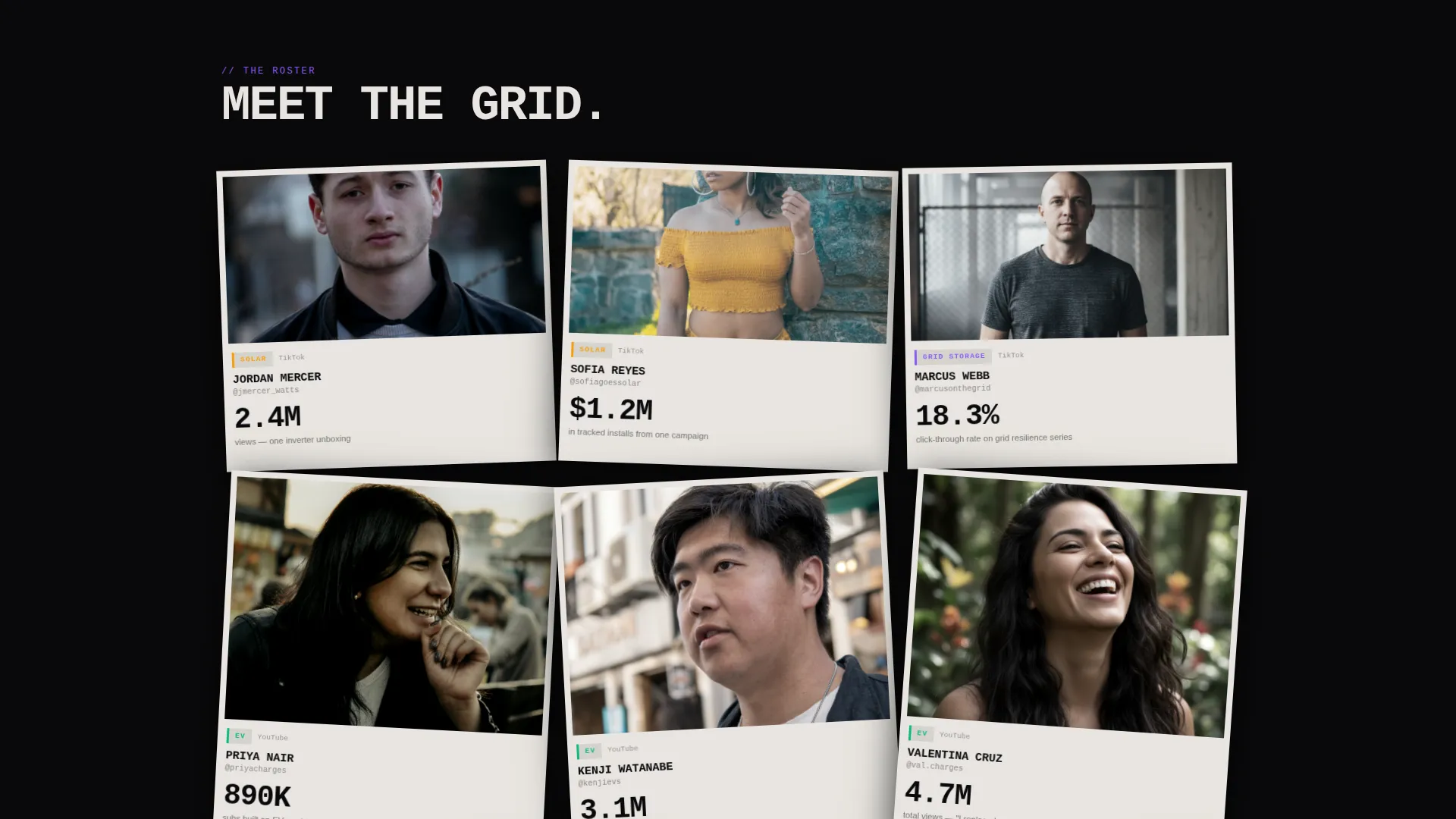
- A masonry creator spotlight grid with staggered snap animations, niche tags, platform icons, and single bold stats per card
- A fixed viewport-bottom call-to-action button, a brutalist waitlist modal with a live position counter, and a separate creator application path in the footer
Feature list
This section covers the core designed components delivered in the Amplify template.
Full-Viewport Collage Header
The header fills the entire screen with overlapping creator portraits, cropped mid-laugh or mid-gesture. Ripped energy brand logos, torn graph paper metrics, and neon violet tape strips layer across the composition. A monospace scrawled headline sits slightly askew. Cursor-driven parallax gives each layer its own movement speed, making the static collage feel alive.
Masonry Creator Spotlight Grid
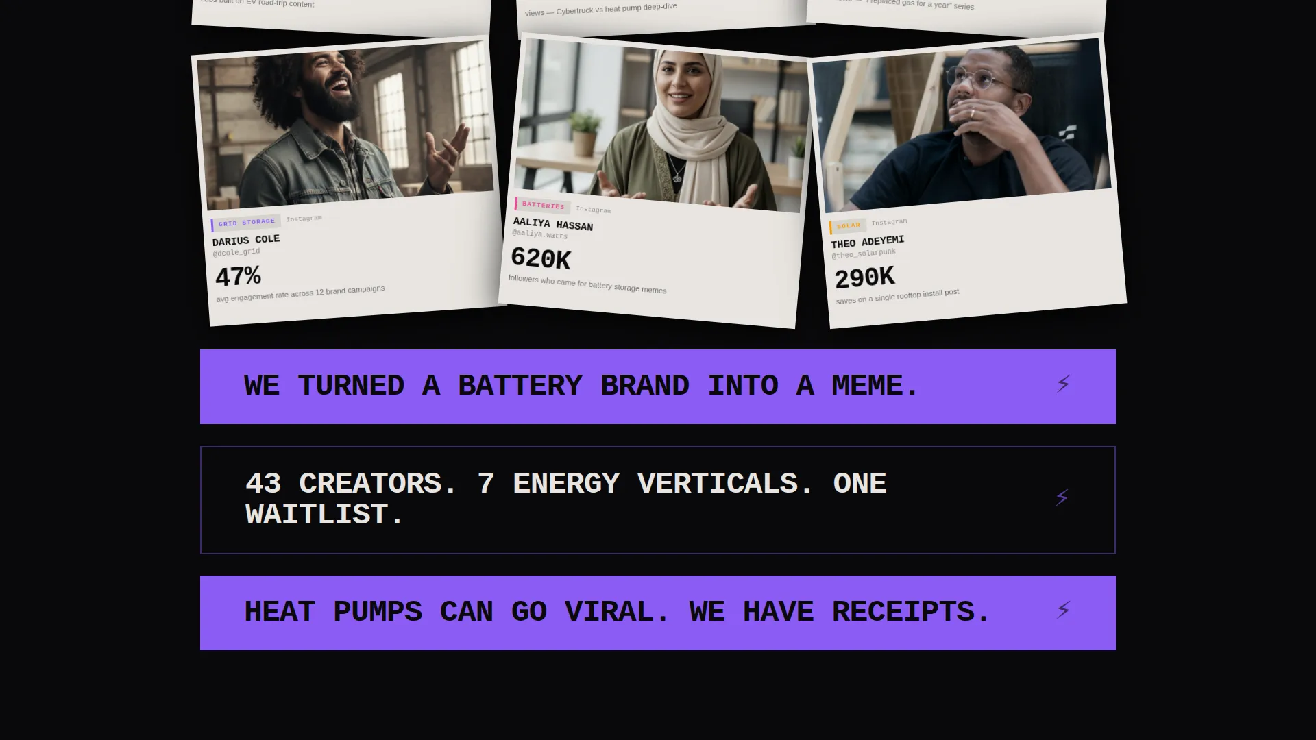
Creator cards load in staggered brutalist animation, snapping into place like polaroids on a corkboard. Each card shows a portrait, platform icons, a niche tag (solar, electric vehicle, grid storage), and one oversized standout stat. Every three rows, a full-width interrupter card breaks the grid with a bold agency claim.
Fixed Bottom Call-to-Action Button
After the first scroll, a violet "Claim Your Spot on the Grid" button locks to the bottom of the viewport. It stays visible throughout the entire scroll journey, keeping the conversion path accessible without interrupting content discovery.
Brutalist Waitlist Modal
Clicking the fixed call-to-action opens a modal with three inputs: company name, monthly creator budget via a slider (not a dropdown), and email. A live counter displays the visitor's current waitlist position in real time. No pricing page, no demo link. Scarcity drives the signup.
Full-Width Interrupter Cards
Interrupter cards appear every three rows inside the masonry grid. They break the pattern with bold agency claims printed large across the full width. These rhythm-breakers reset attention and reinforce the agency's roster depth and vertical range.
Creator Application Footer Path
A secondary "I Make Content" link lives in the footer, giving creators a separate path to apply for the roster. This keeps the supply-side flow cleanly separated from the brand-side waitlist without adding visual clutter to the main page.
Page sections overview
| Section | Purpose |
|---|---|
| Collage header | Establish raw visual identity and hook first-time visitors |
| Scrawled headline | Anchor the brand message in an iconic, skewed typographic moment |
| Creator spotlight grid | Prove roster depth through staggered card discovery |
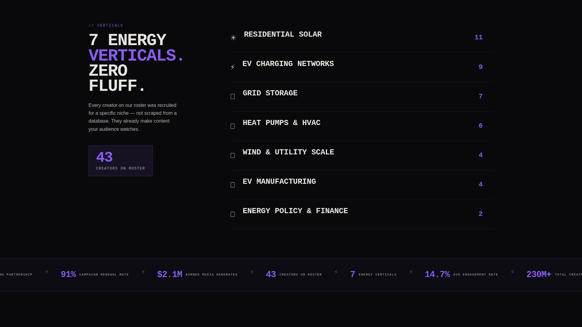
| Interrupter cards | Break scroll rhythm and reinforce key agency stats |
| Fixed call to action button | Keep the waitlist signup accessible at every scroll depth |
| Waitlist modal | Capture company name, budget range, and email with position counter |
| Footer creator link | Route creator applicants without disrupting the brand-client flow |
Design & branding system
The Void and Violet color system runs on four values that feel like a cracked phone screen glowing purple in a dark room. Black dominates every background. Violet hits headlines and hover states like ultraviolet ink under a blacklight. Off-white inside masonry cards creates breathing room, making each tile feel like a torn page pinned to a dark wall.
- Color palette: absolute void black (#09090B), electric violet (#8B5CF6), bruised ultraviolet (#4C1D95), and raw concrete off-white (#E8E5E0)
- Typography: monospace typeface used for the scrawled header headline, reinforcing the zine-meets-warehouse-party aesthetic
- Visual language: bold brutalist with deliberate misalignment, rotation variation, layered collage elements, and high-contrast card surfaces
Mobile & speed optimization
The layout is built with mobile scroll behavior in mind. The fixed bottom call-to-action button remains accessible on smaller screens throughout the entire page. Masonry grid proportions and card stacking adapt to narrower viewports so creator tiles stay readable and impactful.
- Masonry grid adjusts column count for mobile without losing the staggered animation effect
- The fixed call-to-action button is sized and positioned for thumb-reach on mobile devices
- Parallax depth in the collage header scales down gracefully so smaller screens still feel the motion without visual overload
How this template helps you convert
Amplify is designed around scarcity, discovery, and momentum. Every design decision pushes the visitor toward one action: claiming a spot on the waitlist.
- The collage header creates instant emotional investment, pulling the right audience in and signaling that this agency is culturally fluent, not just technically competent.
- The masonry grid builds trust through volume. Each new card proves the roster is deeper than expected, and the interrupter cards punctuate that proof with concrete claims.
- The fixed call-to-action button and live waitlist counter work together. Seeing a real position number turns abstract interest into a specific, urgent reason to submit.
Other information about this template
Amplify is designed as a coming-soon page, which means it works best before a full site launch. It creates pipeline and social proof before your agency is fully public, which is a real advantage in a competitive niche. The template suits any agency building at the edge of emerging technology and creator culture.
- The "I Make Content" footer link makes this template functional for both sides of a two-sided marketplace without requiring separate pages
- The budget slider in the waitlist modal is a built-in qualifier. It filters casual interest from serious brand budgets without adding a friction-heavy form
- The scarcity mechanic (live waitlist position counter) works as a psychological nudge that does not require discounts or gimmicks to be effective
- This template is suited to the bold brutalist aesthetic as a standalone creative direction, not a trend layered on top of a neutral base
Theme
Bold Brutalist
Creative direction
Creator Spotlight
Color system
Void & Violet
Style
Masonry/Pinterest
Direction
Waitlist/Coming Soon
Page Sections
Full-viewport Collage Header
Masonry Creator Spotlight Grid
Fixed Viewport Bottom Call to Action
Brutalist Waitlist Modal
Creator Application Footer Link
Related questions
Can I use this template for a different industry beyond clean energy?
Does the waitlist modal require a specific form tool to work?
Can creators apply through this same landing page?
Is the parallax effect in the collage header customizable?
How does the live waitlist position counter work?



